Good typography is invisible. Typography should be functional and purposeful, aiming to draw the reader to the content, not to the type itself.
The following section provides guidance for the selection and use of type for a non-device Software GUI.
Design principle
When selecting a typeface for use in a GUI, clarity and legibility at all screen sizes should drive decision making for usability and support efficient device use.
The use of type on GUIs should follow a defined type scale to reinforce a consistent visual hierarchy, predictability to promote Trust and Confidence in device use.
Typeface Selection
The primary application of a type is a communication interface between user and device. Therefore the typeface should be simple, clean, calming, easily read and robust.
A typeface is considered robust when it is flexible and usable across the multiple sizes, formats and resolutions of digital displays.
Consideration should be given to the x height, character width and contrast of stroke widths to determine the legibility of a typeface at both large and small sizes.

A typeface with a range of weights and styles in a family will provide the flexibility and consistency needed to build a cohesive GUI.
Use of multiple typefaces together should be limited to specific circumstances, e.g. if a GUI is required to regularly display paragraphs of text, a font that works well for UI elements may not be the best choice for large amounts of body copy.
The GUI should adopt Sans-serif type (opposed to Serif type) to minimize visual detail and complexity displayed on screen to aid better and faster reading.
In addition, Sans-serif typefaces generally appear simpler, cleaner and more modern.
Avoid decorative and display fonts which should be limited to product logotypes.
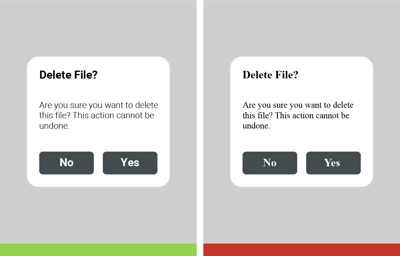
A typeface adopted for an existing Radiology non-device Software GUI matching these guidance recommendations is the Open Source typeface Roboto designed by Google.
It was designed for GUI applications and is self-described as ‘modern, yet approachable’.
Roboto draws from both neo-grotesque and humanist influences, using geometric, open counters, friendly curves and easily distinguishable letter forms to make it a highly legible typeface that can facilitate clear and efficient interaction with the device.
This font is recommended as a default choice for GUI applications, however other device and branding considerations may take precedence. Any other font selection should have similar typographic characteristics to Roboto.
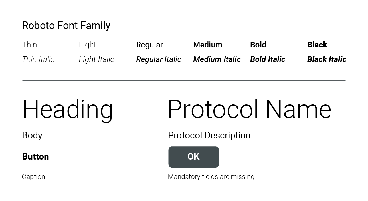
The Roboto typeface should be the benchmark for any other typeface chosen regarding legibility and flexibility.
Typeface Usage
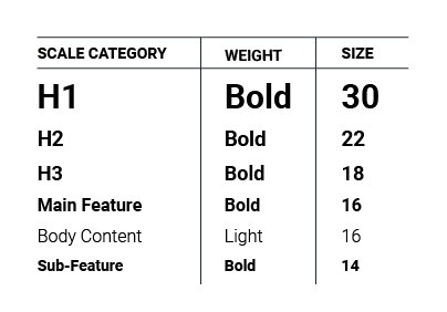
A defined type scale will help create a consistent GUI experience for the user, both visually and functionally.
A type scale establishes the hierarchy of type on the screen and defines the functionality that dictates each style’s usage.
Consistent use of weight, size, spacing, style, case and color will establish predictable interactions between the user and the device. This helps create trust between the user and device and will lead to more efficient device usage.
The hierarchy established by the type scale should be adjusted based on the display size and format. For example, a touch screen display on an injector will require larger type size compared to a website displayed on a desktop monitor.
Before developing a type scale, the anticipated device size, resolution and pixel density, as well as the expected reading distance from the device must be considered to determine minimum font sizes. To calculate minimum font sizes, refer to appropriate Human Factors guidelines, such as ANSI/AAMI HE75:2009(r)2018. Minimum font sizes calculated using visual angle recommendations assume normal vision, ample lighting and regular working conditions.

If you have any further questions about this or any other section of Bayer Identity Net, please contact:

