Good interactions between a user and a device are easy to learn and recall, reducing the cognitive load on the user and are facilitated with a system of controls and indicators.
The following guidance covers visual and auditory interactions for a Radiology non-device Software GUI.
Design principle
When designing GUI interactions, each interaction should:
- Follow a consistent implementation style that indicates the purpose and function of the interaction element. Elements should be distinct and recognizable while fitting within the overall visual language of the system.
- Be suggestive of their function to guide the user, e.g. buttons should look like they are interactive or disabled, expandable lists should indicate their state.
- Be responsive and facilitate efficient user engagement with the GUI.
Controls
A control is an element that facilitates the interaction between the user and the system. Consistent design and usage of controls will help create efficient user interaction through predictable system behavior.
Buttons
Buttons visually represent actions the user can initiate by interacting with the GUI. Use containers for buttons to indicate it is a functional element. Consider the subtle application of shadows to provide additional affordances of button behavior and added depth in the visual style.
For displays such as 10” touch screens, button containers should be a minimum of 1cm width and height in physical size to help improve usability and efficiency.

Use rounded corners on buttons to help create a softer and more approachable aesthetic, particularly in complex screens with lots of elements.

Button States
Additional overlays indicate whether a button is idle, active (pressed), or disabled (not currently active).

Drop Down Lists
Drop down lists, indicated by a downwards chevron, facilitate quick selection of limited options.

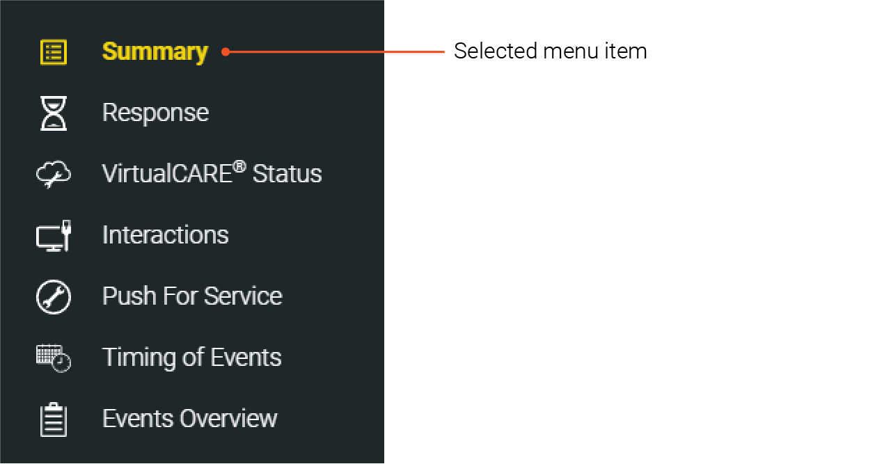
Menu List Selections
Consider the use of a highlight color to indicate the currently selected menu item.

Toggles
Toggles provide a binary selection for users and should be used when turning a feature on and off.

Input Fields
Input fields are controls which allow the user to enter data. Input fields typically contain a placeholder text which describes the input field.

Visual indicators
System status should be always visible to the user as it provides a predictable and consistent location for high level system status, building trust between user and interface.
The visual representation of detailed system status should simultaneously provide an at a glance overview of system status as well as provide a means for users to view additional details.
To establish a sense of place within the GUI workflow, provide indicators of location and workflow progression. Breadcrumbs can help identify place within nested navigation.
If you have any further questions about this or any other section of Bayer Identity Net, please contact:
Auditory Indicators – Sound
The use of sound in Bayer Radiology products should also follow the GUI design principles to be consistent and calm. While the intent of sound should be focused on communication with, due to the specific context of radiology devices, particular emphasis should be placed on ensuring sounds provide a calming experience for all users.
- The tone and timbre of sounds should be consistent with the visual aesthetic. Utilize calmer, softer tones. Sounds should not be distracting or overlap. Use short and responsive sounds.
- Avoid sound fatigue by limiting the use of bright and complex sounds.
- For frequent feedback sounds, such as touch feedback, use softer, muted sounds. The duration should be short so that each touch registers as a distinct sound without overlapping.
- Avoid replicating sounds for different events as this can cause confusing. Users regularly interact with patients are not always focused on the screen.
- Ensure that the speaker hardware components chosen have a suitable frequency response to produce audio at the quality needed for the chosen sounds.
Next topic – Instructional Materials
Please press the play button to listen.
Please press the play button to listen.
Please press the play button to listen.
Please press the play button to listen.
Please press the play button to listen.
For additional sounds used in Bayer Radiology Medical Devices, refer to:


