A graphic user interface (GUI) might be applied to Bayer Radiology apps and services and Software GUIs such as the Workflow Solutions //Insights application.
A good GUI layout communicates information clearly, groups related elements consistently to aid usability, enables efficient decision making, and provides intuitive navigation of the workflow to support the user in achieving their objectives, and in providing a good user experience.
The following sections contain guidance for developing layouts for Bayer in Radiology software GUIs that are not associated with the use of Radiology hardware devices.
Design principle
The Software GUI should:
- Be Consistent in its design and create a level of predictability.
- Promote a sense of Calm during interaction to support efficient, quick decision making, especially during safety critical events.
- Provide a Sense of Place for the user, allowing the user to always know where they are in the workflow.
- Be Guiding to the user, clearly indicating current system status and the next step.
Information Architecture
To create a usable and efficient GUI experience, a well-structured information architecture based on an analysis of the workflow is required. This creates a clear, logical, and efficient breakdown of tasks for users.
The workflow will be dependent on the features and functionality required for the app and should be used to structure the menu and screen navigation systems.
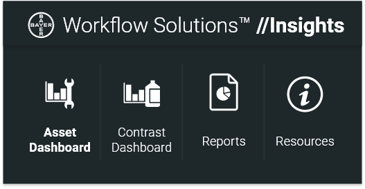
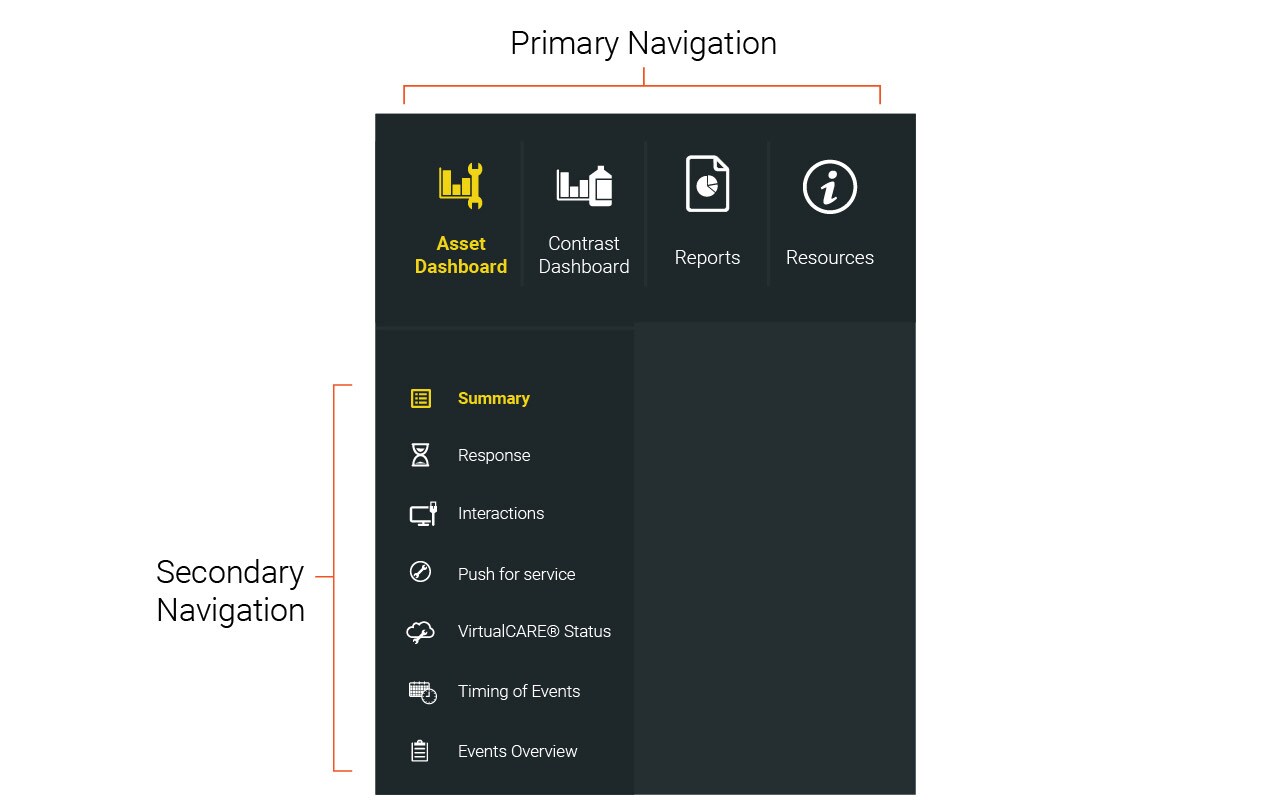
For Example, the Workflow Solutions //Insights website breaks down the workflow into the following structure:
- Asset Dashboard for insights and data related to customer devices and related service events,
- Contrast Dashboard for insights and data related to injections and contrast usage,
- Reports for the generation and review of time based reports,
- Resources for guidance and training materials.
For an example of how Information Architecture is applied to a Device GUI, refer to:
Grids & Guides
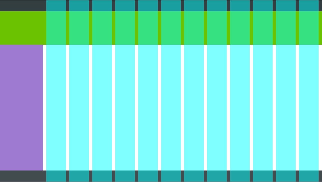
To create a consistent and efficient GUI, a system of grids and key guides is needed to frame all content within. The grid system should have established margins, columns and gutters to organize and dictate placement of elements throughout all screen designs to create a consistent and predictable experience.
It can be helpful to define margin spacing independently to gutter spacing to allow for more flexible layout designs. For visual consistency, these widths may be the same, however for different display sizes and content density, wider margins may be preferable to create more negative space, or narrower margins may be preferable for smaller displays that require higher content density.
Landscape Displays
One example of a grid system that is commonly used in landscape orientations is the 12-column grid; this is flexible and adaptable being divisible by 6, 4, 3, 2 and 1.
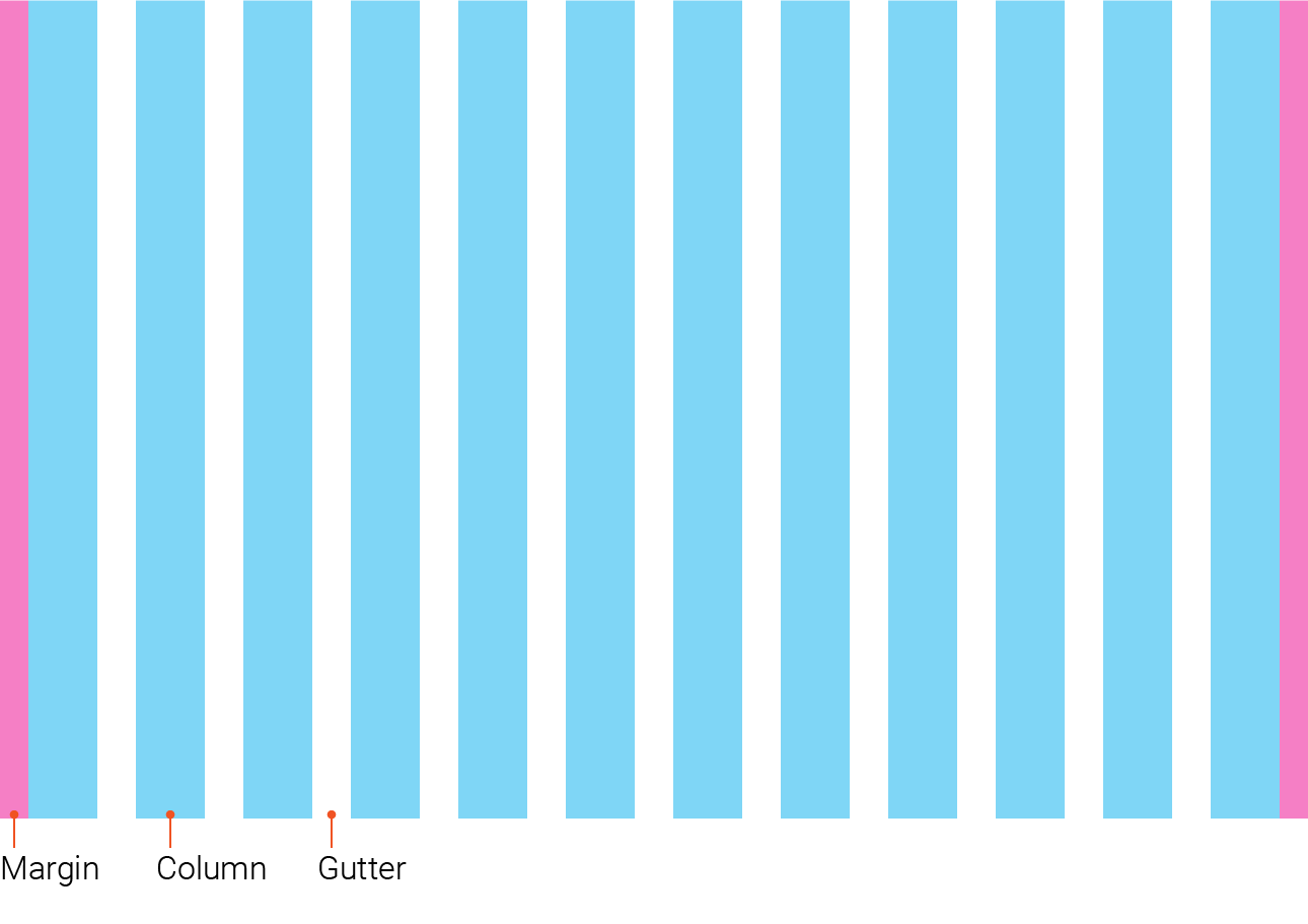
Depending on the app or service being developed, additional layout structure may be necessary to facilitate simple and intuitive navigation. For example, the Workflow Solutions //Insights application utilizes a fixed menu in addition to a column structure.
Portrait Displays
Depending on the requirements and usage of the app or service, a portrait orientation may be preferable to landscape. For a portrait display the same principles should be adopted with a column structure that is appropriate for the size of the display. For example, a tablet sized display can be suited to an 8-column grid, and a smaller phone sized display can be suited to a 4-column grid.
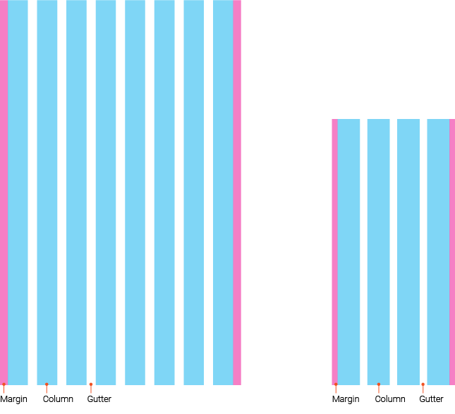
and a 4-column grid for a smaller display (19.5:9).
Screen Structure
Dividing the screen into sections facilitates consistent and predictable placement of content and features. The sections required for each app or service may vary depending on the features and functions required.
Typically, the most common sections are:
- Header – used for persistent content such as titles, profile and logout actions
- Footer – used for persistent content such as legal notices, copyright and links
- Content Columns – the main content area
- Menu Navigation – a dedicated location for persistent navigation

Spacing & Padding
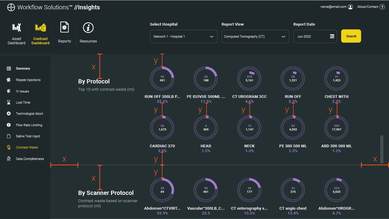
When developing alignment and spacing guides, give elements enough padding and spacing to reduce visual clutter and complexity; negative space will create a cleaner and calmer visual appearance.
Scaling
The GUI layout should be responsive not only to provide a consistent but also scalable experience depending on the size of the display.
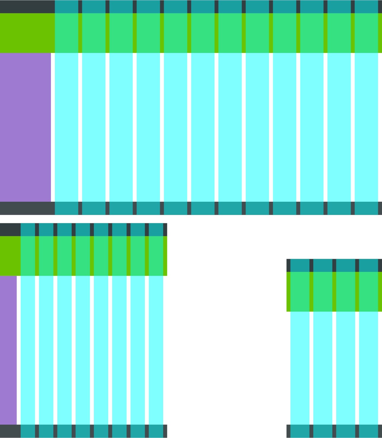
By using a grid system, content can scale depending on the screen size, ratio and resolution. If an app or service is intended to be used across all device sizes, such as desktop, tablet, and mobile sizes, then it can be beneficial to design in breakpoints at predetermined screen widths. Note: take into consideration pixel density and target device software for precise calculations (refer to industry definitions of density independence for dp, pt and px guidance).
For example, small devices with <480px width may have a breakpoint with a 4-column layout; tablets 480>840px may have a breakpoint with an 8-colum layout; desktop devices >840px may have a breakpoint with a 12-column layout.
Content & Components
Content can be populated after defining an information architecture, a grid system and consistent screen structures.
Content is communicated with the user through various GUI components. This section outlines some guidance and links to guidance on the following components:
- Graphs & Charts
- Buttons
- Input Fields
- Typography
- Icons
Graphs & Charts
As the primary tool for communication in dashboards, graphs and data displays should be clear and uncluttered.
Graph colors should follow existing color guides where applicable, however as a Software GUI there is less burden to comply strict color rules based on relevant standards. Therefore, there is more freedom to create a style that prioritizes satisfaction.


Navigation
Navigation should be constructed based on the Information Architecture for a given app or service. Where possible creative a hierarchy of navigation to group common elements together and allow for multiple tiers of navigation.
Breadcrumbs should be used within nested menus to provide the user with a sense of place when navigating within multiple menus, such as within the various types of admin settings.
If you have any further questions about this or any other section of Bayer Identity Net, please contact:

