How to use the graphic device

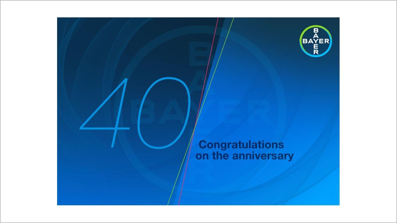
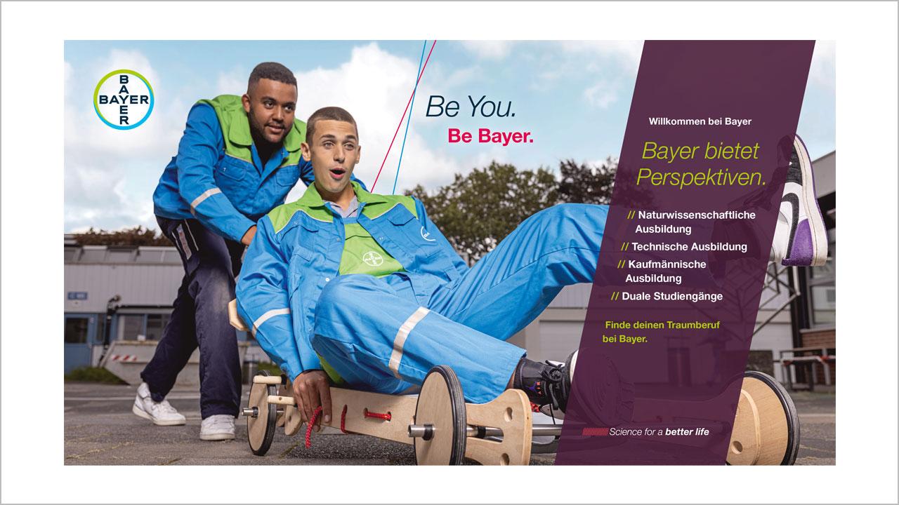
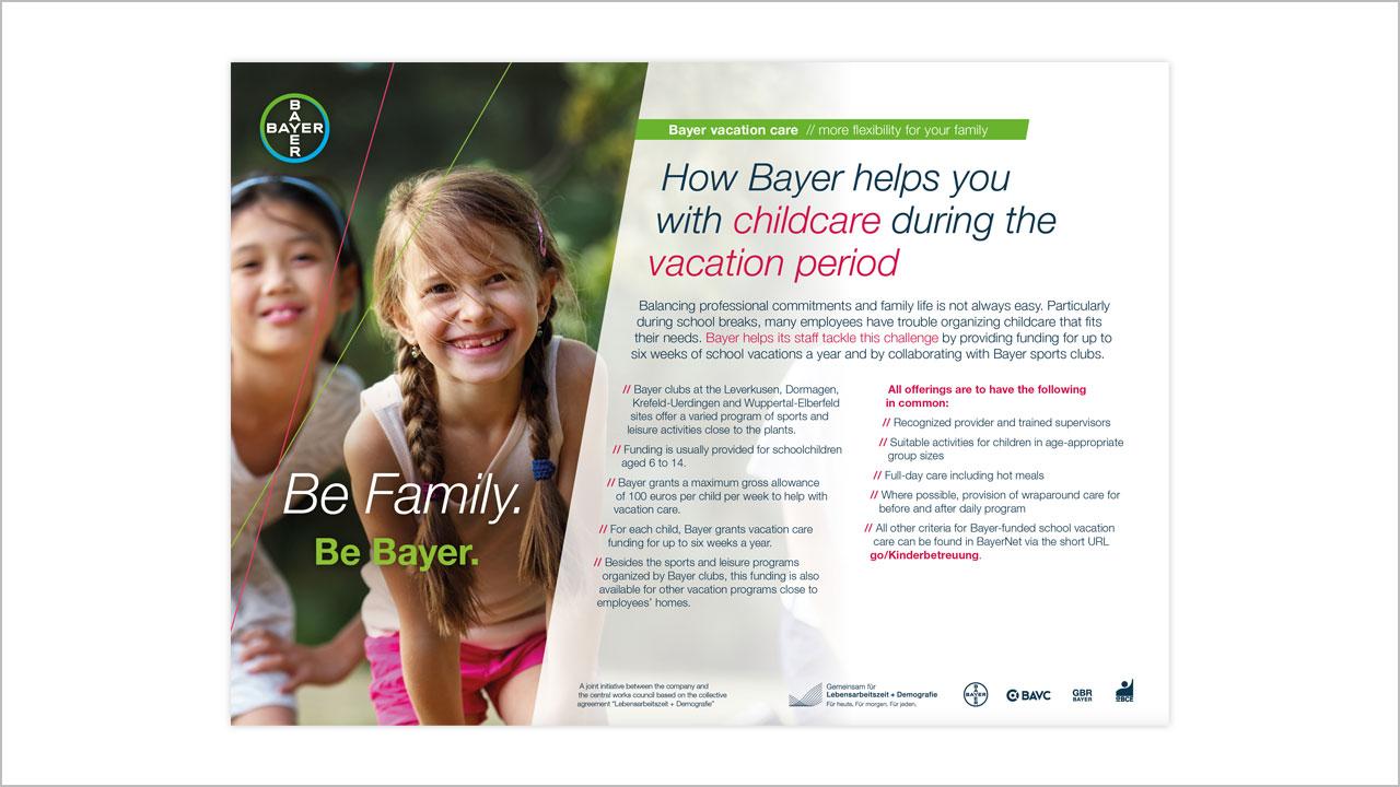
The graphic device is a flexible element and should therefore be applied with care and consideration. The examples on this page show how the dynamic angle device can be applied to layouts and designs. These represent starting points and should be seen as inspiration. It is important that the dynamic angle continues to change and evolve.
All design applications should use a dynamic angle
The angles should be between 12° and 80°
One, two or three angles create pleasing designs
Angles must always point upwards; so that it looks positive
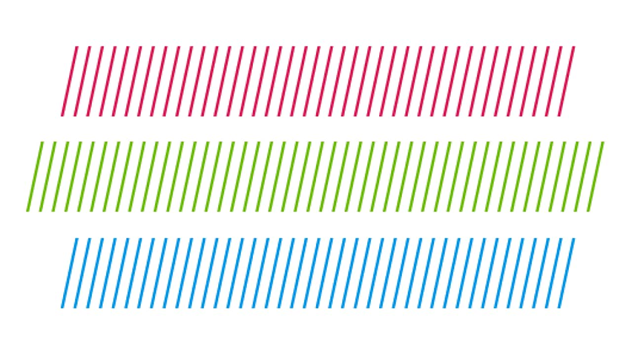
Dynamic textures
Dynamic structures are incorporated into the layout to add visual interest and movement to the composition. However, they should be used judiciously and in conjunction with other design elements, such as dynamic page graphics and image crops, to create a cohesive aesthetic.
Dynamic textures are often used in microtypography. For instance, they can be used as an alternative to traditional bullet points or as decorative elements for page numbers or section titles.

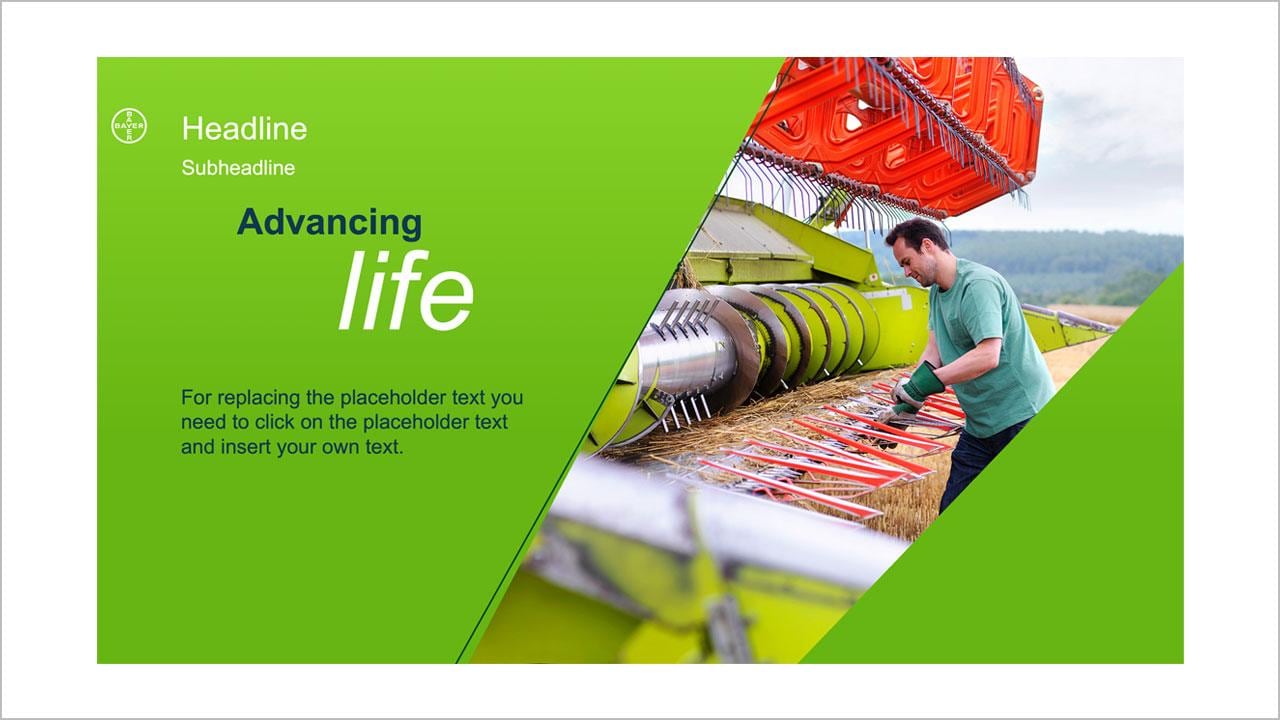
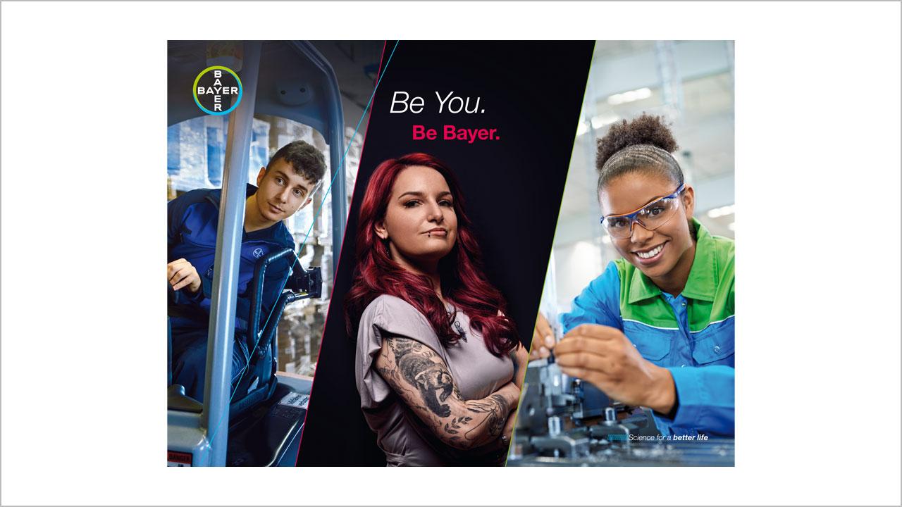
Dynamic image crops
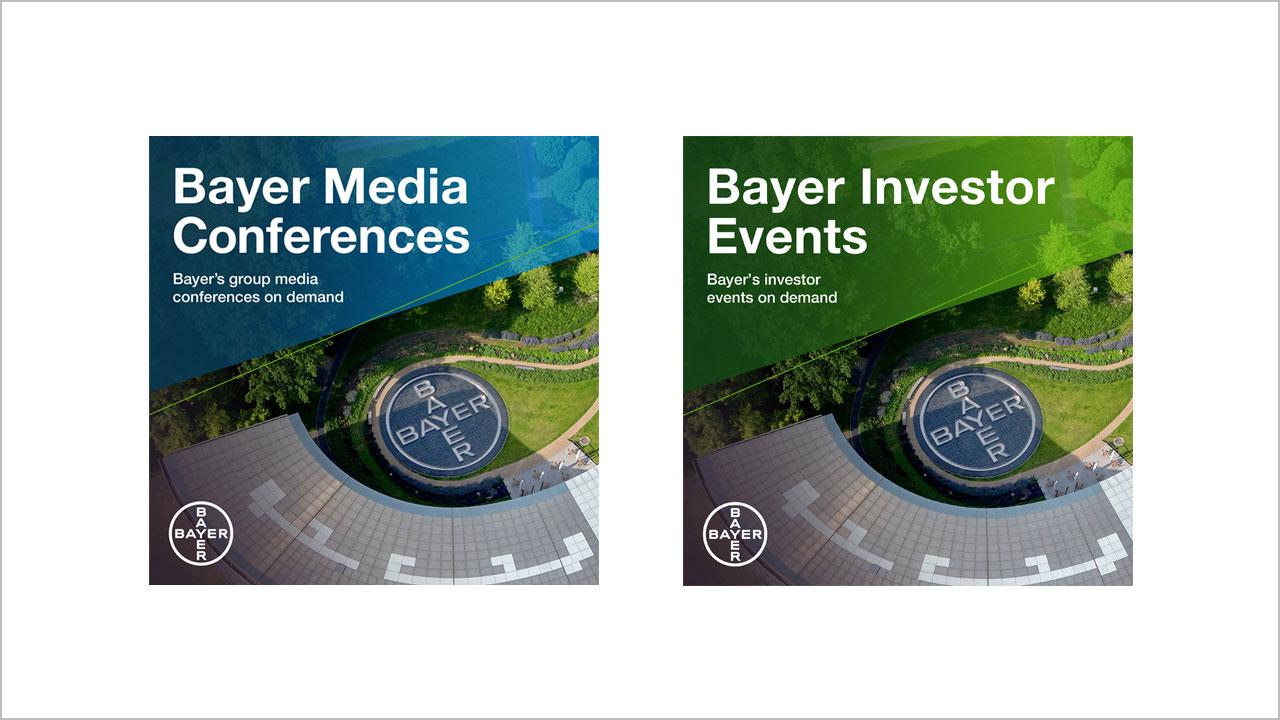
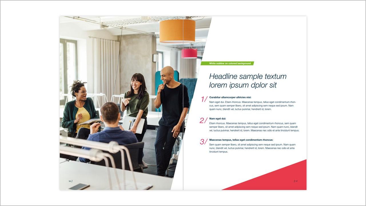
When cropping images with dynamic angles, it’s important to explore the many possibilities available. Above all, ensure that the crop is both visually appealing and sensible. The cropped image should fit well into the layout to create a harmonious composition. For inspiration, check out some of our successful examples below.
Content images
Teaser images
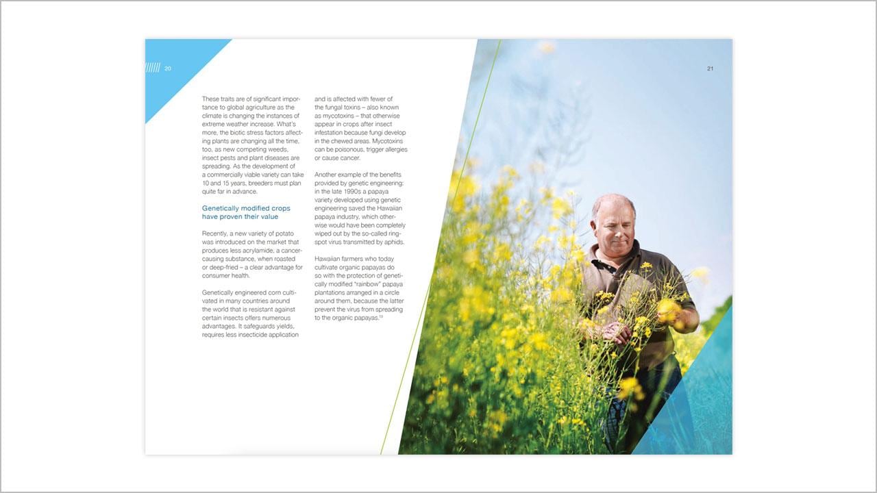
Dynamic page graphics
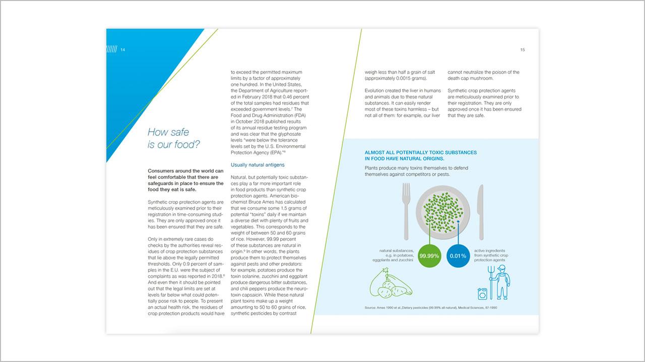
The flexible use of graphic device elements enables customized solutions that fit the purpose of your application. So design dynamic page layouts with colored areas, cropped images, and lines.
Also, be sure to create layouts with asymmetry, contrasts, and hints of movement and energy to create additional excitement. An asymmetrical balance between positive and negative space, light and dark, large and small type, is crucial to an interesting page layout.
Dynamic shapes
Dynamic shapes can be employed to emphasize headlines or text markups. It's important to ensure that the shapes consistently have a positive upward orientation and parallel angles, especially in diagrams with multiple shapes. Of course, the legibility of the text should not be compromised.

If you have any further questions about this or any other section of Bayer Identity Net, please contact:
