How To: Design Inclusive Campaigns

Most of our Inclusive Language recommendations focus on the people and groups who may be affected by our language: being inclusive, listening to and amplifying their perspectives, and using language to contribute to a fair, open and equitable working environment.
In this section, however, we start from the perspective of Bayer colleagues: our everyday activities, projects, and situations we encounter where we may need to consider language.
On this page, we share tips for designing inclusive campaigns. How can you take a holistic approach to inclusivity across all your messaging?
Subject matter choice and timed content
In general, we would only engage with a subject, or produce content to participate in an event, if we have a strong storytelling angle.
When it comes to the many country-specific and international observances or occasions that Bayer might celebrate in team events, written content or social media, we strive to participate in a way that gives fair and equitable representation to the relevant people, ethnicities, cultures or causes.
When planning timed content, first relate it to our overall communication and business goals, content framework and channel strategies. Within this, you can select stories to tell and events to celebrate in a way that’s localized to your business function or territory, and meaningful for your audience.
If participating in a themed day, check hashtags close to time of content posting to see which ones are the most popular and relevant in the broader conversation. That way, our content can participate in the dialogue and be found by others using those relevant hashtags.
Remember design as well as text
Design, just like language, plays a key role in making information accessible and removing barriers to getting the most out of our content. Just as plain language or attention to paragraph structure can make information easy to find, so can the right page layout, website template or app interface.
This applies to form and function – and is a process best started at the initial phase of any project’s design. However, some individual points to help you achieve accessible, inclusive design across a variety of formats include:
- Use an adequate font size (18-point or more is recommended). Make sure text is legible, especially when used in images or areas that aren’t modifiable
- Include alt text, video captions and transcriptions
- Consider offering a software feature that reads written content out loud as an additional service for people with visual impairments
- Present text in an easy-to-read structure on the page or screen (breaking up large blocks of text and using colorways that promote easy reading)
- Don’t overuse caps. Full-caps can be difficult to read and misinterpreted by screen readers
- Avoid using visual references to communicate information (e.g. “click the circle on the right,” “required fields are in red”). Use direct and descriptive call-to-actions instead, e.g. Proceed, Sign up, Try it for free, Subscribe
- Avoid flashing images, intense bright colors or visual patterns that could cause seizures or other physical reactions
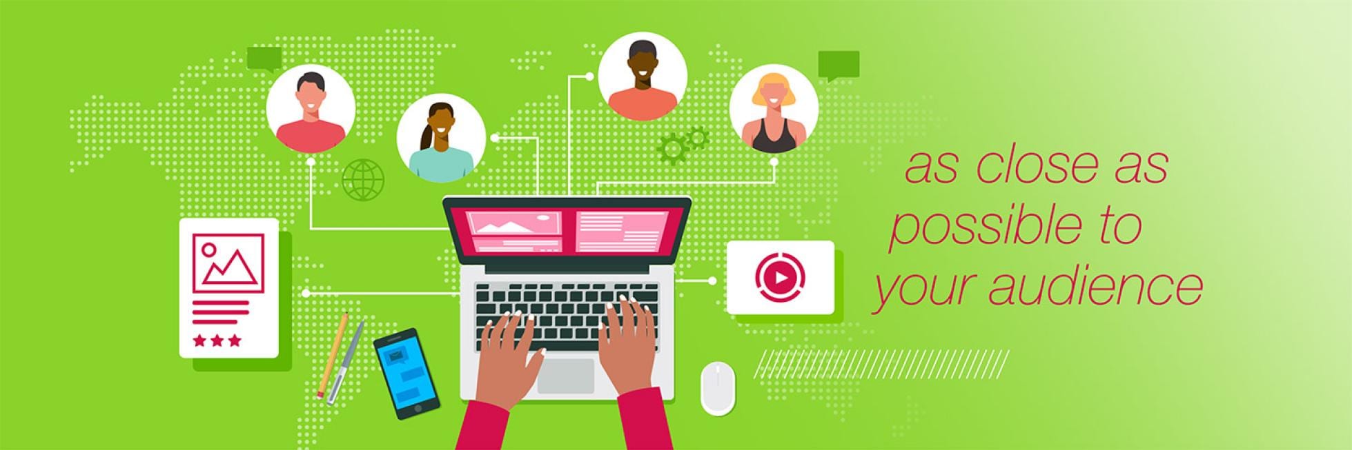
- Publish on the right channels that get as close as possible to your audience and remove barriers to accessibility
Check the page on inclusivity in multimedia content for more guidance on alt text, captions and other media elements.
Create more than one version
Tailor-made versions of campaign messaging, designs or interfaces can be created to suit different needs and target audiences. This could be for accessibility purposes (say, a Braille version of a printed brochure) or to meet the needs of different cultures and audiences.
To do this efficiently as possible, you could create a ‘master’ version of a document or design file, which can be sent to local teams for editing accordingly.
But make sure you…
If you have any further questions about this or any other section of Bayer Identity Net, please contact:
Localize, don’t copy
When a text is adapted for use in a different country, it may be translated – changed to a different language. But for maximum efficacy, you can go further than just translating word-for-word while keeping every meaning and reference the same. Are there any idioms or cultural references used that aren’t appropriate for the piece’s new destination? Do any facts need updating? Are there different market needs, which need greater emphasis?
If you consider and adjust these factors, you aren’t just updating or copying: you are localizing, getting the overall message across in the most appropriate way for each audience. You can do this with design, photography and training content too.
It makes your campaign more engaging, more inclusive, and more real. By responding to your audience’s real needs and depicting real people who they identify with, you give your campaign a sense of being dynamic and personal, rather than cold and corporate. And your customers will hopefully respond in kind.


