


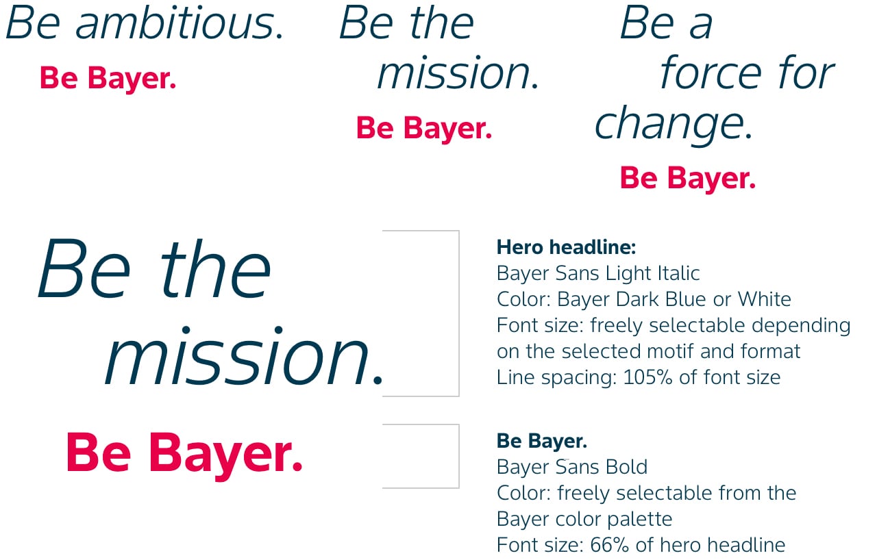
Headline design
The headline always consists of two prompts: the hero headline and ‚Be Bayer‘ as unchangeable element. Other features of the composition, e.g. the size and the colors used, depend on the image chosen.
Besides the general typography rules (Typography), which apply here too, the following specific rules apply to the employer branding compositions. The power of our employer branding is its flexibility and the freedom it offers you. This means that you will now play a much bigger role in developing messages, and choosing images to ensure they are relevant in your market and resonate with your local talent (see Segmented Talent Communication).
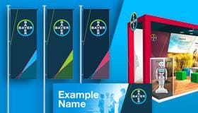
Examples


The headline
The headline always consists of 2 prompts:
1. Hero headline always starting with “Be” (freely selectable from the headline catalogue)
= Bayer Sans Light italic
2. Be Bayer. (unchangeable element)
= Bayer Sans Bold
The headline can be set in two or more lines depending on its length and on the format (portrait/landscape) and the selected position on the image. The last line always consists of “Be Bayer.” The alignment of the text is freely selectable and should create a dynamic line break.
Please note: The headline “Be You. Be Bayer.” states an exception. We capitalize the „You” whereas all other headlines are written in lowercase. Reasons are that “Be You. Be Bayer.” is the name of our employer brand and we want to highlight the “You”.
If you have any further questions about the employer branding section of the Bayer Identity Net, please contact:
The color combinations
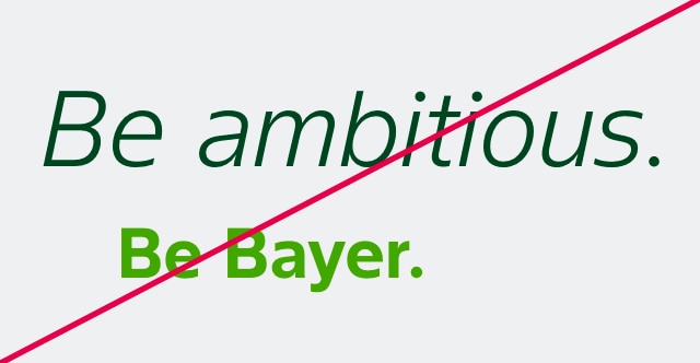
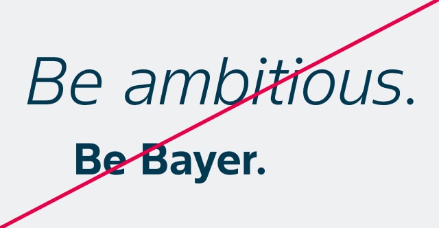
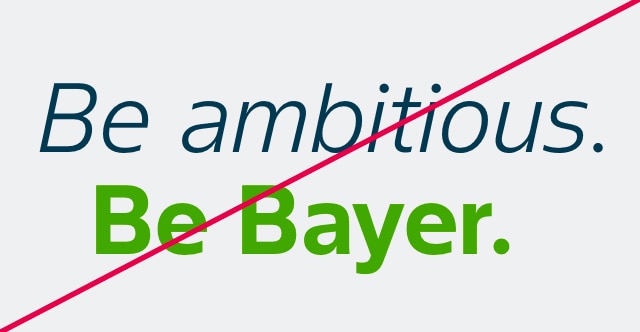
Use Bayer Dark Blue and White for the hero headline and any other color of the Bayer color palette for “Be Bayer.” Optimal contrast to the background and good readability must be ensured.

What to avoid
The following examples show usages that should be avoided.