Bayer Cross

Competence, quality and trust
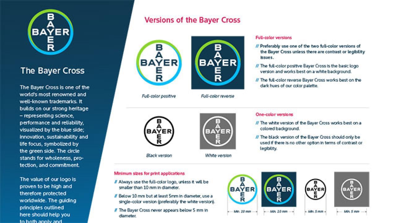
The Bayer Cross is one of the world’s most renowned and well-known trademarks. It builds on our strong heritage – representing science, performance and reliability, visualized by the blue side; innovation, sustainability and life focus, symbolized by the green side. The circle stands for wholeness, protection, and commitment.
The value of our logo is proven to be high and therefore protected worldwide. The guiding principles outlined here should help you to both apply and protect our logo.
Full-Color Positive Bayer Cross

Full-Color Reverse Bayer Cross



How to use the different logo versions
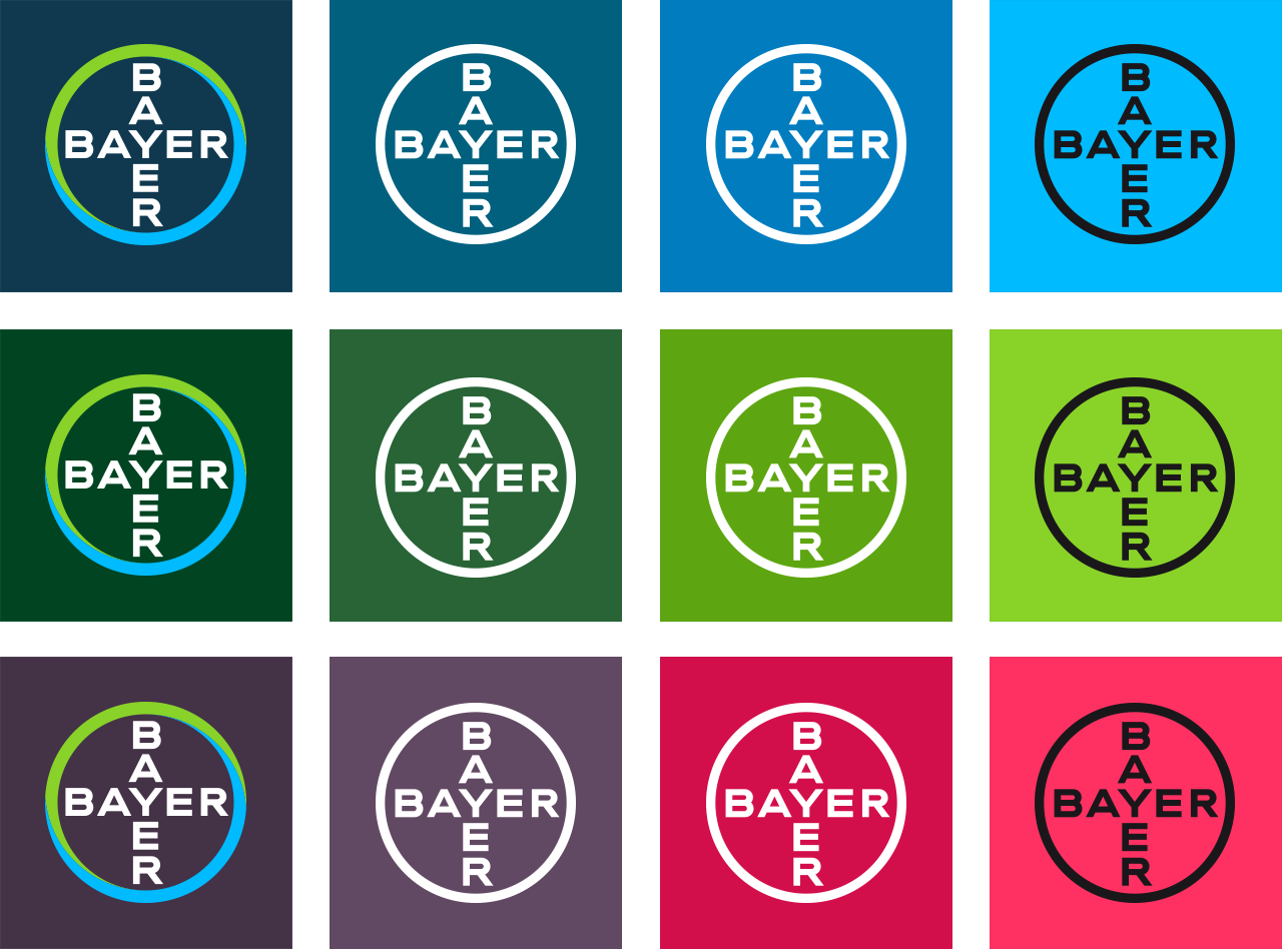
Preferably use one of the two full-color versions of the Bayer Cross unless there are contrast or legibility issues.
The full-color positive Bayer Cross is the basic logo version and works best on a white background.
The full-color reverse Bayer Cross works best on the dark hues of our color palette.
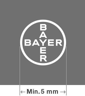
The white version of the Bayer Cross works best on a colored background.
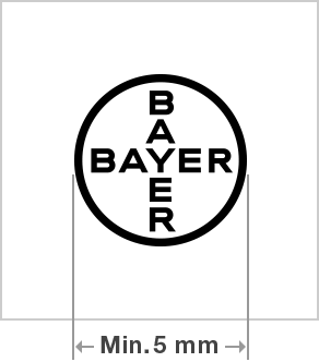
The black version of the Bayer Cross should only be used if there is no other option in terms of contrast or legibility.
All elements of the Bayer Cross have a fixed size and position in relation to each other. The logo exists as a unique set of master artwork files.


Minimum sizes for print applications
- Always use the full-color logo, unless it will be smaller than 10 mm in diameter.
- Below 10 mm but at least 5mm in diameter, use a single-color version (preferably the white version).
- The Bayer Cross never appears below 5 mm in diameter.
Size for digital applications
- There is no fixed size of the logo for digital usage.
- Always use one of the two full-color versions of the Bayer Cross unless there are contrast or legibility issues.
Usage of Bayer Cross on colored background
To ensure maximum impact and stand out of the Bayer Cross, use the following guide:
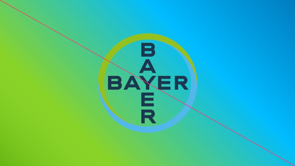
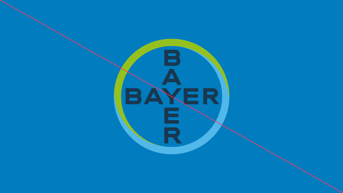
Misuse of the Full-Color Positive Bayer Cross
Whenever you use the full-color positive Bayer Cross, ensure sufficient color contrast between the logo and background elements, making sure that Bayer is clearly identified as the sender of the message. Use high contrast color combinations and avoid relying solely on color to convey information.
We show here some examples of misuse of the full-color positive Bayer Cross.

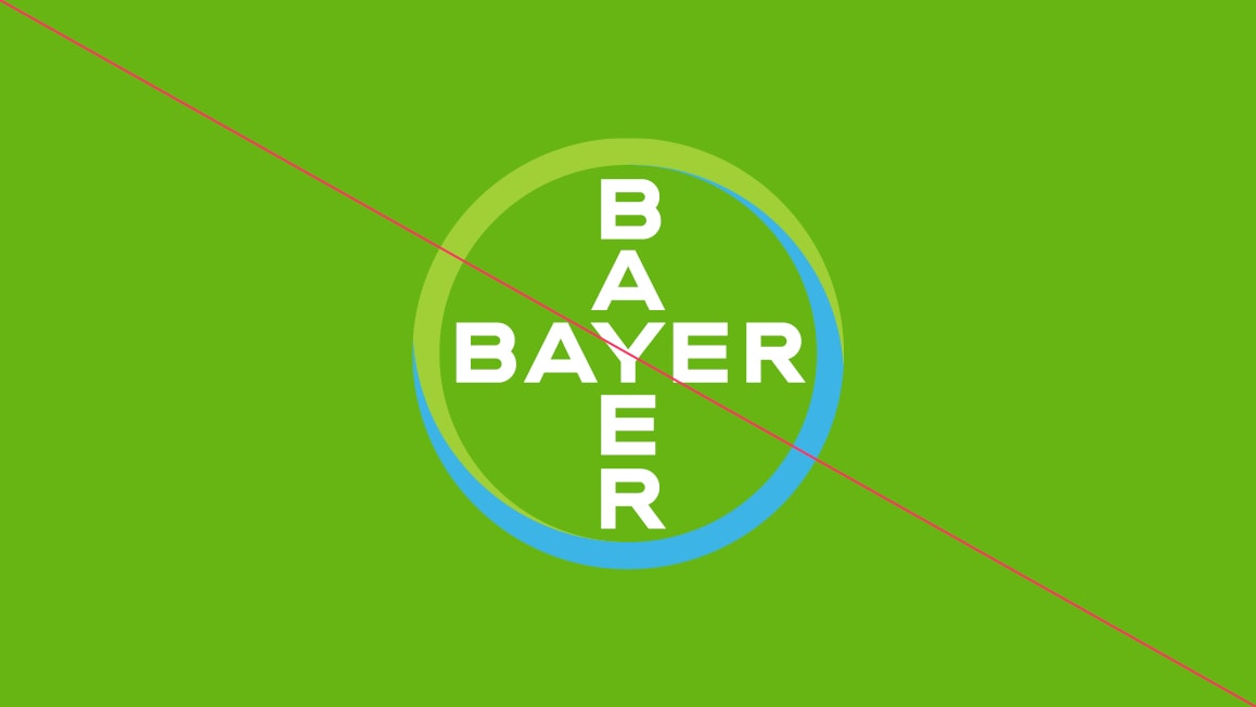
This page shows examples of misuse of our Full-Color Reverse Logo.




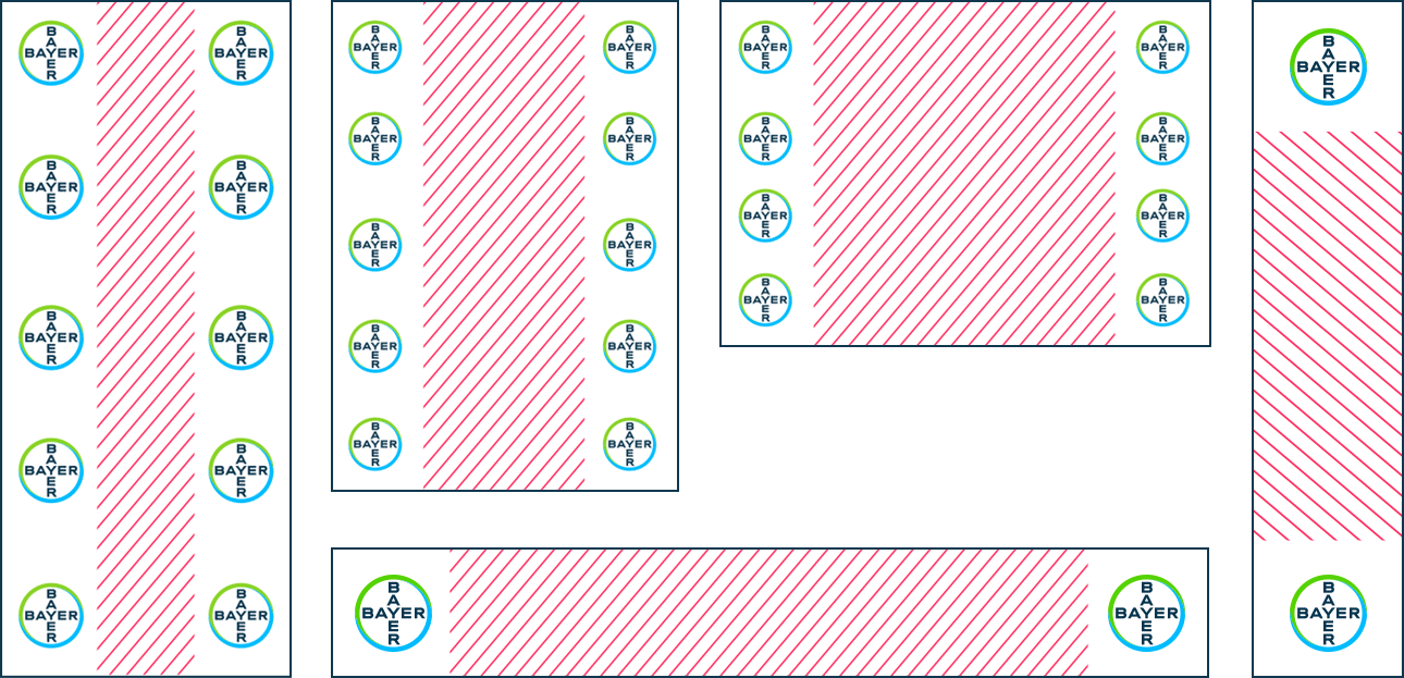
Placing the Bayer Cross in layouts
- You can place the Bayer Cross on the left or right-hand side, depending on what best suits your composition (see diagram below). Always avoid placing it in the middle.
- On extremely narrow formats only place the logo at the ends of the smaller side of the format.
- We recommend using a consistent position for communications belonging to the same family e.g. a range of brochures.
- If the item you’re designing has a convention for where logos are placed, we recommend following it (e.g. websites).
The Bayer Cross and logotype



Use this version to add impact where it appears to improve readability and recognition and in restricted spaces or at a small size (e.g. sponsor walls at events or advertising at sports events).
Minimum clear space

Always allow a space of at least ¼ of the logo diameter all around the square on which the logo sits.
Photographic backgrounds
On light and dark photographic backgrounds, use the full-color positive and reverse Bayer Cross versions respectively, as shown. If standout is compromised (e.g. on green or pale blue backgrounds), use the white version.
The full-color positive version works on backgrounds with a tonal range equivalent to 0–20% tint of black. The full-color reverse version works on backgrounds with a tonal range equivalent to 60–100% tint of black.






Other aspects to consider
Make the use of the Bayer Cross clearly accessible for visually impaired persons.
Don’t incorporate the Bayer Cross into custom logos or logotypes. For further information see here.
Don’t place the Bayer Cross in or on other graphic elements such as lines or curves. The only exception to this is using it in its entirety or as a bleed to make a creative background such as a watermark.
All third-party uses of the Bayer Cross and/or logo require written consent declaration from Trademarks Department. This applies worldwide for all partners, agencies, and suppliers. For further information see here.
Product and corporate brands need to be considered together so they appear unified, consistent, and mutually beneficial.
Position of the Bayer Cross on websites
On websites where a product or a campaign is the focus, the Bayer Cross is on the right-hand side of the header, leaving space in the naming area for the brand or campaign title. On these websites the Bayer Cross must be linked to either the global Bayer Portal, www.bayer.com or the local corporate country portal.

On websites where corporate content is the focus, the Bayer Cross is on the left-hand side of the header with the naming area. On these websites the Bayer Cross is linked to the homepage of the website.

Downloads
For details concerning color specifications, file names and abbreviations, see the appropriate; overview PDF for screen/print or for flexo printing, which will be added automatically to your search results.
If you have any further questions about this or any other section of Bayer Identity Net, please contact:


