


Elevate Your Designs with Bayer Colors

Our distinct color palette is a hallmark of the Bayer brand identity, fostering a consistent and recognizable presence across the globe and expressing our passionate, optimistic and visionary brand personality. While there are no specific color assignments for divisions or departments, extensive use of our color palette is encouraged. When we combine colors with text and the Bayer cross, we prioritize accessibility and readability to ensure an optimal experience for our audience.
Explore Our Spectrum of Colors
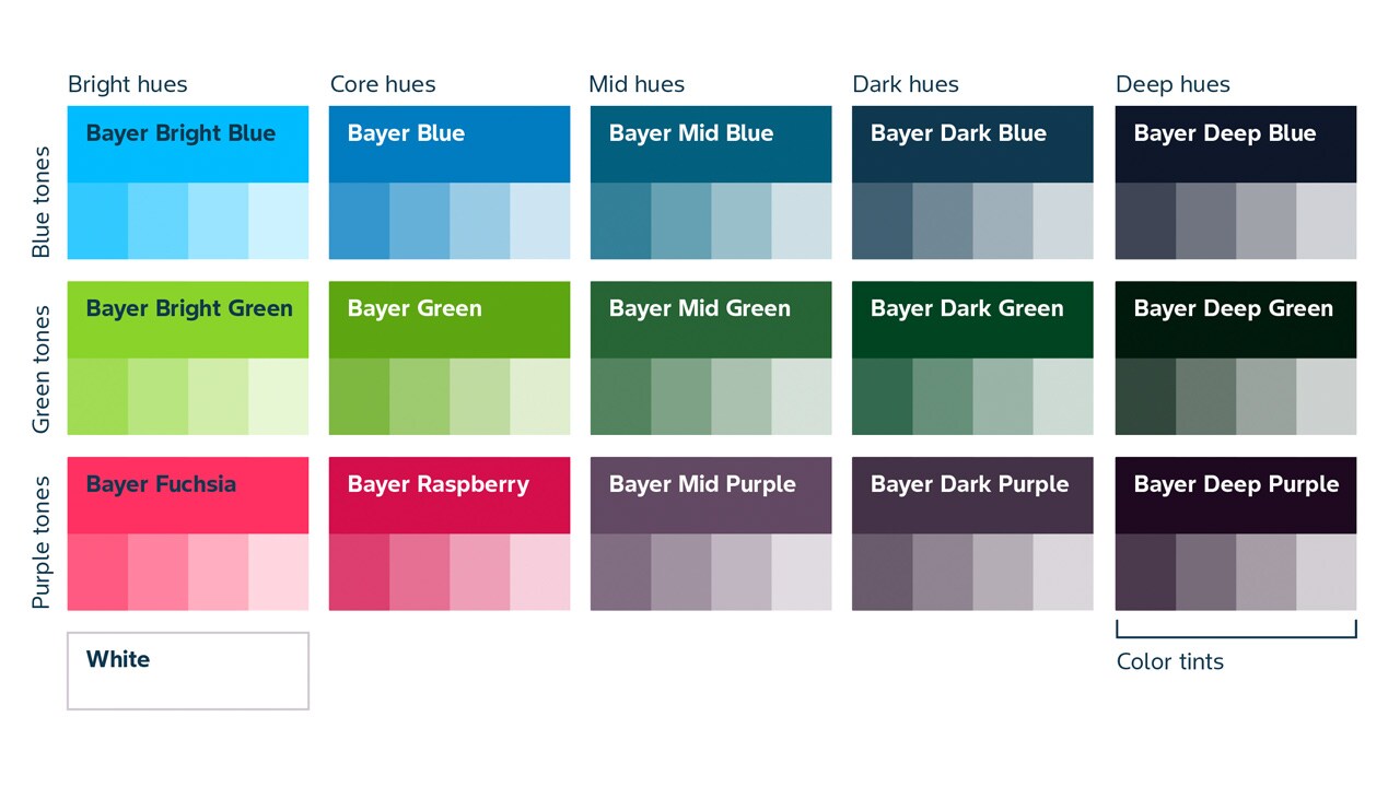
The Bayer color palette features 15 colors, plus white, categorized into three primary groups: Blues, Greens, and Purples. Each color is available in five hues: Bright, Core, Mid, Dark, and Deep. This structure enhances the versatility of designs while maintaining brand integrity.
Deep hues
| Bayer Deep Blue | |
| Pantone | 296C |
| RAL | 5004 |
| RGB | 15/23/43 |
| HEX | 0F172B |
| CMYK | 100/50/0/85 |
| Bayer Deep Green | |
| Pantone | 5535C |
| RAL | 6009 |
| RGB | 0/26/13 |
| HEX | 001A0D |
| CMYK | 100/0/75/90 |
| Bayer Deep Purple | |
| Pantone | 511C |
| RAL | 4007 |
| RGB | 29/9/32 |
| HEX | 1D0920 |
| CMYK | 70/90/30/85 |
Dark hues
| Bayer Dark Blue | |
| Pantone | 2380C |
| RAL | 5011 |
| RGB | 16/56/79 |
| HEX | 10384F |
| CMYK | 80/33/0/80 |
| Bayer Dark Green | |
| Pantone | 553C |
| RAL | 6005 |
| RGB | 0/68/34 |
| HEX | 004422 |
| CMYK | 82/30/65/76 |
| Bayer Dark Purple | |
| Pantone | 518C |
| RAL | 4007 |
| RGB | 68/50/71 |
| HEX | 443247 |
| CMYK | 55/88/32/63 |
Mid hues
| Bayer Mid Blue | |
| Pantone | 7699C |
| RAL | 5009 |
| RGB | 0/96/126 |
| HEX | 00607E |
| CMYK | 90/50/35/15 |
| Bayer Mid Green | |
| Pantone | 2427C |
| RAL | 6001 |
| RGB | 40/100/54 |
| HEX | 286436 |
| CMYK | 85/35/90/20 |
| Bayer Mid Purple | |
| Pantone | 5135C |
| RAL | 4001 |
| RGB | 98/73/99 |
| HEX | 624963 |
| CMYK | 36/68/24/31 |
Core hues
| Bayer Blue | |
| Pantone | 2172C |
| RAL | 5015 |
| RGB | 0/124/191 |
| HEX | 007CBF |
| CMYK | 84/40/0/0 |
| Bayer Green | |
| Pantone | 7737C |
| RAL | 6018 |
| RGB | 94/166/17 |
| HEX | 5EA611 |
| CMYK | 65/5/100/0 |
| Bayer Raspberry | |
| Pantone | 1925C |
| RAL | 3027 |
| RGB | 211/15/75 |
| HEX | D30F4B |
| CMYK | 0/100/55/0 |
Bright hues
| Bayer Bright Blue | |
| Pantone | 298C |
| RAL | 5012 |
| RGB | 0/188/255 |
| HEX | 00BCFF |
| CMYK | 71/0/0/0 |
| Bayer Bright Green | |
| Pantone | 2299C |
| RAL | 6039 |
| RGB | 137/211/41 |
| HEX | 89D329 |
| CMYK | 40/0/100 /0 |
| Bayer Fuchsia | |
| Pantone | 1785C |
| RAL | 3018 |
| RGB | 255/49/98 |
| HEX | FF3162 |
| CMYK | 0/88/62/0 |
Discover the Meaning Behind Our Colors
Blues: This color embodies the essence of competence, science, performance, and reliability, reflecting Bayer's rich heritage. Blue hues instill confidence and trust, making them ideal for conveying Bayer's commitment to science and progress.
Greens: Symbolizing innovation, nature and sustainability, green hues focus on life and growth. These colors create a harmonious balance with blue, reinforcing Bayer's dedication to advancing sustainable agricultural practices and promoting health across communities and ecosystems.
Purples: This vibrant addition brings a personal and expressive touch to our palette, adding warmth and creativity to designs. Purple and fuchsia hues enhance emotional engagement, highlighting Bayer's innovative spirit and commitment to connecting with our audience on a deeper level.
If you have any further questions about this or any other section of Bayer Identity Net, please contact:

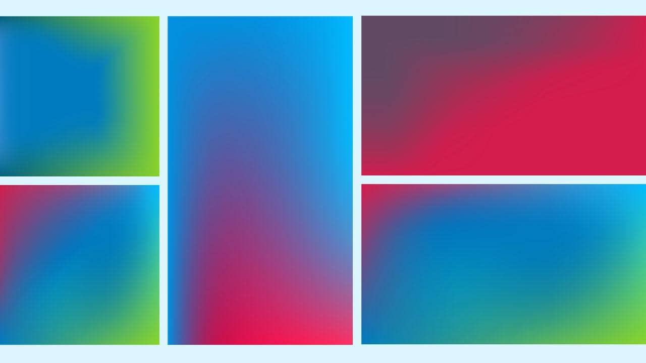
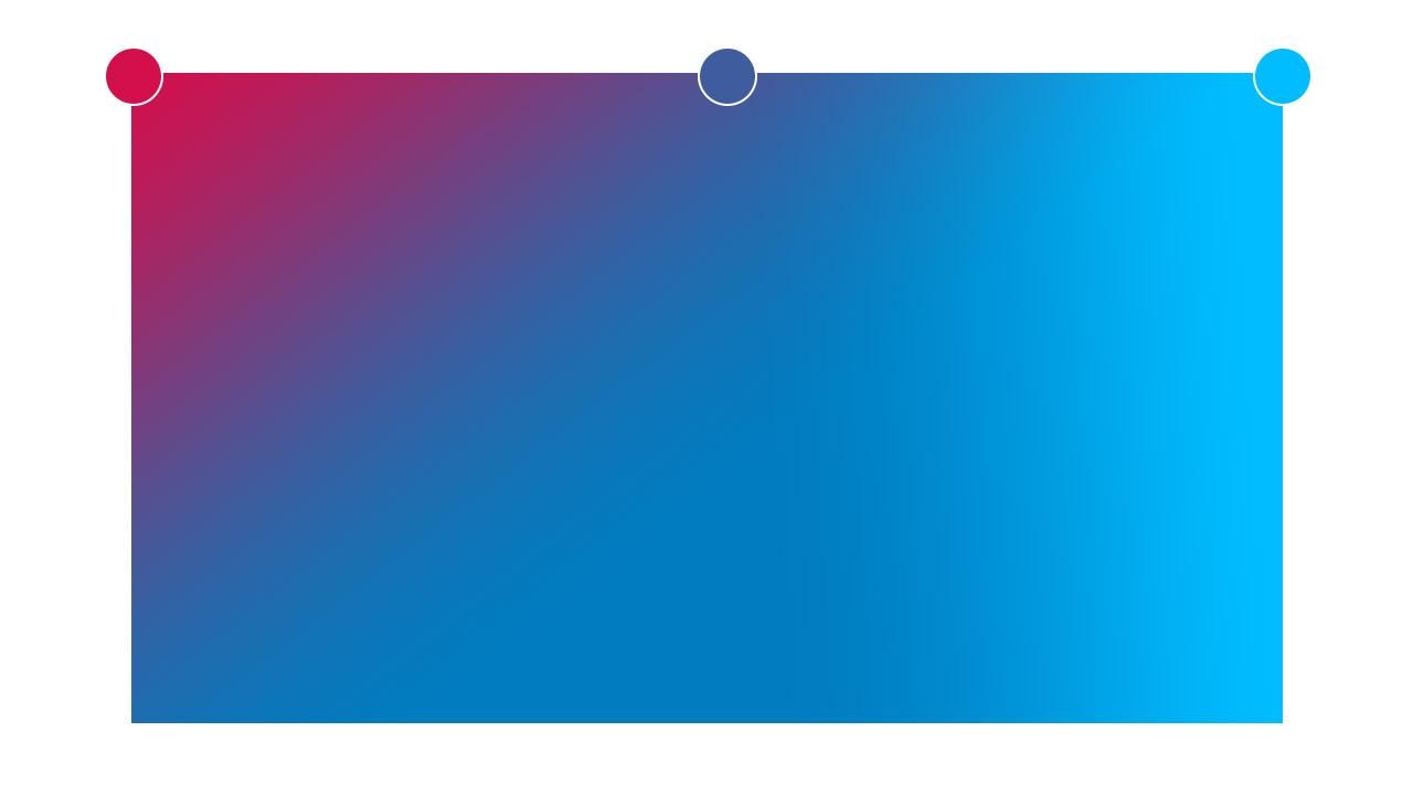
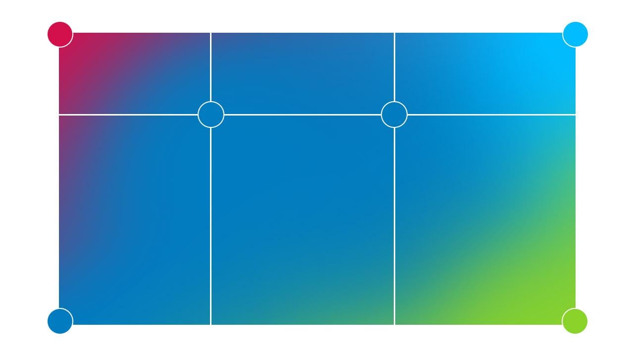
Dynamic Gradients: Bring Your Designs to Life
Gradients are a powerful design tool that can infuse vibrancy and depth into your projects. By blending colors seamlessly, gradients enhance visual interest and engage the audience. Our dynamic gradients are specifically crafted to evoke a lively and optimistic aesthetic.
Guidelines for Creating Effective Gradients: Tips for Success
Maintain Simplicity: Keep designs clean and uncluttered to ensure clarity and focus.
Limit Color Use: Use single or two colors in your gradient to avoid overwhelming the viewer.
Select Complementary Colors: Choose adjacent colors like green and blue for subtle brand expression or subtle transitions.


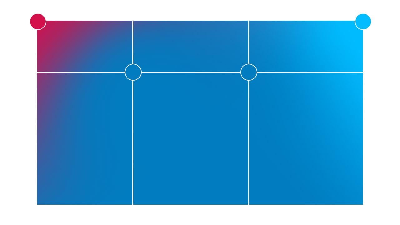
Step-by-Step: A Practical Guide to Creating Your Own Gradient
To create a gradient using Adobe Illustrator:
Utilize the mesh tool to blend colors effectively.
Position the most accessible colors centrally to maximize contrast with white text.
Prioritize accessibility and legibility in your design.
For good color transitions, mix a dark color with a medium color, a medium color with a core color. For accessibility and legibility reasons it is not recommended to use the bright hues of the colors.
- 1/7
- 2/7
- 3/7
- 4/7
- 5/7
- 6/7
- 7/7


Tonal gradients
For good color transitions, keep the tone the same, mix a dark color with a medium color, a medium color with a core color. For accessibility and legibility reasons it is not recommended to use the bright hues of the colors.
Blue gradients


Green gradients


Purple gradients


Expanding Our Color Universe: Introducing Deep Hues
To enhance emotional depth as well as create an immersive look and feel for digital experiences, we supplemented the color library with additional deep hues that make the key content stand out, pop, and truly shine. The deep hues adhere to web accessibility guidelines, ensuring our designs are both visually appealing and inclusive. When using text with gradients on colored backgrounds, it is essential to prioritize readability and accessibility for all users.