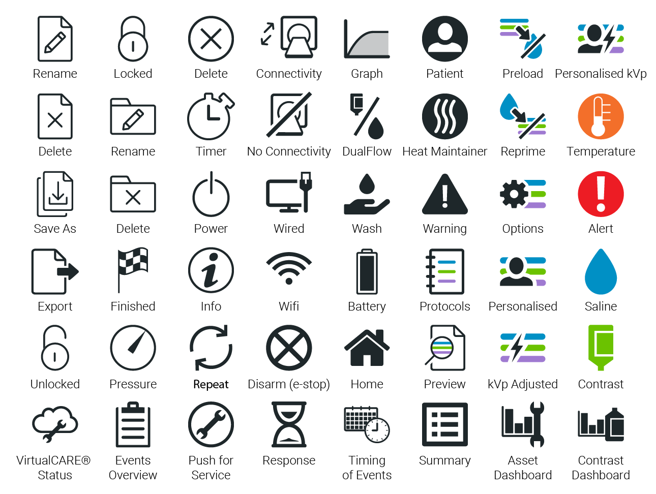
The use of an icon set in GUI design provides users with additional visual context to help understand and remember system functionality. Icons should communicate a visual metaphor of the function or content being interacted with while also being designed with a consistent aesthetic.
The following section provides guidance on key considerations when approaching icon design for a non-device Software GUI.
Design principle
When designing icons for implementation in a GUI, the primary motivation should be to create an Efficient user interface. The implementation of an icon should provide a shortcut in understanding to facilitate an efficient user workflow.
Icons should be designed as a set with similar visual elements and styles to create a Consistent visual vocabulary that is clear and recognizable for the user to interact with.
Clarity of visual elements is required for efficient visual comprehension. Icons should be reductive: visually concise and minimalist without unnecessary detail.
Icon Development
The visual treatment of icons should follow a minimalist aesthetic approach without realistic details or decorations. Too much detail can create clutter and complexity whereas a clean minimalist aesthetic will help achieve a calmer aesthetic and efficient visual comprehension.
Shape
Icons should be constructed geometrically, with consistent arcs and angles. Do not design realistic looking icons that use organic shapes and freeform lines.
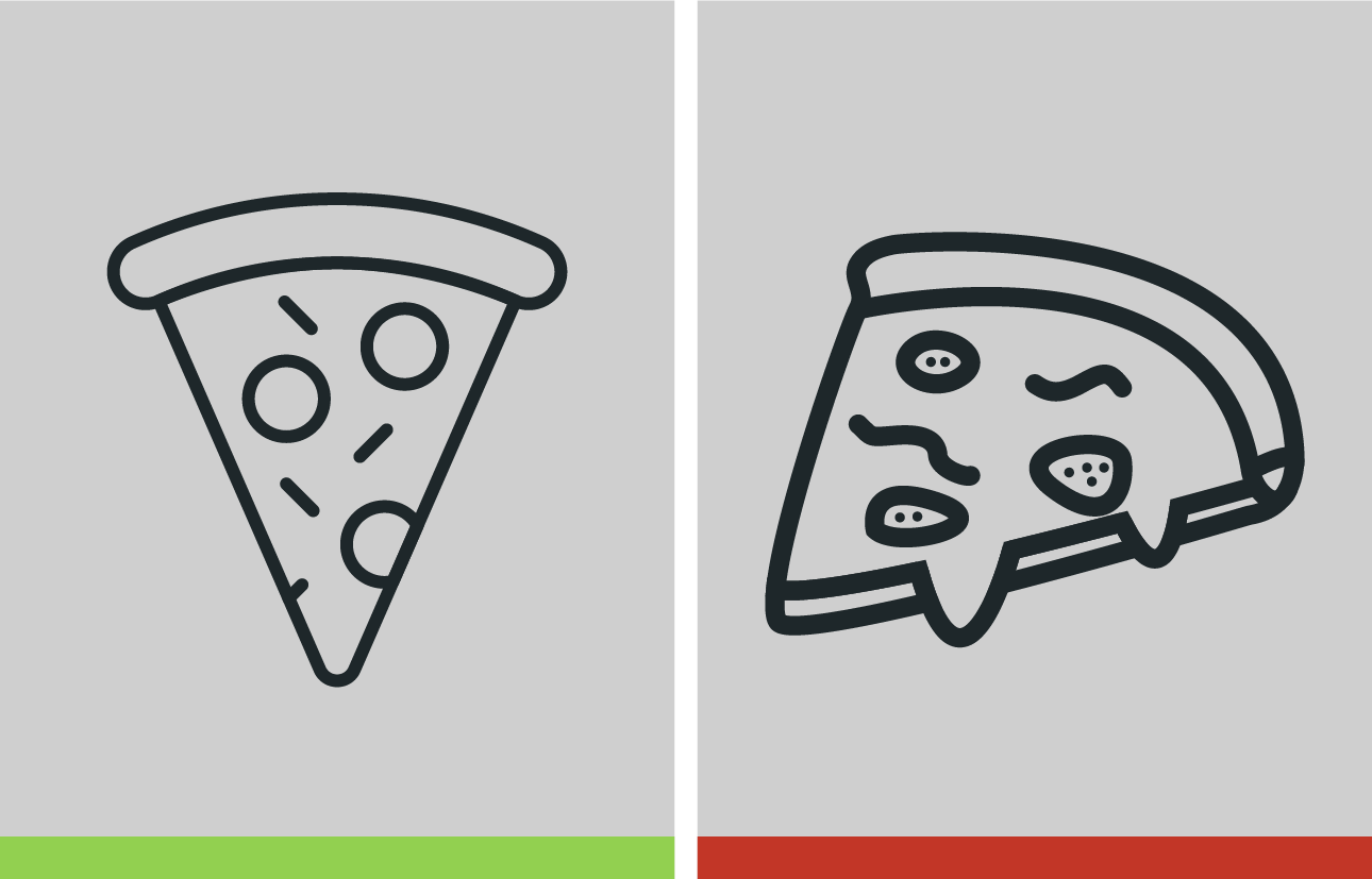
When designing an icon, use strokes more than fills. Strokes have a lighter visual impact on the screen, particularly for complex GUIs with multiple visual elements. A lighter visual impact will help promote a calm and approachable GUI.
Corners should be rounded. Rounded corners with strokes will help achieve a softer and more approachable GUI aesthetic. By comparison, hard edges and fills can create a harsher and heavier visual appearance.

Fills can be used sparingly where appropriate based on the shapes and visual weight of the icon, such as when indicating fluids where filled icons and color lend themselves to easier comprehension.
Color
One way to achieve visual consistency is through color. Use a common color palette for the icons that is consistent with the overall GUI experience; most icons should be the same color as the primary font color.
Limit the use of multiple colors in a single icon except where it helps with visual comprehension, such as status icons showing warnings states.
Fluid colors should stay consistent using the blue, green and purple colors associated with saline and contrast types (purple used for systems with a second contrast location, such as the MEDRAD Centargo CT Injection System).
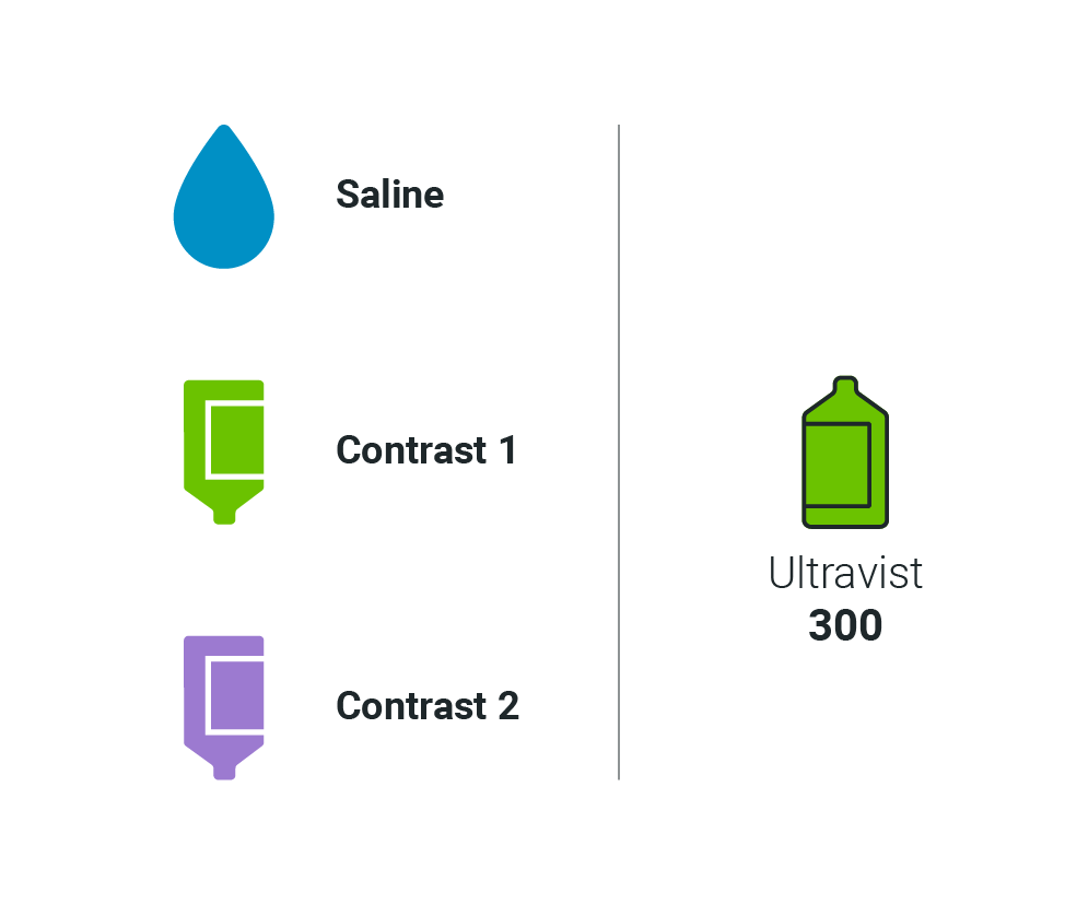
For the recommended color palette and values see:
Visual Metaphors
When designing icons, first consider the purpose of the visual metaphor; what idea is it intended to represent? Does it visually represent an action, a state or another concept? Use the same visual elements and metaphors for related concepts.
Wherever possible, utilize visual metaphors or icons that are commonly accessible to users such as those consistent with consumer products. This will help users to understand common functionality efficiently and build confidence in the device.

Specific icon recommendations established in existing injector systems include the following:
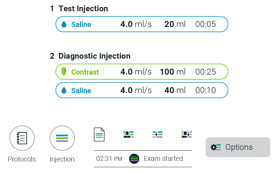
Injection phases should be represented using the pill shape (geometric stadium):
![]()
Saline fluid should be represented with a water drop shape:
![]()
Contrast fluid should be represented with a bottle and label shape:
![]()
Compound Icons
At times, more complex system status or workflow progression may need to be communicated for the user to understand at a glance.
In these instances, compound visual metaphors can communicate complex status states while remaining true to the visual aesthetic.
When combining compound visuals, the additional element should trim the original – in this context broken segments can help with visual comprehension.
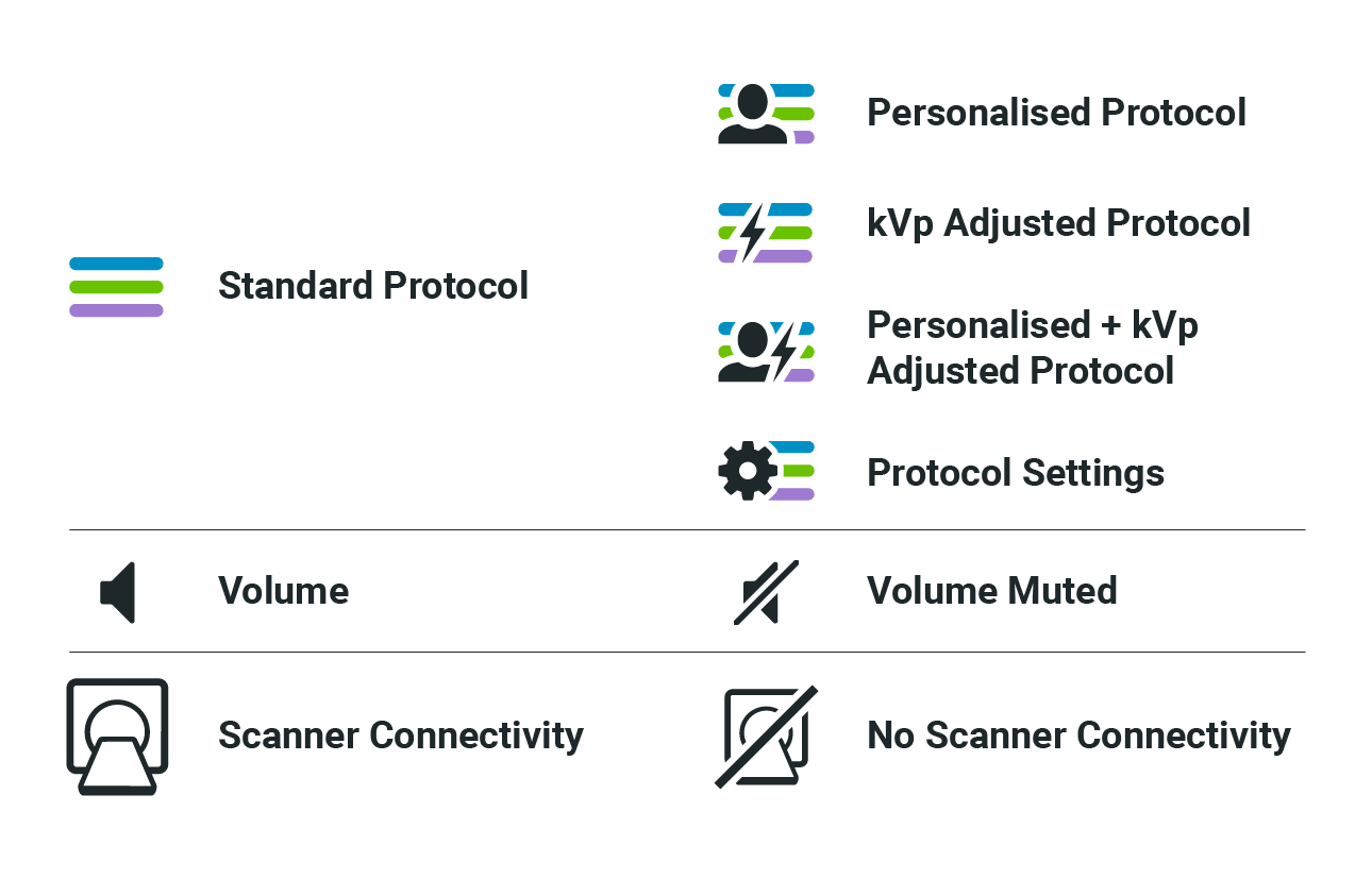
Combining these elements for Protocol ‘phases’:
Navigation Icons
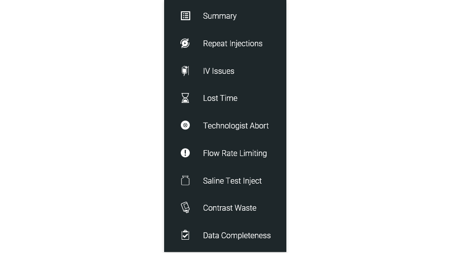
When facilitating navigation within the GUI, common behaviors such as “Home” and “Back” should utilize standard icons so that high level navigation is easily recognized.
The directional chevron should also be used for indication of directional actions, such as drop-downs or panels.

Depending on the navigation structure and information hierarchy for a GUI, there may be additional navigation icons used to facilitate easier and faster navigation through the various workflows.

System Status Icons
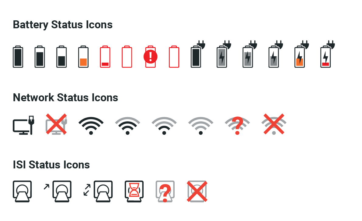
System status icons should be designed with all states in mind so that a consistent visual language is used across numerous icons.
Clear and consistent visibility of system status builds trust and confidence between the user and the device.
The system states should use additional colors for efficient visual comprehension.
Device Status Icons
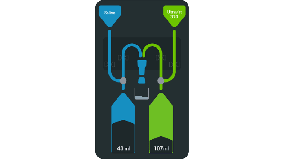
In addition to status bar icons, device status may be communicated through more complex visual representations of the system such as schematics.
Schematic icons should be more literal and more closely related to a physical mental model of the device than other icons. This helps users to link status indicators more efficiently to the physical status of the device.

Icon Implementation
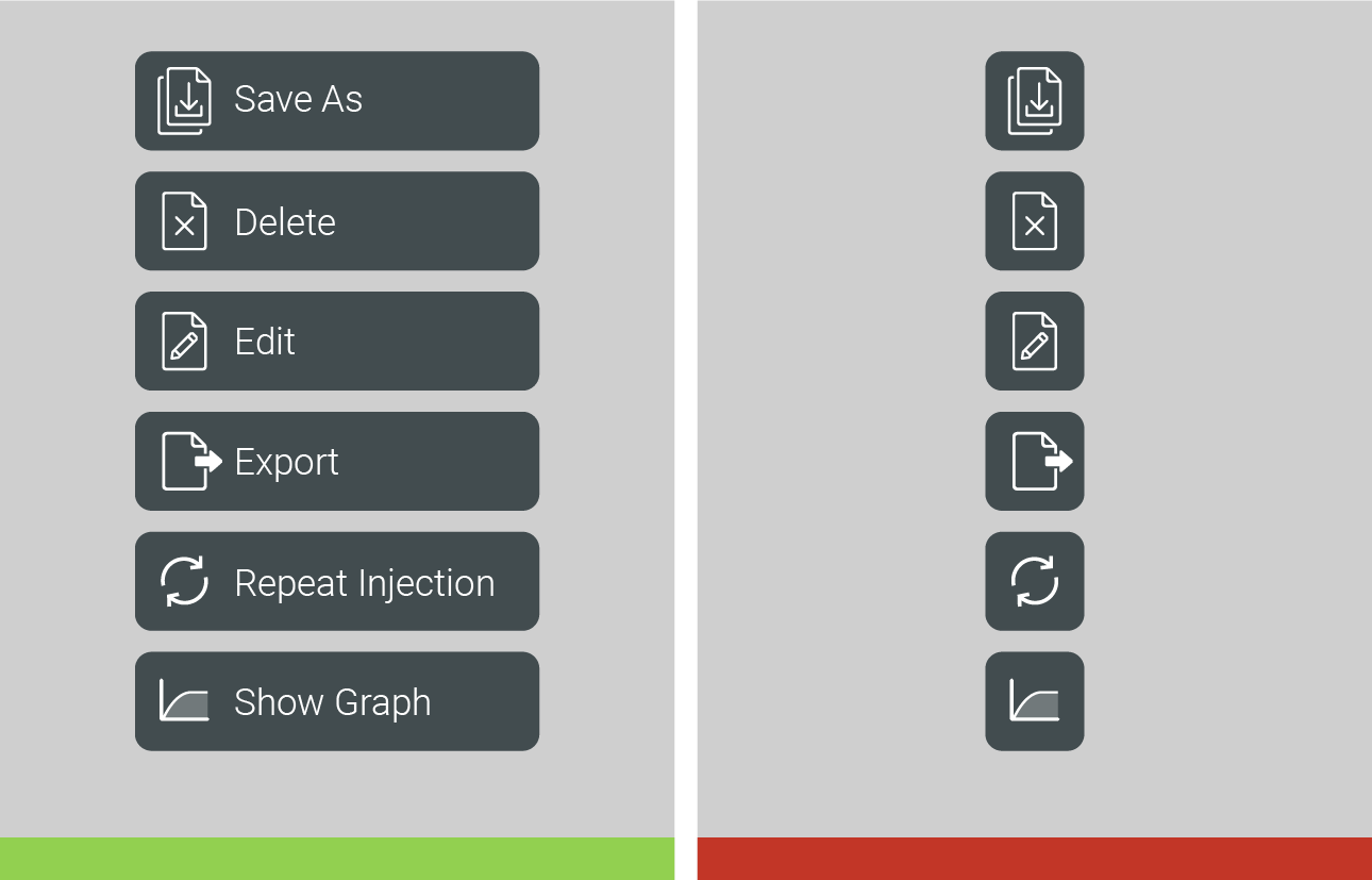
Action icons should be combined with a label to reduce the risk of use error and to help the user build their understanding of the visual language.
Other Icon Sets
If you have any further questions about this or any other section of Bayer Identity Net, please contact:

