Use of motion in a GUI works to provide additional information and feedback to the user, directing attention to the relevant information at hand and guiding the user through a workflow.
This section contains guidance on the use of animation with graphic elements, icons and colors for a Radiology device.
Design principle
Motion should be used to:
- Provide feedback to the user, e.g. indicating progress when the device is performing an action.
- Actively communicate system status and progress.
- Confirm successful selection or completion of a task.
The style of motion for the GUI should be smooth and natural.
Providing feedback, communicating system status, progress and confirming successful completion of tasks reinforces Bayer’s reputation of Trust.
Smooth visual interactions evoke sense of smooth performance where device predictability is enhanced, further reinforcing Innovation and state-of-art performance.
Intent of Motion
Communicating Progress
Use motion to communicate progress when the user must wait for an action to be completed. Animating visual elements such as progress bars and spinners indicate progress and reduce confusion if the system is unresponsive mid-task.
To indicate the system is performing an action, place an animated spinner icon on the device component that is busy.
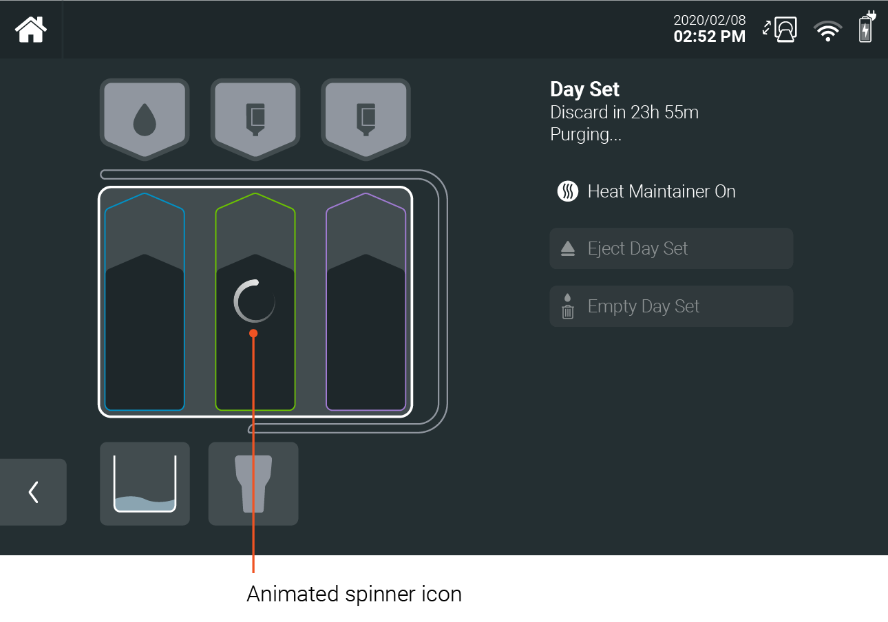
As with all artwork and iconography, the spinner design should be minimalist to avoid introducing distraction. One suitable spinner is a line trail with a fading tail as shown below.

ask Completion Status & Selection Confirmation
Use motion to indicate task completion status. Animated task completion indicators provide the user with information on where they are in the workflow and how far they have left in completing tasks/ selections.

Change Blindness
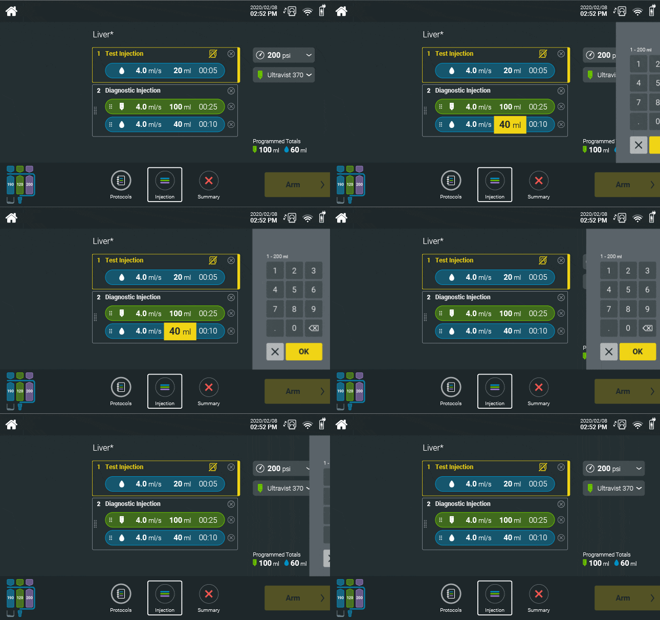
Change blindness can occur when there is a sudden change in screen state. This can create confusion to the user, the perception of a device fault and even increase the chances of user error (by selecting an option without knowing).
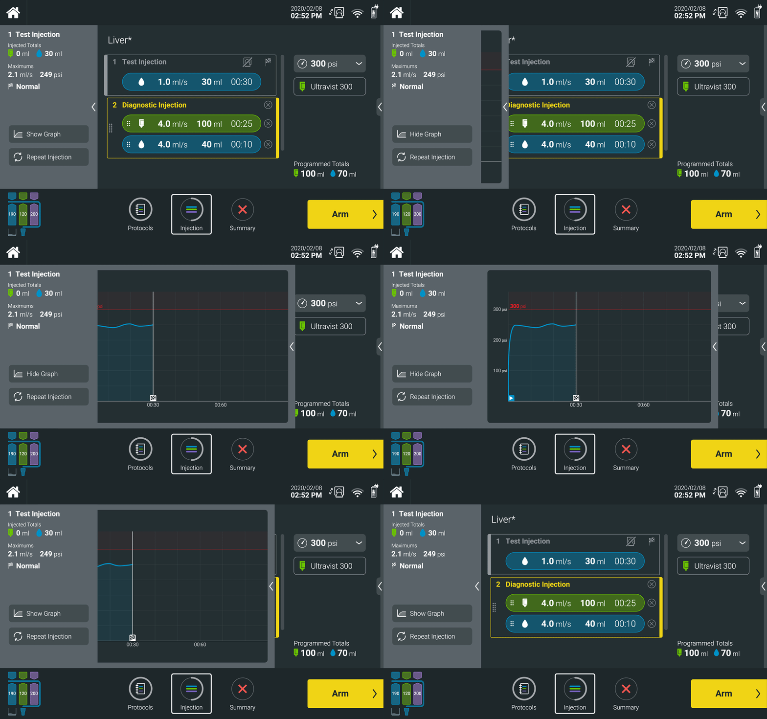
Motion should be used to guide the user in the transition from one screen to the next or to guide in and out visual elements such as keypads.
Use motion to introduce new options, selections, or menus on a screen. This allows for a clear and efficient call to action for the user.
Implementation of Motion
Motion should be smooth, natural, and predictable. As such, use easing when animating the position of visual elements.
- A linear animation can be sharp and jarring to the user and should be used only when representing linear time based actions such as pressure graphs.
- Ease In transitions start slow and end fast. Use Ease In motion to move elements off screen such as panels.
- Ease Out animations start fast and end slow. Use Ease Out motion to move elements on screen, such as panels.
- A combination of both of these creates an accelerating and decelerating animation., Use Ease In + Ease Out when moving elements from one position on the screen to another.

- Small motion like a toggle should target 100-150ms to create a responsive feeling.
- Larger motion like transitions should target a duration between 250-500ms. Depending on the screen size, resolution and refresh rate, faster motion may be preferable.
Animated elements should appear responsive and fast in response to user interaction.
Motion must not make the user wait which may detract from building Trust, a sense of Performance and Efficiency.

Next topic – Interaction & Sound
If you have any further questions about this or any other section of Bayer Identity Net, please contact:

