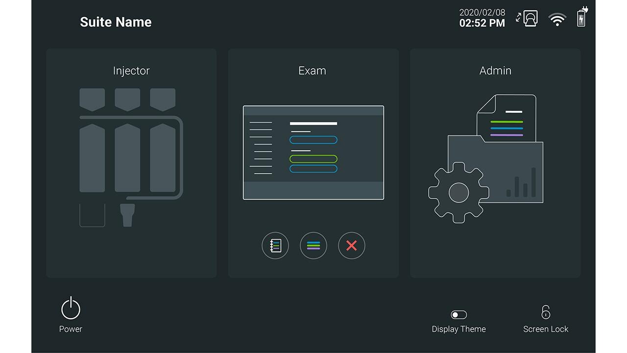
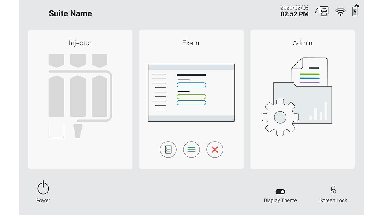
A carefully chosen color system applied to GUI elements improves usability, legibility and efficiency, as well as fulfilling the requirements of the brand aesthetic.
The following sections contain guidance on developing and using colors for a Radiology device GUI.
Design principle
The use of a color system creates a distinct visual language and helps users efficiently interact with the device. Consistent color use that communicates functions and status creates predicable system behaviors.
Color evokes an emotive response from the user. The overall aesthetic mood should be Approachable and Calming. Consideration of contemporary palettes and trends will help to achieve this effect with radiology users globally.
The Color System
Background colors are the primary drivers of the overall GUI mood. Neutral colors with lower saturation should be used that provide enough contrast for high legibility of foreground elements.
Foreground elements should contrast with the background so that they are easily recognized and understood by the user. Text and icons should be white or near black depending on the color theme being used.
Highlights are intended to break the rules of the foreground and background colors in order to draw attention to important actions. These can be call to action buttons or warnings to communicate critical system behaviors. Highlight colors should contrast to the foreground, background and secondary colors.
Secondary colors are additional colors that don’t fit into a defined role but support the color system wherever additional color depth or range is needed.

Contemporary color theory considers colors on the cooler side spectrum to be more Calming and Trustworthy, as opposed to warmer colors. One example is the grey dark theme used in the MEDRAD Centargo GUI system.
Color System for a Radiology device GUI
Color Themes
Multiple themes should be considered so that the user may select the most appropriate color theme for their use environment. A dark, ‘Twilight’, and light, ‘Purity’, theme has been adopted for a Radiology device GUI where the background and foreground color sets defined differ, however they still share the common highlight colors.
‘Twilight’ (Dark) Theme
Background Colors

Foreground Color

‘Purity’ (Light) Theme
Background Colors

Foreground Color

Highlight Colors
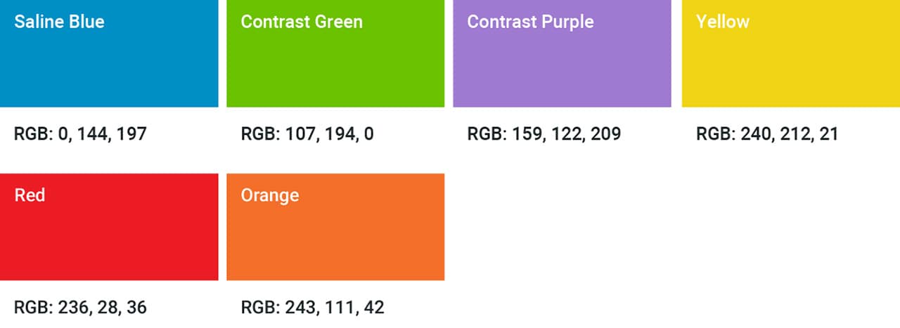
Secondary Colors

Applying Color to the GUI
Color Usage
A general rule of thumb taken from interior design that can be applied to the overall color system is the 60-30-10 rule that helps govern an overall balance of colors. Consider the overall use of background, foreground and highlight colors to be within a 60% - 30% - 10% ratio.

Confirmation & Progress
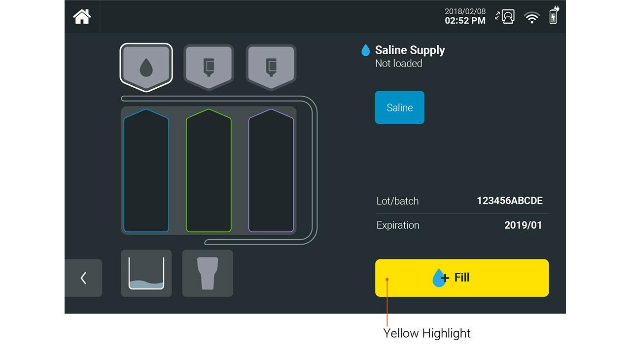
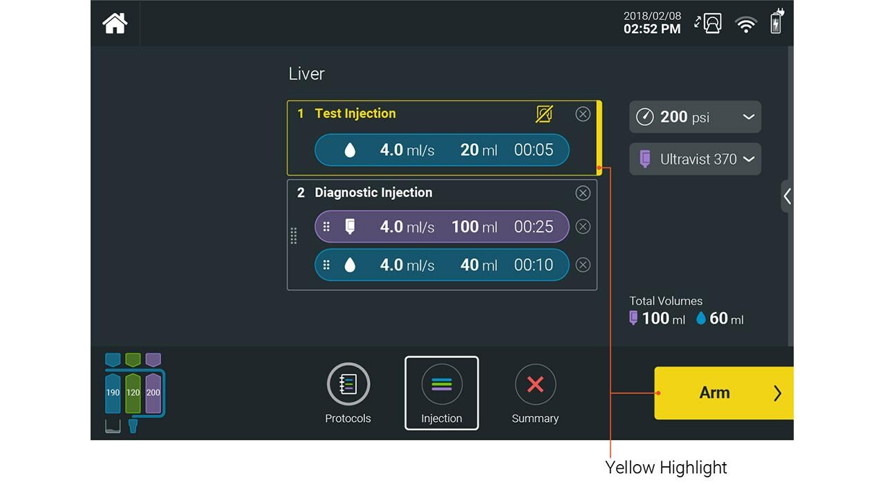
For complex GUIs, establish a highlight color reserved for primary actions to create a strong link between the workflow and the elements on the screen.
For example, the use of yellow as a highlight color draws attention to the primary workflow actions and elements related to workflow progression.
Color for Functional Relationships
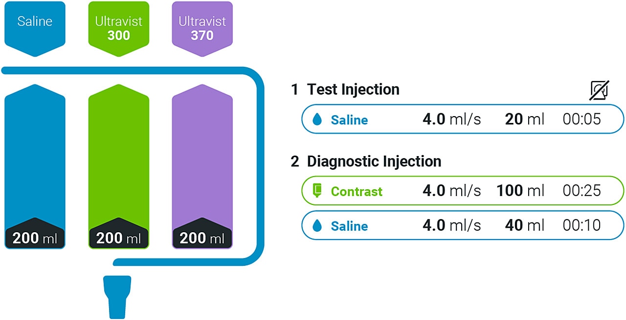
Highlight colors should define when device functionality requires a more specific relationship to a certain color.
For a Radiology device, saline and contrast fluids are indicated on the system in relation to specific colors. Use blue, green and purple, respectively, to communicate saline and contrast elements.
Color to Convey Status
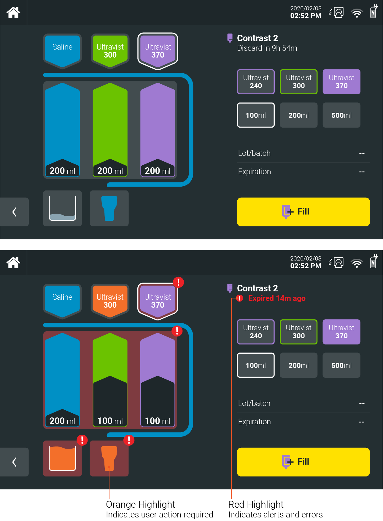
A Radiology device GUI must communicate to the user system status efficiently and effectively. This is prioritized over the overall calm aesthetic during normal system status in order to alert the user of a critical system message.
For such scenarios, use of safety critical colors should be used to capture the attention of the user.
If you have any further questions about this or any other section of Bayer Identity Net, please contact:
