A graphic user interface (GUI) might be applied to Bayer in Radiology injector systems such as the graphical display on the injector in the scan room and the workstation in the control room. A good GUI layout communicates information clearly, groups related elements consistently to aid usability, enables efficient decision making, and provides intuitive navigation of the workflow to support the user in achieving their objectives, and in providing a good user experience.
The following sections contain guidance for developing GUI layouts for a Bayer in Radiology hardware device GUI.
Design principle
The GUI should:
- Be Consistent in its design and create a level of predictability.
- Promote a sense of Calm during interaction to support efficient, quick decision making, especially during safety critical events.
- Provide a Sense of Place for the user, allowing the user to always know where they are in the workflow.
- Be Guiding to the user, clearly indicating current system status and the next step.
Information Architecture
To create a usable and efficient GUI experience, a well-structured information architecture based on an analysis of the device workflow is required.
For a Bayer in Radiology device GUI, workflow is broken down into discrete streams of tasks. The GUI should divide the workflow into core areas where applicable. For example:
- Injector for system status, device and fluid management
- Exam for executing injections
- Admin for all settings and configuration actions.
This creates a clear, logical, and efficient breakdown of tasks for users.
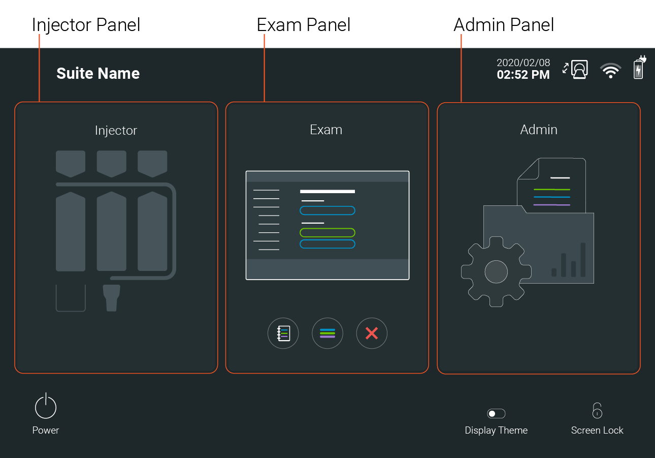
Once the top-level information architecture is established, workflows and wireframes within them should be mapped out to aid what visual design decisions should be made based on this workflow.
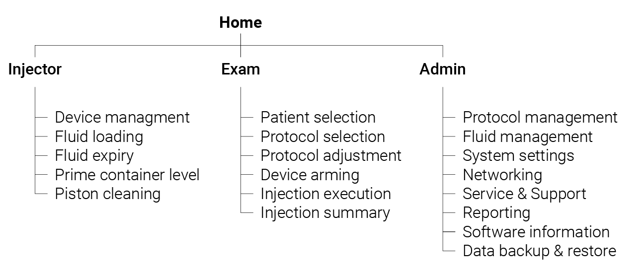
Note this list is not comprehensive and is for illustrative purposes only.
As much as possible the workflows and architecture defined should be the same for both injector and control room devices for a consistent experience (within the scope of any technical or safety limitations).
Grids & Guides
To create a consistent and efficient GUI, a system of grids and key guides is needed to frame all content within. The grid system should have established margins, columns and gutters to organize and dictate placement of elements throughout all screen designs to create a consistent and predictable experience.
For different display sizes and content density, wider margins may be preferable to create more negative space, or narrower margins may be preferable for smaller displays that require higher content density.
Landscape Displays
The grid system that is used in landscape orientations is the 12-column grid; this is flexible and adaptable being divisible by 6, 4, 3, 2 and 1.
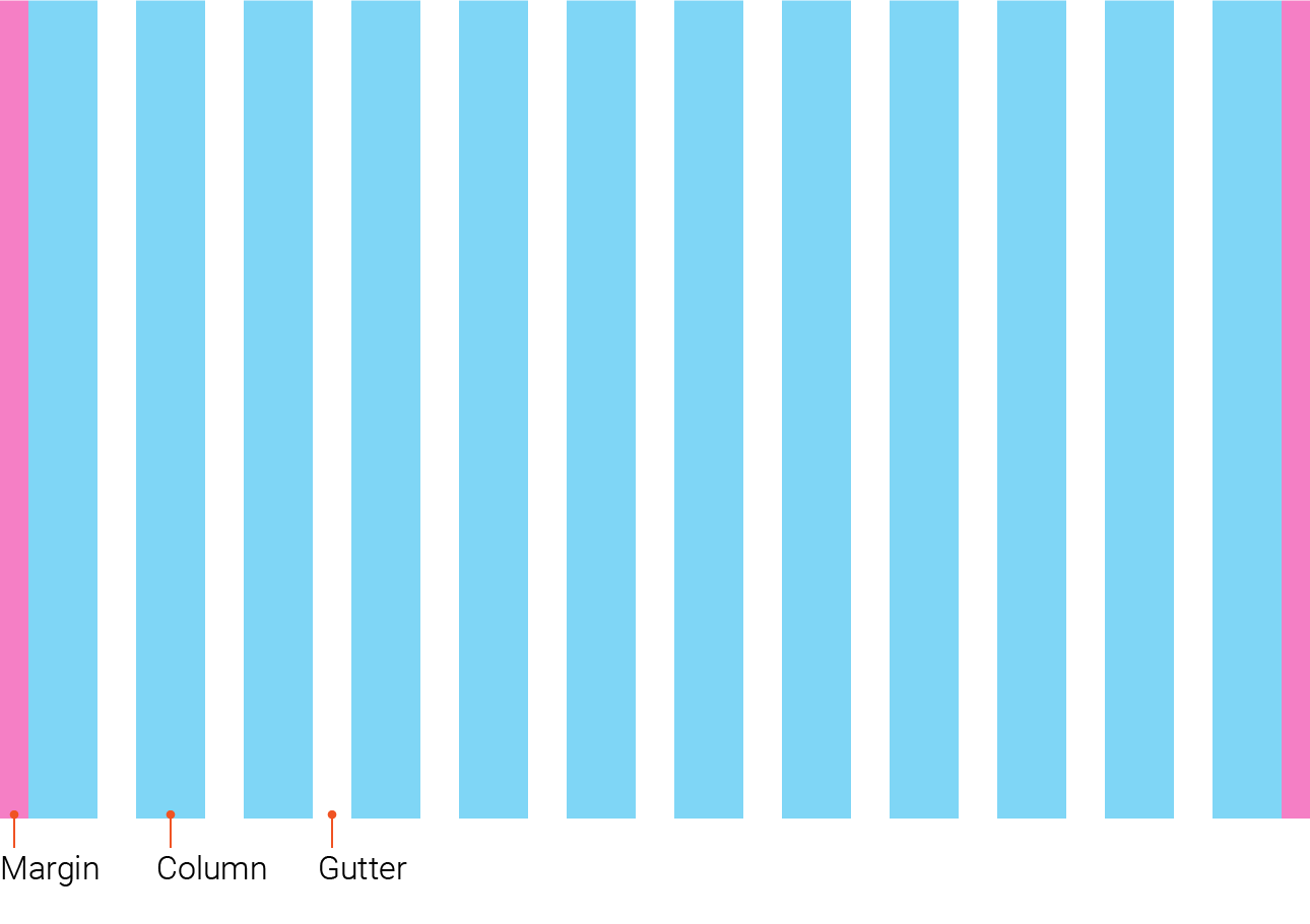
3 common column layouts are used for a Radiology device GUI:
- 1/3
- 2/3
- 3/3
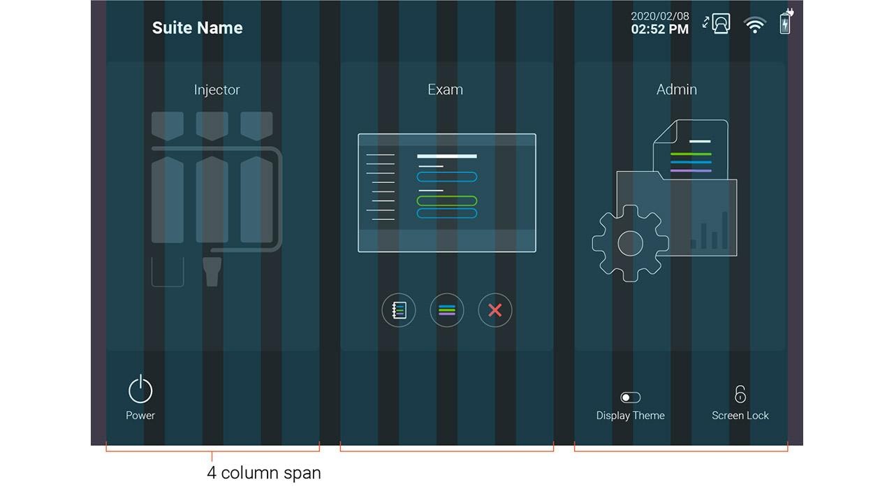
The 12-column grid defines three 4-column spans.
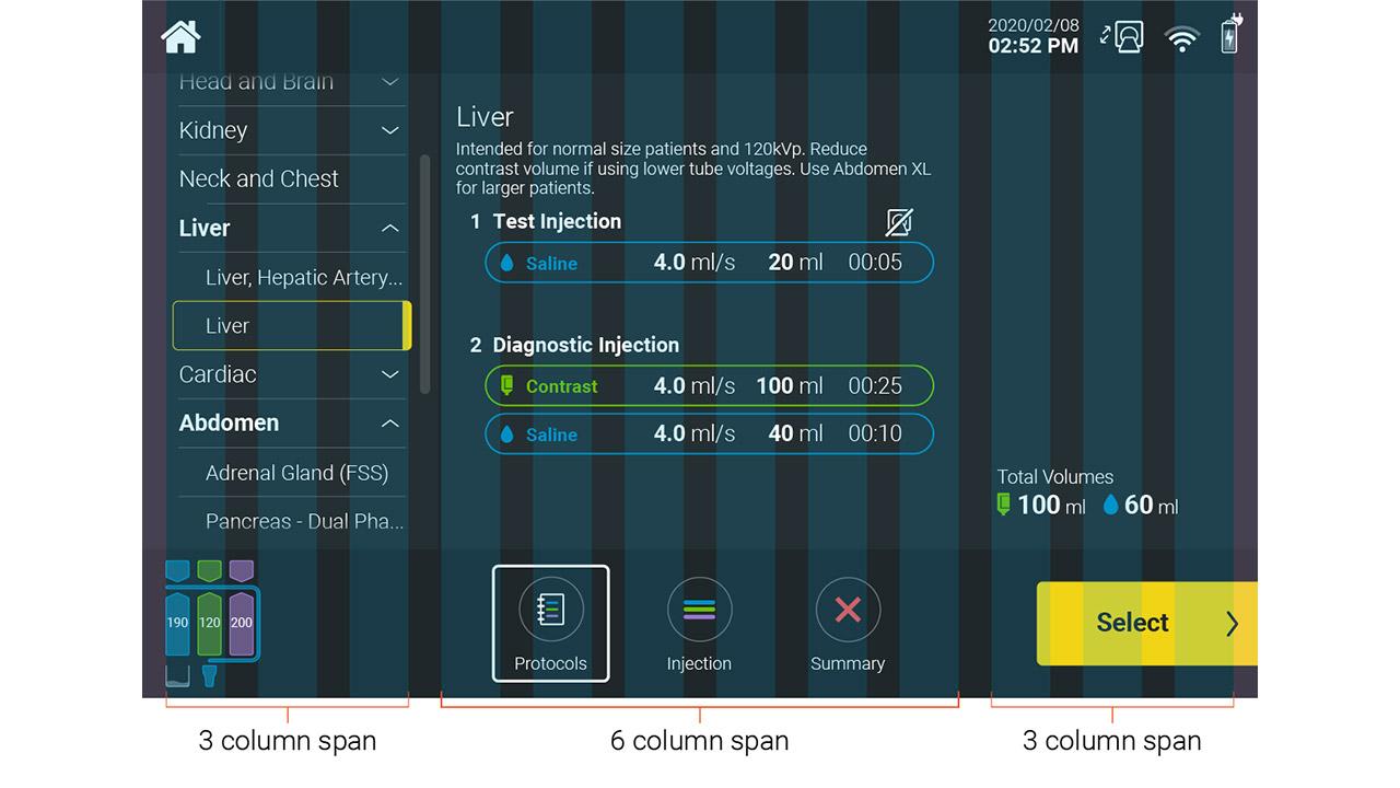
The 12-column grid defines a left, center and right division of 3-6-3 columns.
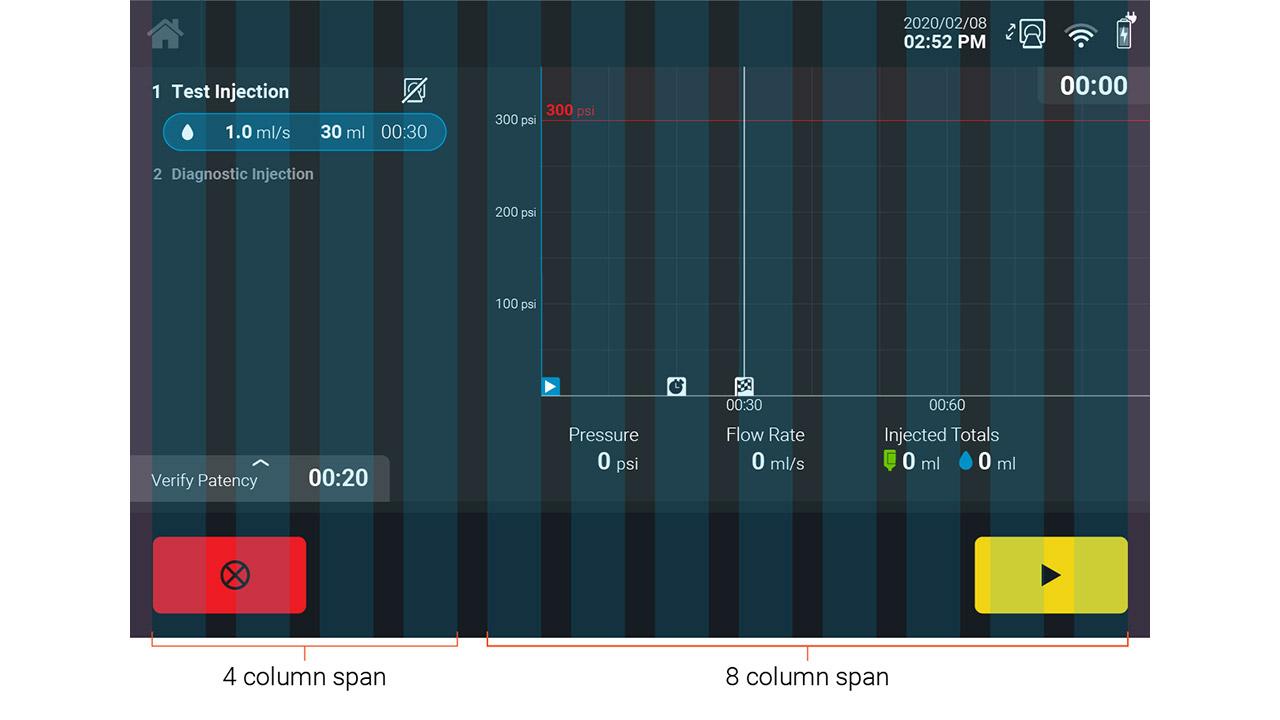
The 12-column grid defines a left and right division of 4 and 8 columns.
Portrait Displays
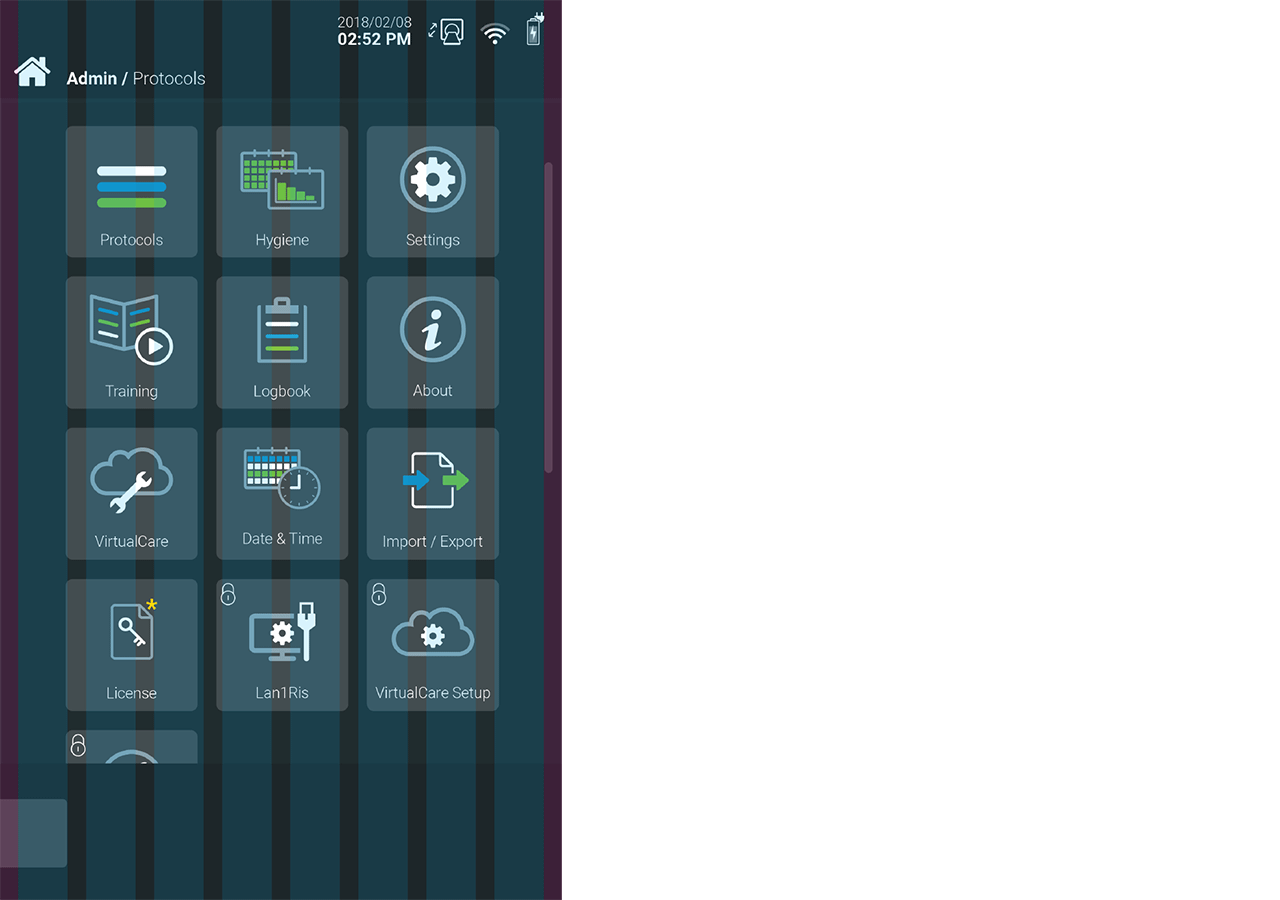
For a portrait display the same principles should be adopted with a column structure that is appropriate for the size of the display. For example, a tablet sized display can be suited to an 8-column grid, and a smaller phone sized display can be suited to a 4-column grid.

and a 4-column grid for a smaller display (19.5:9).
It may be necessary to break from alignment rules in order to make better use of the display area when the content requires it.
Screen Structure
Dividing the screen into sections facilitates consistent and predictable placement of content and features.
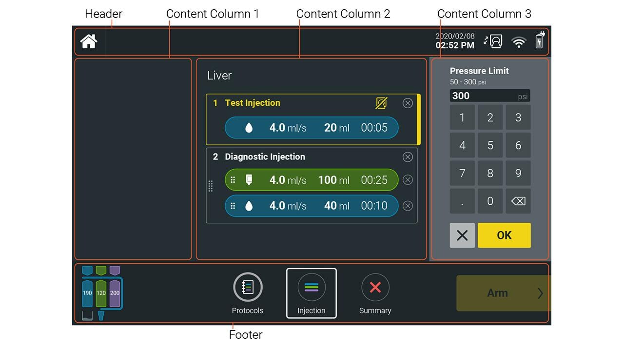
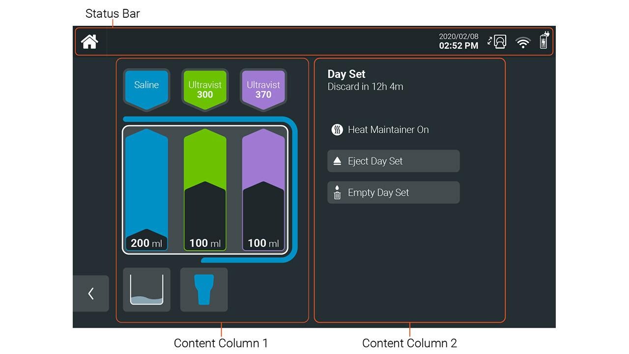
The Radiology device GUI adopts the following structure:
- Header – Status bar
- Footer – Navigation bar and secondary actions
- Content Columns – Columns for menus, panels, lists, and primary content. The columns are consistently applied but can adapt in width depending on the content required.
The header should be the smallest content area with spacing sufficient for status bar icons and titles only. The primary content area should have the majority of the layout spacing to keep the visual focus on the primary task being completed. The footer should also be limited in size with spacing sufficient for a single row of buttons or indicators as required.
A rule of thumb for proportions can be 1:7:2 for the header, content and footer areas respectively in order to maximize the spacing for the primary content.
Depending on the content requirements a footer may not be necessary in order to allow for additional primary content. In the above example, the device schematic requires more space to appropriately communicate the system status and so it takes priority over the need for a footer.
Spacing & Padding
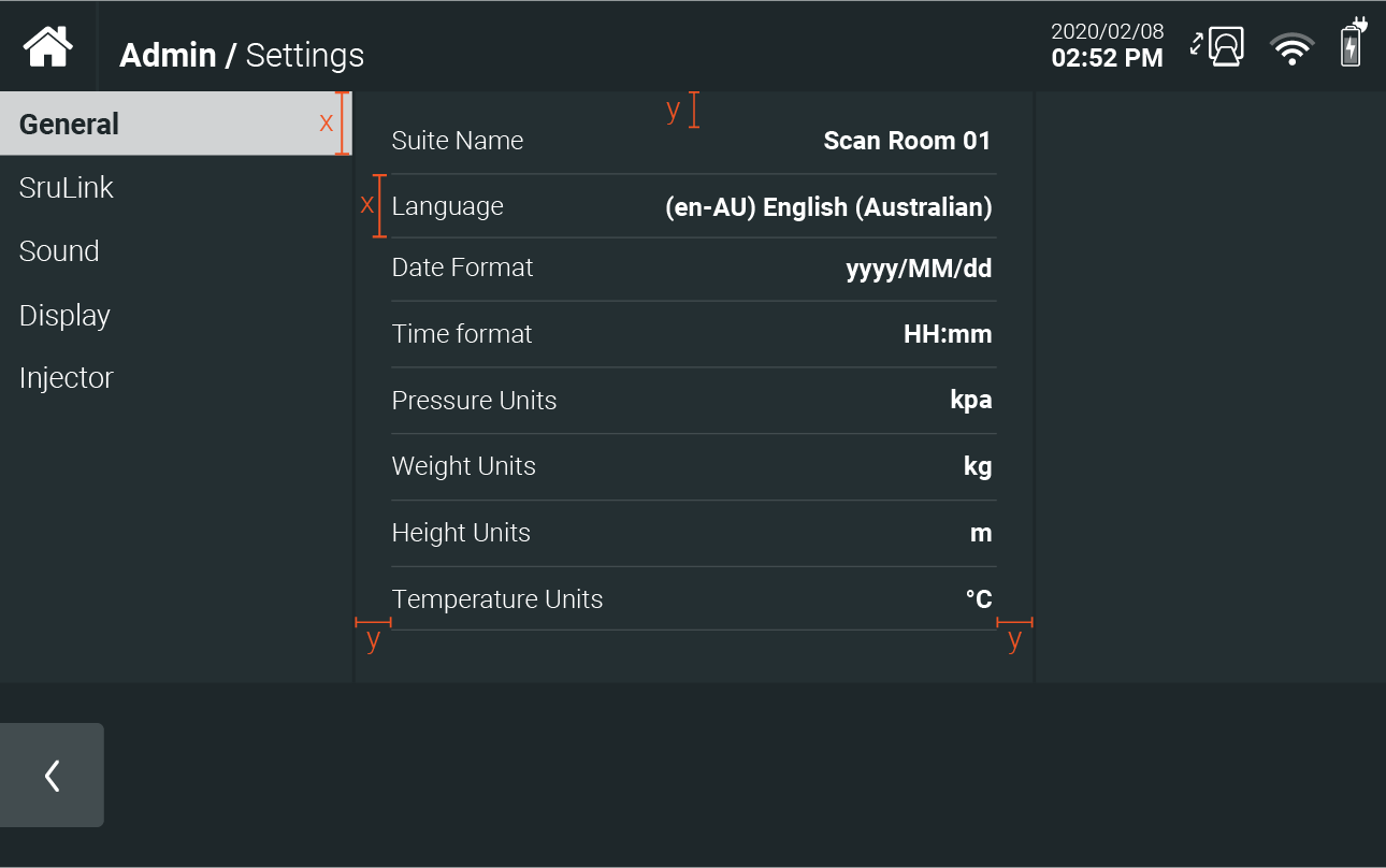
When developing alignment and spacing guides, give elements enough padding and spacing to reduce visual clutter and complexity; negative space will create a cleaner and calmer visual appearance.
Scaling
The GUI layout should be responsive not only to provide a consistent and scalable experience depending on the size of the display.
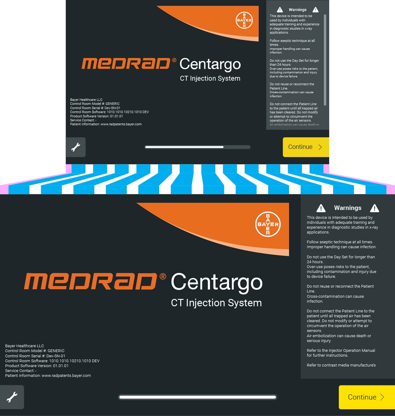
By using a grid system, content can scale depending on the screen size, ratio and resolution.
Content & Components
Content is communicated with the user through various GUI components. This section outlines some guidance and links to guidance on the following components:
- Artwork
- Panels
- Graphs & Charts
- Buttons
- Input Fields
- Typography
- Icons
For more guidance on component behaviors see:
Artwork
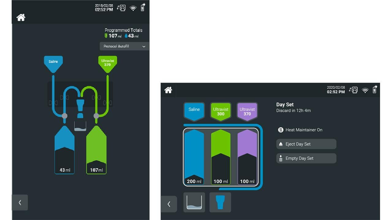
Artwork should provide functionality to the GUI and not be purely cosmetic. This is to provide context and visual cues to the purpose of a feature.
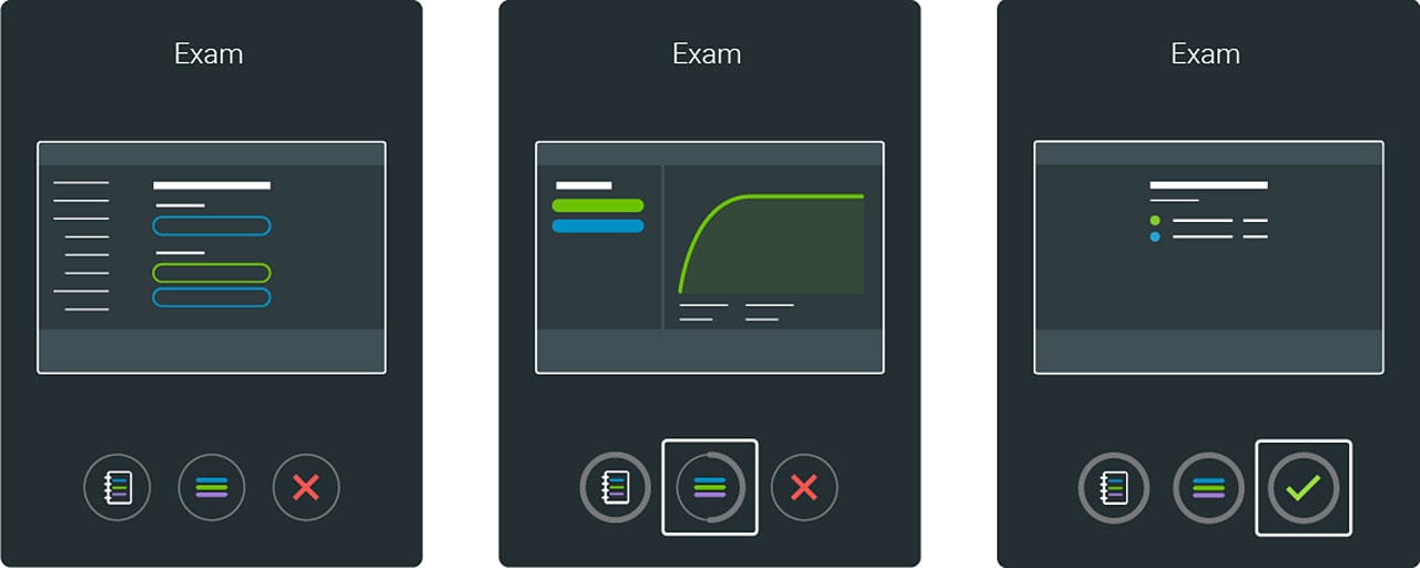
Protocol setup (left), Injection (Middle) & Injection complete (right).
Panels
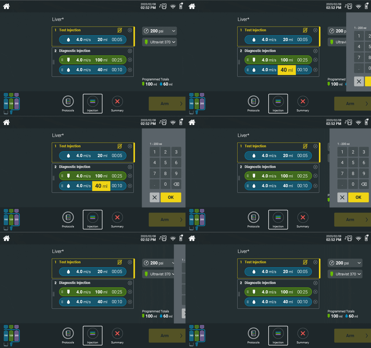
For a responsive and uncluttered GUI experience, sliding panels should be used to provide additional content based on the context.
For example, a keypad input panel for entering numerical data. Panels should behave consistently and follow the same visual language.
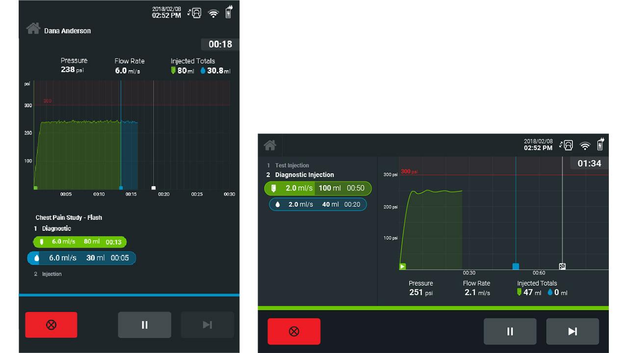
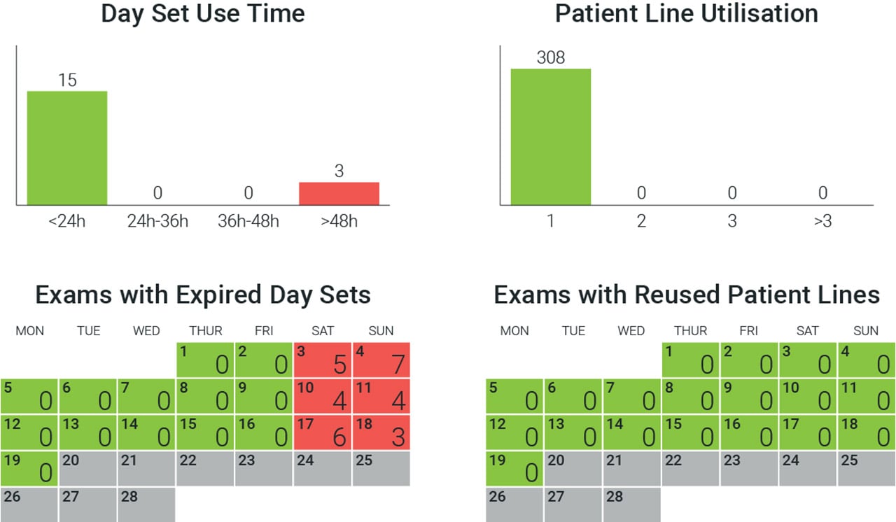
Graphs & Charts
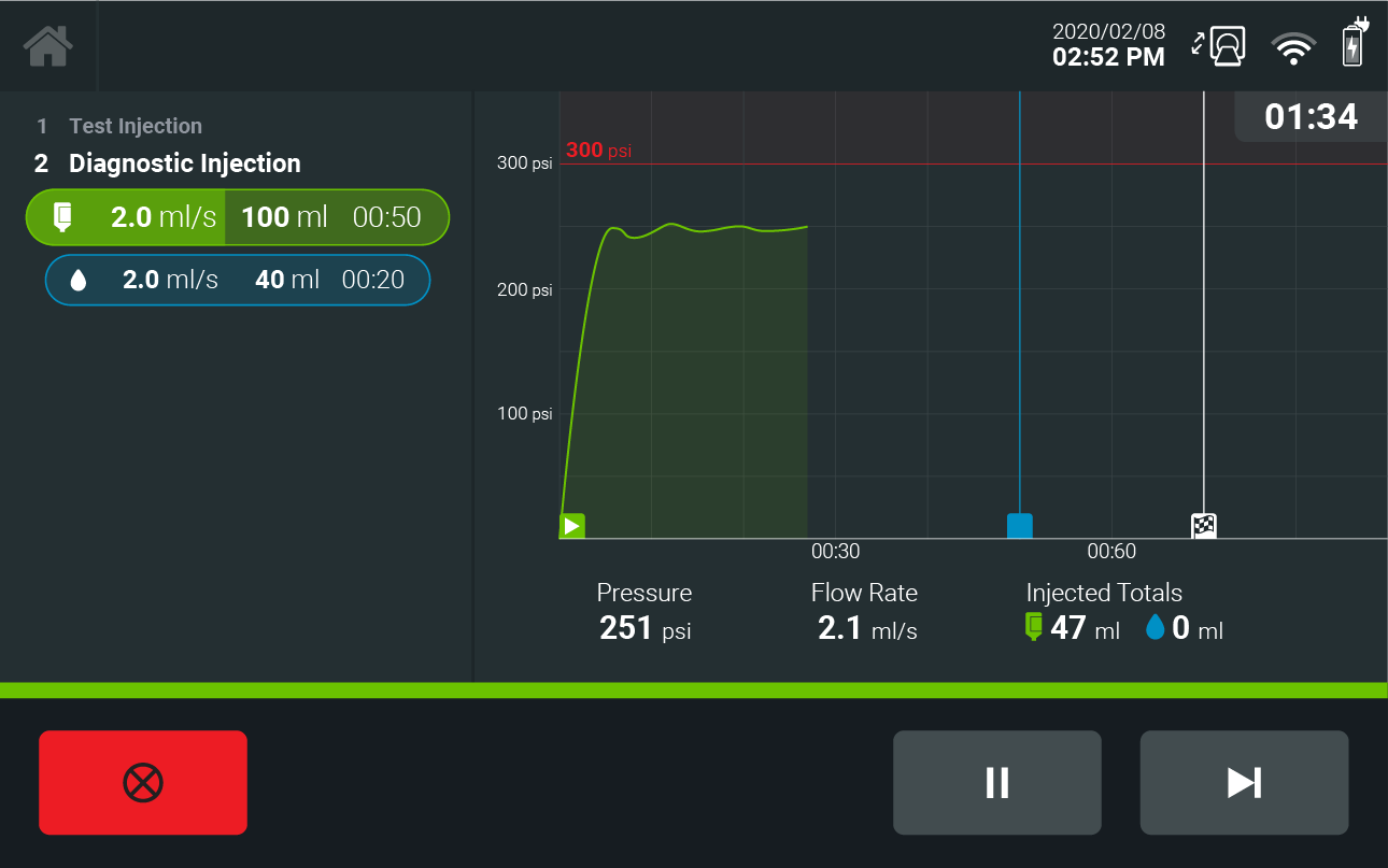
Graphs and data displays should be clear and uncluttered.
Pressure graphs should follow fluid color conventions to help communicate the progress through an injection in conjunction with phase diagrams while not introducing unnecessary visual complexity.
Links to other component guidance:
Navigation
Navigation should follow a left to right progression. Actions related to moving backwards, such as returning home or to the previous screen, should be positioned on the left side, while actions related to progression should be on the right side.
Breadcrumbs should be used within nested menus to provide the user with a sense of place when navigating within multiple menus, such as within the various types of admin settings.
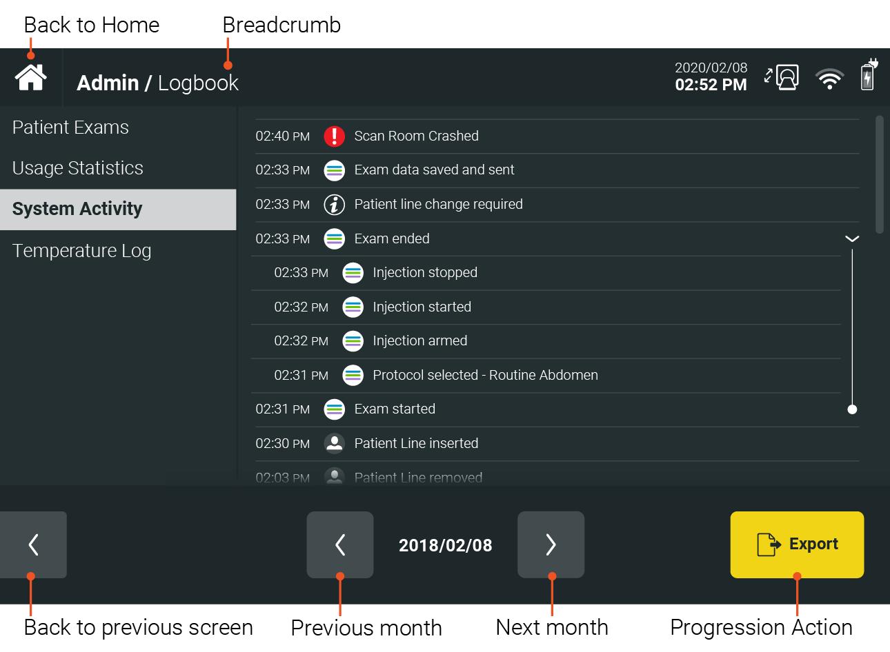
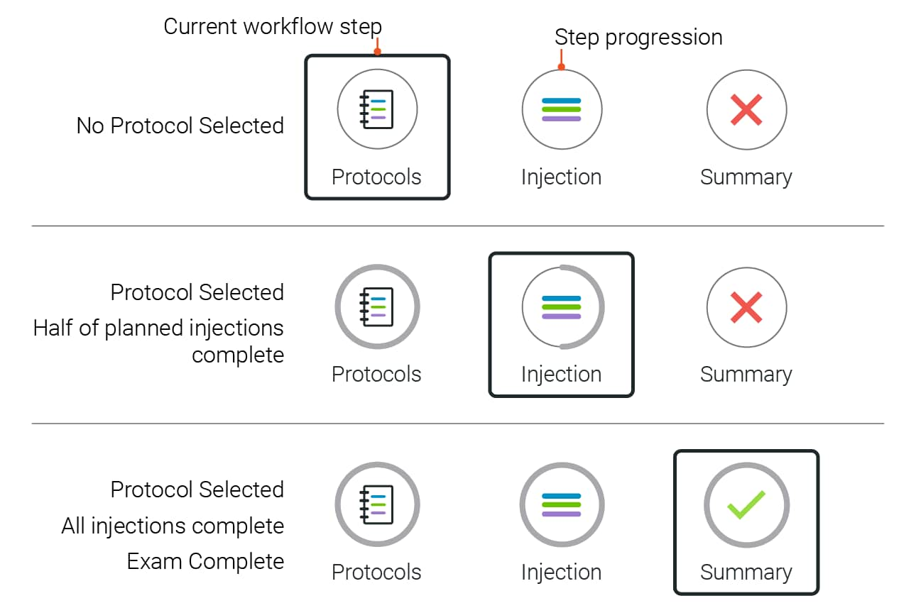
Since the primary function of most Radiology device GUIs is to facilitate injections, special consideration should be given to navigation within Exams.
Each step should be clearly identifiable, along with a clear indication of progress.
If you have any further questions about this or any other section of Bayer Identity Net, please contact:
