Interaction & Sound
Good interactions between a user and a device are easy to learn and recall, reducing the cognitive load on the user and are facilitated with a system of controls and indicators.
The following guidance covers visual and auditory interactions for a Radiology device GUI.
Design principle
When designing GUI interactions, each interaction should:
- Follow a consistent implementation style that indicates the purpose and function of the interaction element. Elements should be distinct and recognizable while fitting within the overall visual language of the system.
- Be suggestive of their function to guide the user, e.g. buttons should look like they are interactive or disabled, expandable lists should indicate their state.
- Be responsive and facilitate efficient user engagement with the GUI.
Controls
A control is an element that facilitates the interaction between the user and the system. Consistent design and usage of controls will help create efficient user interaction through predictable system behavior.
Buttons
Buttons visually represent actions the user can initiate by interacting with the GUI. Use containers for buttons to indicate it is a functional element. Consider the subtle application of shadows to provide additional affordances of button behavior and added depth in the visual style.
For standard displays such as 10” touch screens, button containers should be a minimum of 1cm width and height in physical size to help improve usability and efficiency.

Use rounded corners on buttons to help create a softer and more approachable aesthetic, particularly in complex screens with lots of elements.
A radius of 5px-15px is typically used – however this should be based on the scale of the button elements and the screen size.

Button States
Additional overlays indicate whether a button is idle, active (pressed), or disabled (not currently active).

Drop Down Lists
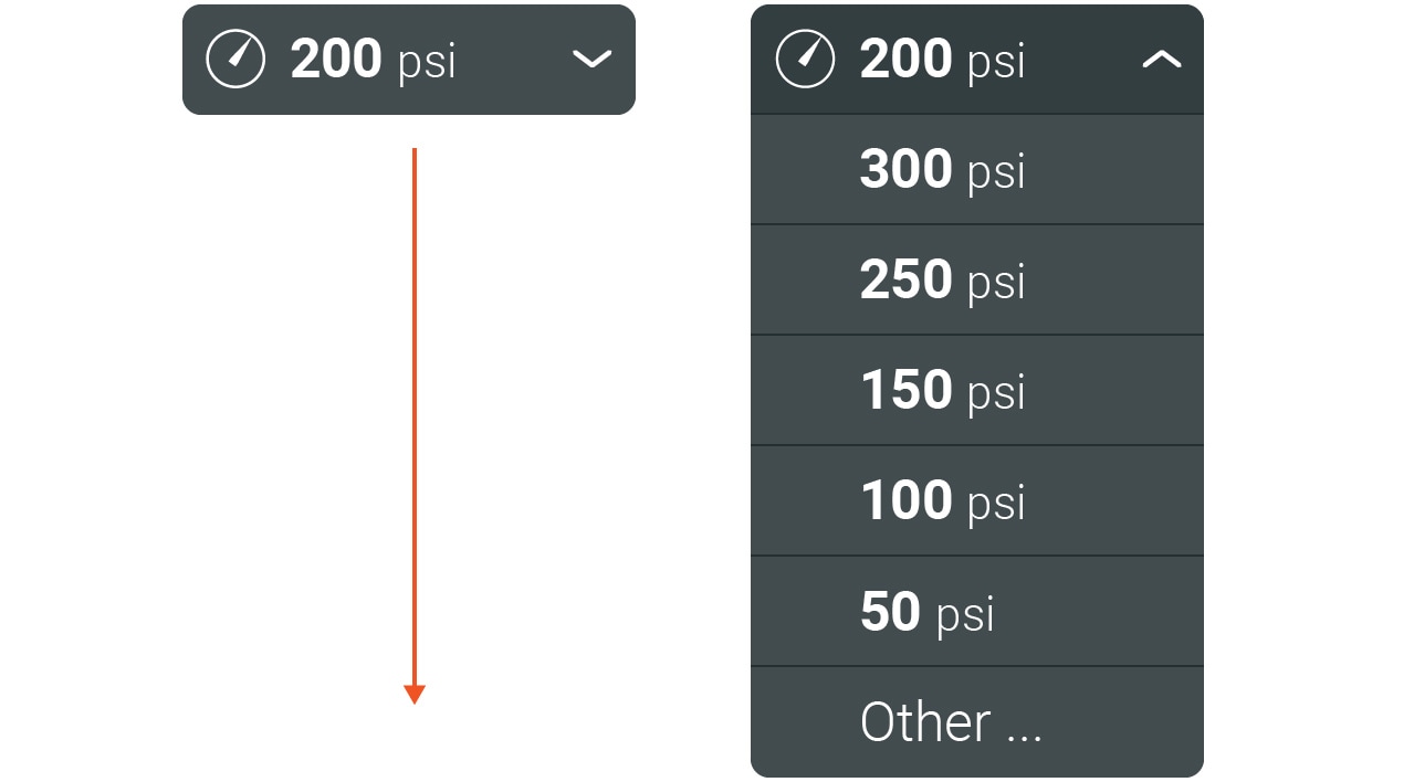
Drop down lists, indicated by a downwards chevron, facilitate quick selection of limited options.
Menu List Selections
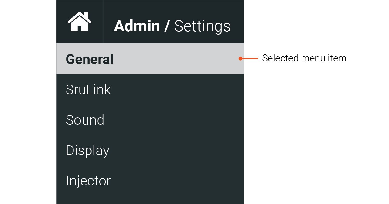
For screens with nested menus, such as various settings screens, use a neutral highlight to indicate the selected menu item.
Toggles
Toggles provide a binary selection for users and should be used when turning a feature on and off.

Input Fields
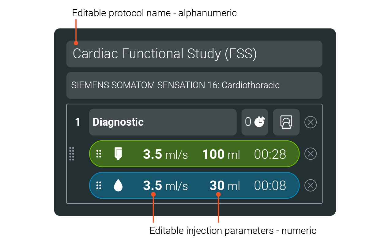
Input fields are controls which allow the user to enter data. There are 2 basic input types for a Radiology device GUI: alphanumerical and numerical.
Alphanumerical Fields
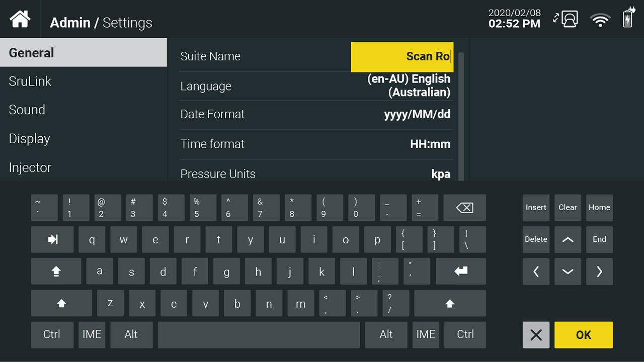
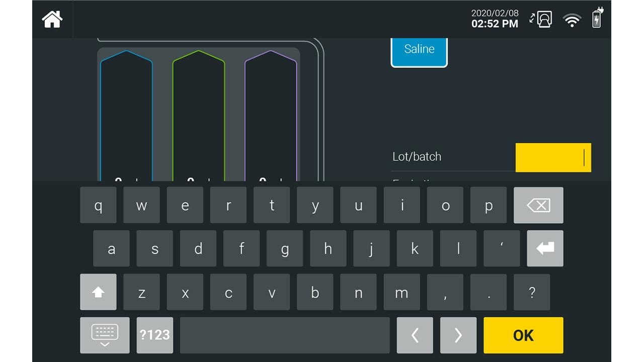
Items such as suite name or protocol name can be edited using a standard keyboard. A touch keyboard should be provided for systems that don’t have a physical keyboard.
Highlight colors should be used to indicate input fields are selected and active. This creates a visual link to the confirmation and cancel buttons to guide the user to completion of the action.
Numerical Fields
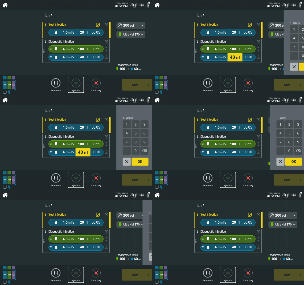
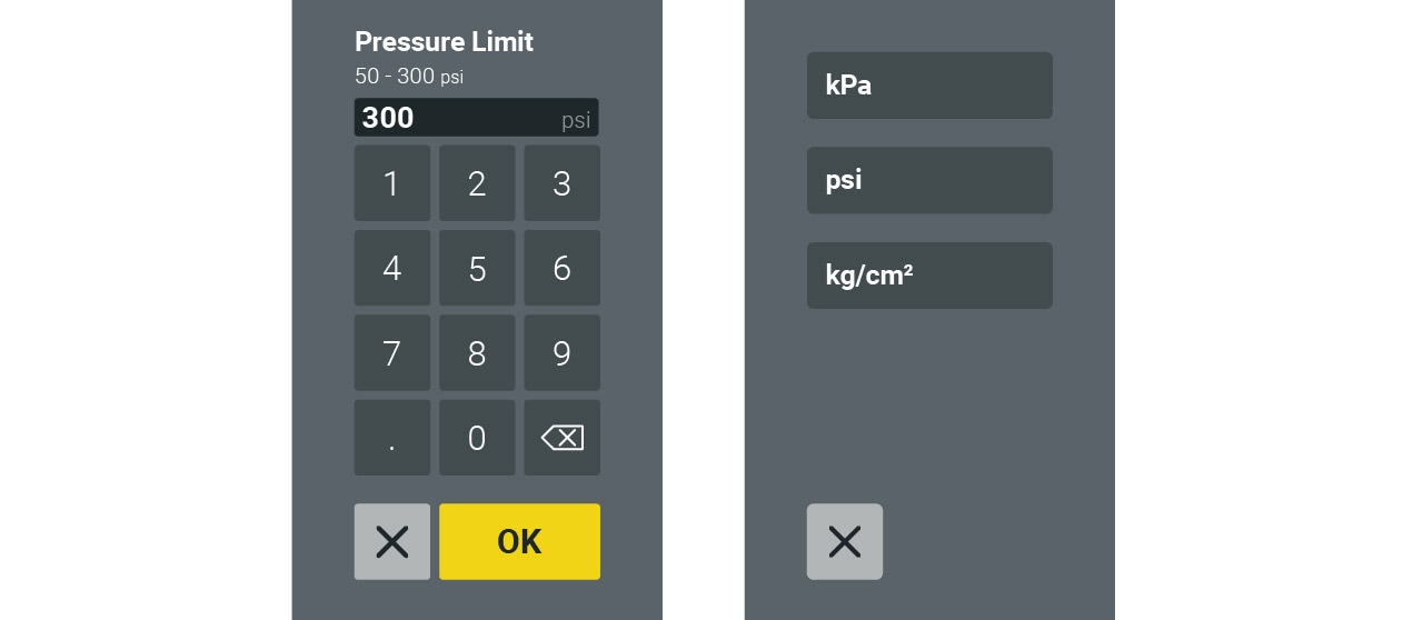
Injection parameters are editable to allow for customized protocols as needed by the user. Fields such as flow rate, volume and phase duration can be edited using the keypad panel for systems without a physical keyboard such as injectors; control room units with physical keyboards may not require on screen inputs.
Hierarchy of Controls
Create a hierarchy of controls to help distinguish between primary and secondary actions. For example, the use of highlight colors, increased size and location prominence help the user navigate complex screens.
Gestures
The use of gesture controls on touch screen devices should follow standard conventions expected by users.
Refer to contemporary consumer applications such as pinch, drag, swipe and multi-finger input behaviors.
Additional visual indications of gesture controls can help guide the user to the correct action.

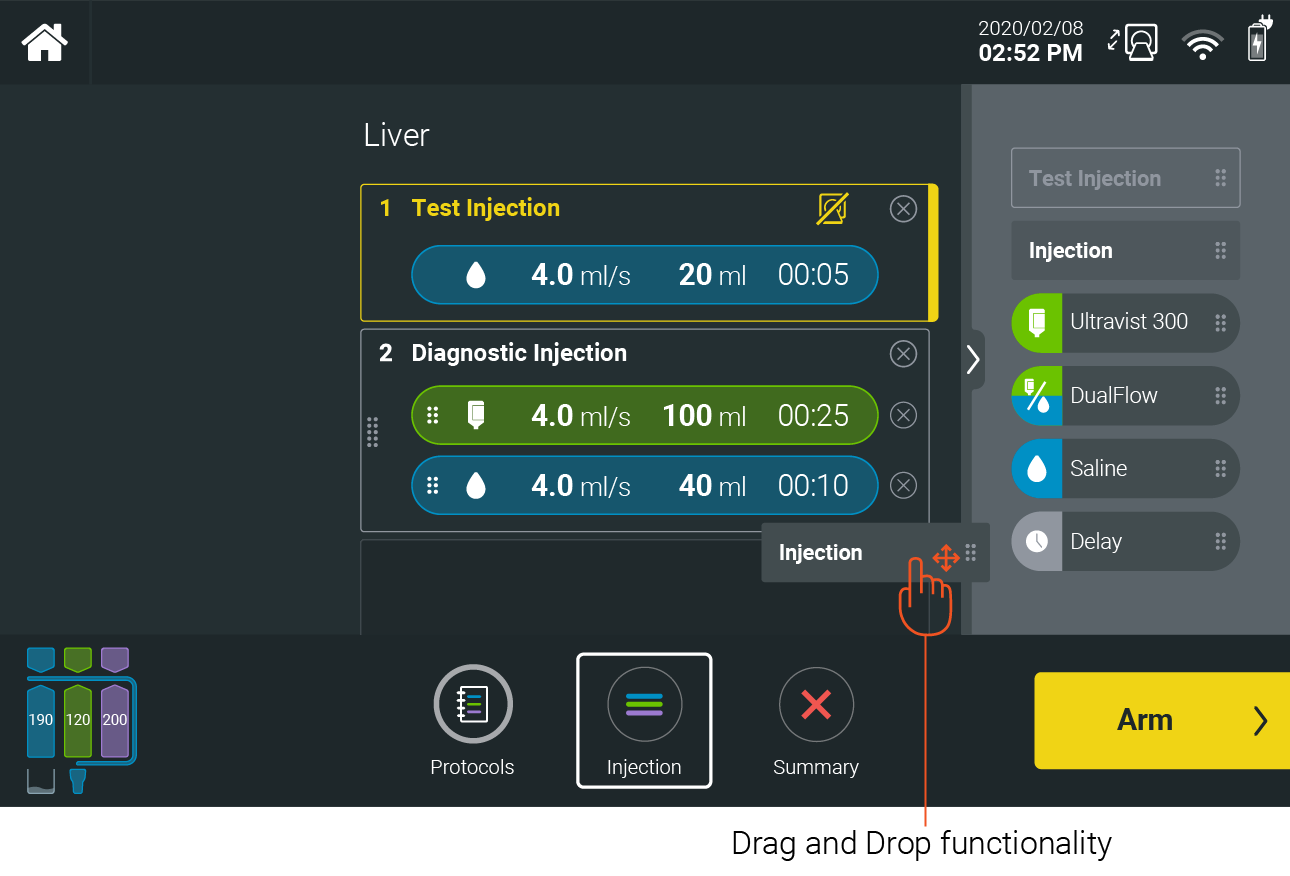
Gesture controls must meet performance requirements to be implemented. Poor gesture control will eliminate trust built with the GUI much more than the use of traditional control replacements (such as zoom buttons instead of pinch to zoom).
Define consistent gesture patterns to create predictable GUI behaviors; predictability will create efficient user interaction.
Indicators
An indicator is an element that communicates system status to the user. Consistent indicator implementation will help users understand the system status efficiently.
Visual indicators
Visibility of system status is critical to building trust between the user and device.
System status should be always visible to the user as it provides a predictable and consistent location for high level system status.
For more guidance see:
The visual representation of detailed system status should simultaneously provide an at a glance overview of system status as well as provide a means for users to view additional details.
For more guidance see:
To establish a sense of place within the GUI workflow, provide indicators of location and workflow progression. Breadcrumbs can help identify place within nested navigation.
For more guidance see:
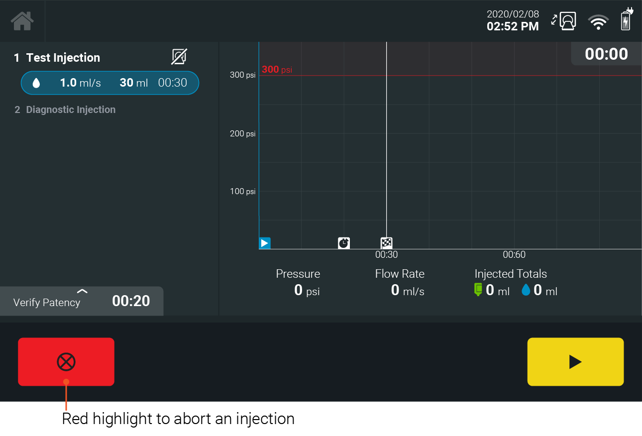
Critical status indicators should follow any regulatory guidance where applicable, such as IEC 62366 and IEC 60601. When indicating system alerts, warnings or critical tasks, carefully consider the usage of red.
If you have any further questions about this or any other section of Bayer Identity Net, please contact:
Auditory Indicators – Sound
Note: Any use of sounds to indicate critical status or warnings should follow any regulatory guidance where applicable.
The use of sound in Bayer Radiology products should also follow the GUI design principles to be consistent and calm. While the intent of sound should be focused on communication with, due to the specific context of radiology devices, particular emphasis should be placed on ensuring sounds provide a calming experience for both patients and users.
- The tone and timbre of sounds should be consistent with the visual aesthetic. Utilize calmer, softer tones. Sounds should not be distracting or overlap. Use short and responsive sounds.
- Avoid sound fatigue by limiting the use of bright and complex sounds.
- For frequent feedback sounds, such as touch feedback, use softer, muted sounds. The duration should be short so that each touch registers as a distinct sound without overlapping.
- Avoid replicating sounds for different events as this can cause confusing. Users regularly interact with patients are not always focused on the screen.
- Ensure that the speaker hardware components chosen have a suitable frequency response to produce audio at the quality needed for the chosen sounds.
Please press the play button to listen.
Please press the play button to listen.
Please press the play button to listen.
Please press the play button to listen.
Please press the play button to listen.
Please press the play button to listen.
Please press the play button to listen.
Please press the play button to listen.
Please press the play button to listen.
Please press the play button to listen.
