Instructional Materials
Operation Manuals, Quick Guides (QGs) and Instructions For Use (IFUs) are part of the user interface and should be developed and evaluated in conjunction with the device hard and software user interfaces.
Design principle
Whether print or digital, the material should:
- Be designed with clarity and simplicity: legible and uncluttered text and visuals.
- Have continuity with the device experience: use visual elements that reference the device design language.
- Be consistent: use consistent color, typography and artwork styling.
Operation Manuals, QRGs and IFUs should be consistent in following general labelling and branding guidance. See:
SD Packaging, Labelling & Artwork
Formats
Operation Manual
The Operation Manual for Radiology products should consider use in both digital and hard formats and should be in a portrait layout. The type of product will dictate the color style to be used. For details refer to the latest Bayer in Radiology Brand Guidelines.
Bayer in Radiology Brand Guidelines 2020


Quick Reference Guide
Quick Reference Guides (QRGs) should follow the product color styles as defined in the Bayer in Radiology Brand Guidelines. QRGs should be highly illustrative and provide clear instruction for users.

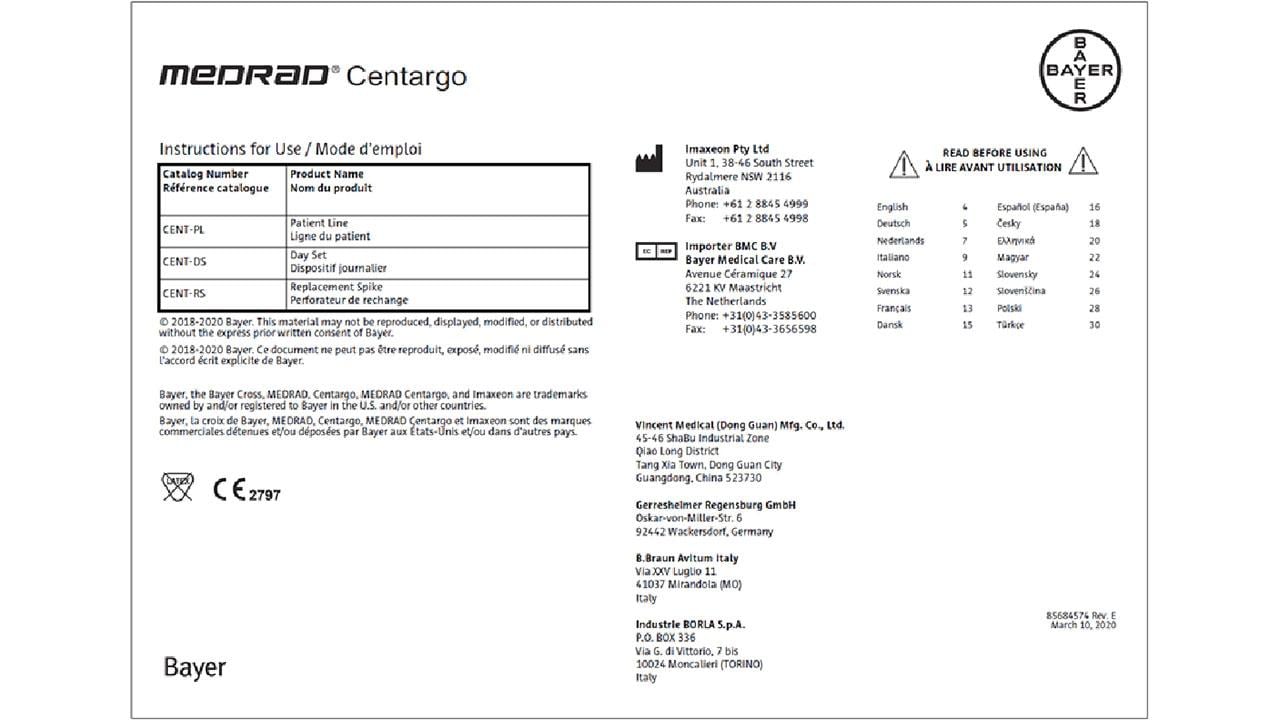
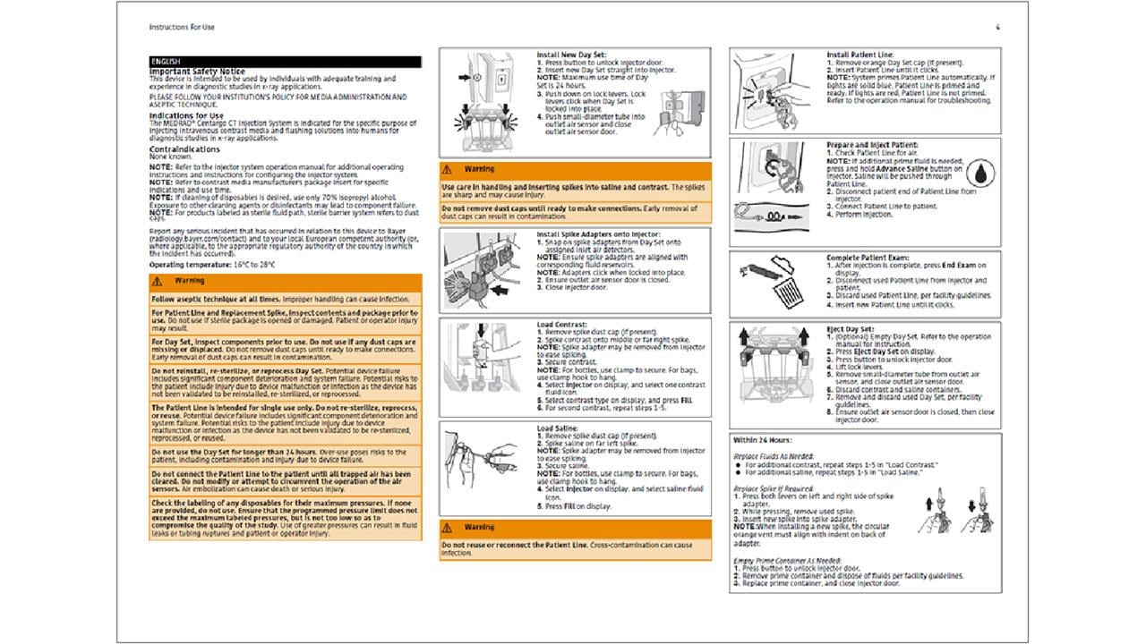
IFU
Instructions for use should consider use in both digital and hardcopy formats. IFUs must follow relevant regulatory requirements. For further guidelines and specifications on IFUs, refer to Bayer Labelling Design Spec documents (PDP-CE-LBL-02 and 201547).
Content
Written Content
When designing for IFUs, QRGs and Operation Manuals, use a tone of language that is clear and concise with instructions written in the imperative mood.
Develop a type scale for clear and consistent typography through the materials. Use a font suited for print media and large bodies of text. For additional guidance see:
Visual Illustrations
Visual instructions should be used as much as possible. Artwork should use technical illustrations that are:
- Clean
- Minimal
- Clear in visual relationship with the physical device
Illustrations should use thin line weights and minimal shading without too much detail.

Design features being called out should be emphasized through highlights, and annotations to clearly differentiate the subject from the device detail.

Use illustrations in the same style as possible, avoid use of real images/ photography of the device were possible as this can create visual inconsistency in style.
Tables
When presenting tables and figures they should be designed with clean lines and open spacing to maximize negative space. Full table borders can create additional visual complexity and make the page feel cramped.

Where real estate and the number of pages are limited such as in an IFU, borders can be used to define discrete sections of information to aid better reading.

Color
Artwork and typography should use colors consistent with Radiology devices where possible.
Illustrations should use the Primary, Secondary and Highlight colors for continuity with the physical device, with outlines that also reference these colors.
For more guidance on colors see:
Bayer in Radiology Brand Guidelines 2020
When developing written content with warnings, use a highlight color to differentiate content from other instructions.

Icons
Follow relevant regulatory guidance for the use of symbols and icons. Wherever possible combine the icon with a description to clearly communicate its meaning.

For an example Operation Manual and IFU for a Radiology device, download the PDFs here:
MEDRAD Centargo Operation Manual
Refer to the latest Branding Guidelines for examples of brand elements, typography and layout guidance for use in print.
Bayer in Radiology Brand Guidelines 2020
If you have any further questions about this or any other section of Bayer Identity Net, please contact:


