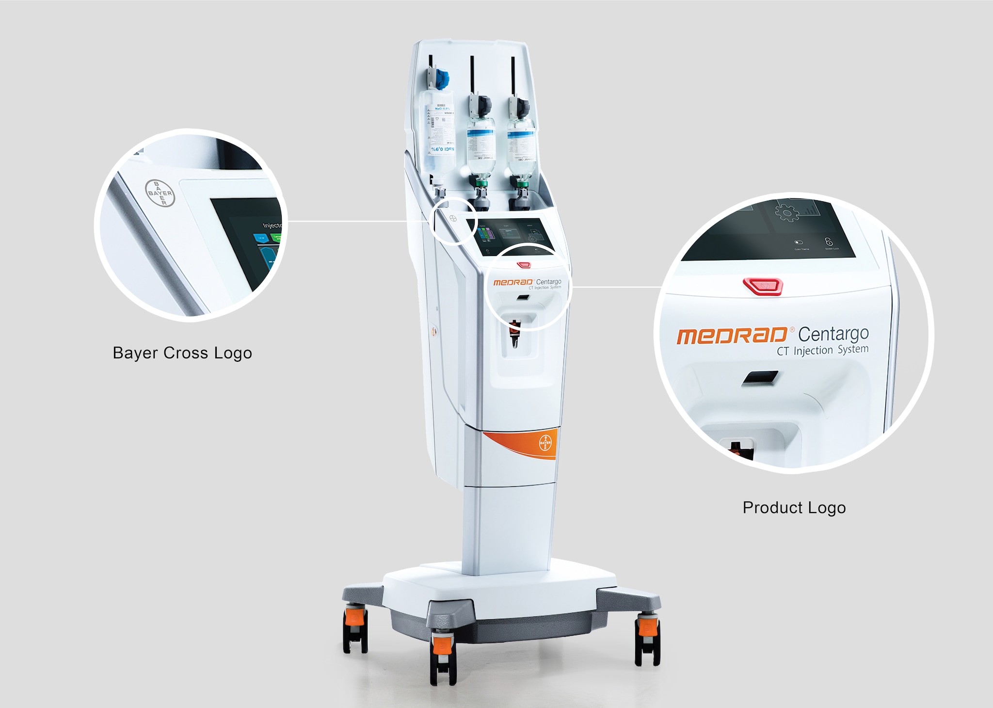
Strategic physical product branding allows a company to express its identity, reflect core company values and visually leverage an established recognition of the brand.
Consistency in applying this across a company’s products promotes an instantly identifiable brand throughout a product portfolio. The following guidance describes how to apply branding effectively on Bayer Radiology-devices.
Design principle
The Bayer Radiology-device brands are well-known and trusted worldwide. Three elements should be applied across Bayer Radiology-devices consistently to strengthen this:
- Bayer brand logo: identifies the product as a Bayer Radiology-device.
- Product brand logo: identifies product name/brand.
- Orange color highlights: reinforces and leverages the Bayer Radiology-device brands and established Trust.
Applying these 3 branding elements helps provide a strong visual identity and reinforce established customer Trust & Confidence in the Bayer Radiology-device brand.

Bayer Cross Logo
The Bayer cross logo should be applied where it is highly visible or close to the area of most user interactivity as possible on Radiology devices. For non-injector type devices, see:
Brand logos should not be obscured by other features of the device e.g. where disposables might be positioned.
When applying the logo:
- Position it on a surface with a good visual contrast.
Color - Use the monotone versions of the Bayer logo as preference, grey/black on white/ light surfaces and white on orange or colored/dark surfaces for visual contrast.
- Should be an appropriate size, in general between 25 – 40 mm.
- It should be visible but not over-powering or distracting.
- For more variations & additional guidance, refer:
Bayer Cross


Product Logo
The Product logo is used to indicate the commercial product brand name, it should be applied to allow for high visibility.
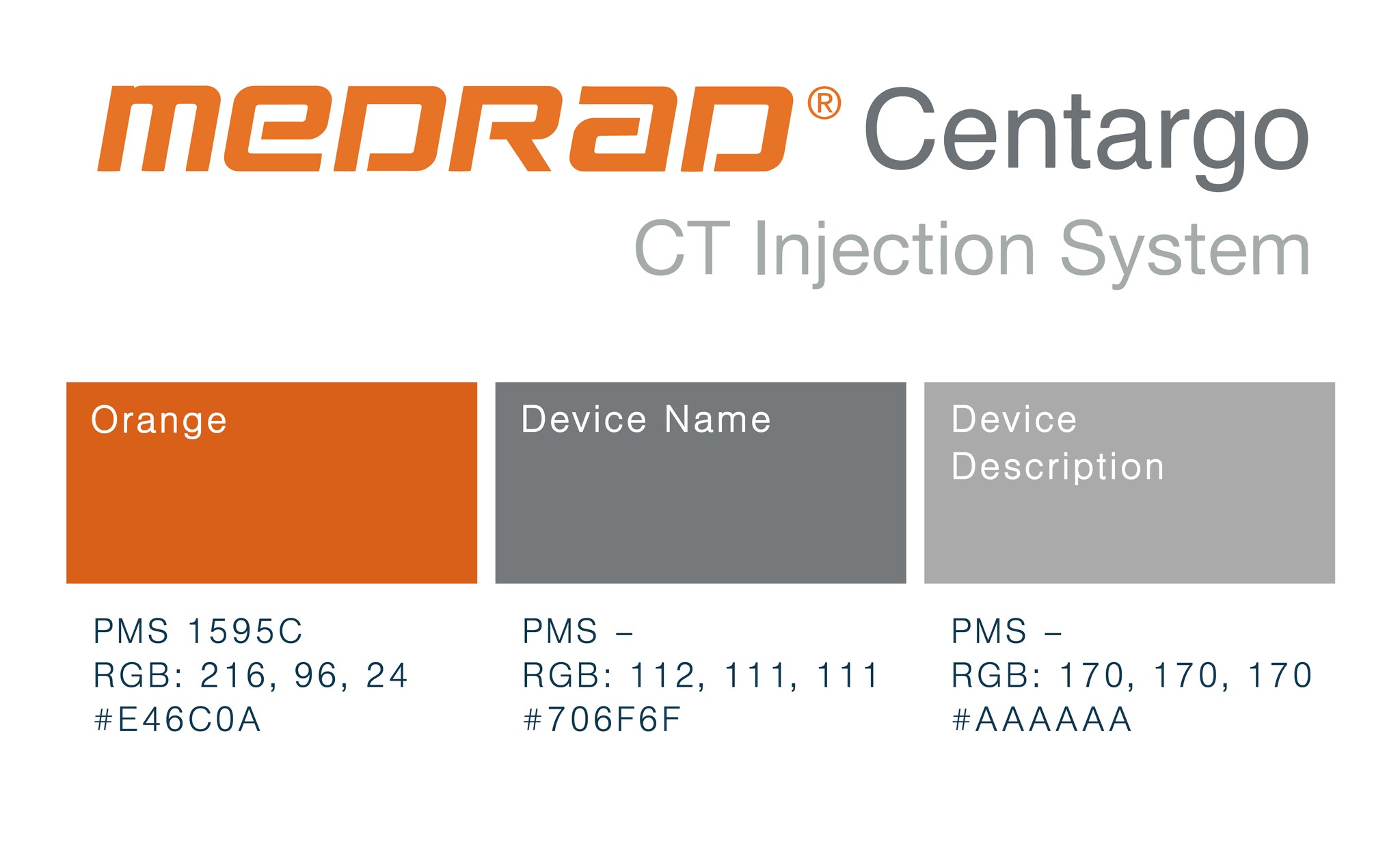
The logo consists of two elements: The MEDRAD prefix and the device name:
- The MEDRAD prefix in full color (signature orange) with the ® mark.
- The Device name in dark grey.
- In addition, the Device description or other secondary brand message in light grey.

For more guidance on the product logo see:
Bayer in Radiology, Brand Guidelines 2020
When applying the logo:
- Position it on the front face of the device (face of where user is predominantly facing during use) if possible.
- It should be an appropriate size. Should span the width of the surface applied leaving space on either side. See following figure.
- It should not be over-powering or distracting.
- Ensure there is a clear area around the entire logo free from other features on a device such as other artwork, prominent features, edges of a surface etc.


Signature Orange Highlights
- Apply signature orange color highlights to reinforce brand identity and improve usability by denoting user touch points, for more guidance see:
Color
User Interaction - For additional guidance on applying branding see:
SD Packaging, Labelling & Artwork
Packaging
Bayer in Radiology, Brand Guidelines 2020
If you have any further questions about this or any other section of Bayer Identity Net, please contact:


