A strategic use of color schemes helps reinforce brand identity, reflects brand values and expresses style and product characteristics to create a cohesive and recognizable design language across product lines.
The following guidance describes the use of a framework when making decisions on color for a Radiology device for Bayer.
- 1/3
- 2/3
- 3/3


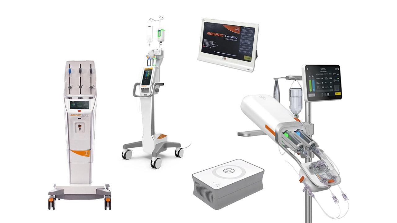
Design principle
When developing a color scheme for an electromechanical device, adopt a color system by defining color groups according to how they are used. These groups can be defined to convey fundamental themes and messages, express a certain product attribute and specific visual cues for functional aspects of the product.
For Radiology devices a 3-part color system is used consisting of Primary, Secondary and Highlight color groups.
Each color group has an intended use purpose and a degree of usage. Defining and using these color groups when developing color schemes across products helps create a strong, consistent, and recognizable visual language unique to the Bayer brand. See next figure:
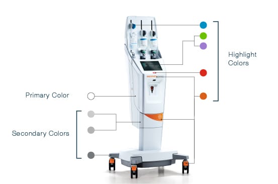
The Color System
Primary colors are the base color and the predominate color used for most of the visual surfaces on the product. In the context of radiology devices, the primary color is typically neutral to create a comfortable, simple, and clean foundation to coincide with Secondary and Highlight colors.
Secondary colors are an intermediate color group used to visually break up part of a device and can be used as a visual cue to emphasize functionality and product attributes. In addition, it can also be used to highlight recurring elements (for example a feature which exists across devices such as a handle, casters or base) and as additional design details constant across product lines.
Highlight colors are used for a variety of reasons but generally in moderation and as accents. Use of highlight colors may include highlighting significant user interaction points, reinforcement of brand and can also be used to emphasize a device attribute. Additionally, highlight colors can include other color associations which assist in product usability (e.g. a red button for emergency stop). It is also important to consider alignment of these colors with the device corresponding UI/GUI to ensure visual consistency.
Primary Color: White

|
PMS |
000C |
|
RGB |
255/255/255 |
The Primary color to use for Radiology devices is white. The Primary color should be the most widely visually utilized color on the user-facing parts of the device because this color conveys cleanliness and a feeling of clinical appropriateness. Subscribing to this contributes to and encourages patient trust & user confidence aiming to align current expectations of a professional & medical aesthetic.
Secondary Colors: Grays & Metallic

|
PMS |
COOL GRAY 9C |
|
RGB |
117/120/123 |

|
PMS |
COOL GRAY 5C |
|
RGB |
177/179/179 |

|
PMS |
METALLIC 877C |
|
|
|
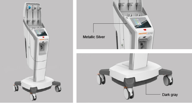
The Secondary color to use for Radiology devices is gray and is used primarily to highlight or create visual breaks between different parts of the device and as visual cues to communicate a particular attribute. Two colors gray may be used on Radiology devices: ‘Dark Gray’ and ‘Metallic Silver’ or ‘Light Gray’.
In general, Dark Gray should be considered for use on device bases (for example on the underside of a pedestal) to reinforce a sense of strength and stability, in addition to being used to hide any ‘bulky’ volumes which may detract from a light, simple and therefore efficient aesthetic.
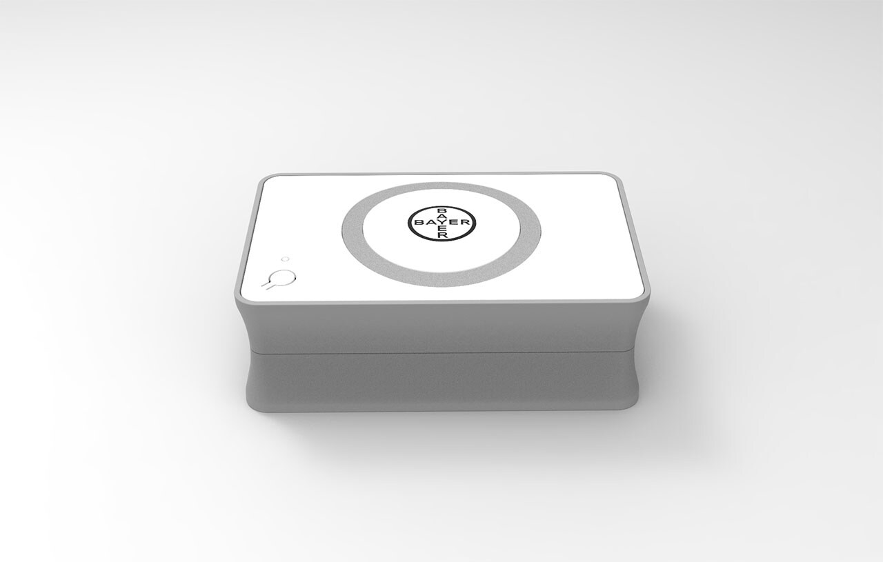
Certain devices may not require this treatment, as their volume and size may already be small. See example of this in the guidance section on Accessories.
Metallic Silver finish is used to convey a sense of innovation and technology on premium Radiology devices and is applied on device handles and as a trim. The Metallic Silver finish is also used in some current state-of-art scanner products and therefore creates visual relationships between these scanner devices and Radiology devices.
For more guidance on its application refer:
Light Gray is used as an alternative where use of a metallic finish on a device is not appropriate or feasible. For example, refrain from using metallic finish on the device, when the visual message of high innovation and technology is less desired or not desired such as in non-Premium, Value range devices.
Highlight Colors - Orange Accent

|
PMS |
1595C |
|
RGB |
216/96/24 |
The signature color orange is a significant highlight color, both in its functional usage and visual impact. Orange highlights should be used sparingly and preferably be applied on devices that feature white surfaces to maintain maximum contrast, and to draw the user’s attention for 2 reasons:
- Reinforce Bayer device brand.
- Identify user interaction points.
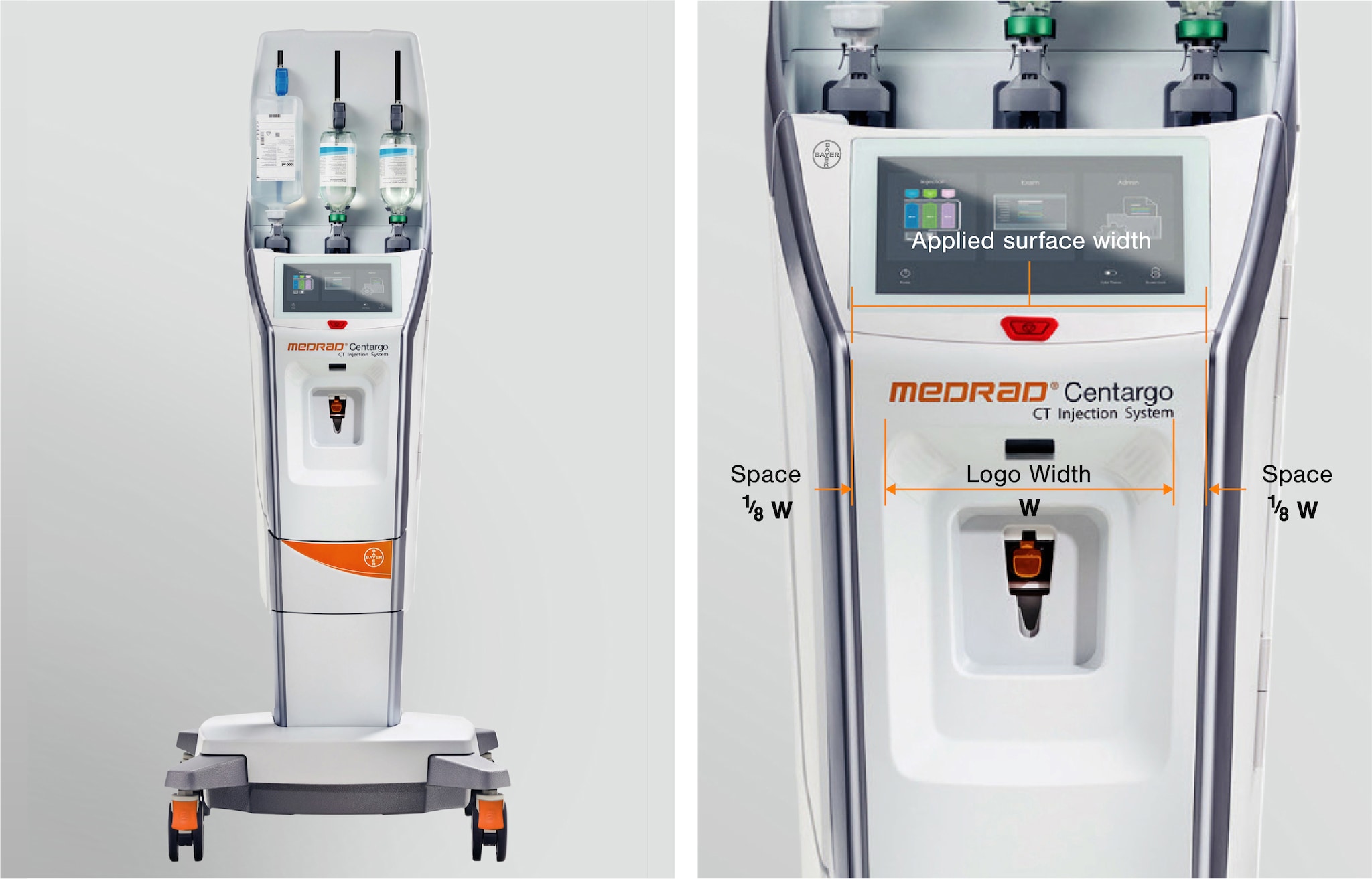

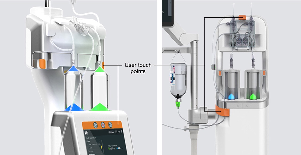
For more guidance on use of the signature color orange refer to the following sections:
Highlight Colors - Functional

|
PMS |
3005C |
|
RGB |
0/144/197 |

|
PMS |
3561C |
|
RGB |
107/194/0 |

|
PMS |
2087C |
|
RGB |
159/122/209 |
Functional highlight colors adopted on a Radiology device include ‘Saline Blue’, ‘Contrast Green’, ‘Contrast Purple’. These colors are used to indicate the locality and status of fluid mediums/ consumables and the alert button, as is to be consistent to the devices corresponding GUI in order to create functional and visual cohesion.
Highlight Colors - Alert

|
PMS |
485C |
|
RGB |
237/28/36 |
‘Alert ‘Red’ is used to highlight critical components and functions.
As a general rule, highlight colors should be used sparingly as accents and as required for the functional requirements of the device. Refer:

Summary
- Use white as the primary surface color for the device.
- Use secondary color Dark Gray to break up different parts of the device and for device bases.
- Apply Metallic Silver to highlight a sense of innovation & technology or apply trim on Premium range devices. Refer:
Product Hierarchy (for Exceptions)
- Apply secondary color Light Grey to apply trim on Value range devices.
- Highlight color orange should be used for user interaction (touch) points and branding elements.
- Functional Highlight colors used should align with the GUI design when referring to the same elements (E.g. Physical components used to indicate Saline & likewise in GUI share the same color – ‘Saline Blue’).
Next topic – Materials & Finishes
If you have any further questions about this or any other section of Bayer Identity Net, please contact:


