The following section provides guidance on what to consider and how to approach the design of user interaction points for a Bayer in Radiology device as to promote intuitive usability and generate a positive experience for the user.
Design principle
When developing user interaction points, there should be consistent visual & tactile design cues to communicate what the device does, how the user should interact with the device, and the device status. Additionally, user interaction points should be cohesive with the other design features and reinforce a high-quality aesthetic.
An intuitive user interaction, promotes device Approachability, Efficiency, and Trust.
Physical Interaction Points
Buttons & Action Points
Buttons and action points on a device have specific actions for the user to initiate a function.
Regularly used buttons and action points should be predominantly positioned where most visible to and directly presented to the user during use.
Use signature color orange to highlight key user interaction points to draw attention to and identify actionable areas for the user.
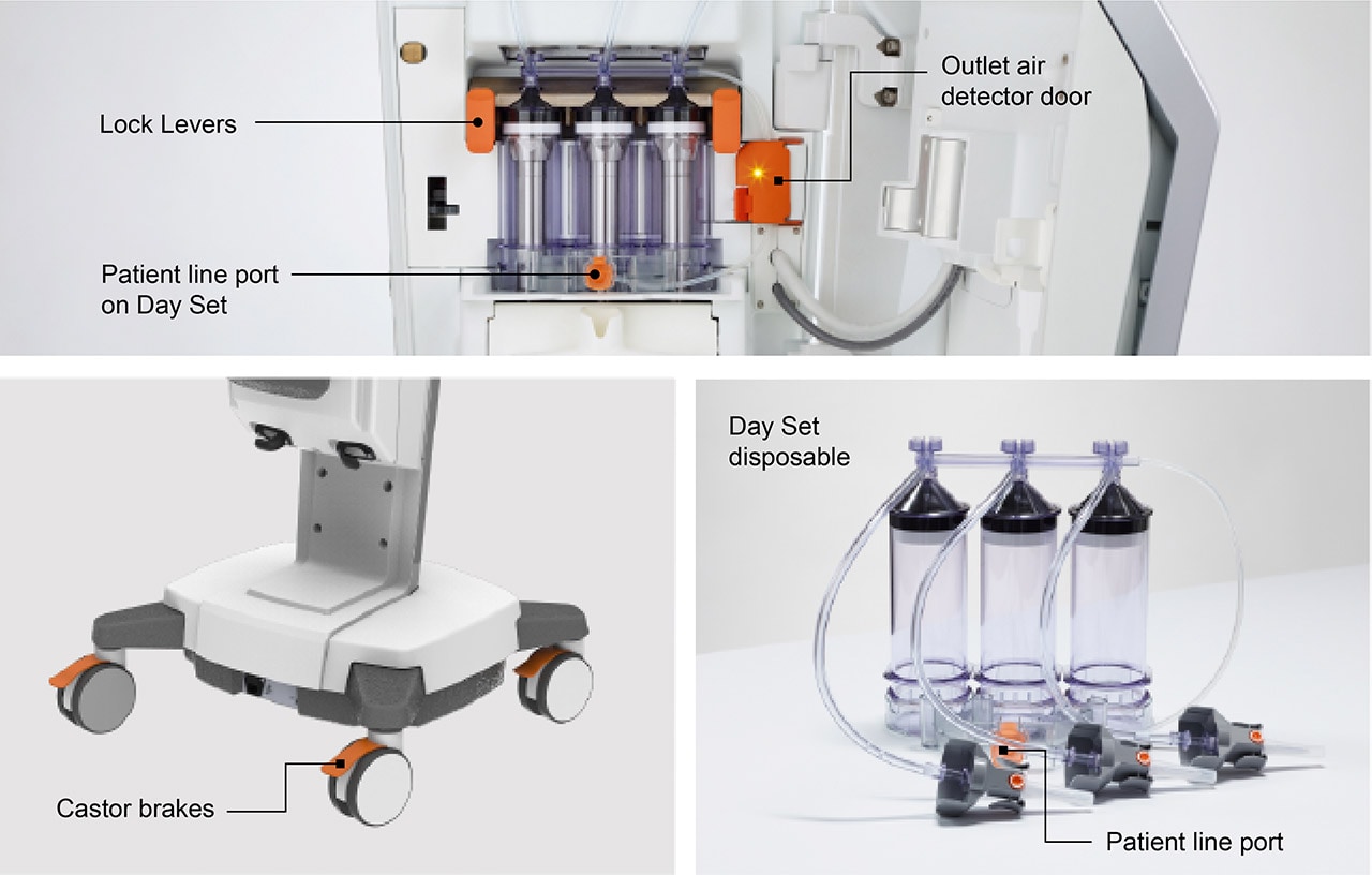
Consistently using colors to highlight actionable interaction points and consideration of their placement creates user intuitiveness, device predictability and operation of the device enhances the understanding and therefore a sense of Efficiency for the user.
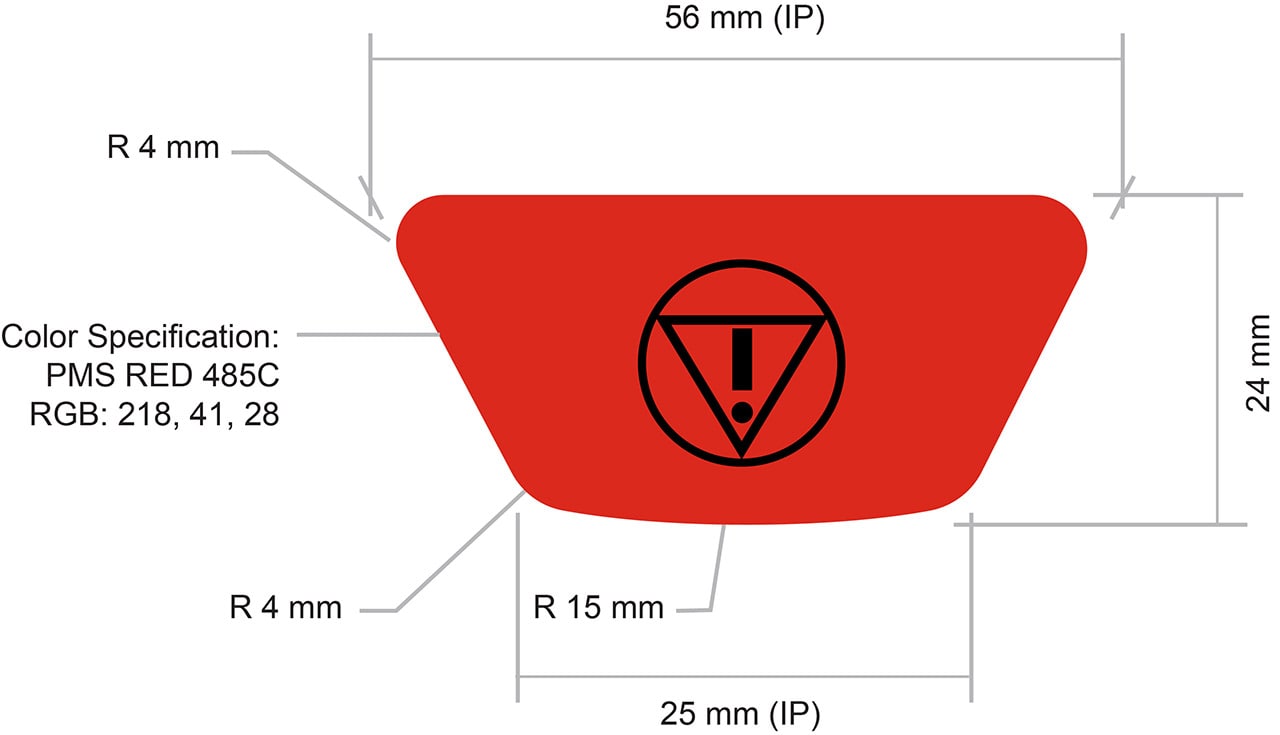
Safety-critical action points such as physical Emergency stop buttons should have exclusive use of the color red and located where they are easily accessible and in high visual contrast.
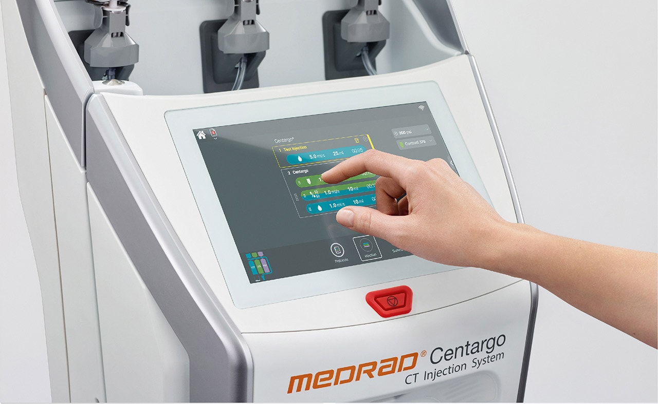
Where possible, Emergency stop buttons should be positioned where the user is predominately positioned during use of the device, such as underneath the device GUI. Refer to the following figures for an example of its placement and recommendation on shape, size and color specification.
Where user controls are duplicated in the GUI, refer:
Device Handles/ Handling
Device handling points are for large/heavy devices that require ease of handling &/or maneuverability.
Handling points should be easily visually identified on the device by creating visual and tactile contrast with the use of color and finish.
The main handle should connect directly to the device’s center of mass allowing the user to maneuver the device at its center of mass directly promoting a tactile sense of control.

The handle should be constructed in metal for devices with a large mass and where appropriate and should be in a Silver Metallic finish or light Grey finish (for non-premium devices) to convey quality & robustness. Refer:
Handles for devices with a smaller mass (such as for maneuvering an injector head) should follow the same approach in providing robust tactility, however may not require a metal construction. In these cases the use of another robust material in color light Grey, or for smaller handle volumes, signature orange color, can be considered.
Handle shapes should adopt simple, rounded, basic forms and be at an ergonomically suitable size that invites user interaction. Size and shape of handles are dependent on their functional use.
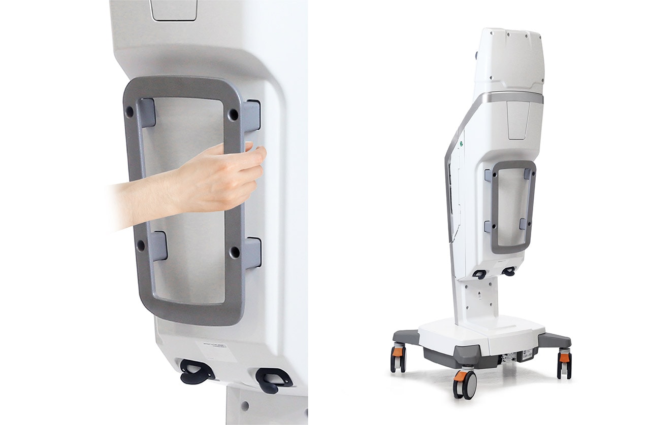

By ensuring handling points are visually identifiable, inviting and connected to the devices center of mass reinforces robustness, stability and combined with the use of metallic finishes (for Premium devices) to convey quality enhances user Trust & Confidence.
For guidance on Value range devices, refer:
Use of Lighting
Functional Lighting
Functional lighting uses high visibility, defined colors and light patterns to communicate device status. The benefit of using functional lighting is that it allows important device status to be communicated to the user from afar without referencing specific information displayed on the GUI, improving usability and enhancing user-device experience.
When designing visual cues for indicating the status on a Radiology device, consider the use of lighting to indicating the following device states:
- Placement/ location of disposables via lighting color associations.
Color - Fluid states/ replacement of disposables
- Key steps during a procedure such as filling, priming the patient line and during an injection.
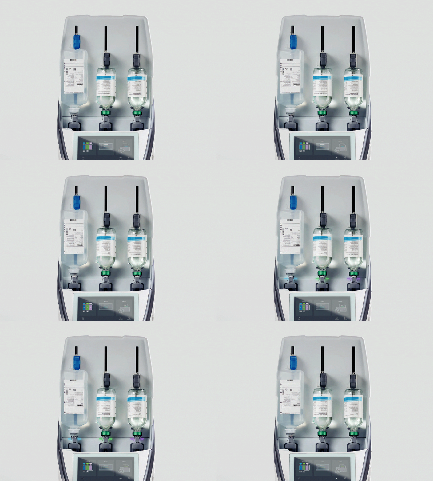
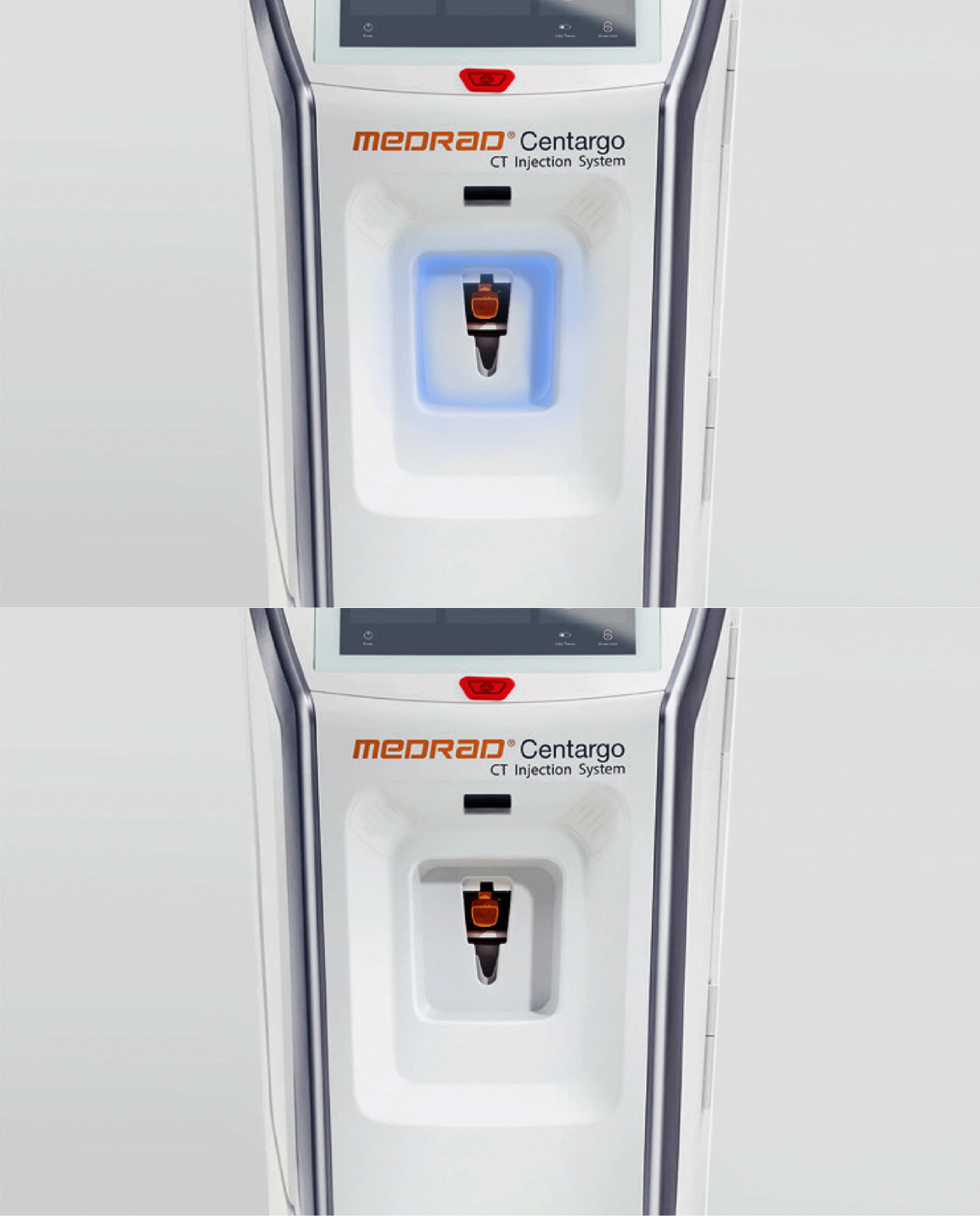
For patient line status use the following color schemes for lighting:
- Blue Patient line is primed with saline
- Green/ Purple Patient line is primed (at start of day) with contrast 1 or 2
- Orange Patient line requires replacing
Refer to the color section for color specifications:
Mood Lighting
Lighting is also used to create visual ambience through color and light patterns, creating visual cues to reinforce a sense of high technology/quality in addition to altering the use environment via projected light and to create a visual softening of the device. Refer:
Customizable lighting schemes may be deployed to allow users to alter environment ambience and to create device cohesion with the surrounding environment and parallel products or in setting the Radiology device apart from it.
The use of ambient lighting enables the device to blend into the environment making it more familiar, approachable and environmentally appropriate increasing the perception of Trust.
When possible, and where it does not interfere with clinical procedures, allow for use of blue colored mood lighting to convey a sense of technology. Customized colored mood lighting might be applied to indicate a function or to make the device fit with other devices and its environment (e.g. for pediatric use).
Refer:

Lighting Types
Backlighting
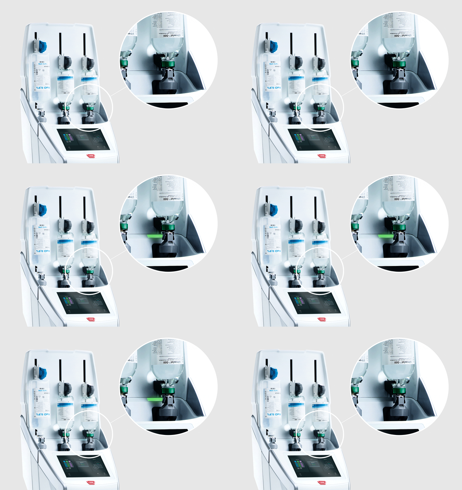
Backlighting (projecting light through a specific surface of the device) should be considered when indicating device state such as the fluid state full/empty (see figure below).
When designing lighting for fluid status, adhere to Bayer branding and refer to the colors section.
Bayer in Radiology Brand Guidelines 2020
Indirect Lighting
Indirect light (projecting light on a surface) on specific areas of the device should be considered when indicating a general device state.
Indirect light on the device provides a high level of gross visibility to users allowing them to interpret the state of the device at a glance and at larger distances from the device.
Light sources that produce indirect lighting should be hidden from direct visibility by the patient and user where possible.
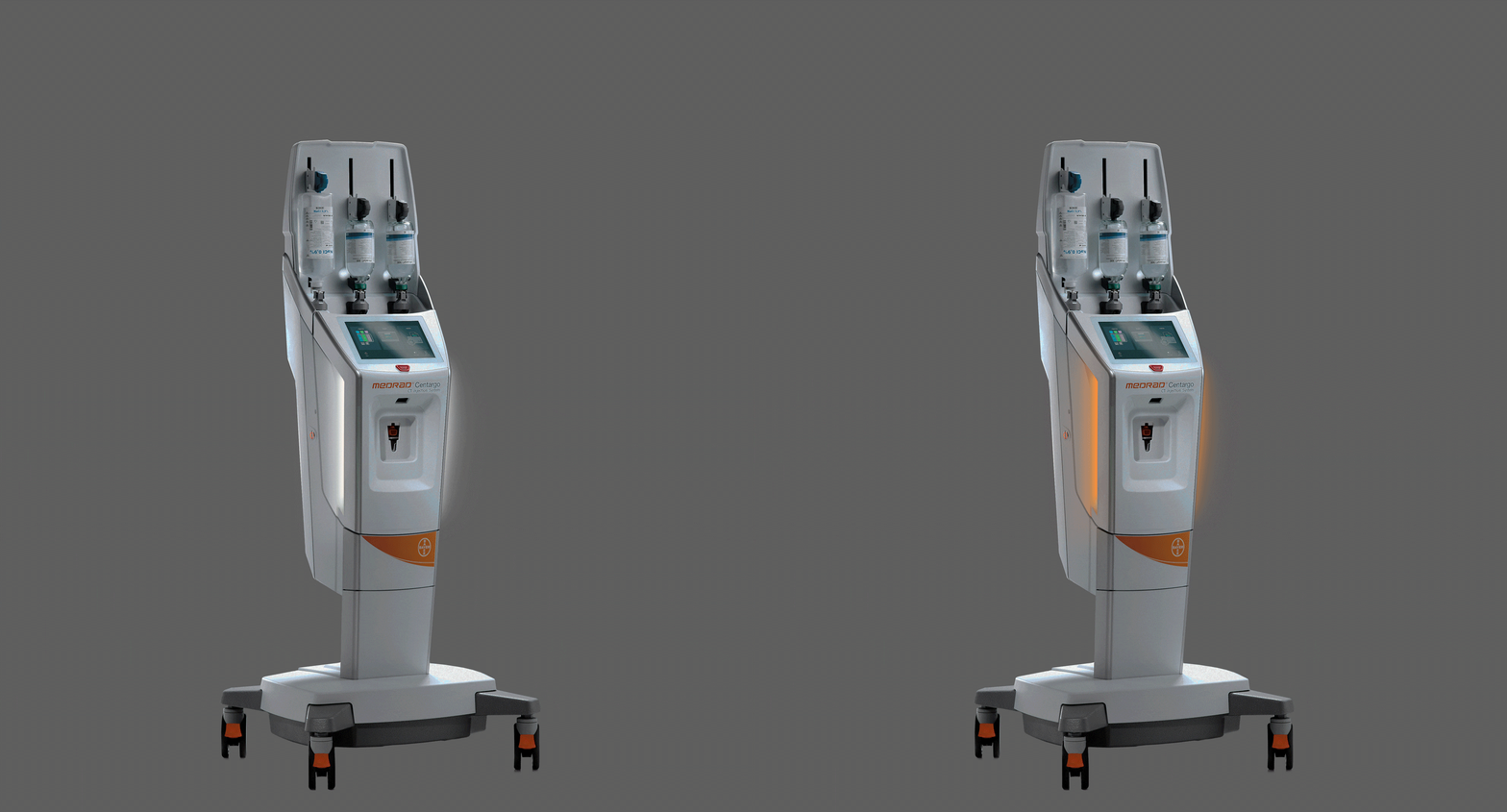
Focused Lighting & Power Button Status
Focused lighting (non-reflected light such as use of light pipes or light diffusers) for feedback related to a specific action.
Focused lighting should be used minimally so as to not overpower the visual attention of the user. When designing areas with focused lighting, use basic color association to avoid misunderstanding.
For power button status and when applicable:
- Green Device is powered On
- Orange Device is in hibernation or sleep mode (Optional)
For feature/ lock button status and when applicable:
- Green Control is active (door is locked and can be opened)
- Orange Control is inactive (door is locked / cannot be opened)
Refer to the color section for other specific color associations:
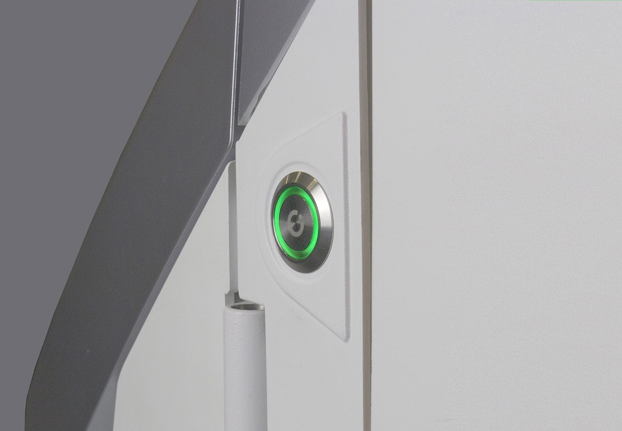

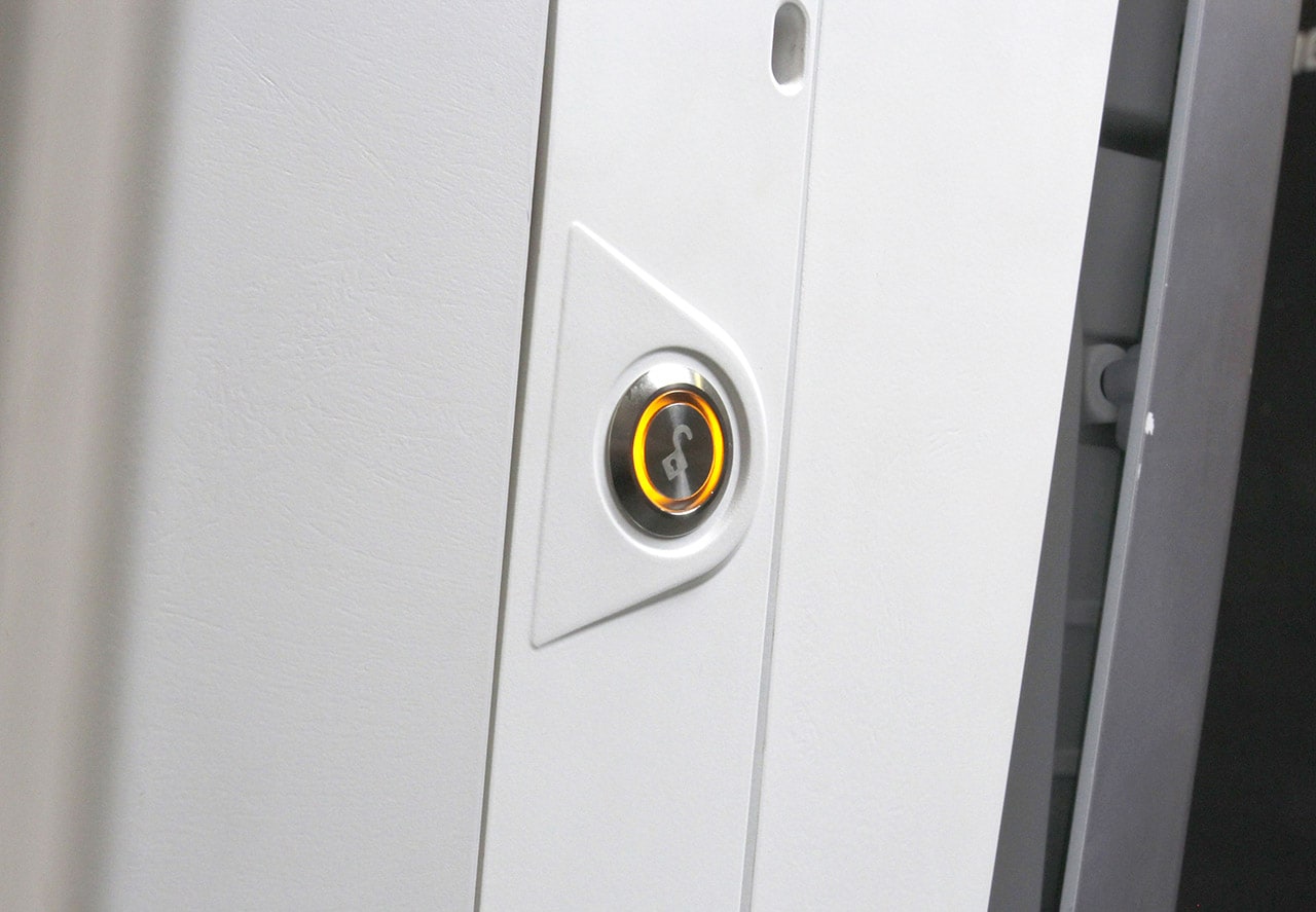

Focused lighting can also be used as an alternative way to display power state.
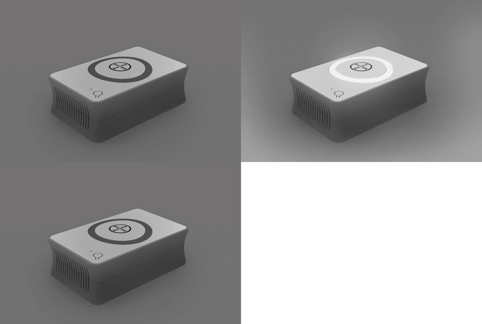
Lighting Sequences
Using lighting sequence (pauses of lighting – ‘on & off’ patterns) draws attention of the user. Below are some rules of thumb for lighting sequences:
- Avoid quick paused lighting (< 1 second) - unless intended to draw the users attention of an alert condition or reminder.
- ‘Probing’ color glow transitions (<2 seconds on/off) are used to signal the user for reminders for fluid replacement and for reminders to replace the patient line.
- ‘Slow’ color glow transitions (>3 seconds on/off) are longer transitions, used to associate powering up state “off to on” and powering off state “on to off”). Alternating and repeating this can be used to indicate device is in a ‘sleep’ or charging mode.
- Consider synchronizing lighting and sound sequences where visual & audio feedback is required, timing of transitions may need to be adjusted.
Summary
- Physical touchpoints should be clearly defined through color, material, and/or surface breaks.
- Important physical touchpoints should be highlighted with signature orange consistently to improve usability and reinforce the Bayer device brand.
- Main device handles should be connected directly to the center of mass of a device to enhance the sense of control and confidence when maneuvering the device.
- Handles and interaction surfaces should use Grey or Grey Metallic finish.
- If used, emergency stop buttons are to be in clear view and have exclusive use of the color red.
- Backlighting should be used to indicate fluid/disposable states on injector devices.
- Indirect lighting should be used as visual cues when communicating overall device status.
- Focused lighting should be used for feedback related to a specific action.
- The use of short ‘on off’ duration lighting transitions (<1 sec) is to be used for alert conditions and reminders.
- The use of long duration (>3sec) probing/ long paused lighting should be used to indicate general device power or ‘sleep’ status.
- Timing may be adjusted for light sequences which synchronize with sound indicators
If you have any further questions about this or any other section of Bayer Identity Net, please contact:


