Shapes, Forms & Surfaces
A strategic approach in defining the shape and form of a product enables brand message and product attributes to be conveyed as well as driving a recognizable, unique for product/brand differentiation or a use environment appropriate aesthetic.
The following guidance describes general design principles when designing device shapes, forms, surface treatments and design details for a Bayer in Radiology device.
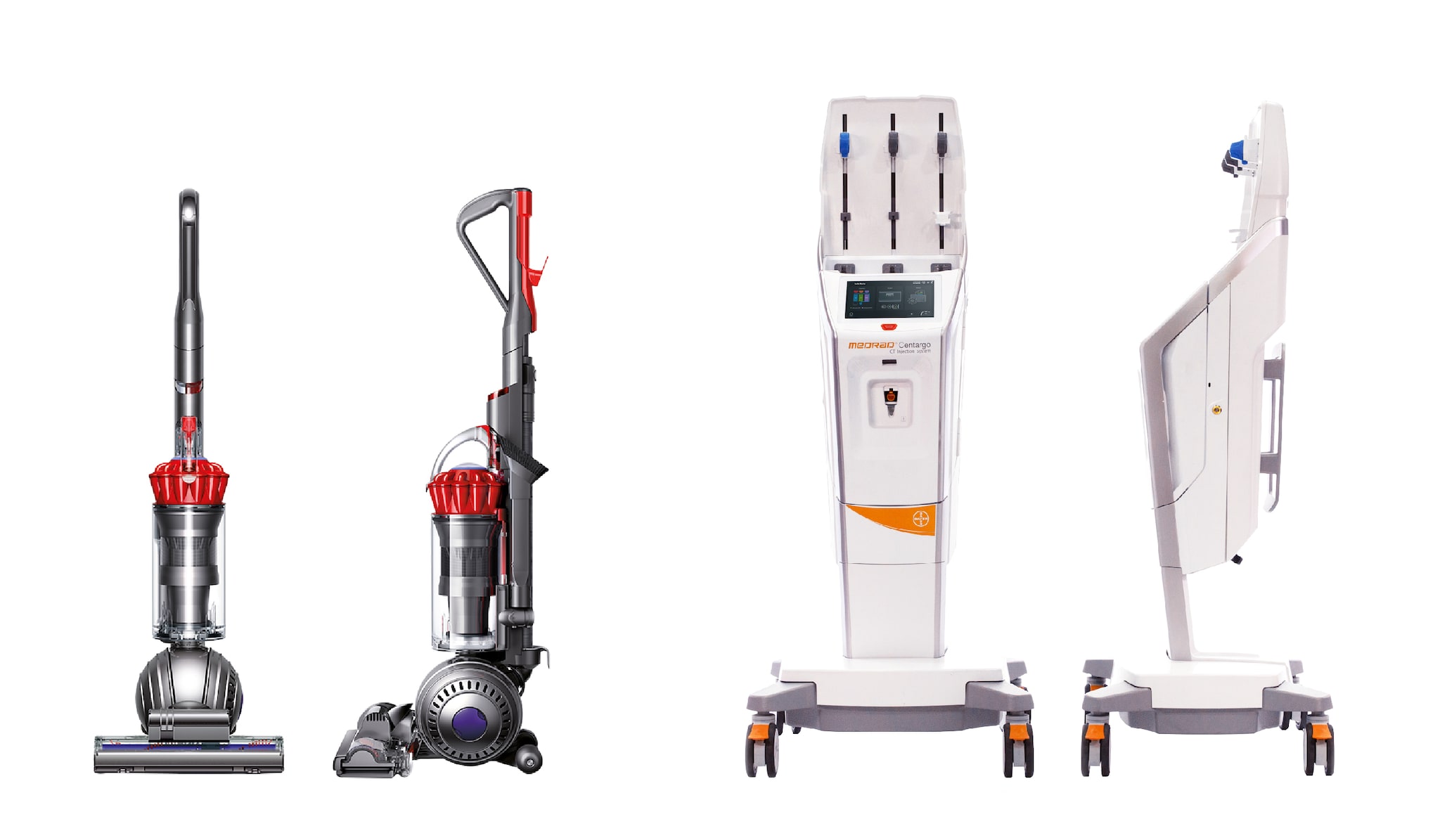
(Source Image (left): https://www.dyson.com.au/light-ball-multi-floor-plus)
If you have any further questions about this or any other section of Bayer Identity Net, please contact:
Design Principle
When developing the physical device, consider targeted themes, product attributes & messages and creating visual relationships with the use environment.
Key Values & Messages for the Bayer brand are Care, Confidence & Trust, Efficiency, Innovation & Approachability. Shapes, forms, surface treatments & design details developed should aim to reflect the associated qualities of the themes. As such:
- Providing a simple visual design to drive the sense of
Efficiency & Approachability - Clean, uncluttered design details enhance user/patient
Approachability - Emotive design cues & features emphasize Technology & Innovation
Use Environment: Consider the context of use of the device to provide a purposeful relationship with its use environment (which can be used to make it fit-in or stand out).
Consideration and consistent application of the two aspects above when developing the device will promote product recognition, visual differentiation and reinform the Bayer brand identity.
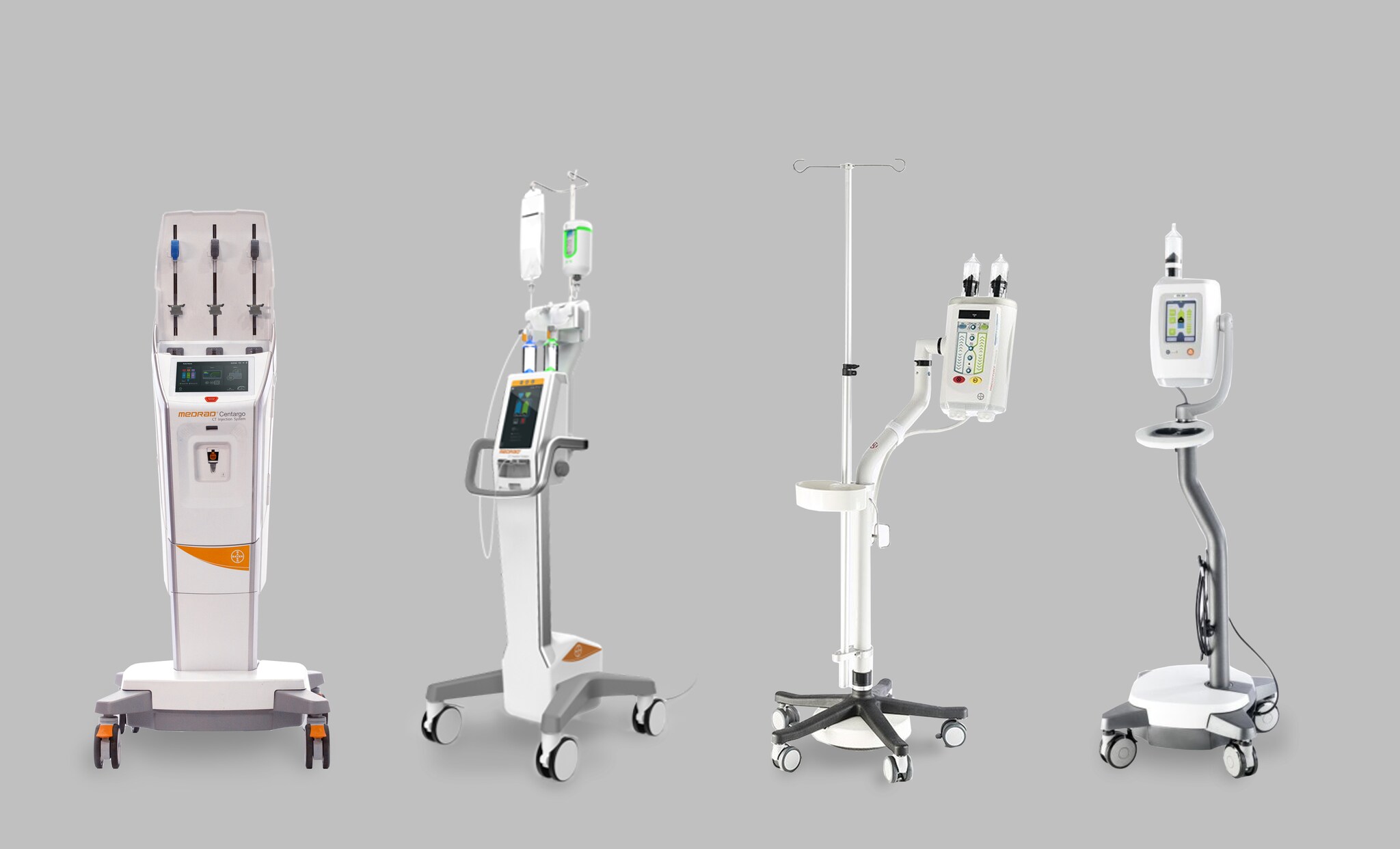
Shape & Form
Silhouette-Defining Shapes
When defining the overall silhouette for the device, consider use of predominately simple softened geometric shapes.
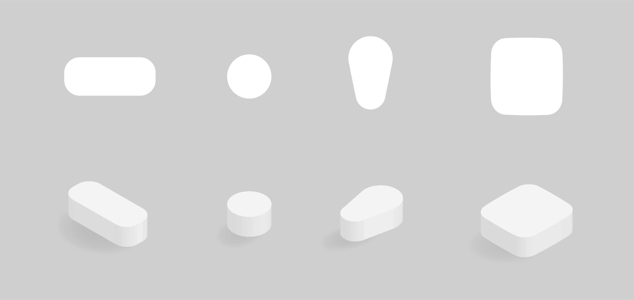
To convey a sense of visual order and therefore Efficiency, avoid use of overly organic or rounded shapes as a rule of thumb as this can typically create added visual complexity.
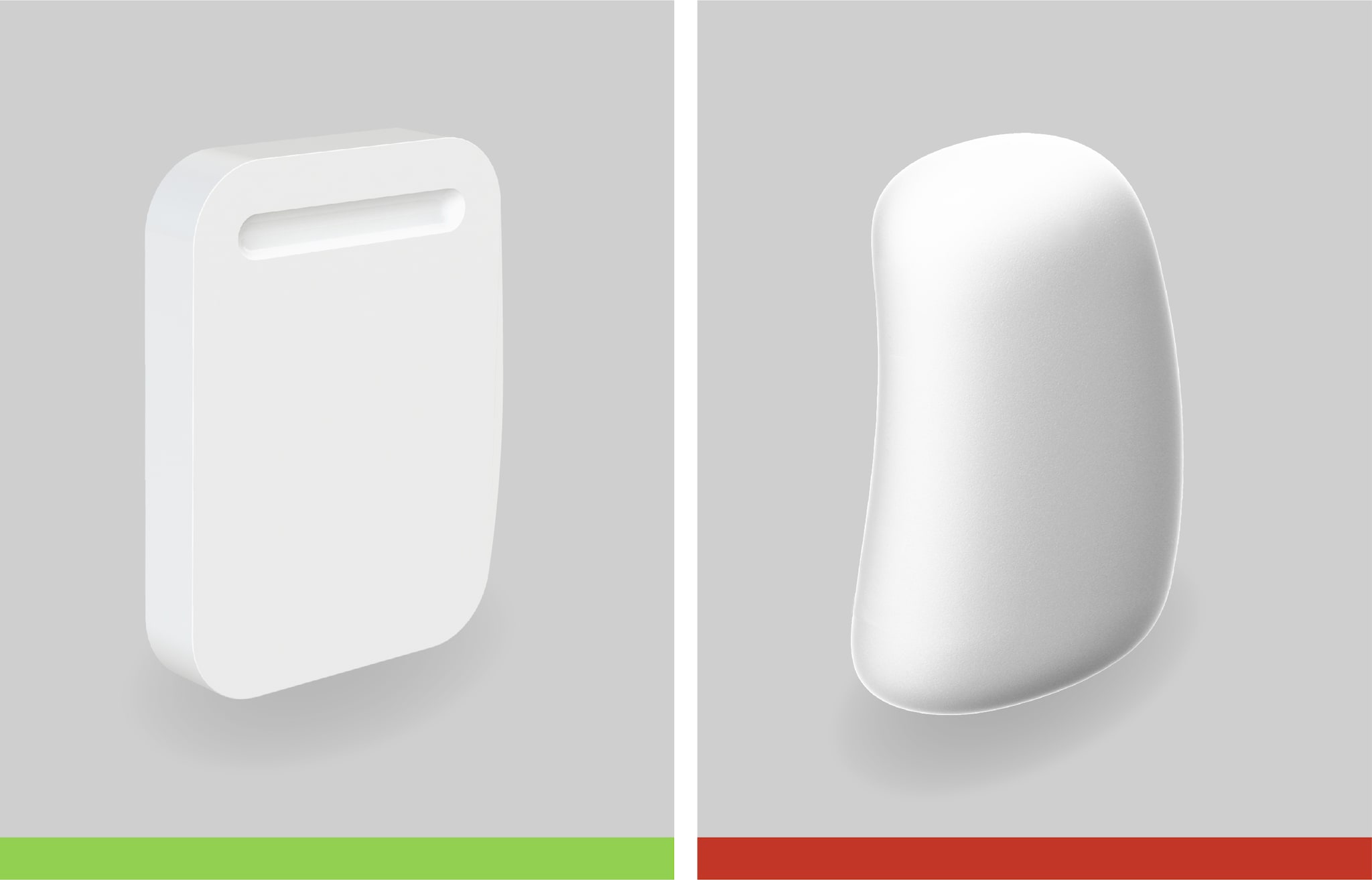
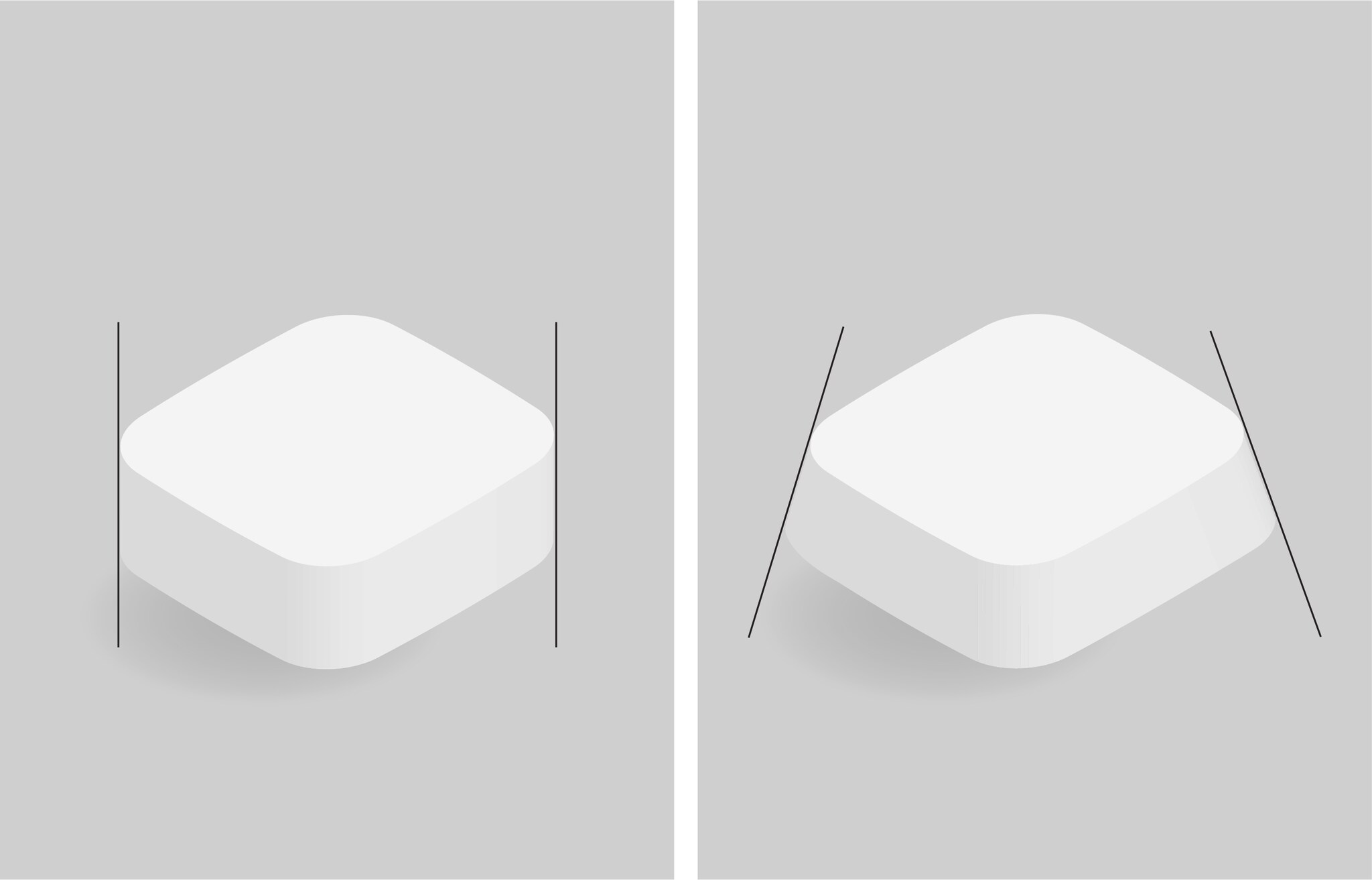
Symmetry promotes visual balance and order. Streamlined or tapering shapes can be adopted to create visual interest and add to the visual dynamic in addition to reducing the perceived device size.
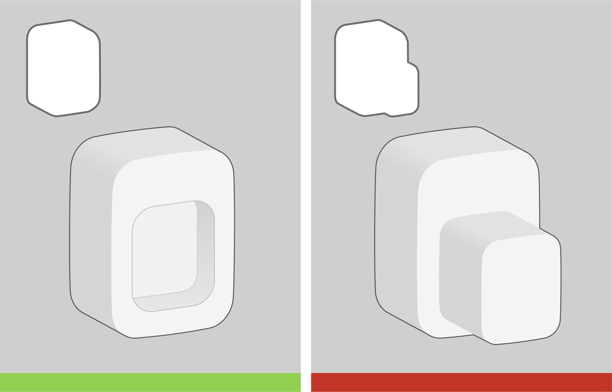
Where possible, develop one central integrated volume and avoid too many separate volumes & shapes to reduce clutter.
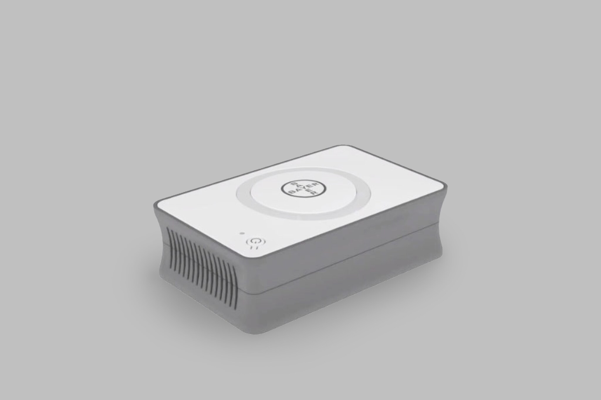
Developing a simple, clean and easy to understand aesthetic helps in expressing qualities of Efficiency and promotes user Confidence.
Managing Visual Volume
Large device volumes/sizes are visually undesired.
Defining a visual lightness of the device can help in creating a sense of agility/ease of use in addition in clinical environments where the availability of space can be limited, lightness helps in providing visual appropriateness. This can be achieved by the following:
- Using tapering forms and layered volumes can effectively manage unwanted visual volume. (See previous on Silhouette-Defining Shapes)
- Visually reduce size by subtracting shapes/volume as opposed to adding them where visual cues may be required for a feature be visually highlighted. This can also aid in avoiding unnecessary visual clutter and in maintaining a clean device silhouette. See below figure:
- Large volumes and perceived size can also be treated by breaking up the form visually with color or texture.
By minimizing perceived volume, a visually lighter device can reinforce Efficiency and therefore user Confidence, ease of use and Approachability.
Surface Details
Surface treatment and details can be used to impact the visual language and therefore the overall look and feel of the device. When developing device surfaces consider the following:
Surface Treatments
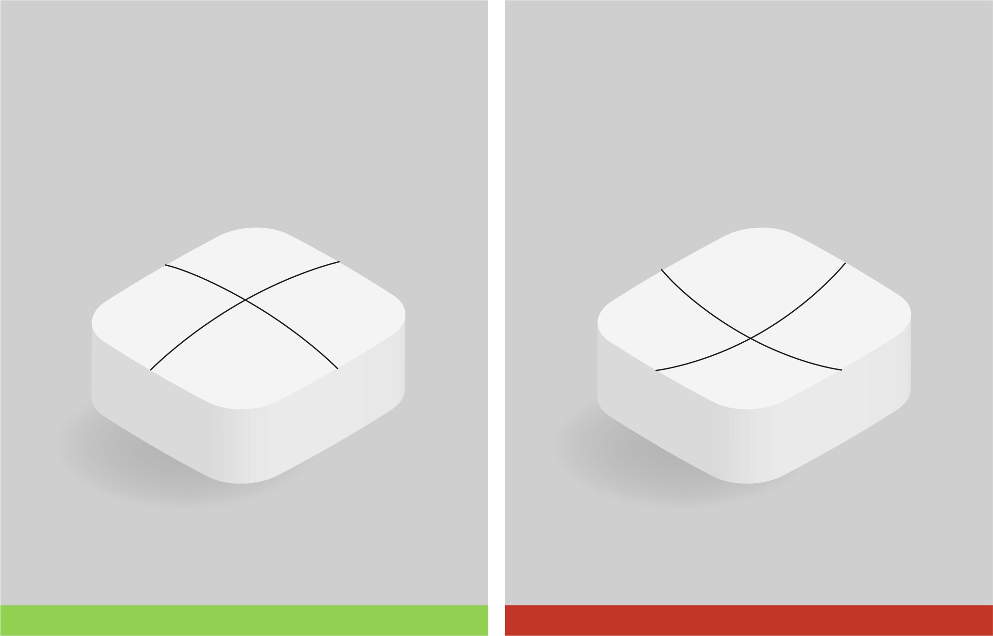
- Use slightly convex curved surfaces where possible to soften the overall appearance of the device. This can also be used to treat large surfaces to add visual purpose and interest
- Use large sweeping curves and surface continuity across the device to help create an integrated and streamlined aesthetic.
Abrupt and overuse of transitions in curvature for surfaces should be avoided or kept to a minimal to avoid overly visually complex geometries.
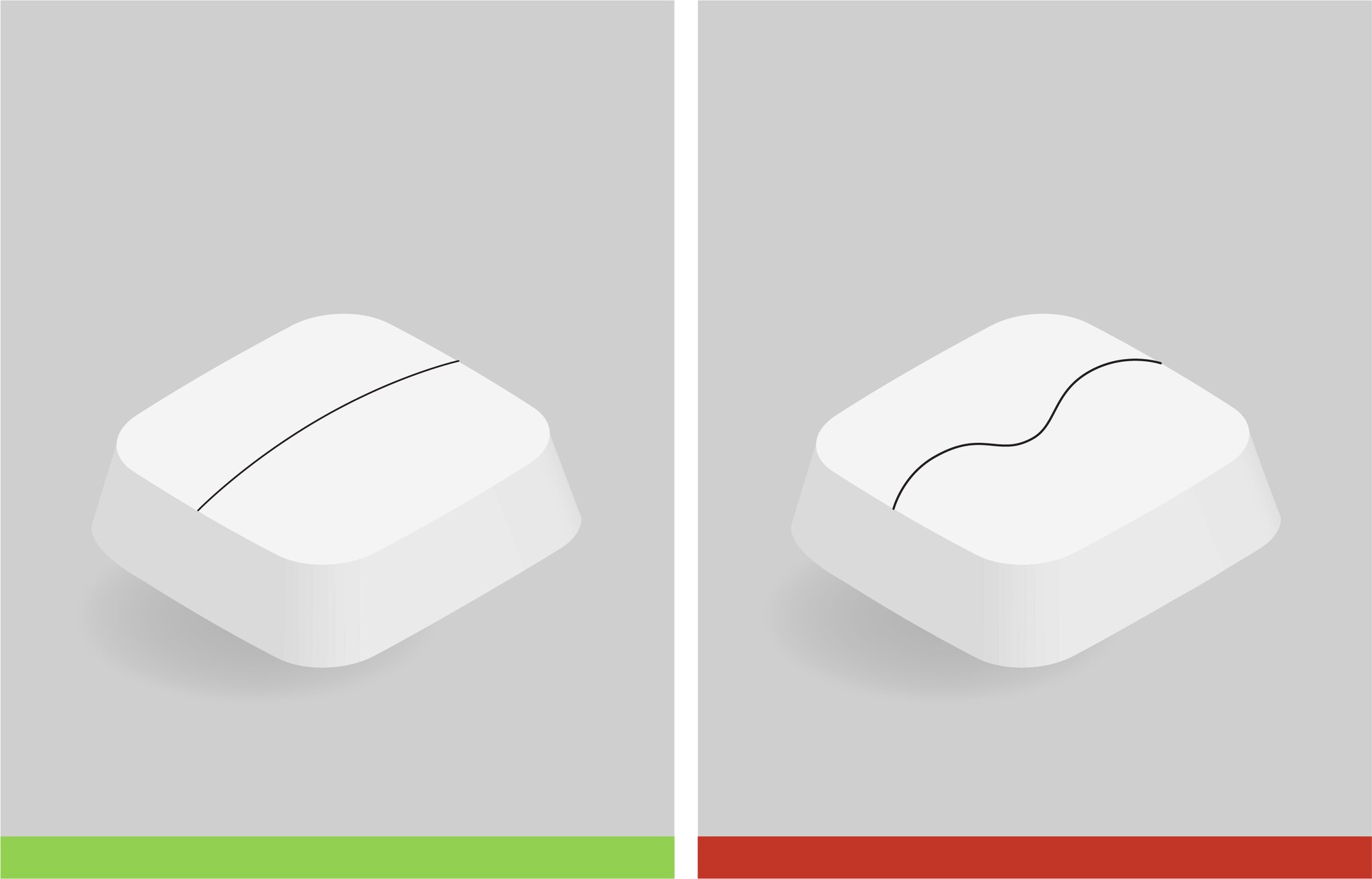
Surface Breaks
Surface breaks can be used to provide visual separation, emphasizing differing areas of functionality, or to create interest for the user.
- For areas which seem visually too large, consider visually breaking up the large surface with a surface break.
- Where possible keep the physical space between gaps at the break to a minimum, aim for gaps between breaks to be between 2 – 5 millimeters.
- When applying breaks for visual treatment, consider other functions required or affected by the chosen treatment such as surface cleanability.
- Overall, surfaces should be kept relatively large and uninterrupted for a clean aesthetic.
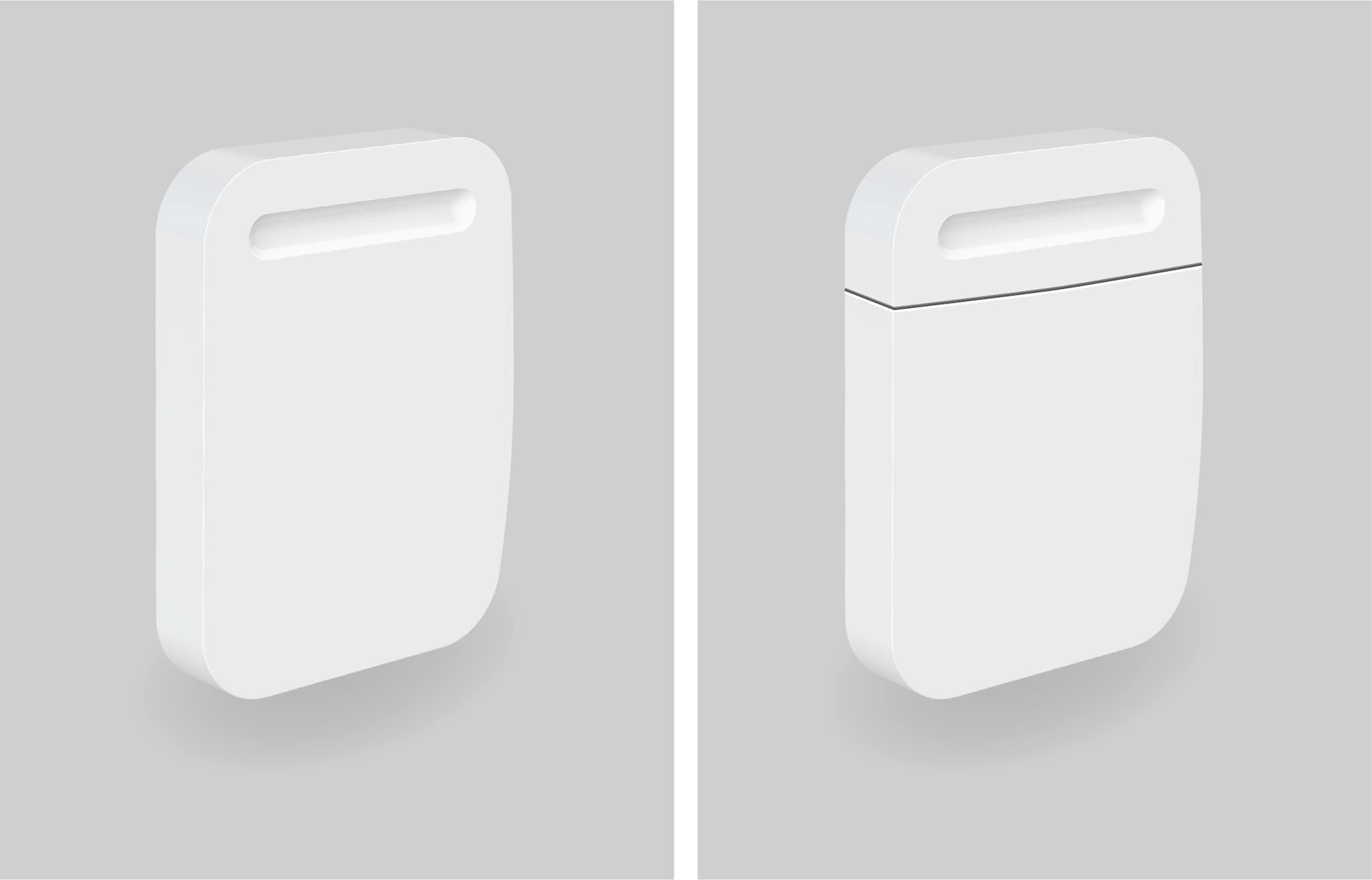
Color, materials & finishes can also be used to provide visual separation, refer:
Avoid breaking up surfaces unnecessarily to avoid visual clutter and to maintain visual simplicity.
Design Details
Concealed Complexity vs Exposed Details
As a rule of thumb, high levels of visual complexity should be concealed where possible (whilst not impacting functionality) as it reduces visual clutter and minimizes unnecessarily information to the user therefor promoting a cleaner, simple and friendly aesthetic improving device Approachability.
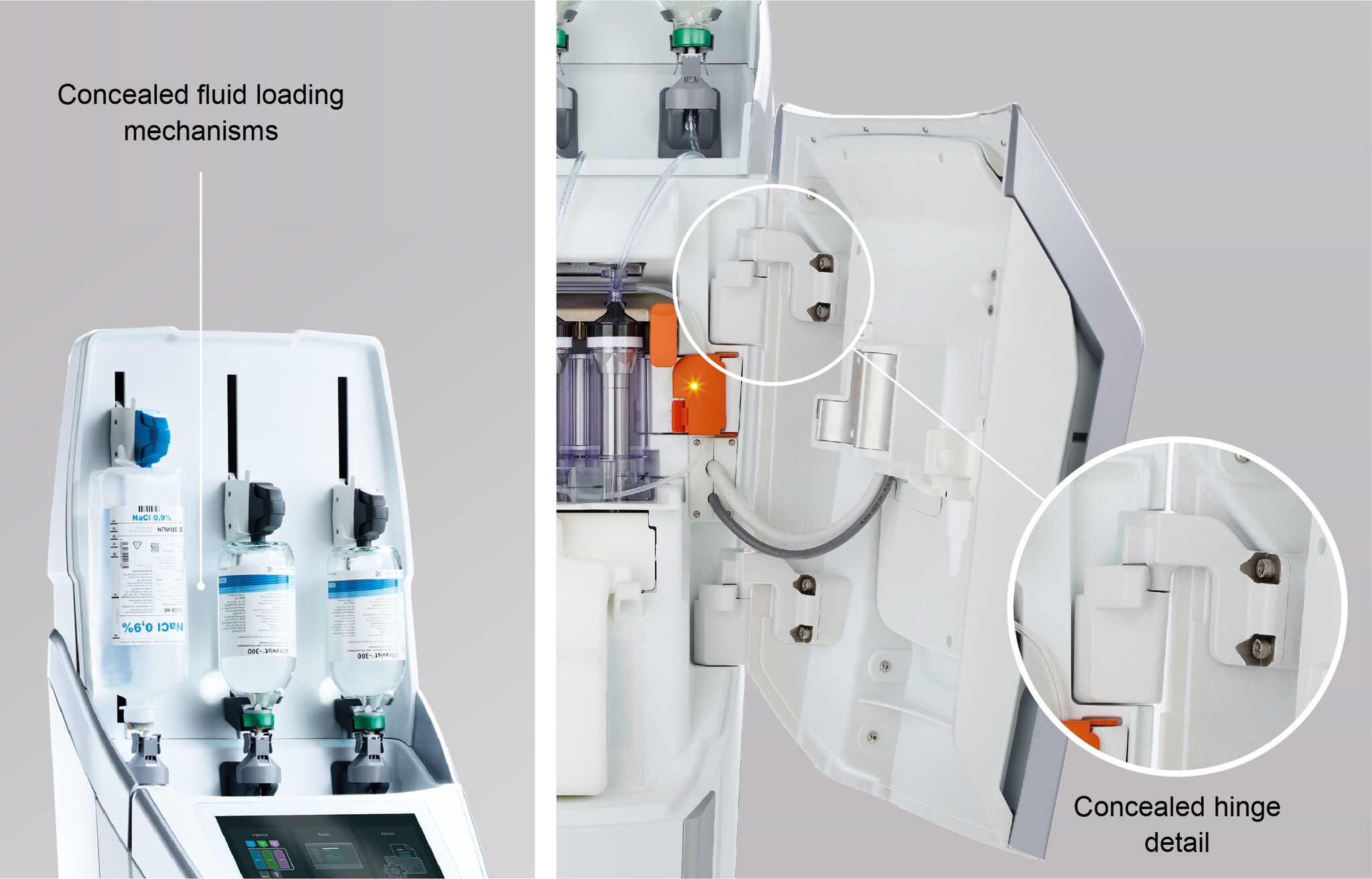
When the aim is to emphasize a sense of high technology or high quality in performance, you may choose to expose more visual details, cues and information. A balance should be sought in exposing a level of detail which can convey these qualities whilst not becoming overly visually complex or intimidating.
Edges & Corner Treatments
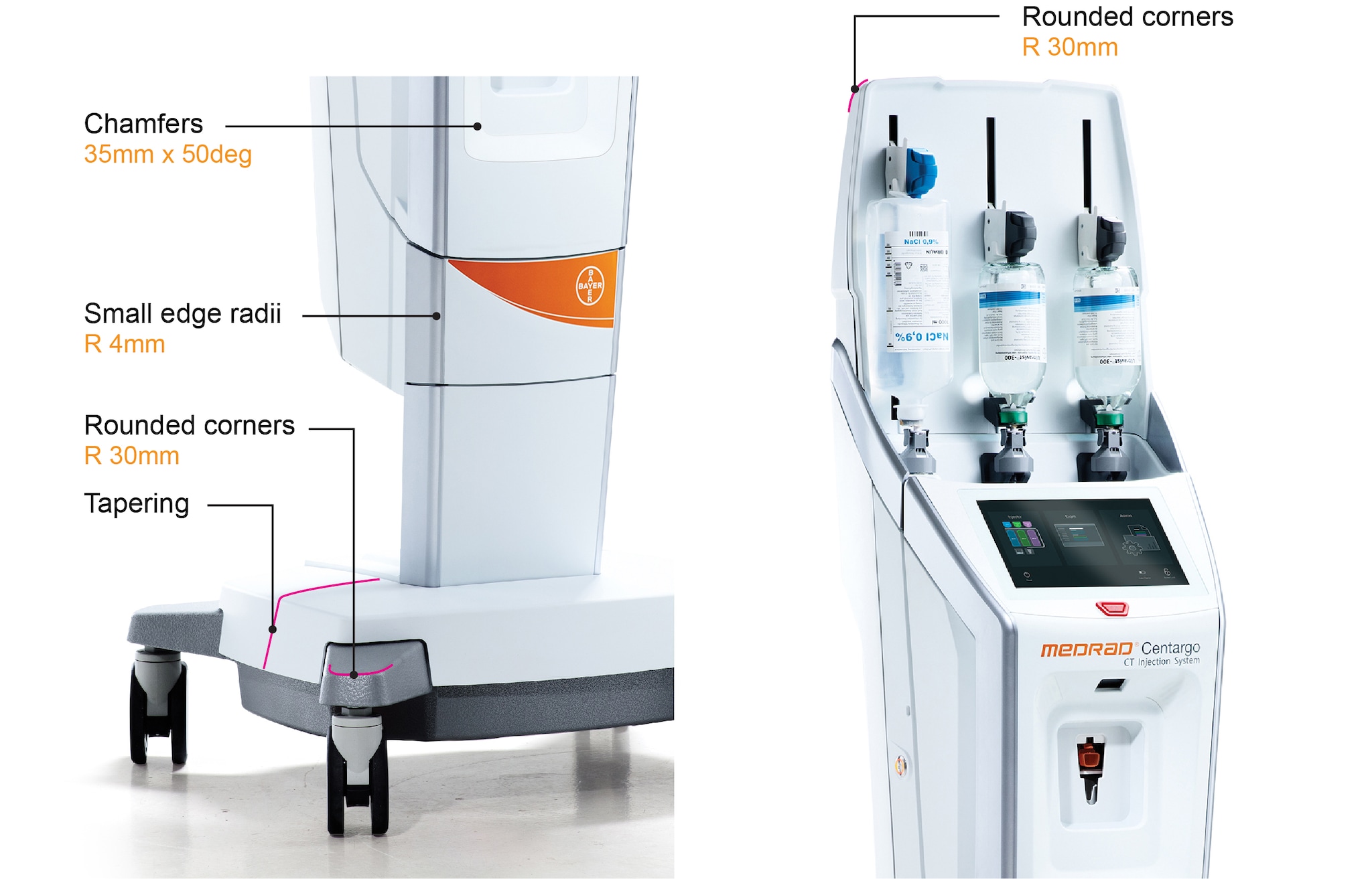
For edge and corner treatments, a balanced use of rounded and chamfered details should be considered.
Use rounds on corners to visually soften visual shapes and elements of the device (and for functionality), larger rounds can be used on overall silhouette defining shapes.
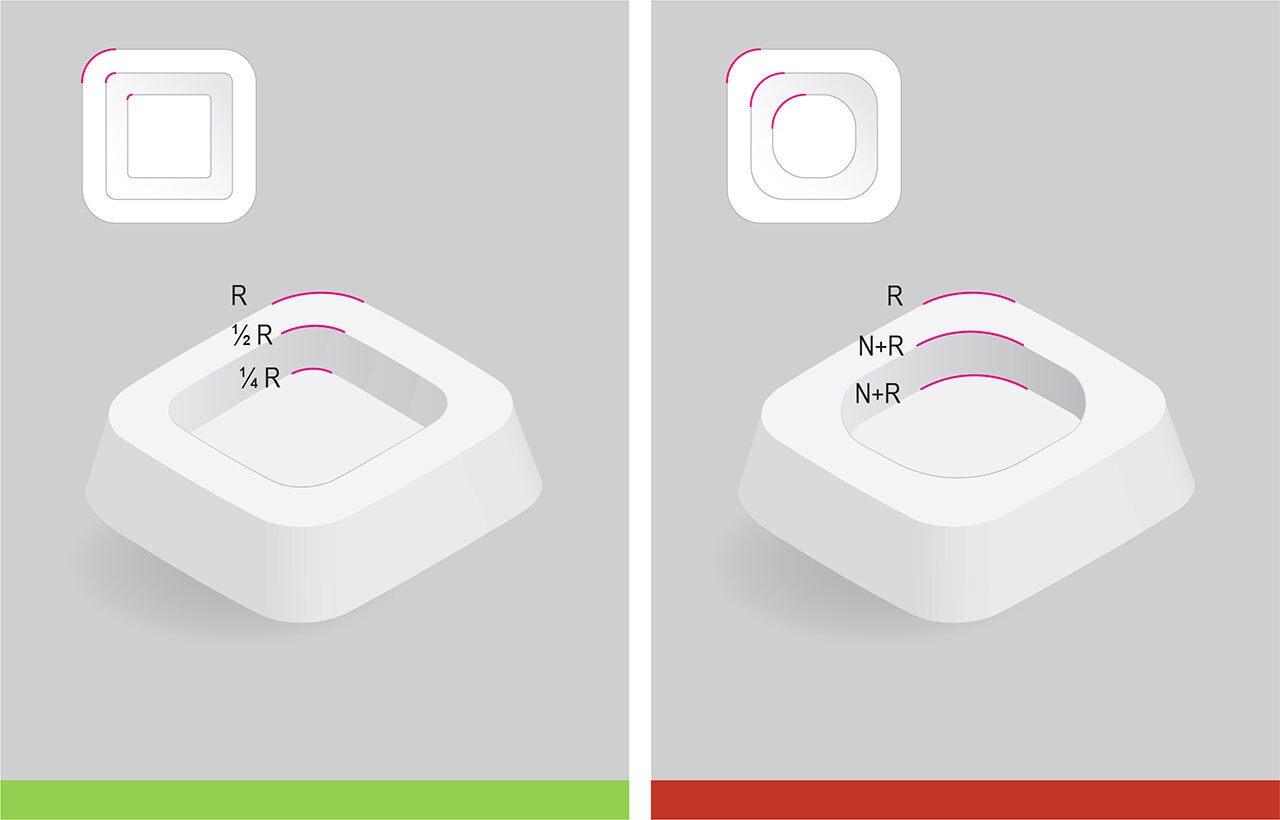
Avoid using overly large rounds on edges where possible, especially on large volumes as it can melt surfaces visually into larger surfaces and emphasizing a large size or volume. Overuse of large rounds may also contribute in making shapes seem organic. See below figure:
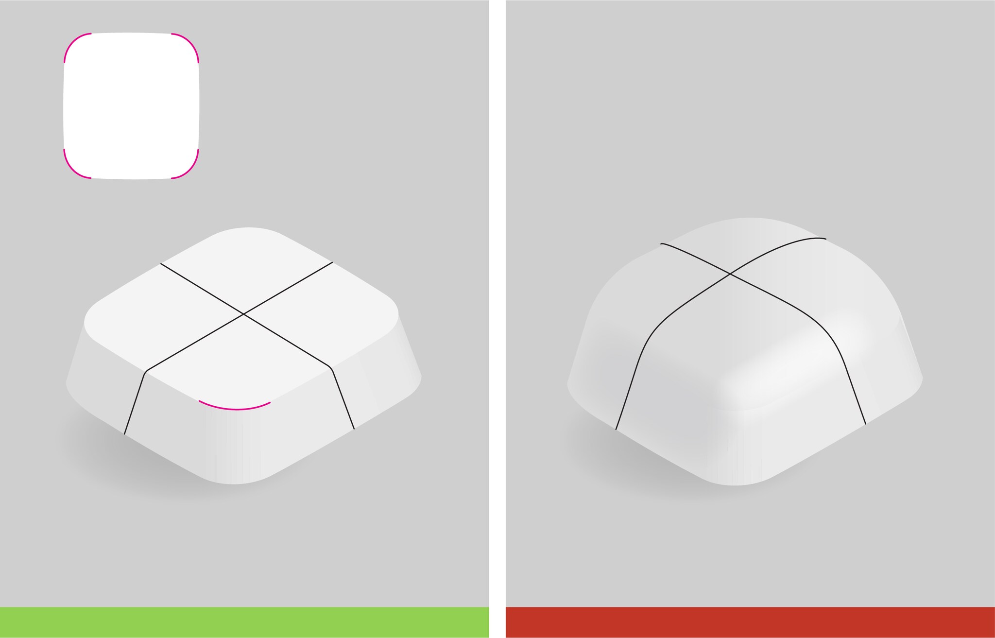
When treating corresponding corners of a feature (recess/protrusion) or on the main silhouette defining shape, adopt smaller rounds then that used on the main shape.
Chamfers are used to visually facilitate a stronger ‘machined/ masculine’ appearance which can promote a sense precision and therefore high-quality visual.
A balance in edge and corner treatments is pursued to convey both an Approachability & Care, yet high performing, quality look and feel to evoke Confidence and Trust.
Summary
- When defining the shape, form and surface treatments for a physical device, consider Bayer themes, product attributes and the use environment of the device.
- Adopt simple, softened geometric shapes to define the overall device silhouette.
- Avoid use of overly organic shapes.
- Where required, the perceived volume of the device should be reduced.
- Use slightly convex curved surfaces for a softer aesthetic.
- Curves should be large, sweeping and continuous.
- Use surface breaks to separate different functional areas of interest or to reduce perceived volume.
- Complex mechanisms and details should be concealed where possible and not impact device functionality.
- Edges and corners should balance the use of rounded and chamfered features to maintain an Approachable but high performing/quality aesthetic.


