Design principles
When developing packaging for disposables, the designs should consider:
- Clarity: Printed information and labels should be clear and legible.
- Regulatory Compliance: Applicable and relevant regulatory requirements, guidance and standards for packaging should be followed.
- Consistency: Packaging should be consistent in its Industrial Design across all products, where possible.
- Sustainability: Packaging should consider sustainable practices including the selection and reduction of materials, size and shipping volumes and overall environmental impact.
- Sterile Fluid Path: Packaging and disposables designed for sterile fluid path should be considered since this may support sustainability such as reduction of packaging materials.
Packaging Formats
Historically, there have typically been 2 “sterile barrier” packaging formats for the primary packaging of the limited/single-use disposables: Trays and Soft pouches.
Tray
The Tray-based packaging format typically uses a vacuum-formed, semi-rigid plastic tray to house the disposable sealed with a print-labelled Tyvek layer.
This semi-rigid format is used to ensure sterility is maintained for the shelf life of the product and is typically used for disposables or components that have more mass/weight and are at greater risk of damaging the primary package (and thereto the sterile barrier) during transportation/handling.

Soft Pouch
The Soft-pouches format packaging typically uses two layers of soft plastic and a print-labelled Tyvek or plastic layer. They have been either procured “empty” from the supplier or formed from sheets via Bayer manufacturing, then filled and sealed.
This format is used for smaller disposables which are generally lighter and do not require as much robustness/rigidity in order to maintain the sterile barrier for the shelf life of the product.

Label Artwork
When designing artwork for labelling, consider the following:
Information Layout
Use uniform borders and sufficient margin widths to keep information central and to avoid areas which require physical sealing which may affect information legibility.
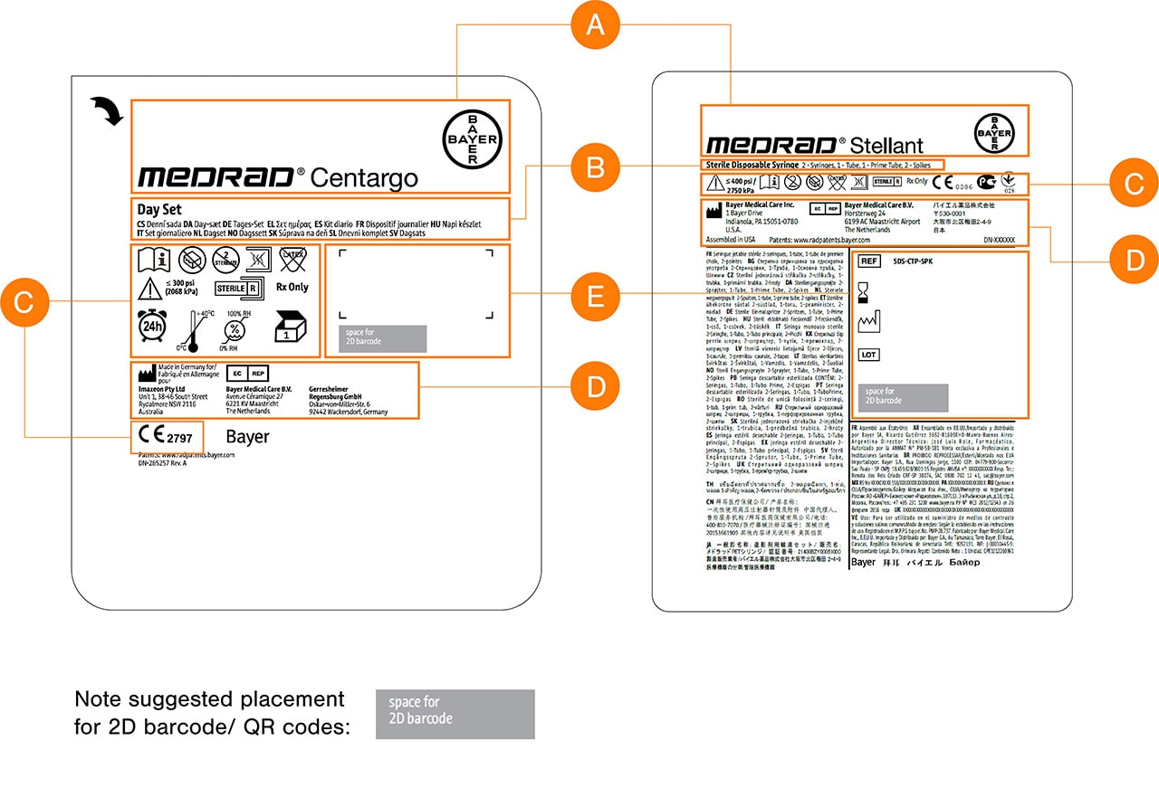
Use a grid structure (per the figure below) to group information on the label and to maintain legibility and allow items to be easily scanned visually by the user.
Provide sufficient space of at least 3mm in between individual graphical elements.
Reserve space for secondary printed information (variable data) such as barcodes or batch numbers.
Information Order & Hierarchy
A. Elements with the most visual presence on the label should be the
Bayer cross and Commercial Product logos.
B. The Product Description or contents should follow and be clear.
C. Product Information & Regulatory Compliant Markings and clear
space for variable data such as batch numberor expiry date labels
for traceability should have their dedicated area and grouped to allow
for quick visual identification by the user.
D. Legal Manufacturing details. Text for this information may be smaller
but must retain clear legibility.
E. Lot/ Batch Information space allocation should be included.

Guidance on labelling type size, layout, headings, use of white space, warnings refer to standards:
- FDA (2001) Guidance on Medical Device Patient Labelling
- ISO 15223-1 (2012) Medical devices - Symbols to be used for Labels, General Requirements
For more guidance on packaging & Labelling, refer:
Bayer in Radiology Brand Guidelines 2020
Color
Use of a single, high contrast color for print is recommended for all information on the package label (e.g. black on white base).
Consider use of signature orange, blue or green as alternatives (to be consistent with Bayer brand colors providing there is still a high level of contrast and legibility of information and graphical elements).
Iconography
For disposable product information & regulatory compliant markings, follow the applicable and relevant regulatory requirements, guidance and standards.
Functional icons should be standardized where possible and used consistently across device disposable packaging.
Include an arrow indicator for tear off points on the packaging.
Guidance graphical symbols & icons refer to standards:
- DIN EN 980 (2008) Symbols for use in the labelling of medical devices

Note: Refer to latest published or applicable standards references in previous sections. Referenced standards may not be the latest or applicable to intended markets of SD.
Branding
The Bayer cross logo should be applied on all packaging. For current guidance on application of Bayer branding see:
Bayer in Radiology Brand Guidelines 2020

Sustainability
Each packaging has its own unique requirements to protect the packaging contents. When designing packaging, consider packaging solutions that are more sustainable while not compromising package integrity.
Materials
- Choose recyclable (and easily separable) materials.
- Limit different types of materials used within a single product’s package.
- Reduce size and thickness – reduction of the amount of material used.
- Where feasible identify material codes of contents and packaging on the device labelling to inform the user of recyclability.
Transportation
- Packaging volume – reduce size, weight and volume of the packaging where possible
- Packing configuration – shape of packaging (nested, stacked etc.) where possible
Next topic – Graphical User Interface Design
If you have any further questions about this or any other section of Bayer Identity Net, please contact:


