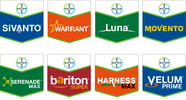
Brand Logo/Brand Tag: A trusted friend for over three decades
Our brand logos were designed to evoke a positive effect on customer commitment to the brand and to replace retailers from being the primary interface between products and customers. They are a symbol to signal our customer’s quality, experience, and trust. Brand Logo and Bayer Brand Tag involve a fusion of existing brand values.

Rules for creating Brand Logos
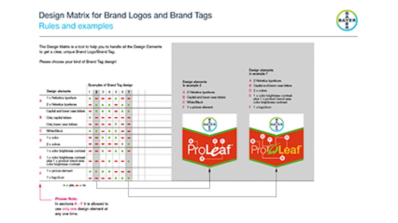
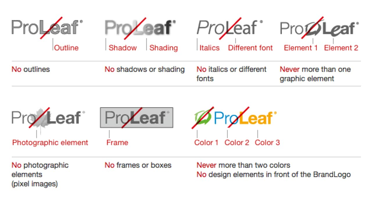
Only a limited number of design elements may be used in designing the Brand Logos. Additional design elements should, for example, always create a link to the brand core, the name, the crop, the disease, the application or the mode of action. These elements must be distinct, and preferably pictograms or icons.


Fonts
No more than two fonts from the Neue Helvetica family may be used in one Brand Logo. Small capitals, italics or condensed fonts are not permitted.

Design elements
A letter or the wordmark may be replaced by a design element.

Colors
Up to two different colors and gradations on those colors are permitted in one Brand Logo. However, the colors of the Brand Logo in the Brand Tag must match.
Rules for creating suffixes
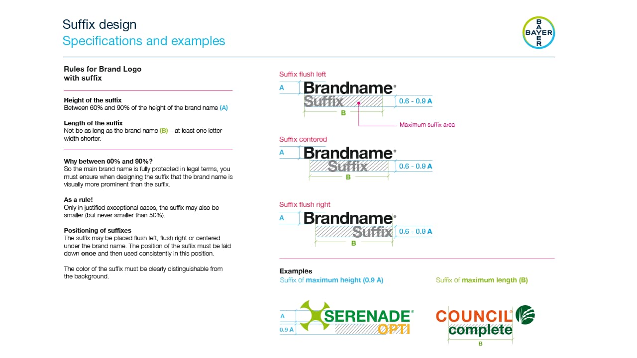
Suffixes are used in Brand Logos to highlight different application forms
of a product.

Height of the suffix
Between 60% and 90% of the height of the brand name (A).
Length of the suffix
Not be as long as the brand name (B) – at least one letter width shorter.
Why between 60% and 90%?
So the main brand name is fully protected in legal terms, you must ensure when designing the suffix that the brand name is visually more prominent than the suffix.
As a rule!
Only in justified exceptional cases, the suffix may also be smaller (but never smaller than 50%).
Positioning of suffixes
The suffix may be placed flush left, flush right or centered under the brand name. The position of the suffix must be laid down once and then used consistently in this position.
The color of the suffix must be clearly distinguishable from the background.
More specifications and examples
See download in the right hand column.
Brand Logo examples

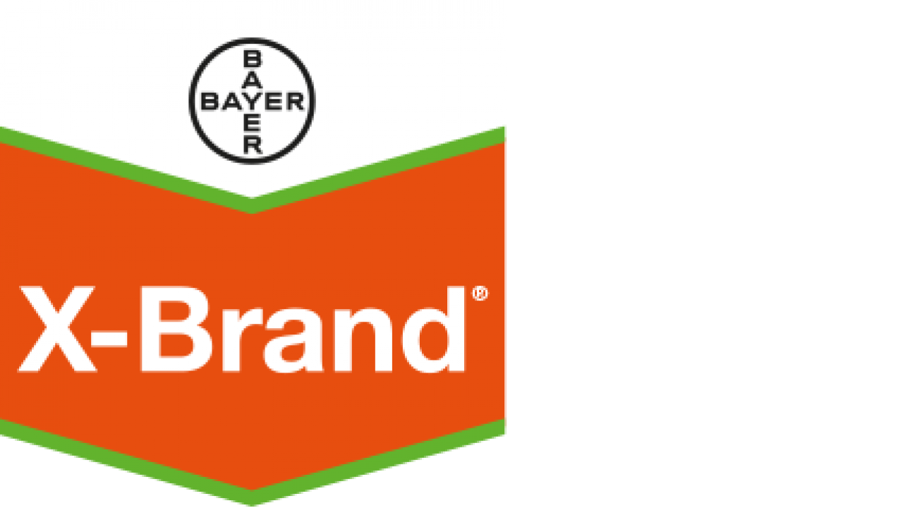
The well known Brand Tag design
The shape of the Bayer Arrow also known as Brand Tag spearheads our products’ attack on the shelves and in the media as they battle for recognition against an ever-growing number of competing products.
It’s a battle that our Brand Tag is winning. More than two-thirds of our customers immediately associate the arrow with Bayer – without seeing the Bayer Cross or a product name. The Bayer Arrow acts as a frame around the product details. Whatever the product.
Combined Strength
In bringing together the Bayer Cross, the Brand Logo and the Bayer Arrow design, we are fusing the three most powerful brand assets into a streamlined logo – the Brand Tag.
A simple idea that harnesses all their individual power into a force that will be even more effective at any point of contact with the customer. And cannot be copied.
Rules for creating Brand Tags
The Brand Tag is used in product advertising, brochures, on packaging, etc. The Brand Tag should be used on all physical products.
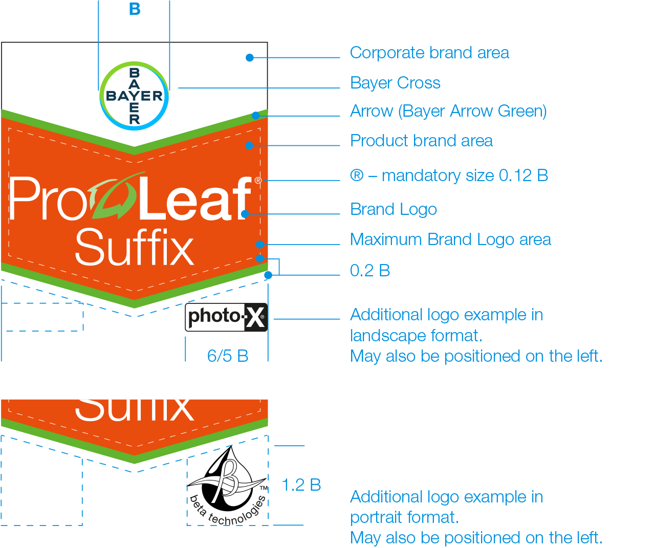
Composition of Brand Tags
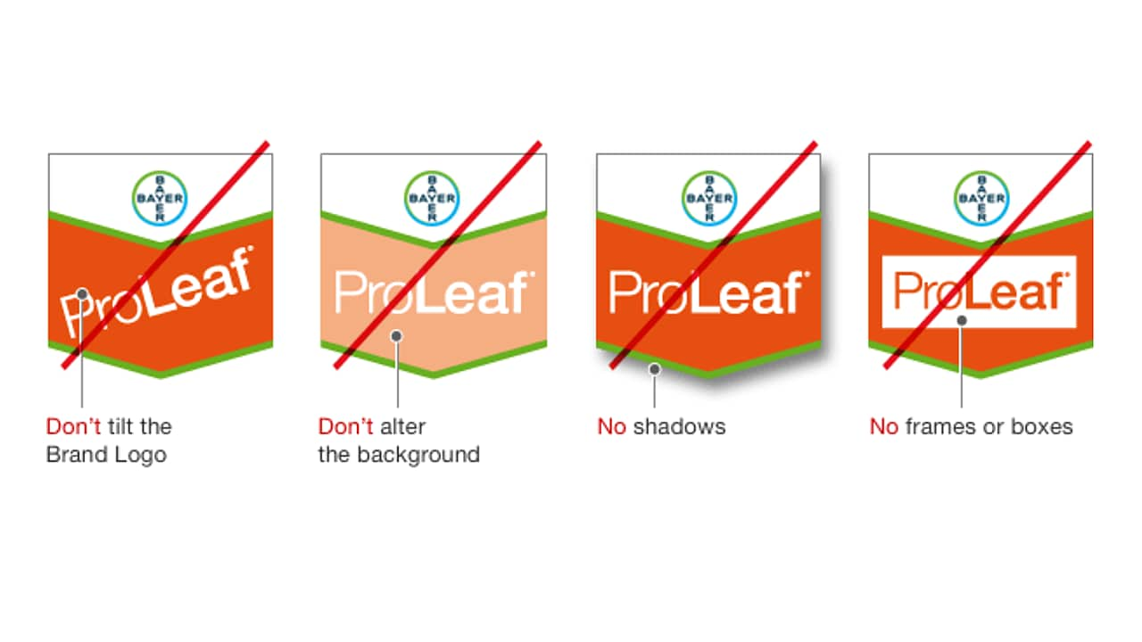
The elements of the Brand Tag – the corporate brand area, the Bayer Cross, the Bayer Arrow, the product brand area and the Brand Logo – must not be altered in their basic composition. Only the Brand Logo can be individually designed.
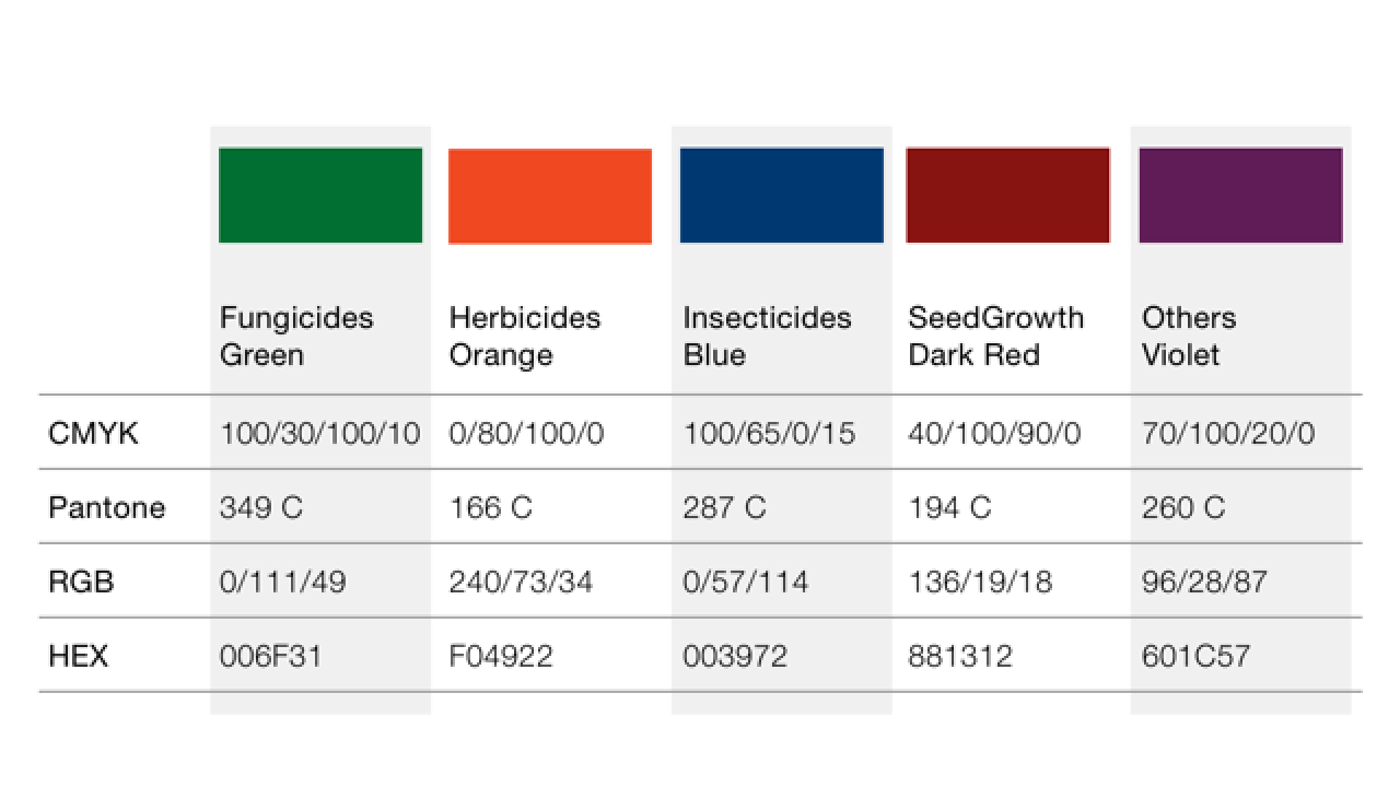
The product brand area color of the Brand Tag always corresponds to the respective product category; here, for example, orange 80M / 100Y for Herbicides.
The Brand Tag should preferably be used with the 4c version of Bayer Cross. The width of Brand Tag with the 4c Bayer Cross must never be less than 52 mm. In the case of smaller images the Brand Tag with the black line art Bayer Cross should be used.
Positioning and size of Brand Logos
To achieve the best possible impact of the Brand Tag, always make maximum use of the space inside the product brand area. The Brand Logo must positioned inside the dotted line with a minimum distance 0.2 B to the edges. For a well-balanced positioning in the product brand area it is important to position it by eye and not by scaling.
Positioning of additional logo elements
Additional logo elements are to be positioned below the dotted lines of the Brand Tag.The distance to the edges may not be less than 0.12 B.
Color of Brand Logos
To ensure good readability, the color of the Brand Logo must be enough of a contrast to the background color of the product categories.
Grayscale and line art Brand Tags for specific requirements
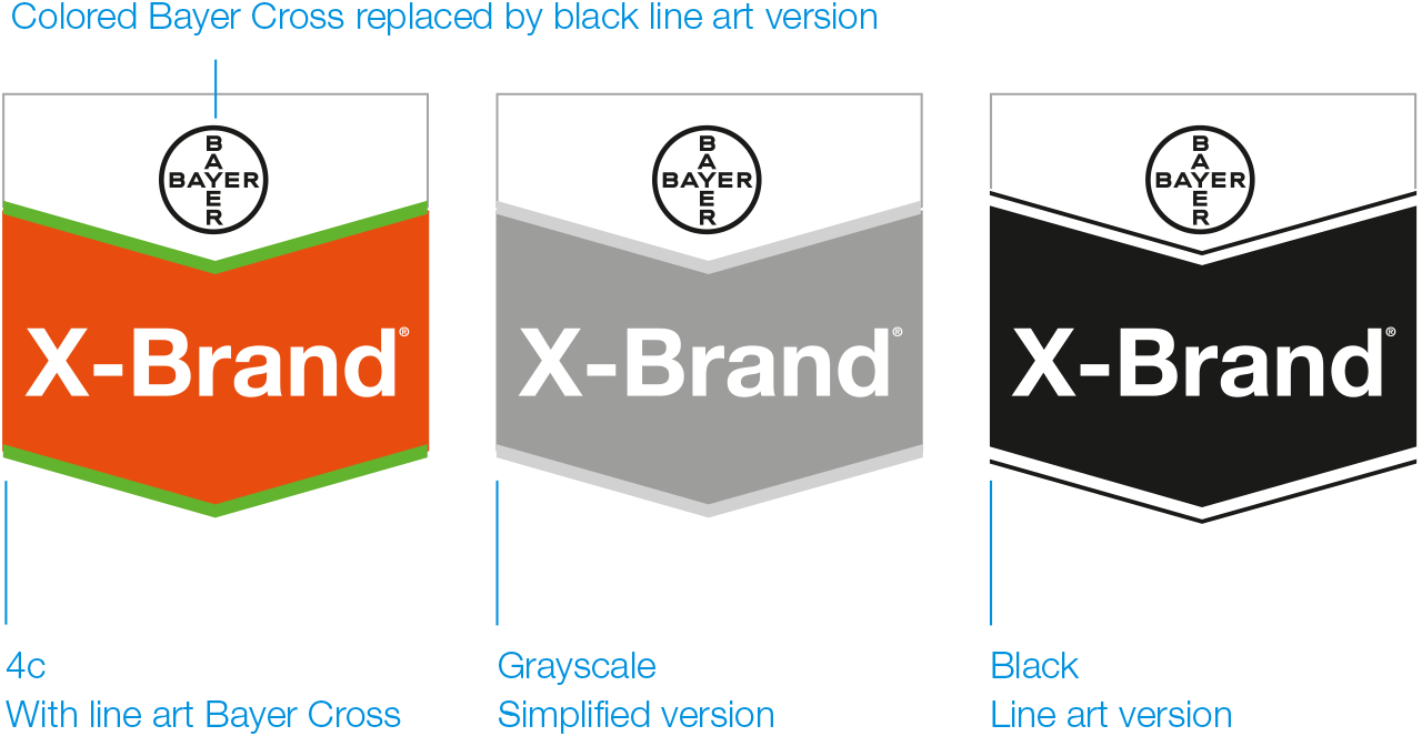
BrandTag 4c with black line art Bayer Cross
If the BrandTag does not meet the requirements of certain printing techniques (especially in label printing), the line art version of the Bayer Cross should be used. This version also has to be used if the width of Brand Tag is less than 52 mm (e.g. on the inside pages of brochures). The general rule is that the line art version has to be used if the diameter of the Bayer Cross is less than 10 mm.
See usage and minimum size of Bayer Cross
Brand Tag as simplified grayscale version
The grayscale version should only be used if it can be printed properly. The gray of the product brand area remains unchanged for all product categories.
Brand Tag as black line art version
The line art black version should only be used for economical reasons.
