Ambient Branding
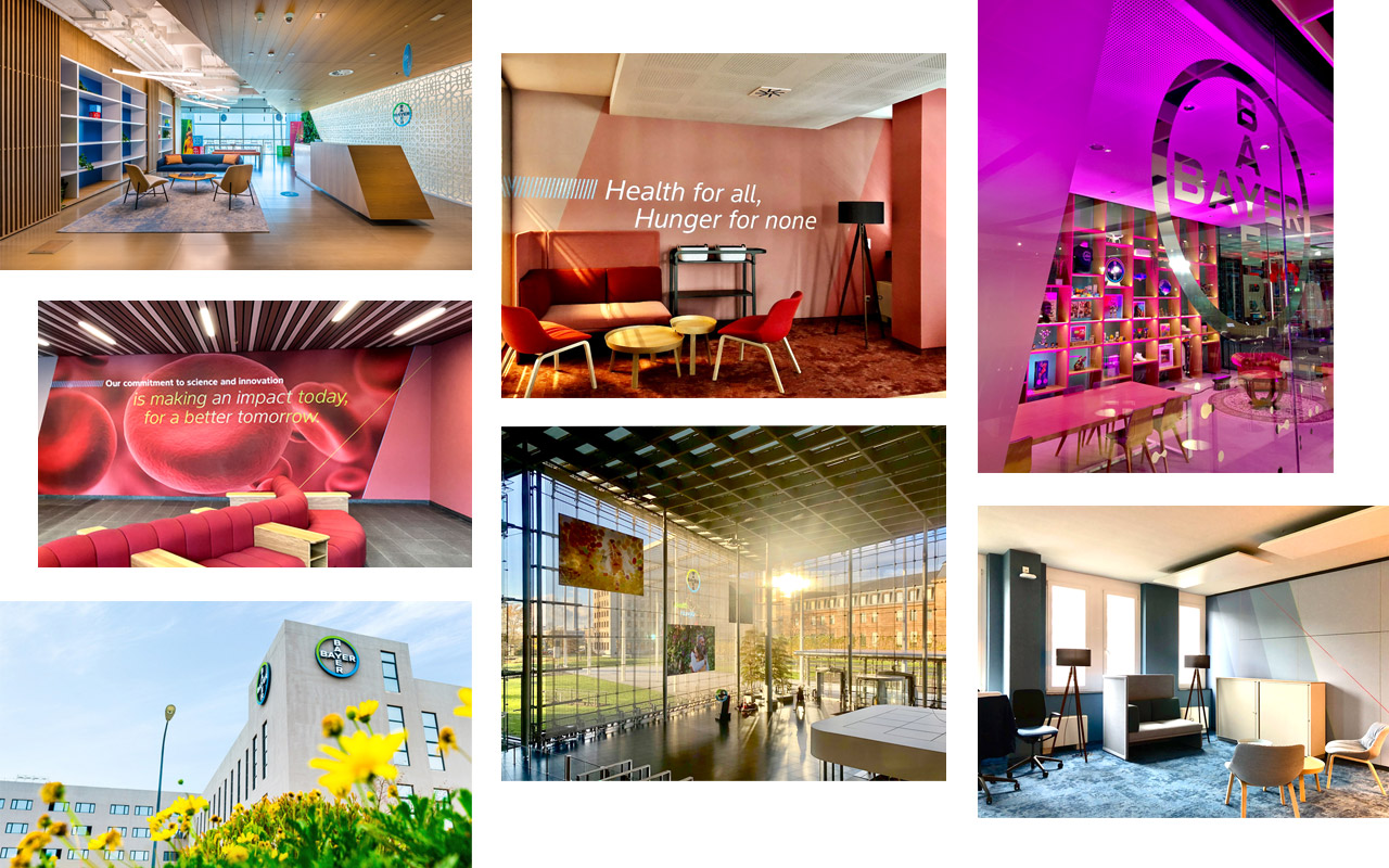
First impressions count! Our company’s reception areas, foyers, waiting areas, and conference rooms need to convey a positive atmosphere in which people instantly feel at home and visitors immediately know they are in a Bayer building.
It is important that the interior design elements sensitively reflect the architectural heritage and style of the building in which they are housed. Although our ways of working will always be innovative, our designers must be conscious of and sympathetic to the existing structures and their details.
That is why this chapter describes the corporate design elements, but does not offer any ready-to-use templates. Our corporate interior design elements allow for flexibility in interior design. They must be planned and agreed with local architects and designers, and adapted to the available space. If you need help to create your work environment, please contact Bayer Real Estate. For questions regarding design, please contact identitynet@bayer.com.
Foyer Principles
Our foyer is the first opportunity to communicate to visitors and staff that we are an optimistic, energetic brand. It goes without saying that our main principle is that guests are always welcomed by optimistic, warm-hearted and helpful staff. However, whilst budgets and space will change between locations, there are design features that should be considered in every foyer in order to create a uniform brand appearance.
Examples of reception areas
Examples of waiting areas
Meeting and conference rooms and area principles
Meeting rooms large or small should be set up to best facilitate digital and face-to-face communication and collaboration. These rooms must be bright and colorful to energize meeting participants. We want to provide meeting rooms that encourage communication by putting users at ease from the moment they walk in, for example through colors via carpets, rugs, upholstery, and lighting features.
Examples of meeting and conference rooms
Coffee corner principles
First of all, coffee corners are important social hubs in Bayer offices. Whilst functional, they should be designed in such a way as to foster and strengthen bonds between colleagues. As such, they should be warm and welcoming.
Examples of coffee corners
Examples of transition areas
Basic elements – Bayer Cross
The Bayer Cross can accentuate features in the interior design of our buildings. A Bayer Cross may be used to draw attention to glass doors, point to elevators, or highlight specific areas of a foyer. When planning its use, particular attention should be paid to the lighting conditions in the area. This is essential in deciding whether a Bayer Cross has to be lit up or not, and if so, what kind of lighting is required, i.e. backlit or spotlighted.
Basic elements – Corporate Colors and pictures
Our Corporate Colors are distinctive identifying features of the Bayer brand and can be used as a supplementary and enhancing recall element in designing rooms, facades, and corridors. In such cases, the Corporate Colors may be used in brighter shades – even as pastel hues – and color gradients, as long as they are still obviously derived from the Bayer Corporate Colors.
Partitions, screens, room dividers, and glass panels can be creatively and imaginatively decorated in the Corporate Colors. Although there are virtually no limits to the color design possibilities, we recommend that each particular color design should be finalized with the help of a graphic designer or interior architect, who can also deliver the required production data.
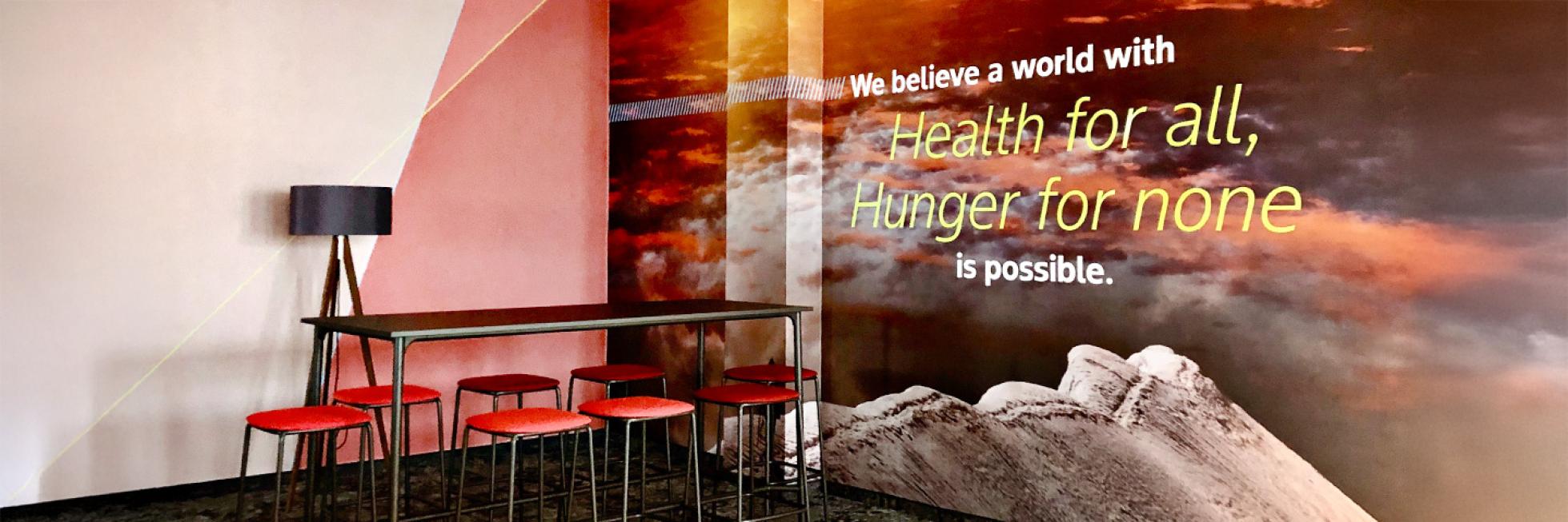
Wherever people meet, photos should encourage a dialog with Bayer and communicate new insights. Such photos should look lively, make Bayer more tangible, and help create an emotional bond between the viewer and Bayer. A selection of premium photos can be found in the Bayer Media Pool.
Color and photo examples
How to use photographs in interior design
In order to ensure that large-format images can be printed for interior design purposes with no loss of image quality, it is important to comply with minimum resolution requirements (dpi). These requirements are dependent on the expected distance between the viewer and the photo, and the required print format of the photo. Photos that will be viewed from a distance of less than 1 meter should have a resolution of at least 300 dpi to avoid a pixelated image. If the distance between the viewer and the photo is expected to be more than 1 meter, the minimum resolution can be less than 300 dpi:
Viewing distance: 1 m | Print format: approx. 60 x 42 cm | Resolution: approx. 100 dpi |
Viewing distance: 2 m | Print format: approx. 120 x 84 cm | Resolution: approx. 75 dpi |
Viewing distance: >3 m | Print format: approx. 356 x 252 cm | Resolution: approx. 50 dpi |
Proofs of photo sections in the intended final format will help you to judge how much enlargement is possible without loss of image quality.
If you have any further questions about this or any other section of Bayer Identity Net, please contact:
How to integrate digital applications in interior design
Digital elements set up in foyers, waiting areas or Bayer brand spaces can be a useful means of informing visitors quickly and thoroughly about Bayer’s highlights in the fields of healthcare and agriculture.
The Bayer Brand Screen animation illustrates our corporate purpose, “Science For A Better Life”, in an entertaining and fresh way in a 10-minute video compilation which can be used as a loop. For movie files see download section in the right column. Get a glimpse of this animated Bayer Cross here.
Please also visit our Digital Applications section for inspiration about our digital applications and their possible use.
How to integrate 3D brand objects in interior design
3-dimensional brand objects differ in their expression to moving digital applications by being solid and sometimes static. Instead of delivering momentary impressions they offer the chance to express the steadiness and strength of the brand. They create an iconic brand presence.
Placing these 3D objects in central, highly frequented places it reflects also the proximity of the brand and can even foster the bond between the brand and its stakeholders.
One good example is the Iconic 3D Bayer Sign. That colorful brand object emphasizes the presence of the brand in important areas. Through its everyday presence it serves many occasions: It welcomes new visitors and invites stakeholders to share their Bayer moment in a natural way – by jointly taking photographs or posting their selfies on social media.