Websites Design
Design Principles
The Corporate Design of our company reflects the modern, human-centric, progressive and trustworthy Bayer brand. Based on the brand personality attributes that are optimistic, passionate, and visionary, the design translates the brand positioning into the overall visual appearance. For digital media, this design is adapted with a strong focus on user experience. Key aspects of the user experience are:
User-centricity – focus on a user’s needs and expectations
Consistency – allows a consistent, predictable and easy-to-navigate experience
Flexibility – allows a user-friendly and clutter-free content presentation
To provide the best possible usability and navigation, a website must reflect device capabilities, react properly to user actions, and detect the medium where the site is currently being viewed. These principles, known together as responsive design.
Content is positioned on a flexible grid that adjusts to fit a device's screen size by adjusting the size and/or numbers or columns. Images and other media are carefully prepared to adapt to changes in the grid and ensure that, whatever the screen size, the content is appropriately displayed.
Key Elements – Overview
A consistent look and feel of Bayer Websites around the world is part of the company's stated aim of presenting a single public image to customers.
When designing corporate, product, topical or campaign websites, some essential elements are specified to ensure a consistent presentation of our brand. In the center are the principles of our verbal and visual identity. For a uniform page layout, please consider the following layout and design principles:
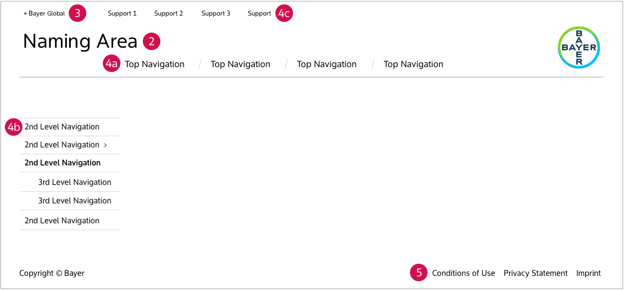
- The Bayer Cross reminds users that they are surfing on a Bayer website, positioning Bayer as a unique and worldwide brand. The Bayer Cross can be placed on the right or left.
- The product logo, campaign title, or company or divisional name in the Naming Area clearly identifies the subject or purpose of the particular website.
- The Bayer Global Link links every Bayer website with the global portal.
- Navigation
a.The top navigation shows the main topics of a website.
b. The left-hand navigation provides additional levels of content, if required.
c. The support navigation provides key website functions. - The legal notices protect Bayer websites from misuse by third-parties, either by private users or commercial users; establishes Bayer's rights on content, design and information databases.
The Position of the Bayer Cross
The Bayer Cross identifies and endorses the websites with our strong corporate brand. The Bayer Cross is to be used in color wherever possible (see the resepective page in the Identity Net for further details).
On the websites with their focus on corporate content, the Bayer Cross is placed on the left-hand side close to the naming area of the header. On these websites the Bayer Cross is linked to the homepage of the website or to the homepage of the global Bayer portal, www.bayer.com.

On websites where a product or a campaign is the focus, the Bayer Cross is on the right-hand side of the header, leaving space in the naming area for the brand or campaign title. On these websites the Bayer Cross must be linked to either the global Bayer portal, www.bayer.com or the local corporate country portal.

Website Name
The product logo, campaign title, or company or divisional name in the Naming Area clearly identifies the subject or purpose of the website.
Navigation
A clear and consistent navigation is essential to provide orientation for users. It should be adapted to work well with a range of devices, such as a mouse and a touchscreen, and screen sizes and use the relevant conventions accordingly, e.g., two-stage hover and click for pointing devices, but touch equals action for touchscreens.
a. Top Navigation
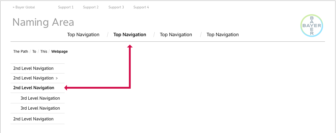
The top navigation shows the main topics of a website and works like a table of contents, or a store directory so that a user always knows whereabouts they are and where to look for more information.
b. Left-hand navigation
The left-hand navigation provides additional levels of content, if required. Where there are multiple levels of content navigation should be extended using the left-hand navigation and flyouts.
Some situations where left-hand navigation is not required:
- in an ordered workflow
- content is not organised hierarchically. e.g. solely by topic as in a magazine or blog
On a site with multiple levels of content, breadcrumbs can really help.

c. Support navigation
The support navigation provides key website functions and groups together functions that are relevant for the whole website. Functions can also be placed elsewhere on the page: search as part of the top navigation or the sitemap in the footer of the page.

Sample items that can appear in the support navigation (in alphabetical order):
| Bayer Global | Link to the Bayer Global portal | If there is not a prominent link to the Bayer global portal in the header |
| Contact | Link to contact form or e-mail addrees | Required |
| Language | Allow user to switch between content languages | If the website exists in more than one language |
| Login/Logout | Link to login form or logout function if a user is logged in | Required if users can log in |
| Search | Link to website search | If the website has a search form |
| Sitemap | Link to sitemap | If the website has a sitemap |
Legal Notices
The Imprint, Privacy Statement and the General Terms of Use ensure that essential legal information is permanently accessible for users at the same position on all Bayer websites.
Links to the legal notices are placed in the footer. If additional items are included in the footer, they must be placed separately from the legal advice links.
The links must be clearly legible so the font size and color must be chosen to provide sufficient contrast with the background.
Below is a sample footer with legal notices. Please also have a look at the chapter “Legal Requirements” that provides more detailed instructions and templates for each element.

Typography
The standards for all Bayer websites (for content, navigation, etc.) are the newly created Bayer Sans. Bayer Sans is the only official font and when you use any other font, please check licenses. For non-Roman alphabets please use the Noto Sans (licensed under the Open Font License) typeface. Everything you need to know about the use of the typeface at Bayer can be found here.
Favorite Icons
The favorites icon adds an individual symbol for "favorite" or "bookmark" sites. The symbol is displayed both in the list of bookmarks or the address bar of the browser. Favorites can also be dragged onto the desktop.
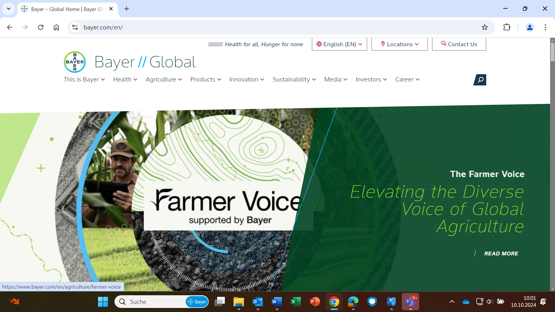
We have two favicons that are used for Bayer corporate websites — one for when browsers are in light mode and one for when browsers are in dark mode. The browser should dynamically display the correct icon depending on the selected color mode of the browser.
![]()
Download Bayer favicons (5 KB zip file)
It is possible to use a favorites icon derived from a product brand. We recommend that you include images of up to at least 48 x 48 px in the icon file. For all images larger than 16 x 16 px the Bayer Cross must be part of the image!
Examples
![]()
![]()
Photoshop templates for product favorites icon. (25 KB zip file)
If you want to learn more about favorites icons and how to add them to your site, please read more
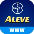
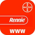
For mobile devices, web clip icons are special favorites icons that can be used to add your web application or webpage link to the home screen.
| 
|
A line-art Bayer Cross must be part of the icon but can be freely placed as long as the minimum distance from the edges is respected. If the product logo already contains the Bayer Cross, an additional one should not be added.
The coloring of the title bar can be freely adjusted to suit the product logo.
The combined image can then be saved in the relevant sizes (76 x 76, 120 x 120, 152 x 152, and 180 x 180 pixels).
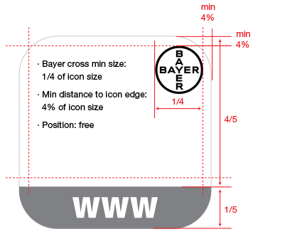
To specify an icon to represent your web application or webpage on iOS, follow these simple steps.
If you have any further questions about this or any other section of Bayer Identity Net, please contact:

