Digital Advertising
Advertising and PR are increasingly taking place in digital spaces, social media, and search engines, as are communications in general. That is why it is vital that just as much care is given to the correct use of our brand and the Bayer logo as in print and video material. All the specific guidelines, links and most important rules for digital advertising can be found in this chapter. Part 1 deals with banner advertising, part 2 with social media ads. While branding in social media is very flexible, you may find some of the banner information is useful guidance for social media ads and posts. The rules for social media channel design can be found here.
Banner advertising
Formats of banner ads
Numerous digital advertising formats are in use around the world: banner, skyscraper, layer, full banner, rectangle, leaderboard, and many more. This chapter contains only the most important formats that are used in general display networks and for Google AdWords.
Overview of standard banner formats for Google AdWords:
- 120 x 600 skyscraper
- 160 x 600 wide skyscraper
- 200 x 200 small square
- 240 x 400 vertical rectangle
- 250 x 250 square
- 300 x 50 mobile leaderboard
- 300 x 250 inline rectangle
- 300 x 600 half-page
- 320 x 50 mobile leaderboard
- 320 x 100 large mobile banner
- 336 x 280 large rectangle
- 468 x 60 banner
- 728 x 90 Leaderboard
- 970 x 90 large leaderboard
- 970 x 250 billboard
Overview of banner formats often used in other display networks:
- 88 x 31 micro-bar, micro-button
- 120 x 40 rectangle
- 120 x 60 button
- 120 x 90 button 1
- 120 x 240 vertical banner, small skyscraper
- 120 x 600 skyscraper, standard skyscraper
- 125 x 125 square button, big square
- 150 x 50 3:1 rectangle
- 160 x 600 wide skyscraper, broad skyscraper
- 180 x 150 rectangle
- 200 x 200 small square
- 234 x 60 half-banner
- 240 x 400 vertical rectangle, fat skyscraper
- 250 x 250 square, square pop-up, pop-up
- 300 x 250 medium rectangle, inline rectangle, content ad
- 300 x 600 half-page banner, half-page ad
- 320 x 50 mobile leaderboard
- 320 x 100 large mobile banner
- 336 x 280 large rectangle
- 468 x 60 full banner, standard banner, full-size banner
- 728 x 90 leaderboard, super banner, supersize banner
- 970 x 90 large leaderboard
- 970 x 250 billboard (YouTube masthead)
If you have any further questions about this or any other section of Bayer Identity Net, please contact:
Position of the Bayer Cross in banner ads
Irrespective of the digital format or channel chosen, every digital ad must contain the Bayer Cross – either as part of the banner itself or as part of the channel. However, for animated formats it is not necessary to show the Bayer logo for the entire duration of the animation.
Depending on the channel and format, the positioning of the Bayer Cross in digital advertisements may vary. You can freely position the Bayer Cross in the ad as long as you observe the minimum space around the logo and the rules regarding the size of the Bayer Cross and the permitted background colors or photo backgrounds. Please also refer to the chapter on the Bayer Cross.
Placing the logo in layouts
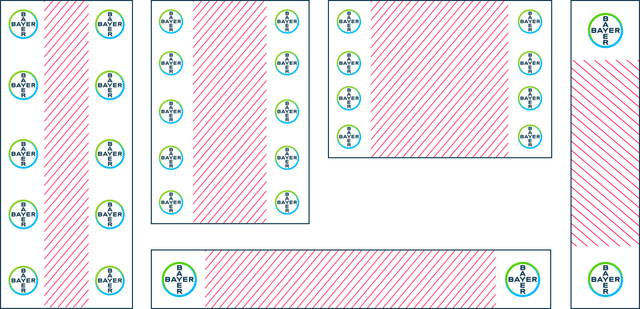
You can place the Bayer Cross on the left or right-hand side, depending on what best suits your composition (see diagram below). Always avoid placing it in the middle.
Specific guidance for digital usage
Use a logo size that makes sense: Bayer, as part of the logo, always has to be easily readable. If this is not the case because the logo is too small, no logo should be used.
The full-color logo is always preferable, but if the background is a photo or only a small logo can be used, it may well be advisable to use the white or black version. Please note that these are separate logo files so the full-color logo must not be converted to white or black.
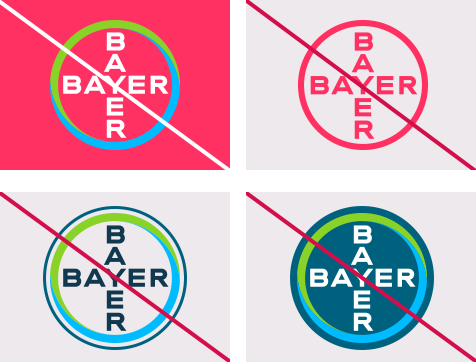
The full-color Bayer Cross is only permitted on certain colored backgrounds.
Apart from full-color, white and black, no other colors of the Bayer Cross are permitted.
Nothing should be added to the Bayer Cross itself, i.e. no white or colored rim or circle, no button-like colored area, etc.
Color spaces
white
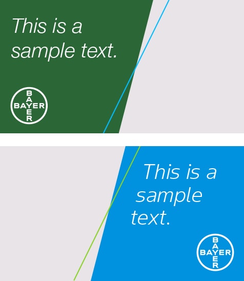
If color spaces are used in a banner, they can be positioned on the left-hand side of the banner so text can be placed flush upper left to facilitate reading. Text may well be easier to read when placed on a color background instead of directly on a photo. Please consider using our graphic device (the dynamic angle) as well.
Graphic device
white
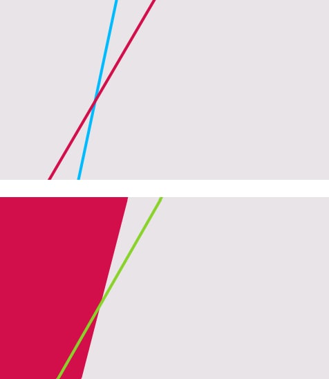
Please also make use of the dynamic angle device in digital communications. You may well want to use one, two or three of the angles to create a pleasant design, and to consider animating the device for banners. The following rules must be complied with:
All designs must use a dynamic angle.
In most instances the starting point for the dynamic angle is set at 12°.
The other angles that can be used range between 12° and 80°.
Do not apply gradients to the dynamic angles.
The angle always has to slope upwards, never downwards.
Please also refer to the section on the graphic device.
Typography, size, color and alignment in banner ads
Our newly developed Bayer Sans is the preferred type face. For more details please consult the Typography chapter.
The type size may well vary depending on the ad format, the language used, and the space available. Good readability is essential! As the overriding aim is to ensure a consistent and harmonious design, the individual charts or banner sections should not have widely differing type sizes.
Bold Italic type may be used to highlight specific words, phrases or sentences.
Only the corporate colors may be used for type. For details please see the Colors chapter. Whatever colors are chosen, they must stand out from the background to ensure good readability.
In text alignment some flexibility is permissible for headlines, though this depends on the image chosen and the position of the graphic element.

Images and photos
Photos should be cropped to ensure that the main focus of the image is clearly visible and, not or only slightly covered if the transparent color space is used. Please refer to the Photography chapter as well
Call-to-action (CTA)
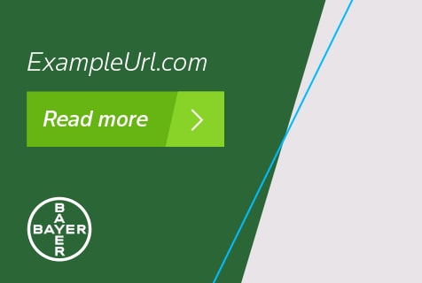
For advertising banners or elsewhere if suitable, it is recommended that the final image is a clearly visible call-to-action button that encourages people to click the banner or post
Animated advertising / story line
Digital advertising and social media increasingly allow the use of animations. If you want an animation, please consider using the animated Bayer Cross and the graphic device, which may rotate at an angle of 12°-80° during the animation. It is important that the graphic device always slopes upwards, never downwards. In each and every case banners should be concluded with the relevant URL and a CTA.
Regional differences
In some languages text is read from right to left. Please consider horizontally mirroring the banner examples shown in this section. You should also carefully check for additional legal requirements, such as mandatory verification numbers or the suffix “publication”. In many cases, your media booking partner or agency will be able to provide you with further information.
Digital advertising prototypes
Search engine ads
Search engines such as Google or Bing use the banner formats mentioned in part 1. Use of the wordmark Bayer is mandatory while the purpose is optional.
Social media ads
In view of the lively and fast-changing character of social media branding of social media ads, posts and stories is much more flexible than banner branding. All the rules for the design of social media channels and their set-up can be found in the social media channel design chapter
In spite of the specific requirements laid down by the respective channel (e.g. Instagram, Facebook or LinkedIn), please ensure the Bayer Cross is used correctly and that the post fits the overall Bayer style (e.g. tonality, photos, etc.).
Specific guidance for digital usage:
Use a logo size that makes sense: Bayer as part of the logo always has to be easily readable. If this is not the case because the logo is too small, no logo should be used.
The full-color logo is always preferable, but if the background is a photo or only a small logo can be used, it may well be advisable to use the white or black version. Please note that these are separate logo files so the full-color logo must not be converted to white or black.
The full-color Bayer Cross is only permitted on certain colored backgrounds.
Apart from full-color, white and black, no other colors of the Bayer Cross are permitted.
Nothing should be added to the Bayer Cross itself, i.e. no white or colored rim or circle, no button-like colored area, etc.
-
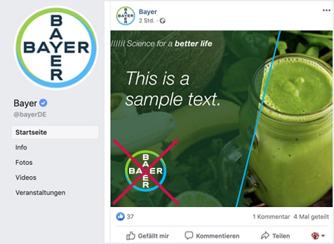
You need to decide if you want to add the Bayer Cross to the actual post/photo. This will depend on whether the Bayer Cross is already displayed as part of the channel frame. No duplication of Bayer logos in a small area is permitted.
Always consider using, where possible, some of the other visual identitys of our corporate design as well – for example, the graphic device/dynamic angle or color spaces in any of the corporate colors.

