


Web Design

Our websites are designed to act as the primary and most trusted source of information for both people and machines.
In a rapidly evolving digital landscape, where search behaviour and content consumption are increasingly shaped by automation and AI, websites remain the central destination for reliable and structured information. To ensure consistency and clarity across markets, Bayer websites follow a set of brand-driven principles. These principles define how the brand is expressed and experienced and should guide all design decisions when launching or evolving a website.
Core Brand Principles
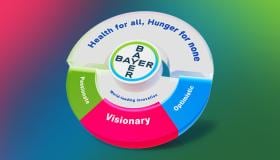
When designing a Bayer website, three elements define the brand experience in order of priority.
1. Bayer Cross
The Bayer cross is the most recognizable, trusted and distinctive brand element.
It serves as the primary visual entry point of every website
It is prominently displayed when entering a page
It remains continuously present through its integration within the navigation
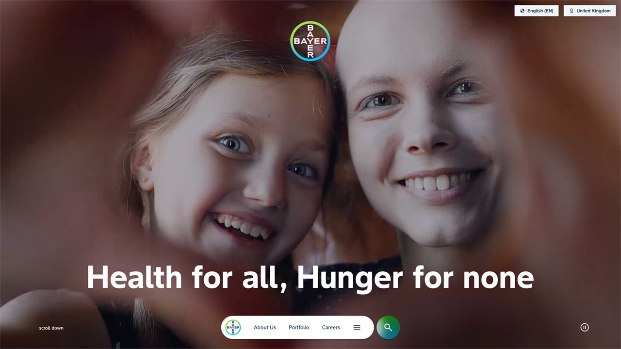
As our company’s most valuable intangible asset, the Bayer cross establishes immediate brand recognition and should always be clearly visible and given sufficient prominence. For corporate global and country websites, the Bayer cross is prominently featured in the first viewport and remains present throughout the experience via the navigation.
Corporate websites have the Bayer cross positioned centrally in the top area of the first viewport to increase visibility and brand recognition above the fold.
2. Bayer Mission
The mission statement “Health for all, Hunger for none” is a persistent element of the corporate web experience, filling it with meaning and direction. It is integrated within the sticky navigation and becomes visible during interaction, reinforcing Bayer’s purpose across the journey.
It is prominently displayed alongside the Bayer cross on the homepage
It remains present throughout the experience via the navigation
It becomes visible during interaction, reinforcing the mission as part of the user journey
3. Brand Identity
Bayer’s visual brand identity is expressed through a combination of visual, structural and interaction principles.
Visionary
Forward-facing layouts using dynamic angles
A distinctive typeface that creates clarity and energy
Motion and interaction that reinforce progression
Content structured to be accessible and interpretable by both humans and AI systems
Passionate
Strong use of colour to create emotional depth
Clear separation between immersive dark areas and functional light areas
Deep blue backgrounds used to create focus and intensity
Optimistic
Use of gradients to highlight key content and create visual emphasis
Imagery that shows real people in authentic, active situations
A visual language that feels open, energetic and forward-looking
Together, these elements create a consistent and recognizable brand experience across all Bayer websites.
Key Elements | Overview
Our websites are defined by a small set of core design elements. These elements should be consistently applied to create a recognizable and scalable digital experience:
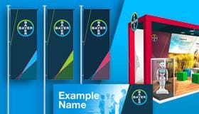
Pill Navigation
The corporate website incorporates a distinctive navigation pattern based on a pill-shaped container.
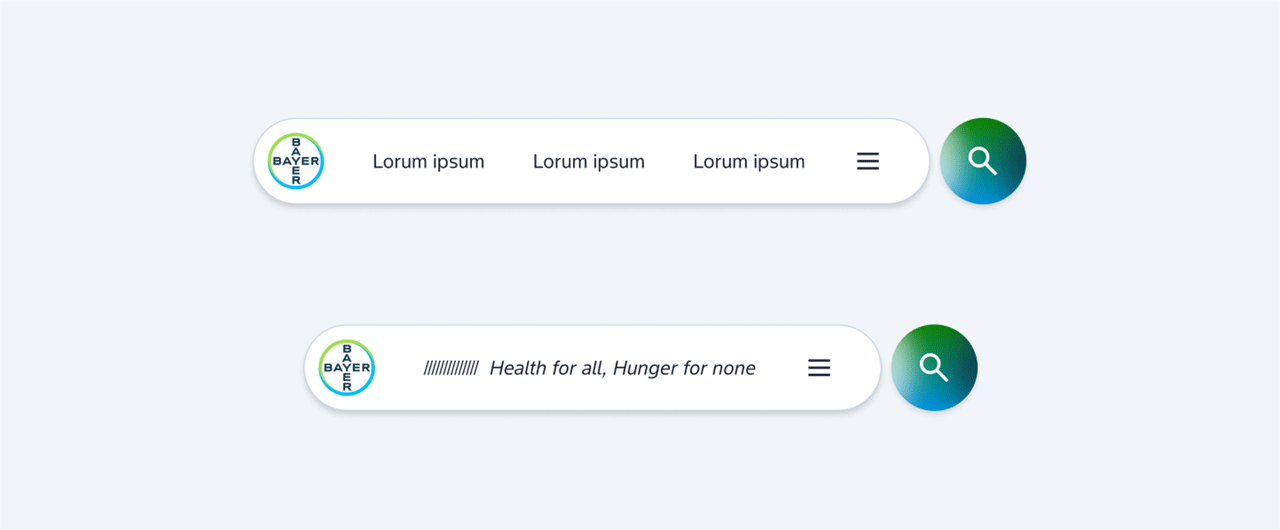
The navigation is fixed and positioned at the bottom of the viewport
It consists of the Bayer cross on the left, three primary hub links, a burger icon providing access to the full navigation
The navigation follows a consistent rounded “pill” shape
A separate circular search button may appear next to the navigation, aligned in size and position
On scroll, the three links are replaced by the Bayer mission “Health for all, Hunger for none”
This behaviour is implemented on Bayer.com and illustrates how navigation can reinforce brand expression through interaction. The pill navigation is the preferred navigation pattern for Bayer websites and should be applied consistently.
Flyout Menu
The flyout menu provides access to the full site structure.
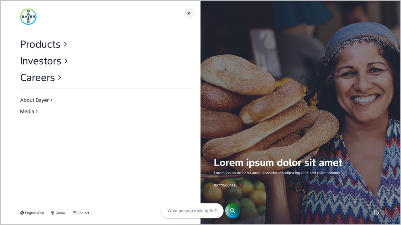
It is triggered via the burger icon in the pill navigation
It appears as a full overlay, clearly separating navigation from page content
The first level of the flyout is structured into two levels:
Main links: These correspond to the primary hub pages and represent the top-level navigation (max 3)
Secondary links: These include all additional pages and supporting content
Giant teaser (right): Highlighted content can be promoted via a large-scale teaser within the flyout menu.
This structure ensures clarity and allows users to quickly understand and navigate the site's hierarchy.
Stages
We use a set of stage types to structure the entry experience of pages.
Homepage (Mission Stage)
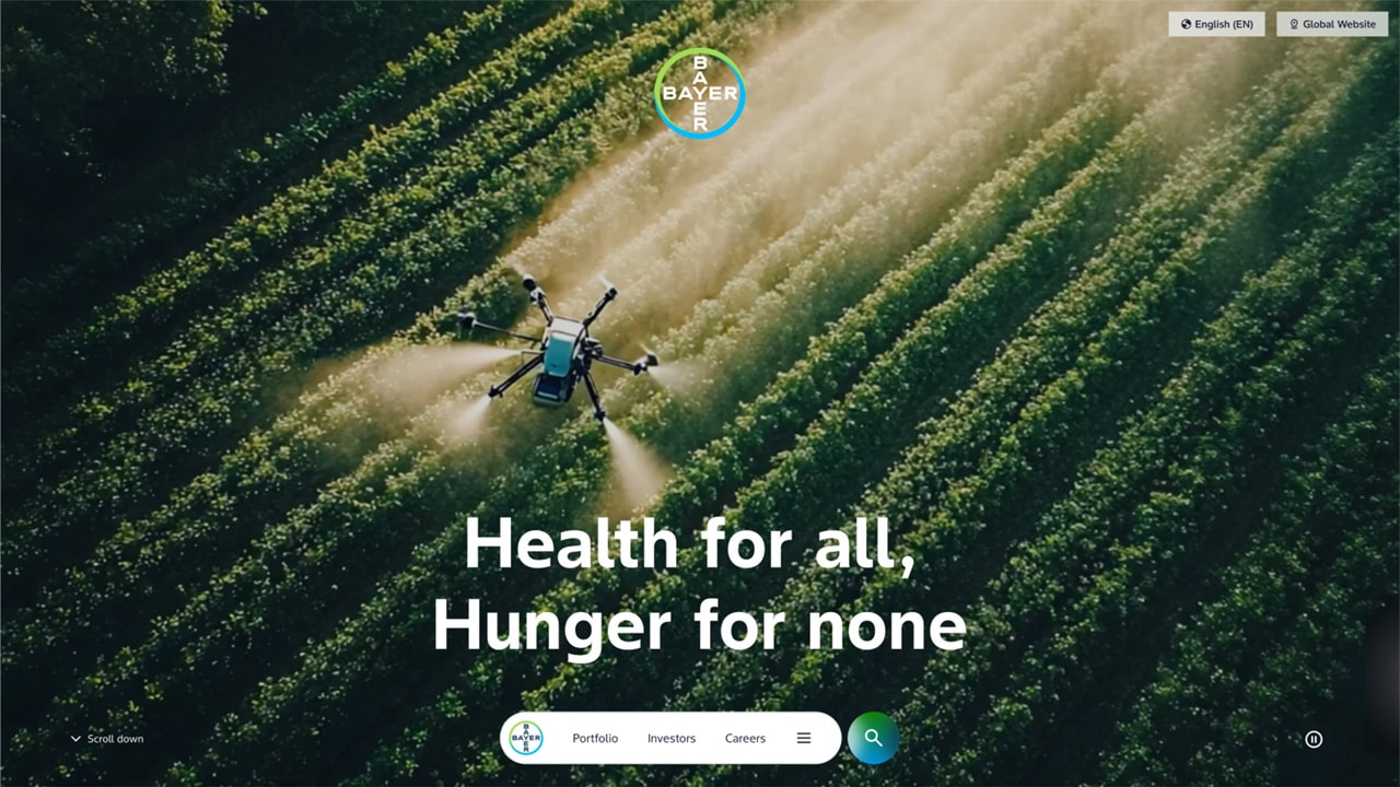
The stage is fully dedicated to storytelling
It uses full-bleed imagery or video
Content is minimal and intentionally reduced
No additional navigation elements or dense content should be placed within this stage
The purpose is to express the mission statement in a clear and emotional way
Hub Pages (second level)
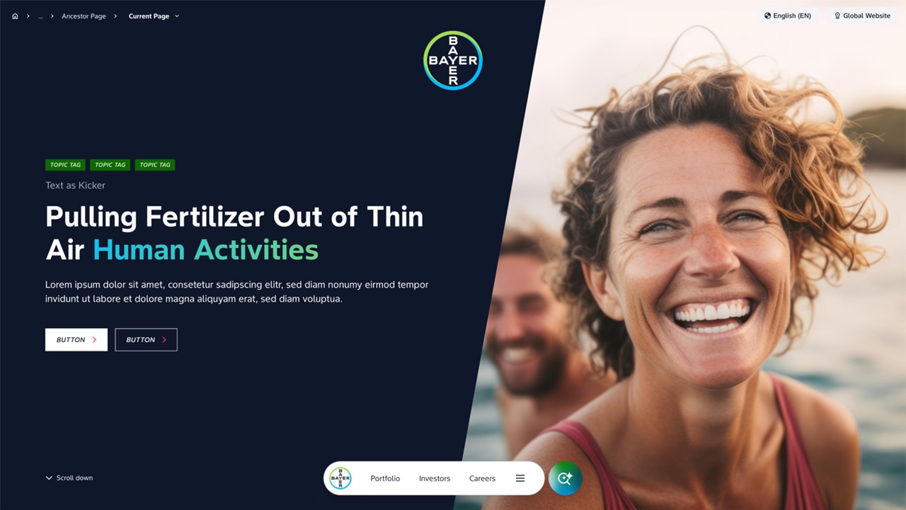
Used on top-level hub pages
Maintains a strong visual presence while introducing more structure
Allows for a combination of storytelling and orientation
Is typically presented in dark layout
Basic Stage (Rich content)
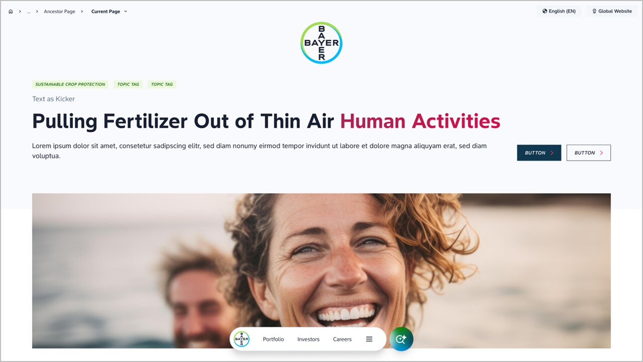
Used for content-driven pages
Prioritizes clarity and structure over visual impact
May include headings, supporting text and imagery
This stage type ensures that content-heavy pages remain readable and accessible.
Layout (Light and Dark Areas)
Bayer website follows a clear and consistent layout logic based on light and dark areas.
Dark areas
- emotional storytelling
- large-scale visual content
- immersive sections
Light areas
- structured content
- detailed information
- text-heavy sections
Background colour
- Dark areas must use Bayer Deep Blue as the primary background colour
- Alternative dark brand colours such as green must not be used for large background areas
Layout rule
- Dark areas appear at the beginning of the page
- A transition to light areas may follow
- There should be no transition back to dark areas
This creates a clear visual hierarchy and avoids unnecessary complexity within the page structure
Dynamic Angle
A defining visual characteristic of Bayer websites is the use of consistent dynamic angles signifying forward-moving progressive attitude.

Images and layout elements follow a defined angled cut
This angle introduces a sense of direction and progression
It is applied across stage compositions, image layouts, section transitions
The dynamic angle is a core design principle and should be used consistently but carefully. It may be reinforced through motion, but animation is not required. The visual direction alone should convey forward movement.
Typography
Typography plays a key role in creating clarity and impact.
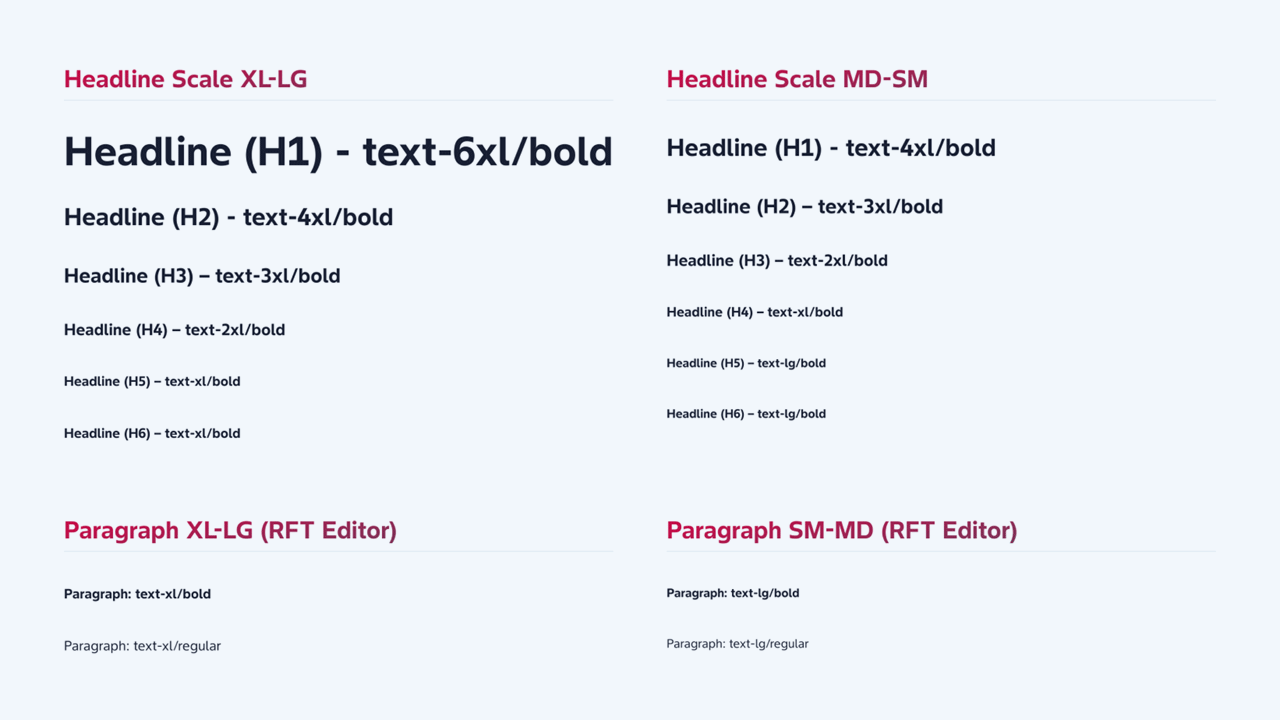
Bayer’s corporate typeface (Bayer Sans) is a key element of the visual identity
It creates a balance between clarity and dynamism across all screen sizes
The typeface supports both strong statements and structured information
Headlines are bold, short and confident
Body text is regular, ensuring readability and balance
Headlines should communicate clear statements, feel direct and purposeful
Typography should follow Bayer’s existing verbal and typographic guidelines (using Bayer Sans). Further guidance is available in the Identity Net typography section.
Gradients
Gradients are a key brand element and should be used consistently.
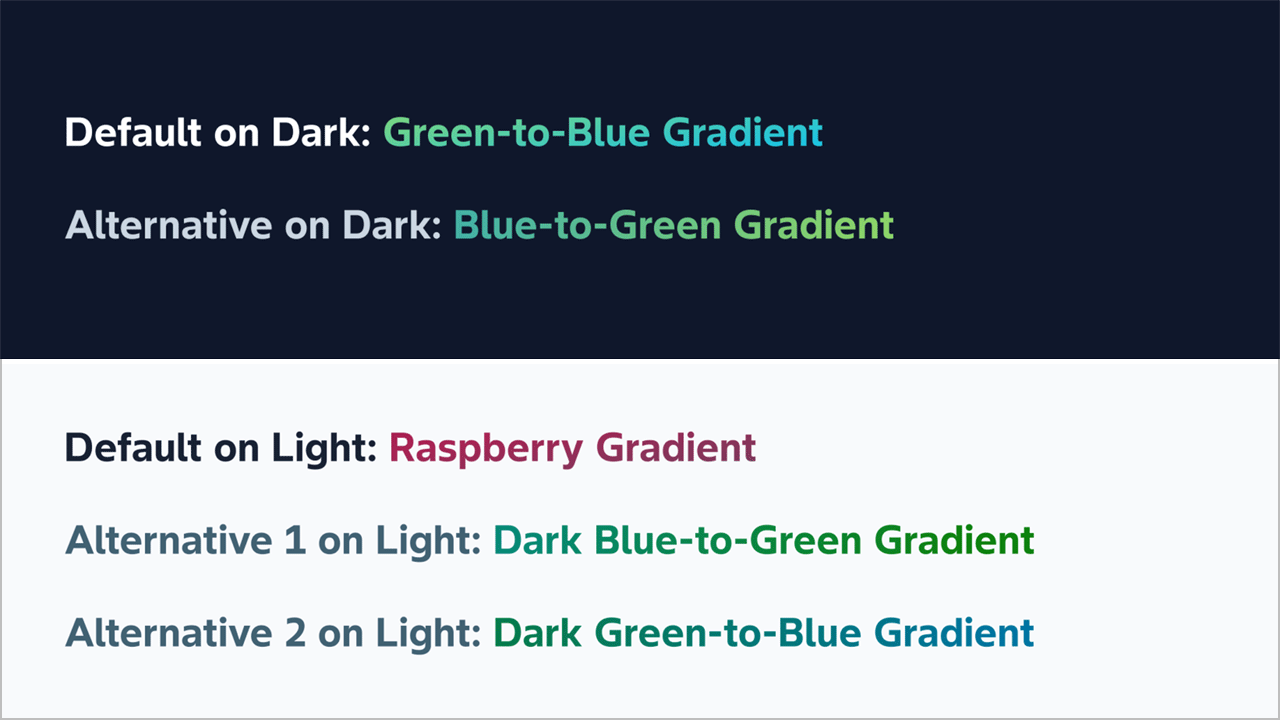
Green-blue gradient
- Can be used on light and dark backgrounds (slightly differently toned for accessibility)
- Is used for key brand moments such as navigation and highlights
- Exists in both directions (green to blue and blue to green)
Raspberry gradient
- Is used only on light backgrounds (due to lack of contrast on dark backgrounds)
- Used in the same way as green blue gradients
Usage
- They are used to accent elements (only borders, not to fill shapes)
- Within headlines, selectively and not across full text
Gradients should enhance the design, not dominate it.
Imagery
Imagery is one of the strongest drivers of perceived quality.
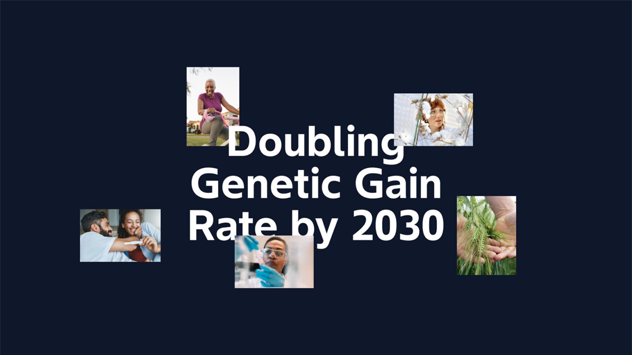
- Use visuals that show real people and real situations
- Images should feel, diverse, relatable and global
- Avoid overly staged or generic stock imagery
- Choose visuals that feel uplifting, energetic and authentic
High-quality imagery is essential to express Bayer’s mission.
Icons
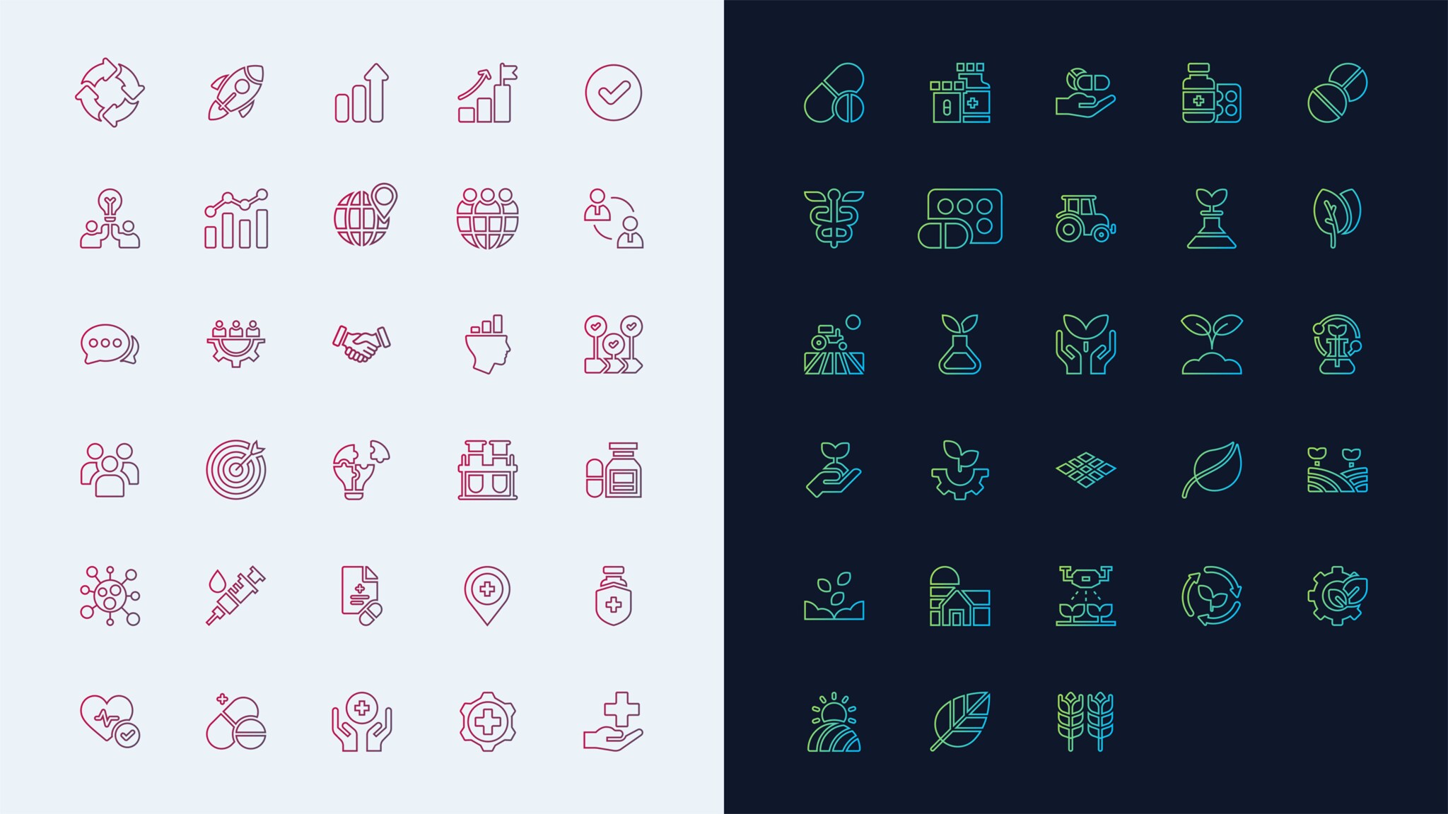
Bayer websites use a dual approach to iconography:
Functional icons
- Use standard systems such as Google Material Icons
- Ensure clarity and usability
Expressive icons
- Use Bayer-specific gradient styles
- Are used for larger, more visual moments
This ensures both consistency in functionality and brand expression where needed.
Tonality
Our communication informs and inspires, reflecting Bayer's commitment to tackling global challenges through innovation and collaboration. We frame clear and impactful messaging that enhances understanding and engagement.
We use American English in an active voice, employing empathetic and inclusive language to foster a connection with our audiences. This approach reflects our commitment to understanding their needs and challenges. Communication must be consistent, authentic, and aligned with our brand values, to reinforce Bayer's role as a leader in health and agriculture. For further details, refer to Verbal Identity Guidance here.
Establishing a consistent tone of voice
Passionate
Personalizing impact: "Thanks to our scientists, lives are transformed.“
Emphasizing emotional benefits: "Imagine a world where health is accessible to all."
Invoking a sense of urgency and mission: "Together, we are on a mission to transform…”
Visionary
Highlight a bold vision for the future: "Pioneering a new era.”
Use inspirational & aspirational language: "Together, we are setting the course for a sustainable revolution."
Emphasize impact on humanity: “We strive to make today, tomorrow and the future better”
Optimistic
Celebrate achievements & forward momentum: "We are pioneering therapies of the future.”
Focus on global benefits & improvements: "Empowering communities through technology.”
Highlight innovative aspects: “empowering”, “thriving”, “confidence” or “optimism.”
The Corporate Web Best Practice assistant on MyGenAssist will help you optimize your content for search engines and large language models (LLMs). All web page should include a list of FAQs.
Practical guidance
- Keep stages focused. Do not combine storytelling and functional content in the same area.
- Use dark and light areas deliberately. Avoid multiple transitions within a page.
- Apply the dynamic angle consistently across layouts and imagery.
- Choose authentic imagery that reflects real people and situations.
- Use gradients selectively to support hierarchy, not decoration.
Legal Notices
The Imprint, Privacy Statement and the General Terms of Use ensure that essential legal information is permanently accessible for users at the same position on all Bayer websites.
Links to the legal notices are placed in the footer. If additional items are included in the footer, they must be placed separately from the legal advice links.
Favourite Icons
The favourites icon adds an individual symbol for "favourite" or "bookmark" sites. The symbol is displayed both in the list of bookmarks or the address bar of the browser. Favourites can also be dragged onto the desktop.

- Corporate
- Products
We have two favicons that are used for Bayer corporate websites — one for when browsers are in light mode and one for when browsers are in dark mode. The browser should dynamically display the correct icon depending on the selected color mode of the browser.
Download Bayer favicons (5 KB zip file)
If you want to learn more about favorites icons and how to add them to your site, please read more
For mobile devices, web clip icons are special favorites icons that can be used to add your web application or webpage link to the home screen.
- Corporate
- Products

The color of the bar can be chosen freely from the Bayer color palette.
To specify an icon to represent your web application or webpage on iOS, follow these simple steps.
FAQs
What are the core brand principles for Bayer corporate websites?
Bayer corporate websites are built around three prioritized elements: the Bayer cross, the Bayer mission statement (“Health for all, Hunger for none”), and the broader brand identity expressed through layout, typography, imagery, tonality, motion, and interaction. If guidelines conflict, prioritize the Bayer cross first, then the mission, then other identity elements.Where should the Bayer cross appear on a page?
On corporate global and country websites, the Bayer cross should be prominently visible in the first viewport and remain present throughout the experience via the navigation. It functions as the primary visual entry point and should always have sufficient prominence to ensure immediate brand recognition.How is the Bayer mission statement used on corporate websites?
The mission statement is integrated into the sticky navigation and becomes visible during interaction, reinforcing Bayer’s purpose across the user journey. On the homepage it appears prominently alongside the Bayer cross, and across the site it supports a consistent experience and orientation.What is the pill navigation, and when should it be used?
Pill navigation is Bayer’s preferred navigation pattern for corporate websites. It is fixed at the bottom of the viewport and includes the Bayer cross, hub links, and a burger icon for full navigation. On scroll, hub links can be replaced by the mission statement to reinforce brand presence through interaction.What is the flyout menu, and how should it be structured?
The flyout menu is triggered via the burger icon and appears as a full overlay to separate navigation from page content. The first level is structured into main links (max 3, aligned to hub pages) and secondary links (all supporting pages). A large teaser area can be used to promote highlighted content.What are “stages” on Bayer websites?
Stages are standardized entry experiences used at the top of pages. They help structure how users first engage with a page—ranging from storytelling-focused stages (e.g., homepage mission stage) to more structured hub stages and content-driven basic stages. Choosing the right stage keeps pages clear and consistent.What is the rule for light and dark areas on a page?
Dark areas are used for emotional storytelling and immersive, large-scale visuals. Light areas are for structured, detailed, text-heavy content. Pages should start with dark areas and may transition to light areas, but should not transition back to dark areas to avoid unnecessary complexity.Which background colours are allowed for large dark sections?
Large dark areas must use Bayer Deep Blue as the primary background colour. Alternative dark brand colours (such as green) should not be used for large background areas, ensuring a consistent and recognizable corporate web experience.What is the “dynamic angle,” and how should it be applied?
The dynamic angle is a defining visual characteristic of Bayer websites. It is used across stage compositions, image layouts, and section transitions to create a sense of direction, progressiveness and forward movement. It should be applied consistently; motion can reinforce it, but animation is optional.What typography should Bayer corporate websites use?
Bayer Sans is the corporate typeface and a key element of the visual identity. Headlines should be bold, short, and confident, while body text should be regular for readability. Typography should follow Bayer verbal and typographic guidance to keep tone and hierarchy consistent.How should gradients be used in Bayer web design?
Gradients should be used to selectively highlight content, not dominate the layout. The green-blue gradient can work on light and dark backgrounds (with accessibility adjustments), while the raspberry gradient should be used only on light backgrounds due to contrast limitations.What imagery is recommended for Bayer websites?
Use high-quality visuals showing real people in authentic situations. Imagery should feel diverse, relatable, and global, and should avoid overly staged or generic stock photos. Strong imagery supports perceived quality and helps communicate Bayer’s mission credibly.Do these web design principles apply to product websites, and should we update them now?
No—this guidance is intended for Bayer corporate global and country websites. Product websites should remain as they are for now and should not be updated to match these patterns until product-specific guidance is published. If you are planning changes to a product website, align with the current product governance/process and wait for further direction from the responsible brand/digital team.
Figma is the collaborative design platform to store and share elements from our new web design. Click here to view the designs on Figma (access is currently available only to employees with a Bayer email address).
In case of any difficulties to get access contact Lars Soentgerath or Andreas Holger Gatzen.
If you have any questions, please contact your Bayer Identity Net expert.