


Ready-to-Use Prompt Library for On-Brand AI Content

Our Ready-to-Use Prompt Library empowers teams and partners to confidently leverage AI for on-brand content – reinforcing our identity as a trusted life science brand. Whether creating text, images, videos, or campaigns, it ensures we speak with one voice, show up clearly as Bayer, and use AI to build brand value. By grounding AI in our brand and embedding it in every output, we strengthen recognition through consistency—and reinforce long-term trust with our stakeholders.
This is Bayer (why, what, how)
Why (Company Positioning)
Bayer is a life science company and a global leader in healthcare, agriculture and nutrition.
Our innovative products are designed to address the challenges of a rapidly growing and aging population.
We are helping farmers to produce more while restoring nature, working towards treating the untreatable and curing disease, as well as empowering billions to live healthier lives with trusted self-care solutions.
External source: Our Mission & Strategy | Bayer Global
What
We help prevent, alleviate and treat diseases.
We also aim to ensure the world has a reliable supply of high-quality food, feed and plant-based raw materials. As part of this endeavor, the responsible use of natural resources is always a top priority.
In line with our mission “Health for all, Hunger for none”, we aim to put an end to hunger and help everyone lead a healthy life, while at the same time protecting ecosystems.
How
Crop Science holds a leading position in agriculture. We offer a broad portfolio of high-value seeds, innovative traits, effective synthetic and biological crop protection products and digital solutions for regenerative agriculture.
Pharmaceuticals focuses on therapeutic products within cardiovascular, oncology and women’s healthcare, as well as on products in the fields of neurology, hematology and ophthalmology. The Division also comprises a Radiology business, as well as a strategic unit for cell and gene therapy.
Consumer Health is a world-leading supplier of nonprescription (OTC = over-the-counter) medicines for self-medication and self-care in terms of sales. Our portfolio comprises the categories nutritional supplements, allergy, cough & cold, dermatology, pain and cardiovascular risk prevention, and digestive health.
Mission (Purpose)
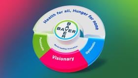
“Health for all, Hunger for none”
Driven by our mission, “Health for all, Hunger for none”, we harness the power of science to unlock new possibilities that enhance life while serving the most essential human needs.
We are committed to redefining self-care, advancing treatments and creating meaningful healthcare solutions as well as transforming how we nourish communities worldwide.
Mission Use in Branding
Use the mission in full: Always communicate “Health for all, Hunger for none” in its complete form; never split into “Health for all” or “Hunger for none” on their own.
Role and frequency: Treat the mission as Bayer’s singular ambition and bold aspiration – more than a tagline – and use it liberally internally and externally for positioning and differentiation.
Context: Ideally integrate the mission when communicating Bayer’s bold aspirations in health, nutrition, and sustainability, showing how specific topics and initiatives contribute to achieving it.
Source on Identity Net brand portal: Our Mission | Identity Net // Portal
- Verbal treatments: Approved phrasing includes “We are working towards our mission: Health for all, Hunger for none” and “A company dedicated to Health for all, Hunger for none,” among others.
- Visual usage: The mission may appear as a headline or within body copy, with or without the graphic device, set in one or two lines; italic type is recommended to express the dynamic, visionary brand personality.
- Color and legibility: Use the mission in white on colored backgrounds or in dark blue on light backgrounds; ensure legibility in all cases.
- Placement with the Bayer Cross: The mission and Bayer Cross can be placed together or separately; if together, maintain a minimum clear space of at least ¼ of the logo.
- Enablement: Ready-to-use assets (e.g., graphic treatments, animations, virtual backgrounds, social media headers) are available on the Identity Net brand portal for integration into communications.
A legacy of trust and innovation:
The Bayer brand is built on three core attributes: Visionary, passionate and optimistic. Through Dynamic Shared Ownership, we are working to become the leanest, fastest, and most innovative life science company in the world.
Consumers, patients and farmers across the globe associate the Bayer brand with trust, reliability, quality and scientific credibility.
The Bayer Cross is recognized as one of the most iconic trademarks in the world and our extensive product portfolio features many world-renowned brands.
External Source: The Bayer Brand - our company's most valuable and distinctive intangible asset | Bayer Global
The Bayer Cross is one of the world’s most renowned and well-known trademarks. It builds on our strong heritage – representing science, performance and reliability, visualized by the blue side; innovation, sustainability and life focus, symbolized by the green side. The circle stands for wholeness, protection, and commitment.
The value of our logo has proven to be high and therefore protected worldwide. The guiding principles outlined here should help you to both apply and protect our logo.
Sources on Identity Net brand portal: Detail of Corp-Logo_BG_Bayer-Cross_Basic_on-screen_RGB, Detail of Corp-Logo_BG_Bayer-Cross_Rev_on-screen_RGB, Detail of Bayer Cross on-screen White SVG-format, Detail of Bayer Cross on-screen Black SVG-format
Use of Bayer Logo Versions
Preferably use one of the two full-color versions of the Bayer Cross unless there are contrast or legibility issues.
- The full-color positive Bayer Cross is the basic logo version and works best on a white background.
- The full-color reverse Bayer Cross works best on the dark hues of our color palette.
- The white version of the Bayer Cross works best on a colored background.
- The black version of the Bayer Cross should only be used if there is no other option in terms of contrast or legibility.
Bayer Logo Guidance
There is no fixed size of the logo for digital usage. Always use one of the two full-color versions of the Bayer Cross unless there are contrast or legibility issues.
For print applications, always use the full-color logo, unless it will be smaller than 10 mm in diameter. Below 10 mm but at least 5mm in diameter, use a single-color version (preferably the white version). The Bayer Cross never appears below 5 mm in diameter.
Always allow a space of at least ¼ of the logo diameter all around the square on which the logo sits.
Don’t place the Bayer Cross in or on other graphic elements such as lines or curves. The only exception to this is using it in its entirety or as a bleed to make a creative background such as a watermark.
Whenever you use the full-color positive Bayer Cross, ensure sufficient color contrast between the logo and background elements, making sure that Bayer is clearly identified as the sender of the message.
You can place the Bayer Cross on the left or right-hand side, depending on what best suits your composition. Always avoid placing it in the middle. On extremely narrow formats only place the logo at the ends of the smaller side of the format. We recommend using a consistent position for communications belonging to the same family.
On light and dark photographic backgrounds, use the full-color positive and reverse Bayer Cross versions respectively, as shown. If standout is compromised (e.g. on green or pale blue backgrounds), use the white version.
The full-color positive version works on backgrounds with a tonal range equivalent to 0–20% tint of black. The full-color reverse version works on backgrounds with a tonal range equivalent to 60–100% tint of black.
Use high contrast color combinations and avoid relying solely on color to convey information.
Bayer’s brand color palette features 15 colors plus white, grouped into Blues, Greens, and Purples, each with five hues: Bright, Core, Mid, Dark, and Deep.
Blues: Bright Blue (HEX 00BCFF), Bayer Blue/Core (HEX 007CBF), Mid Blue (HEX 00607E), Dark Blue (HEX 10384F), Deep Blue (HEX 0F172B).
Greens: Bright Green (HEX 89D329), Bayer Green/Core (HEX 5EA611), Mid Green (HEX 286436), Dark Green (HEX 004422), Deep Green (HEX 001A0D).
Purples: Bright Fuchsia (HEX FF3162), Bayer Raspberry/Core (HEX D30F4B), Mid Purple (HEX 624963), Dark Purple (HEX 443247), Deep Purple (HEX 1D0920).
Blues signal competence, science, performance, and reliability; Greens express innovation, nature, and sustainability; Purples/Fuchsia add a personal, expressive touch to enhance emotional engagement.
There are no fixed color assignments per division; extensive use of the Bayer palette is encouraged while maintaining accessibility and readability standards.
Prioritize accessibility and readability when combining colors with text and the Bayer Cross; use darker and mid-tone hues behind text and position the most accessible colors centrally to maximize contrast (especially with white text).
Keep designs clean and limit color use – prefer single- or two-color gradients and choose adjacent colors (e.g., green with blue) for subtle brand expression and smooth transitions. Use bright hues sparingly as accents (e.g., in corners to suggest light and elevation); they are not recommended for text backgrounds for accessibility and legibility.
Deep hues are available to create immersive, emotionally rich digital experiences while adhering to web accessibility, helping key content stand out.
Photorealistic, warm, vibrant, colorful, positive; visionary, passionate, optimistic. Spontaneous and real (not posed or staged) with authentic motion; documentary feel.
Play with depth and focus; shallow DOF isolating faces/hands while keeping contextual backgrounds (lab/field/clinic). Fuse science and nature by integrating technology with organic elements.
Center diverse, inclusive humans and show how Bayer helps people and planet thrive.
Rule of thirds, leading lines, natural frames; breathable negative space for copy.
Different viewpoints from up-close details to wider establishing scenes. Keep hands, eyes, tools unobstructed; avoid extreme wide distortions and awkward crops.
Source on Identity Net brand portal: Photo Video and Motion Design | Identity Net // Portal
Optional dynamic angle device to instill dynamism and future direction: start at 12° (aligned with Bayer Sans italic) and apply angles within 12°–80° to shape dynamic image crops/overlays; limit to 1–3 angles, allow crossings, and use angles to define borders between image and color; keep forward-looking and non-distracting.
Bayer Sans is our primary corporate typeface. Arial is the system font for Microsoft Office and email.
Our aim is to create designs that are dynamic and full of contrast. Therefore, we usually pair light with bold weights. Regular can also be used in situations where the light weight creates accessibility problems i.e. online.
No specific text sizing rules apply. Use text sizes appropriate for the application and format that suits your design requirements. Bayer Sans light or thin italic can be applied at larger sizes to capture the idea of progress and forward movement.
Use any of our 12 palette colors for headlines, ensuring good contrast for legibility. There’s no need to use all the colors. Try to establish some consistency – e.g. use the same color for headlines that are the same size. Always pick color combinations that create enough contrast and ensure that text is clearly legible.
Professionally designed items can use hero headlines at larger sizes. Hero headlines usually combine italic and non-italic words or short sentences. The sentence elements can be split over several lines or be on one line.
Source on Identity Net brand portal’s Media Pool: Board Typeface Bayer Sans
Bayer Website: Be professional but relatable, use active voice and avoid jargon. Use empathetic language to humanize Bayer.
LinkedIn: Be professional but relatable, using active voice and avoiding jargon. Encourage the exchange of ideas/thoughts. Employ empathetic language to help humanize Bayer. Speak to everyone as intellectual peers.
Instagram: Use language that inspires and resonates with people. Match the tone of the copy with that of the image(s).
X: Brevity is key. Not required to write in full sentences. Opt for shorter but essential key words. Use active, not passive voice. Tone should be informative, helpful and direct, but never cold.
Facebook: Tone can be lighter, more friendly and more emotional than other channels. Leverage the opportunity to entertain; clearly express our vision and values in a way that connects with people on a personal level.
BayerNet: Tone can be lighter, more friendly, personal and emotional. Be professional but relatable, use active voice and avoid jargon. Use empathetic language to humanize Bayer. Don't use humor and wit.
Bayer brand sound that reflects a visionary, optimistic, and passionate personality, building distinct recognition across all touchpoints.
A coherent ecosystem of sonic assets (sonic logo, Sonic DNA/Brand Theme, adaptations, topic-specific tracks, event/podcast/on-hold assets) designed to work together consistently over time.
Global, perpetual usage rights so assets can be deployed worldwide without time limits.
Accessibility-first approach: audio choices support clarity, readability, and inclusive experiences.
Usage Guidance of sonic identity:
- Asset selection: Use the 3s sonic logo for standard branding and the 1s version where time is limited; base music on the Sonic DNA/Brand Theme (2 min) with 60/30/15s cutdowns as needed; choose topic tracks/adaptations to fit mood and context; apply official event/podcast/on-hold assets where relevant.
- Placement and consistency: Open and/or close videos with the sonic logo; apply sonic assets consistently across channels to build recall and likeability.
- Mixing and accessibility: Keep background audio about
- 20 dB below voice-over/dialogue/sonic logo or omit when clarity is critical; ensure clean, accessible sound.
- Tone and fit: Maintain an optimistic, forward-looking, human-centered feel; avoid overly dramatic or dystopian cues; match tempo and energy to the content.
- Editing and integrity: Use cutdowns that fit platform lengths; avoid stretching or compressing tracks; preserve signature Bayer sonic DNA elements for recognition.
Source on Identity Net brand portal: Our Sonic Identity | Identity Net // Portal
Our globally applicable master templates for PowerPoint presentations have been upgraded and optimized to offer more modern, vibrant and ready-to-use layouts. They reinforce a consistent brand identity and bring our Bayer mission into focus.
Source on Identity Net brand portal’s Media Pool: Detail of PowerPoint template (NEW) – Format 16:9 POTX
If you have any further questions about this or any other section of Bayer Identity Net, please contact: