


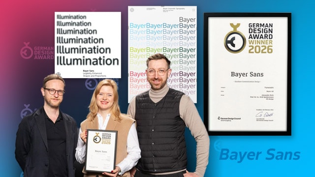
Excellent Communications Design: Typography
We are proud to announce that Bayer Sans, our ownable corporate typeface developed for digital-first use, has been honoured with the German Design Award — Excellent Communications Design: Typography. This recognition is an important milestone: Bayer Sans is not just a visual tool, it is an integral brand asset that strengthens our identity across everything we do.
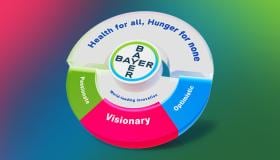
Bayer Sans as a core brand asset
Bayer Sans was developed to be more than a typeface — it is a functional expression of who we are. It translates our brand traits into every line and counter:
Visionary — forward-looking proportions and clear geometry enable confident, contemporary expression across new platforms and formats.
Optimistic — subtle warmth in the letterforms keeps communications approachable and human.
Passionate — purposeful design detail gives the brand voice clarity and personality without ornament.
Dynamism, readability and accessibility
Bayer Sans reflects dynamism through flexible weights and consistent rhythm, making it equally strong in headlines, long reads, and responsive user interfaces. It was explicitly designed to ensure high readability and to support accessibility goals: typesetting guidance, weight and spacing options, and character coverage help meet legibility and accessibility parameters across devices and languages.
From the jury
“Clarity and timelessness define “Bayer Sans” at every level. The typeface masterfully combines scientific precision with subtle warmth, while remaining consistently legible and versatile. Particularly impressive is the harmonious balance between functionality and aesthetics, enabling globally consistent communication. This distinctive typography convinces through its lasting impact and sets a powerful, confident statement in the competition.”
What this means for Bayer
Bayer Sans gives us a single, coherent typographic foundation to communicate with consistency and impact—reinforcing our scientific credibility while staying warm and human. It reduces friction for teams creating content, improves cross-channel legibility, and strengthens recognition of the Bayer brand worldwide.
This award celebrates a strategic investment in clarity, accessibility and lasting brand identity. Small team, big impact.
Find more details on the new typeface and how to use in our Brand Typography section.
If you have any further questions about this or any other section of Bayer Identity Net, please contact: