


How to avoid incorrect uses
When we’re learning a foreign language, don’t we all tend to make the same mistakes over and over again? It’s the same with singing. If you sing a wrong note first time round, it somehow gets lodged in your brain and then it’s hard to sing the right one. Identity Net usage is no different. Many users keep making the same old mistakes. We’re here to help you so that's why we thought it might be useful if we noted down these frequently made mistakes – so you can avoid them in the future.
If you have any further questions about this or any other section of Bayer Identity Net, please contact:
Bayer Cross
Forgetting the minimum space around the Bayer Cross (min. ¼ B; B = diameter of Bayer Cross):
The Bayer Cross needs room to breathe, no matter which medium it is used in. More information here Bayer Cross.

Still using the old Bayer Cross:
Please ensure you’ve got the most up-to-date versions in the different file formats. You can find them via our logo finder

Creating a white or black 1c logo simply by converting the full-color version:
The black and white 1c versions have a thinner rim than the full-color version and are completely different files. You can find them via the logo finder.

Placing a full-color Bayer Cross on a round colored background of approx. the same size or placing an additional colored ring around the Bayer Cross to separate it from the background:
This makes the Bayer Cross look like a button, which is another no-go. Place it either on a white square background or use the white or black 1c version.

Using a full-color Bayer Cross on wrong color backgrounds:
This just doesn’t work because on colors like Fuchsia, certain greens or blues the Bayer Cross doesn’t stand out.

Using the Bayer Cross in colors other than full-color, black and white:
The only exception to this strict rule are the colors Bepanthen blue and Rennie red.
Using a too-small version of the full-color version (smallest size 10 mm) or a too small version of the 1c version (smallest size 5 mm):
OK, this rule may not always apply in digital media but it is really important to remember that the Bayer Cross and the letters BAYER always have to be nicely readable, even in digital media.
Forwarding the Bayer corporate logo or a product logo to third parties without a Consent Declaration by Corporate Trademarks:
We know that third parties are keen to profit from Bayer’s good image, e.g. through co-branding, but you’ve got to get official approval before any third party is allowed to use our corporate logo or any product logo.
Adding other elements to or placing them too close to the Bayer Cross or using a purpose in direct combination with the Bayer Cross
That might be just a word or an icon but the negative result is that visually it looks like you’ve created a new logo. And that’s an absolute no-go! The use of the purpose is optional anyway, and if it is used, please ensure it is separated from the Bayer Cross.

Creating new custom logos or symbols for projects, departments or other events:
This waters down the impact of our iconic Bayer logo(s) so please carefully read the rules in the “Custom logos” section.

Typography
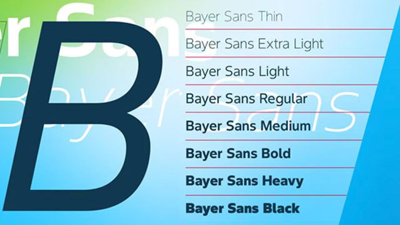
Using other fonts other than Bayer Sans (for professionally designed online and print objects), Neue Helvetica (for professionally designed print objects) and Arial (for office communications). For Microsoft® Office® applications, such as PowerPoint® or Word® and other on-screen applications the system font Arial is used.
Colored text on colored background without paying attention to sufficient contrast:
Always remember that people have different levels of visual acuity and take account of visual impairments by ensuring that there is sufficient contrast when choosing a font color.

Font sizes that are too small or too large:
Although there are no specific rules for text size, care should always be taken to select the appropriate text size for each application to ensure good legibility. Make sure there is a noticeable difference in size between headings, subheadings and body text.
Incorrect punctuation, e.g. apostrophes or quotation marks
Apostrophes are used to indicate ownership, as in “Harry’s book” or “the boys’ coats.” They can also signify the omission of letters or numbers. Make sure to use the correct character, which resembles a small nine.
When quotation marks are needed, use left and right “curly” quotation marks. Avoid using "straight" quotation marks, as they are outdated remnants of the typewriter era and a common typographic mistake in modern writing.

Uncomfortable reading
Line length is determined by the number of characters or words per line and should be adjusted according to the amount of text. It is important to avoid excessively long lines, as they can be difficult for readers to read. Optimal line lengths are both short and efficient, striking a balance between readability and brevity.
Color
Using colors from only one color group
The Bayer color palette encompasses three distinct color groups: blue tones, green tones, and purple tones. For optimal results, incorporate colors from all three groups into your design.

Color combinations with not enough contrast
While it is possible to combine colors from the Bayer color palette, certain combinations can be challenging depending on the application. Inadequate contrast not only compromises readability, but also limits the potential for attractive design. When selecting colour combinations, aim for a balance that ensures both readability and visual appeal.

Using color gradients in these ways:
Avoid using more than two opposing directions and never combine horizontal and vertical gradients.

Do not combine gradients with different hues, even in combination with photographs.


Graphic device
Using downward sloping angles for color spaces or lines (i.e. the graphical device):
The angles need to slope upward (= positive and dynamic).

Creating narrow windows:
Avoid squeezing images between two angles. The layout should always look open and spacious.

Too many angles:
More than three angles should be avoided. In most instances, one, two or three angles create pleasing designs.
Repeating the exact same treatments, angles, and crops:
It is important that the dynamic angle continues to change and evolve. This should also be reflected in dynamic layouts.


Read more about clear definitions and how to use the graphic device:
Photography
Using photos downloaded from the internet:
OK if you purchase a usage license, but why not use photos from the Identity Net Media Pool? They are license-free and there’s a huge choice.
Photographs that do not conform to our photography principles:
Avoid silhouettes, back-lighting and foreground flash effects. Avoid wide-angled lenses that can create foreground distortion shots. Avoid too many conventional, front-on shots. Avoid scenes that look too considered or staged. Use unexpected viewpoints.

Cluttered multipictures that are too small for the format:
Try to find a photo that is representative of your complex subject. However, if you prefer a collage, limit yourself to two or three images that harmonize visually.


Mail Footer
Creating your own mail footer / email signature:
In the interests of a consistent look & feel for our corporate correspondence, please use nothing but the respective templates for updating your mail footer.
Adding slogans, information, pictures or other additions to the actual mail footer:
Such elements are only allowed as part of your email signature content, i.e. above “Kind regards / name”.