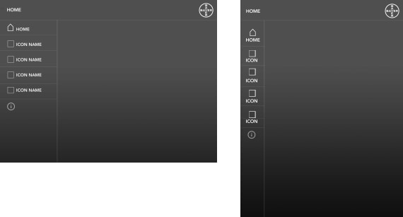
Scaling and Orientation
Because phones and tablets come in different sizes and proportions, it’s essential to consider various scales and orientations during development.
Scaling
For an app that is to run on phones and tablets, the design should follow the principle of progressive enhancement, scaling from small to large. It is easier to add functionality as the display area increases than it is to remove functionality as the display area decreases. This also means including graphics for all relevant resolutions and specifying the app accordingly as part of the publication process.
Apple User Interface Guidelines
Orientation
The default orientations are portrait for phone and landscape for tablet. But it is the user who decides which orientation they want to use. Orientation design must, therefore, reflect user preferences and affect only the scale and format of content rather than be associated with any particular behavior or navigation, i.e. content either reflows to fit the new area or elements are repositioned.
You should avoid trying to enforce a particular orientation for an app.

Apple User Interface Guidelines


