


How to use infographics

Information graphics – or infographics – are graphic visual representations of information, data or knowledge that break down dry facts into more memorable and engaging visuals. They are usually simple graphs, charts and tables, but also more complex infographics with illustrations or icons, in both offline and online applications. They are a key element of our look and feel.
-
Keep infographics simple with flat colors, avoiding unnecessary special effects.
-
The infographics should not be over complicated, remember to consider function over gimmicky design.
-
Where possible, our infographics should either appear on a white or bright colored background or on one of our darker hues. Use only the colors of the Bayer color palette: Color
-
Favor color combinations with lots of contrast between graphics and background for legibility.
-
Use our official typeface for titles, annotations, key and source information.
-
Where possible and appropriate use our dynamic 12° angle to add forward momentum.
If you have any further questions about this or any other section of Bayer Identity Net, please contact:

Everyday use (i.e. PowerPoint and reports)
When using Microsoft applications, the use of elaborate infographics is not possible due to the restrictions of the software.
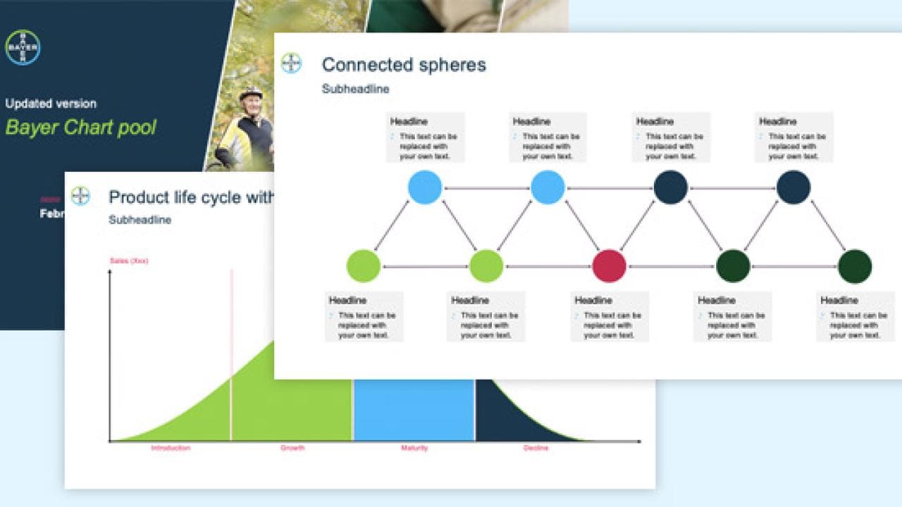
In our Chart Pool you will find a broad range of infographic examples that you can use, as they are designed according to the current design guidelines. We explain only a few common examples here:
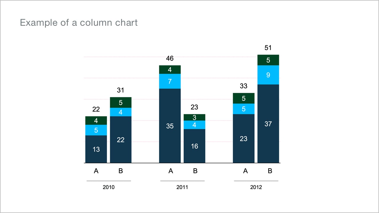
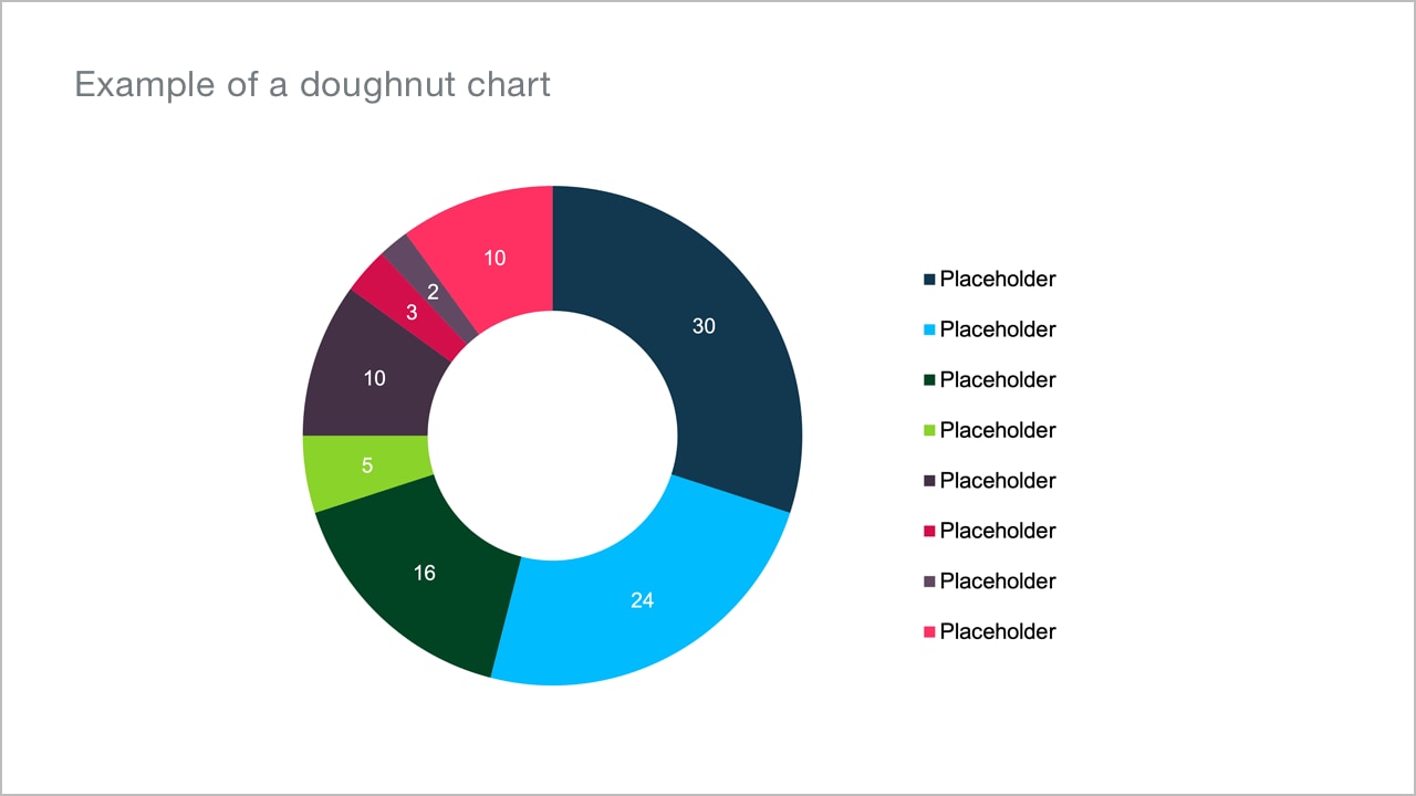
Diagrams and charts
Bar charts are effective for illustrating changes that occur over time and for presenting rankings. Pie charts are well suited for showing distributions and proportions. They are used as ring or pie charts. In order to facilitate the application, our chart pool offers a whole series of templates, which can be filled with the corresponding data via Excel.


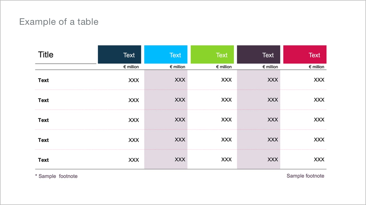
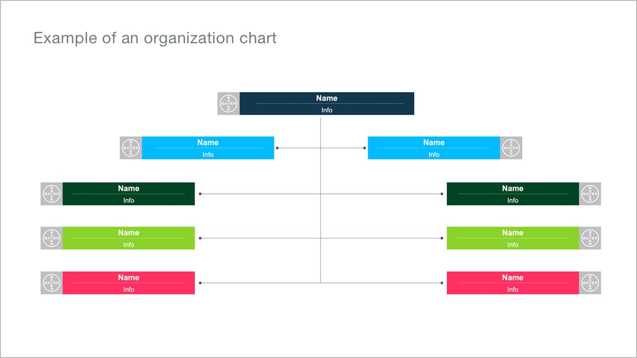
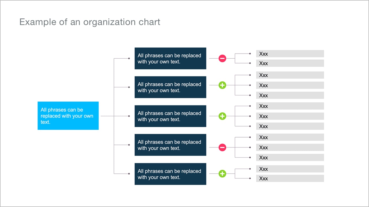
Tables and organigrams
The Bayer Chart Pool also offers a whole range of table templates and organizational charts. Please always make sure to keep tables and organization charts well-structured and not overloaded with too much info.
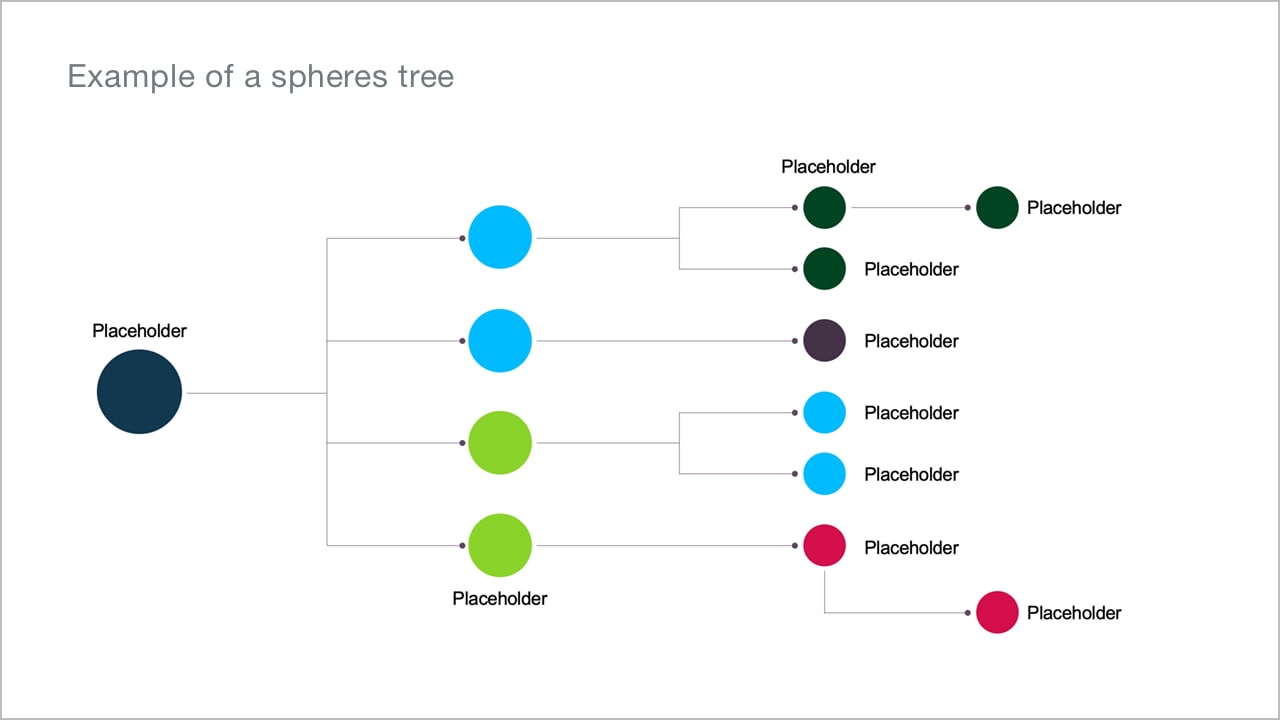
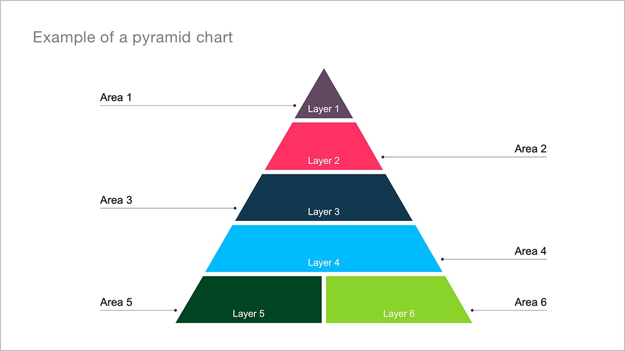
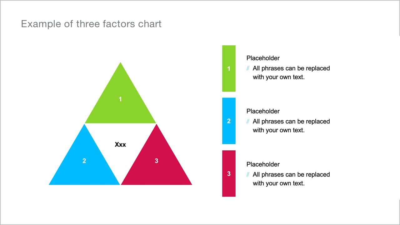
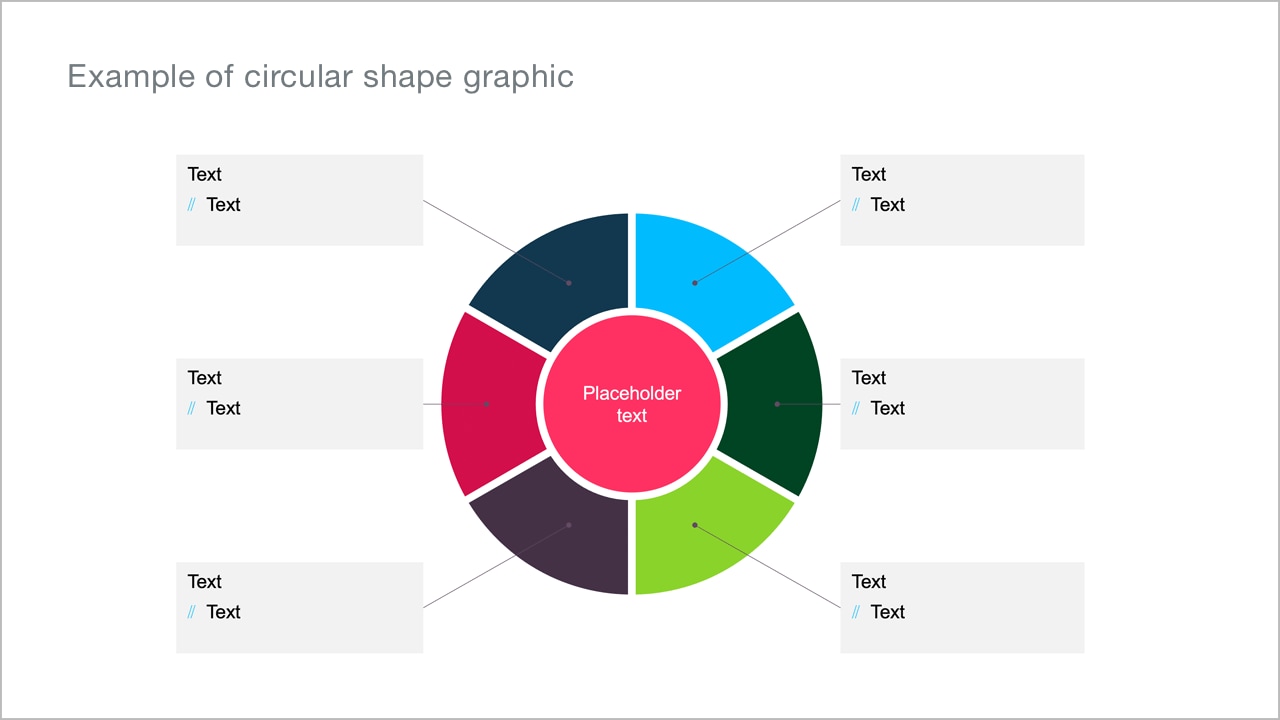
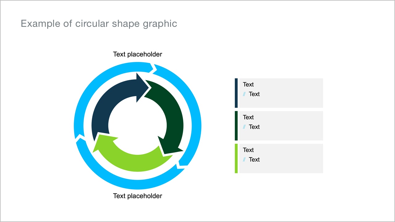
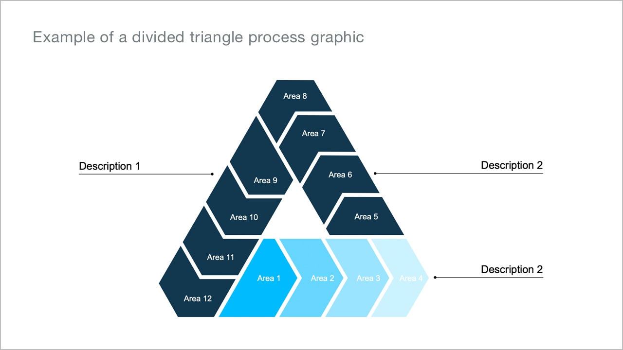
Pyramid charts and circular shapes
A pyramid diagram is a simple and easy-to-understand diagram used to represent hierarchies or workflows. To show a continuous sequence of phases, tasks or events, a circular flow diagram is suitable.
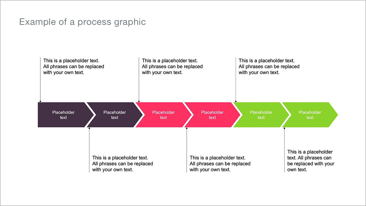
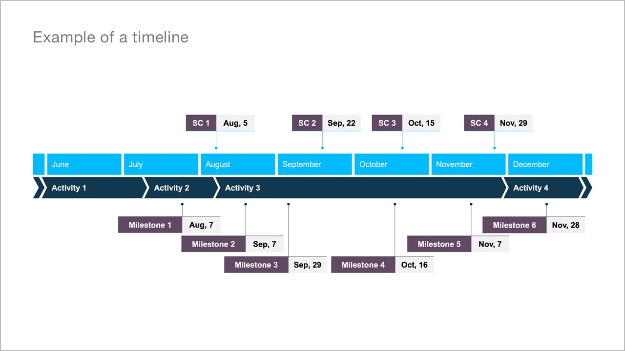
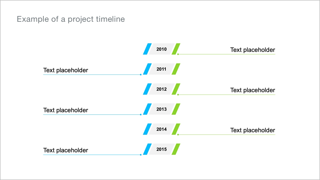
Processes and timelines
Use process graphics to break down a process into smaller, manageable steps and timelines to show the chronological sequence of events.
Publication use (i.e. brochures and websites)
Infographics for print media can be larger and include more detail, depending on the format. To optimize infographics for social media, it is important to consider the smaller scale, especially for mobile devices. The same information that can be included in larger print media infographics should be presented in a condensed format. Focus on displaying only essential elements and consider dividing larger images into multiple posts.
Large figures as eye-catchers
Note that the color combinations used have strong contrasts to ensure readability. In some instances, the use of an angle can be helpful to create an ownable look as shown in the examples. However, this should not be to the detriment of legibility or clarity.

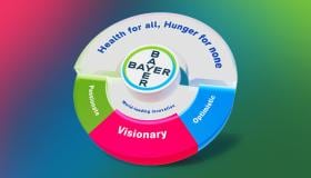
Illustrative infographics
For illustrative infographics, you can combine illustrations with diagrams or charts to convey information in a descriptive way. To make the relationship between illustration and chart or diagram clearer, it helps to slightly overlay both elements.
When creating an illustration for a graphic, ensure that it reinforces the intended message and is not merely an ornamental accessory. Additionally, be sure to follow the Bayer guidelines on colors, typeface, and clear design language to maintain consistency and clarity.

The PowerPoint user guide gives you easy-to-understand, step-by-step instructions on how to
Infographics in combination with icons
Sometimes it is helpful to supplement graphs or diagrams with icons and make the topics more descriptive. Make sure that the icons are used in a meaningful way.

Icons are graphic elements that help save space, improve recognition and convey meaning.
Icons represent precise objects or situations, requiring a clear and easily recognizable visual language that is universally comprehensible and self-explanatory. You can find numerous icons on different topics in the Bayer Chart Pool as PNG files, which can be used on a PC, for digital applications and presentations.
For daily use in PPT presentations you will find numerous icons on relevant topics in the Chart Pool.
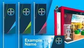
Geographical infographics
Bayer is a globally operating group. Thus, it is not infrequently necessary to address geographical aspects and these are often illustrated with map views.
For more complex presentations in print and digital publications, maps can be combined with graphs and icons. Here, of course, the Bayer design guidelines on colors and fonts must be taken into account.

For daily use in PPT presentations you will find a number of maps and globe views in the Chart Pool.