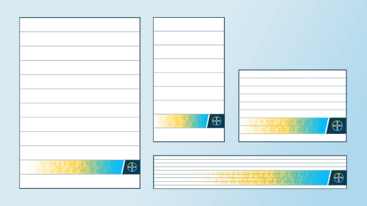
Logo Placement in the Frame
In the design hierarchy, Lighthouse or System Branding holds precedence over the Code design. These logos are positioned outside the Code, within the Frame, allowing individual brand or initiative expression.
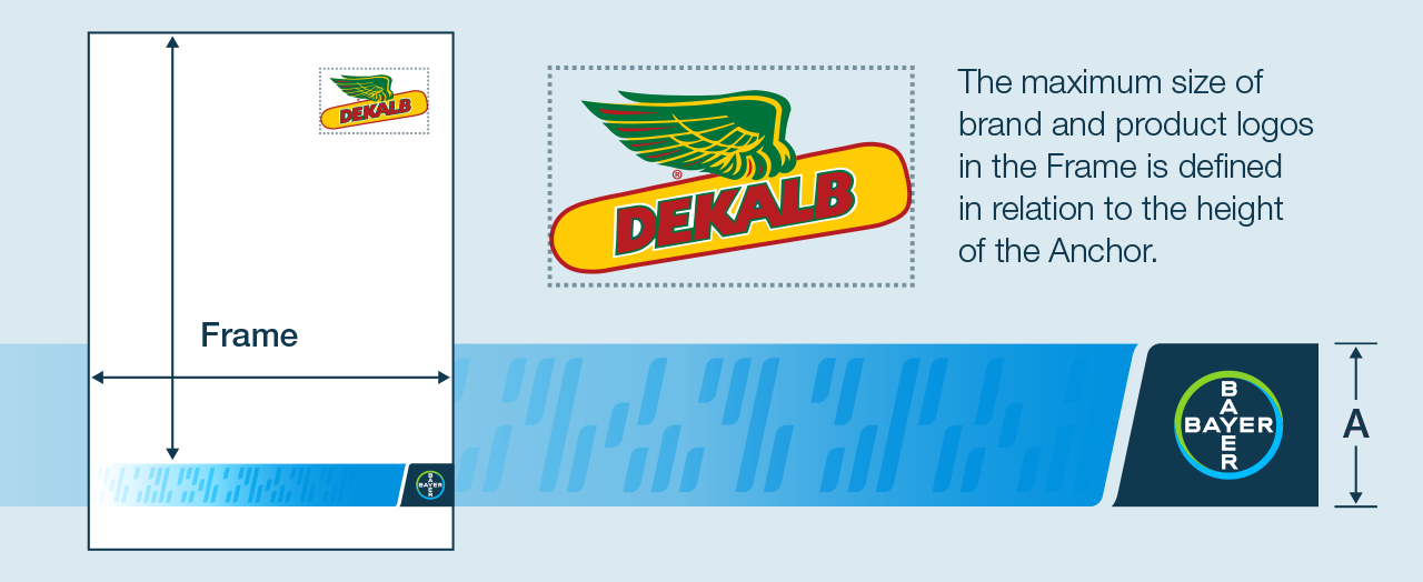
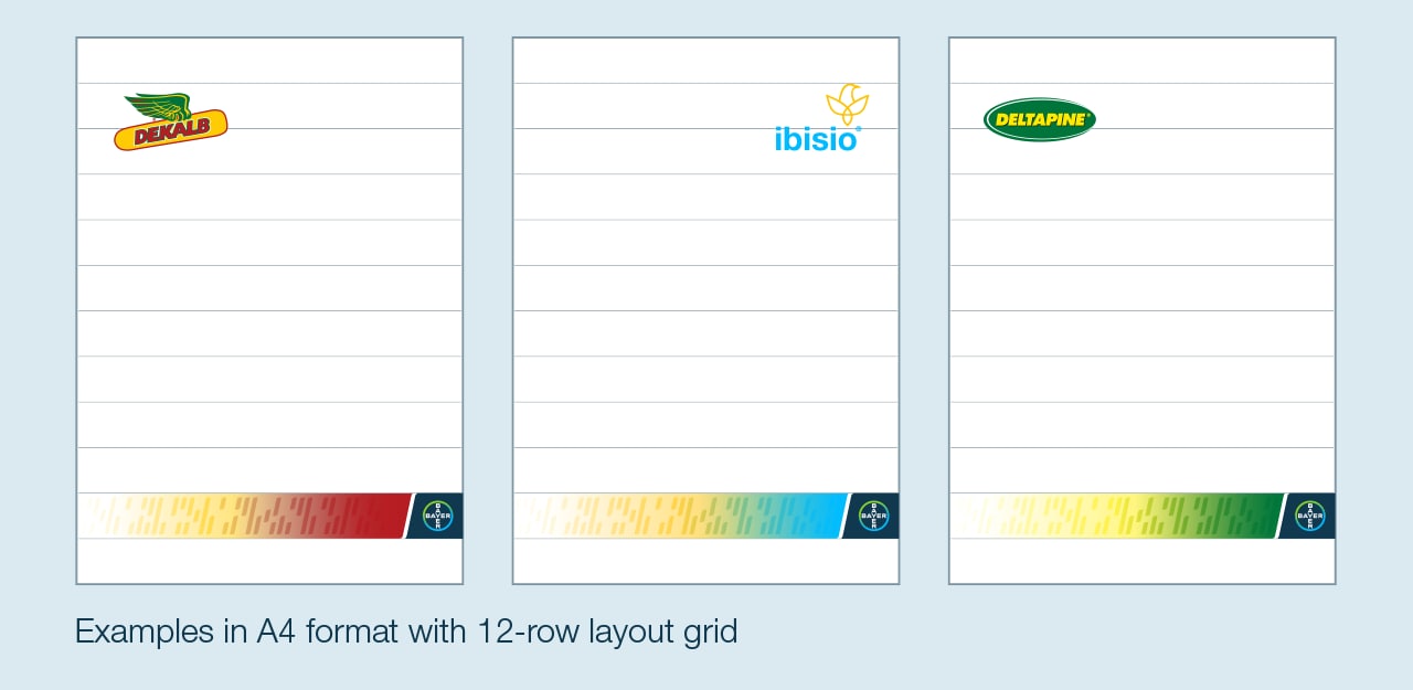
Placement of Lighthouse and System Brands in the frame
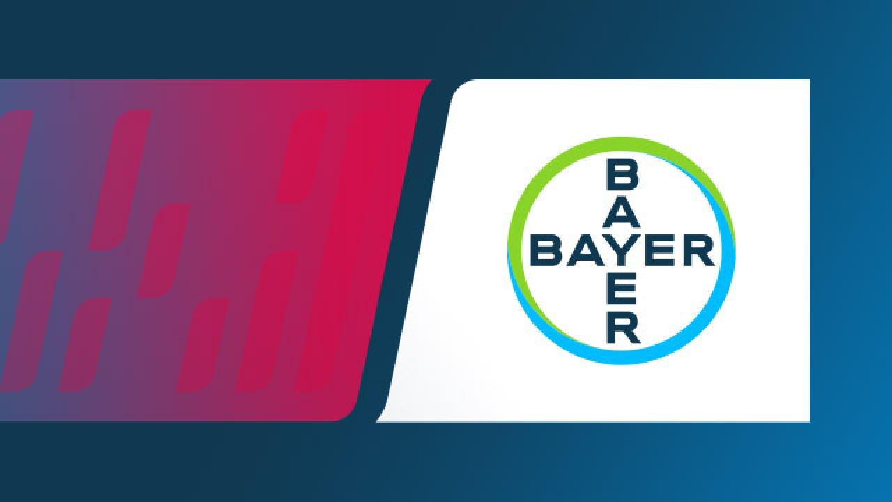
The Code Design brings added weight and importance to the Bayer Brand without being intrusive. The area outside the Code is designated as the Frame, where Lighthouse and System Brand logos are situated. Their dimensions are defined in relation to the Anchor's height, ensuring scalability across formats.


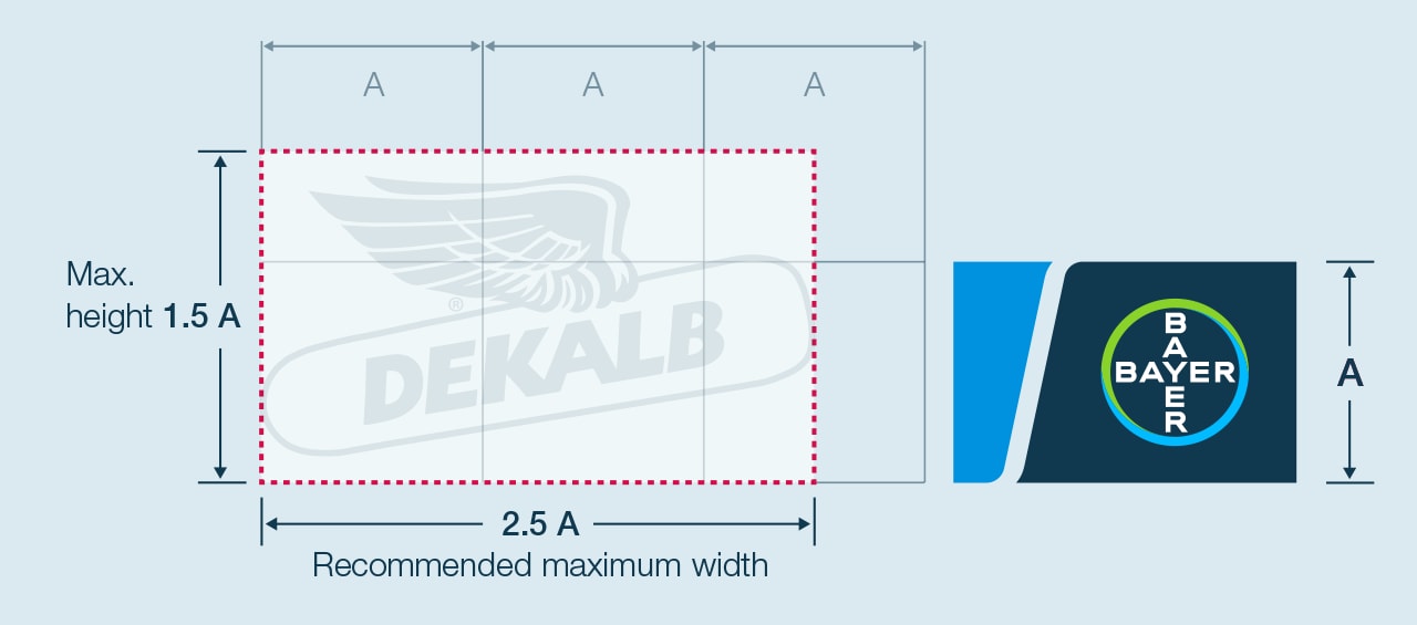
Recommended maximum height and width of brand and product logos
The recommended maximum height of product and brand logos within the Frame is 150% of the Anchor height (1.5 A). The recommended maximum width is 250% of the Anchor height (2.5 A).
For better readability on photographic backgrounds or in unconventional formats, product and brand logos may need to surpass the recommended maximum size limits.
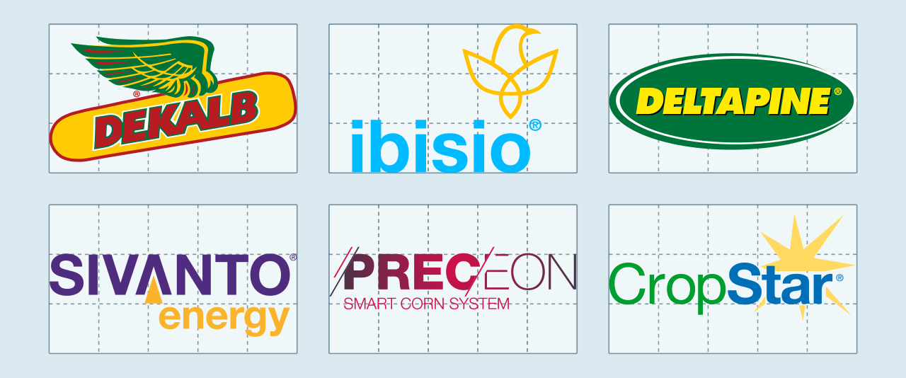
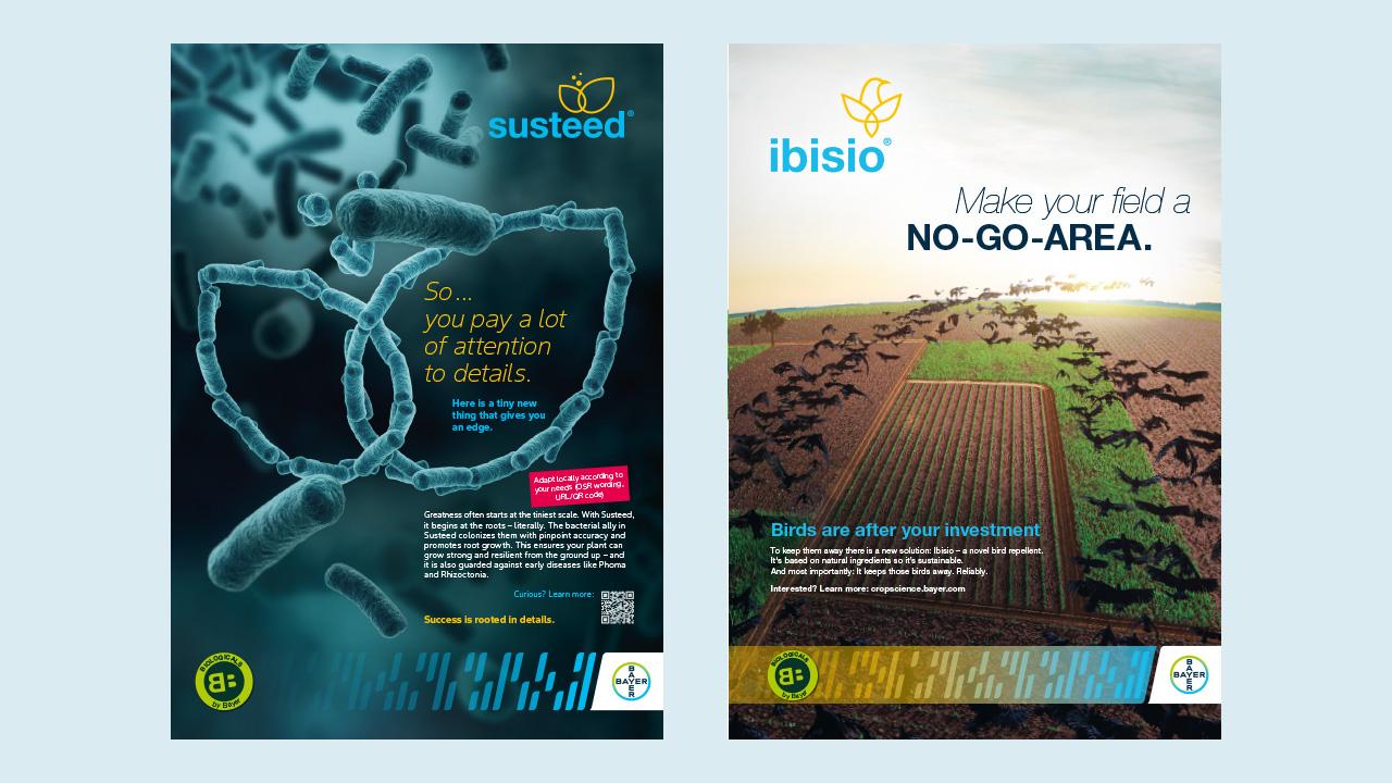
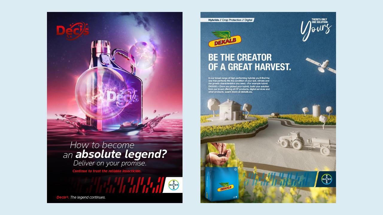
Examples of Lighthouse and System Brand logos
Provided logo examples illustrate the maximum width or height, as dictated by the defined ratios. However, the appropriate logo size for individual applications may be smaller.
Lighthouse and System Brand logo size in digital applications
Similar to print applications, digital instances follow the same sizing principles. The provided logo examples delineate the maximum width or height, yet the appropriate size may vary depending on specific digital contexts.
Examples


