How To Create Clear and Relevant Reports in Power BI
We are an increasingly digitally enabled and data-led company, and that means we have more occasions than ever to present data visualizations such as graphs, reports and dashboards. One of the key platforms for producing these is Microsoft Power BI.
Power BI is an industry-standard business intelligence tool. It is used for managing and analyzing data and presenting it in different formats for different devices – such as live dashboards or timely reports.
There are many reasons why this is beneficial. When we are dealing with masses of data, we need ways to make it accessible, and to highlight the ‘real story’ – the most important information we should be taking away.
Power BI can help produce visuals for a wide variety of purposes. It can work in real-time, connect to many different data sources, integrate with other Microsoft applications to supply data visualizations as part of existing workflows, and even work with AI to make smart analyses and predictions.
Please consider: Power BI is an external tool. We ask you to always fulfill our company’s guidance and preconditions in data and information security. Ensure data does not fall into the hands of unauthorized persons.
Power BI does not function entirely on its own – in fact, it is people who really make it work. By carefully managing our data with Power BI, selecting the right information to extract and the best way to present it, we can get the most out of this powerful solution – giving our teams quick, clear, and useful information that helps them do their best work and improve their outcomes.
We follow a few simple guidelines to ensure our data visualizations are as effective as possible:
Understand your data and your audience’s needs
Use the right visual tool for the job
Keep visualizations clear, consistent and in line with overall branding
We will explore each of these further in this style guide.
Understand your data and your audience’s needs
Before you create any data dashboard, you should take time to understand its purpose. Who is it for? What are they looking to get out of it? What are the keyways it can help them achieve their objectives, address pain points, and meet strategic goals?
We produce and store so much data that there is no way to present it all, or approach it from every possible angle, within a reasonable amount of time and space. You need to be selective and focus on what’s important and compliant. Remember, though data visualizations can be extremely impressive, your goal is not to produce something that looks nice: it is to meet readers’ needs and give them insights that are important to them.
Consider what your readers need to be successful in their jobs, what actions they could take based on the information they receive, what’s necessary to them, and how this could be communicated in a very short space of time. Then, try to express this in visual format. Going into detail is fine where it’s needed, but always keep in mind the overall story you are telling the reader, and how your visualizations fit into the overall business context.
Use the right visual tool for the job
Form needs to meet function. The type of data visualization should intuitively show the patterns, insights, or relationships you are trying to highlight.
Here’s a simple example. To show Bayer and competitor market shares, a pie chart would be appropriate since it shows different values as part of a whole. But if you wanted to show Bayer’s market share evolution over time, you wouldn’t use a pie chart: a bar chart or line graph might be better, since it enables the reader to spot trends more quickly.
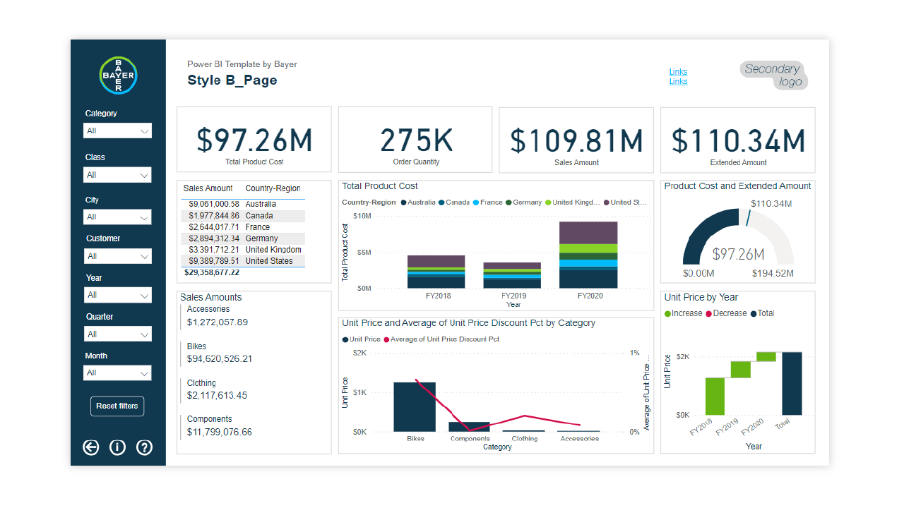
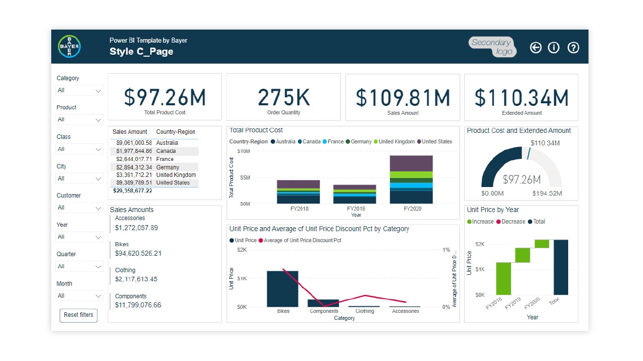
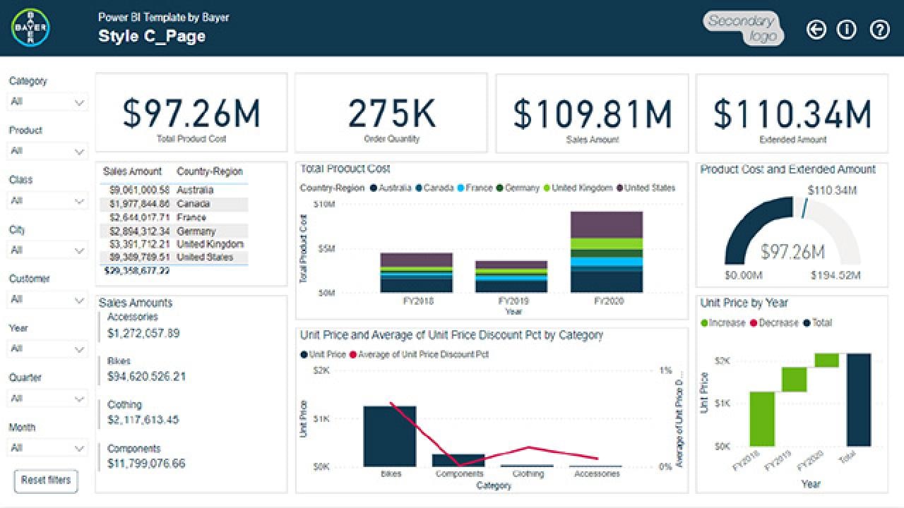
Examples of Power BI dashboard from several use cases
If you have any further questions about this or any other section of Bayer Identity Net, please contact:

The Power BI platform will be supported by the IT ServiceDesk. Supporting of your developed reports needs to be done or organized by yourself. Please find further Information here (link works for Bayer users only):
Types of visual tool you might use, and their suggested purpose, include:
Distributions (e.g., scattergram, bubble chart, visualization on a map):
to show an entire group of values within a data setTrends (e.g., bar chart, line graph, area line graph):
to show progress of a certain value over timeComposition (e.g., stacked bar chart, pie chart, waterfall chart, tree map):
to make comparisons between different values in a set e.g. relative sizes as part of a total, or effects on a running totalRelationships (e.g., network graph, Sankey chart, tornado diagram):
to show connections between different variables, from two connected values (e.g. risk and reward) to full sets of elements with complex relationshipsTargets (e.g., heat maps, traffic light indicators, radar chart):
to show performance against defined standards, or connect different data points to create a ‘big picture’ of the overall status of something

Basic information about data visualization in infographics can also be found at:
Keep visualizations clear, consistent and in line with overall branding
Once you have selected the right data and tools, it’s time work on presentation. Following standard practices here can promote easy and consistent understanding of data visualizations – helping ensure they have the intended benefits.
Best practices for creating visualizations that really work, and that meet branding guidelines, include:
Don’t include more visualizations than you have to.
Perhaps you can consolidate some, e.g., combining multiple bar charts into a stacked bar chart. The less work readers have to do to get the information, the better.Be consistent with types of visual where possible.
If the purpose is the same, use the same graphic throughout all relevant uses, to promote easy understanding and cross-referencing.Keep other data details consistent where possible,
e.g. baselines, labels, scales on x- and y-axes, and spacing.Think about placement.
Group visuals so they work together, and don’t put related visuals too far apart.Put data in an intuitive order (e.g. sequentially or by value) to make patterns stand out.
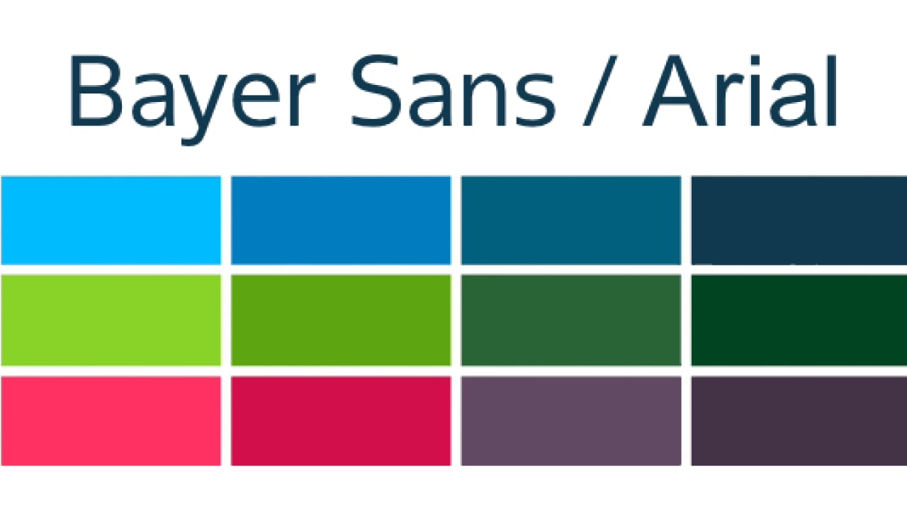
Use a defined and consistent set of colors throughout.
Use PowerBI Theme by Bayer to ensure visual consistency with the brand.Check your use of text.
Everything that needs a label should have one, but be careful not to repeat or over-explain things, or add distracting elements (e.g. different fonts or colors, or verbal puns).Use Power BI template by Bayer
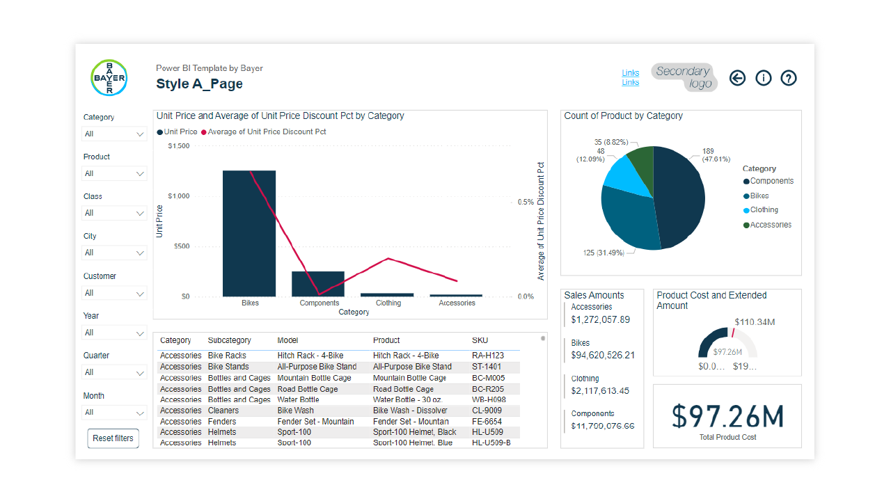
The template includes Bayer logo, fonts, and colors for page elements, visuals, and interactive buttons of the dashboard.
Power BI Template by Bayer
Power BI: The Analytics and Business Intelligence Platform
The Power BI platform will be supported by the IT ServiceDesk. Supporting of your developed reports needs to be done or organized by yourself. For further Information see here. (Link works for Bayer users only.)
These recommendations and guidance were created in close collaboration to our DT-IT-EF Data Visualization team. If you need further support especially on the development of new reports contact data_visualization_team@bayer.com by e-mail or the app http://go/dvconsultationhour.
The template was created by Global Business Services Xperience Lab project team consisting of experts from Visual Design Services (Agnieszka Chromiec, Agnieszka Sendecka) and Intelligent Automation (Patryk Pisarski, Michalina Łapczyńska).

