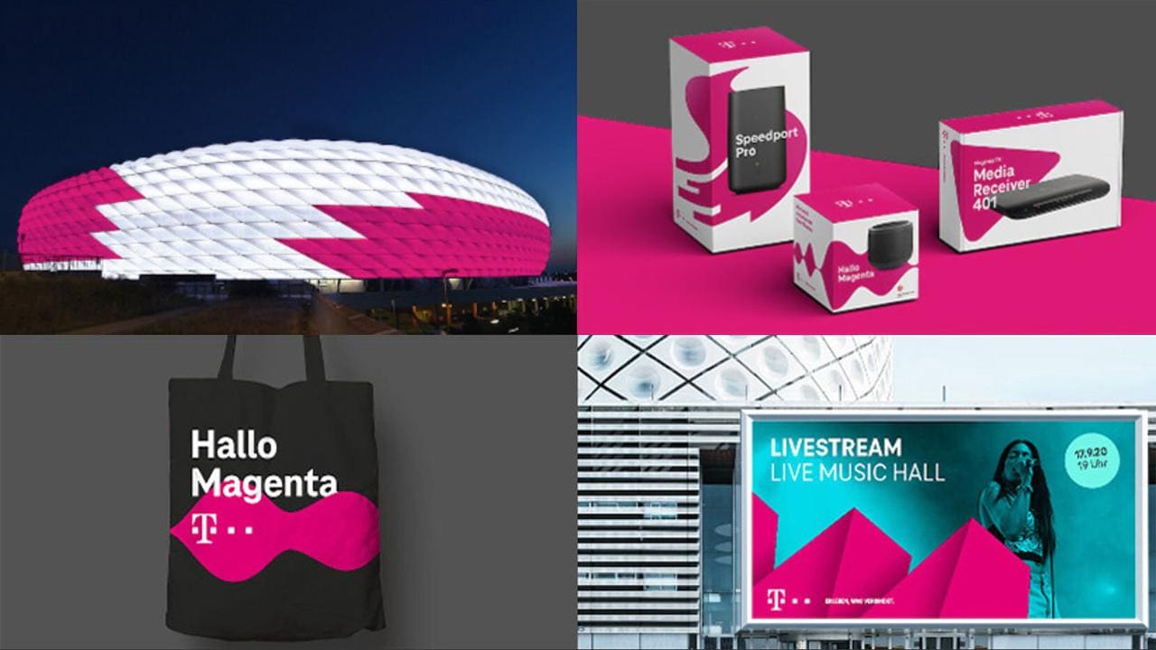
Inspiration from the branding world: Deutsche Telekom
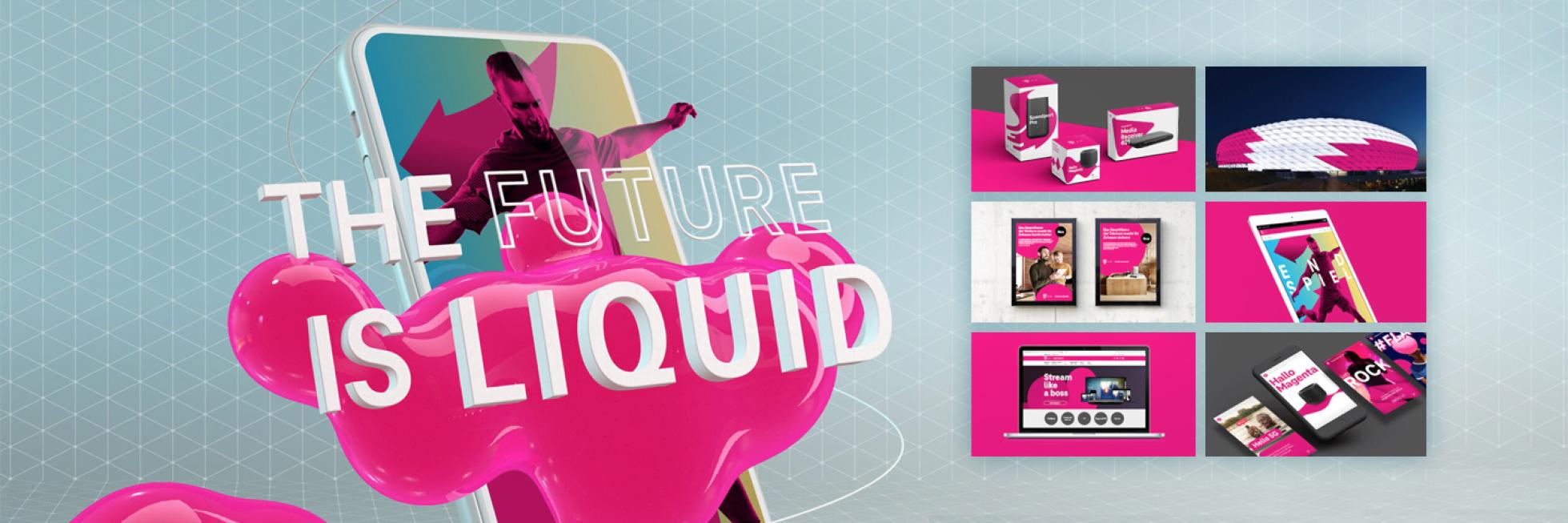
Should branding guidelines be rigid, or flexible? With its ‘Liquid Brand Design’ concept introduced in 2020, digital giant Deutsche Telekom managed to combine the best of both approaches
Brands do not exist in isolation: they are connected to customers, media, people, and the world. That’s why, at Bayer, we look externally as well as at our own projects for inspiration. There’s always something we can learn from others, even those in totally different industries. We can ask ourselves: What is their overall approach to their brand? How did their branding projects work? What relevance does it have to us, and to the world in general? Finally, we can identify and analyze upcoming trends in the branding field.
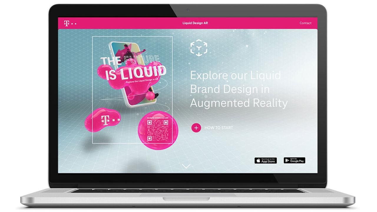
In this article, we will explore the award-winning brand model ‘Liquid Brand Design’, adopted by Deutsche Telekom in 2020. We will learn what it is, why it’s significant in a changing world, what benefits it offers Telekom and its customers, and how we might use it to inform our own campaigns.
When everything is digital, digital branding is everything
Most people will be familiar with Deutsche Telekom or one of its branded subsidiaries, such as T-Mobile. Throughout its history, Telekom gained a reputation as a leading provider of telecommunications and digital technologies – but its purpose has grown so much wider. In a world where every aspect of life and business is becoming digitalized, Telekom needed to reach people and be understood in a wider sense: as an enabler of “digital life, sustainable action and social cohesion”.
At the same time, the communication methods, and channels through which to do this are becoming more varied. From social media to wearables, AR VR and IoT-enabled objects alongside traditional media, there are new brand touchpoints at every turn, creating an ‘always on’ communication environment where a brand needs to be more flexible than ever to fit every single context it may appear in.
Amid this background, Telekom fully revamped and future-proofed its design along the Liquid Brand concept, which uses several key elements in an otherwise fluid setting to promote consistency but not rigidity.
Fixed meets flexible
There are three core elements of the Telekom brand:
- The ‘T’ logo: This was already a brand marque but has now been strengthened and simplified so it can be used across every touchpoint, from small-screen logos to full-size displays. It might be on its own or accompanied by a claim, but the logo in its ‘digit-T-digit’ format is always present.
- Magenta: The magenta color is essential to the recognizability of Telekom branding. In fact, the company’s use of magenta is legally protected! Magenta is always used in shapes, and when referring to products and services. And although it doesn’t have to be the only color, it should be the dominant one.
- Typeface: The Telekom branded font family is TeleNeo, and this is used whenever text appears in any communications. It can be used in different weights and styles, even within the same content piece, but it should always be the typeface of choice.
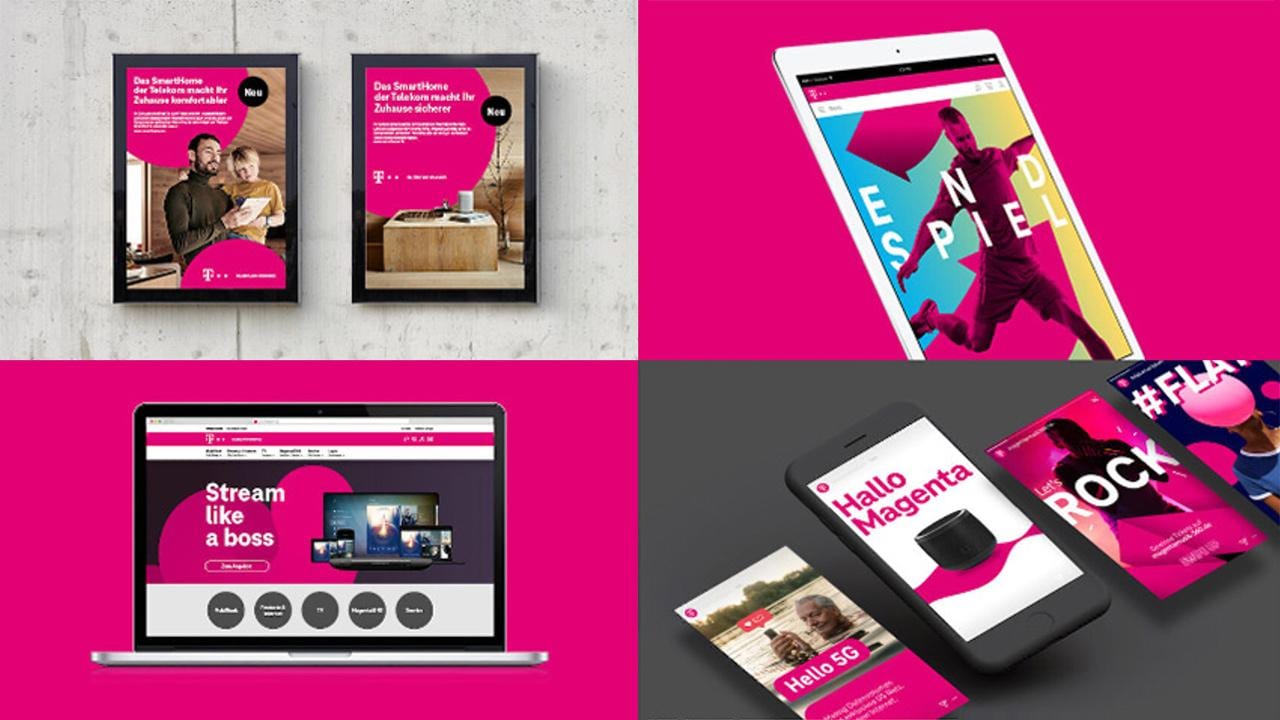
These fixed elements combine to give a strong visual identity – Telekom branded communications are usually instantly recognizable. As long as at least one of the elements is used, they can be flexibly selected depending on the requirements of the media (e.g. if there’s no room for text in a logo). And several more flexible elements can be layered on top of them:
- Shapes
- Patterns
- Additional colors
- Imagery
- Illustrations
- Headline treatments
This gives creators the freedom to express themselves within the brand framework, and to match the brand application to their goals and the story they are trying to tell.
How it looks in practice
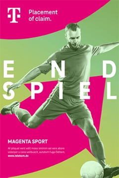 This Telekom sporting image (also produced in an interactive format) exemplifies how different elements can come together to form something genuinely creative within the standardized brand format.
It uses shapes, colors and imagery on top of the fixed elements. It’s bold but still clear and simple. And although it’s clearly not a ‘standard’ design and probably looks quite different to most Telekom adverts, it’s still unmistakably in the Telekom style.
That’s the power of Liquid Brand Design: by mastering the apparent contradiction of fixed and flexible, it paves the way to master other opposed concepts too. Static and moving; bold and detailed; descriptive and emotional; analogue and digital; it’s all possible!
In dialog with the experts
Supporting the brand concept, and its consistent execution across all formats, is the brand team, which approves all brand expressions and campaigns in collaboration with creators through the Brand Dialog portal. This way, the requirement for approval gets turned into an opportunity – because creative teams are involved in the process and can also use the portal to view other successful branding examples, whether created internally or by an agency.
This has many parallels to our holistic, 360-degree brand model at Bayer. We are committed to the consistent and supportive use of our key brand elements, from the Bayer Cross to our Visual Identity, Sonic and Verbal Identity. But within this, there’s still a lot of room to be creative and to create things that embody our goal of being a more dynamic, more outwardly oriented and people-centric brand. Giving full consideration to different identity elements, such as typography, color, use of graphic devices and imagery, gives an idea of how much flexibility you can have in designing communication material clearly identifiable as ‘Bayer style’.
And with the resources in the Identity Net – starting with these best practice guides! – we hope to bring you closer to the resources and tips you need to make inspiring brand projects a reality within our guidelines.
With a recognizable yet flexible brand that suits all channels and projects, Telekom was able to bring its brand to customers in a way that fits with their lives and meets their needs. And with your help, we can do the same!

