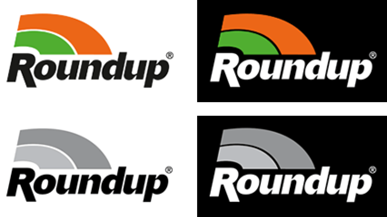
Roundup Logo
The elements within the Roundup logo have a specific size/space relation to each other, and as such should not be altered in any way. The three main corporate colors must always be adhered to. Where possible, the Pantone color system must be used, however if the need arises CMYK or RGB can be used.
Parent brand

Roundup suffixes

The elements within the Roundup suffixes are designed for maximum visual impact. The size of the elliptical symbol or icon remains consistent, but due to the variation in cap height, exact positioning of the suffix text is adjusted as required – the vertical center of the symbol always aligns with the vertical center of the cap height. However, in some instances the symbol may be dropped as it is not mandatory. The suffix color and typeface must be adhered to.


Brand expression
Don’ts and Dos

Never alter the brand logos in any way. Each element has a specific size/space relationship to each other. Examples shown opposite of what not to do.


