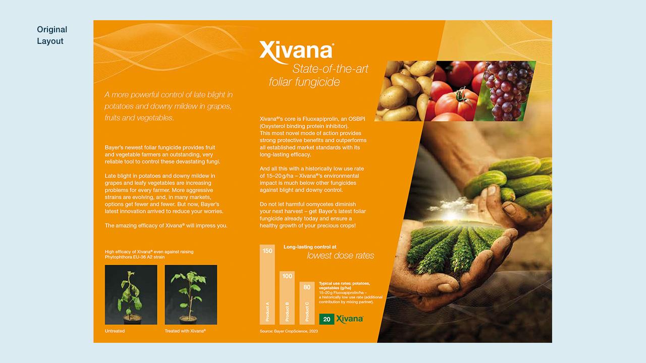
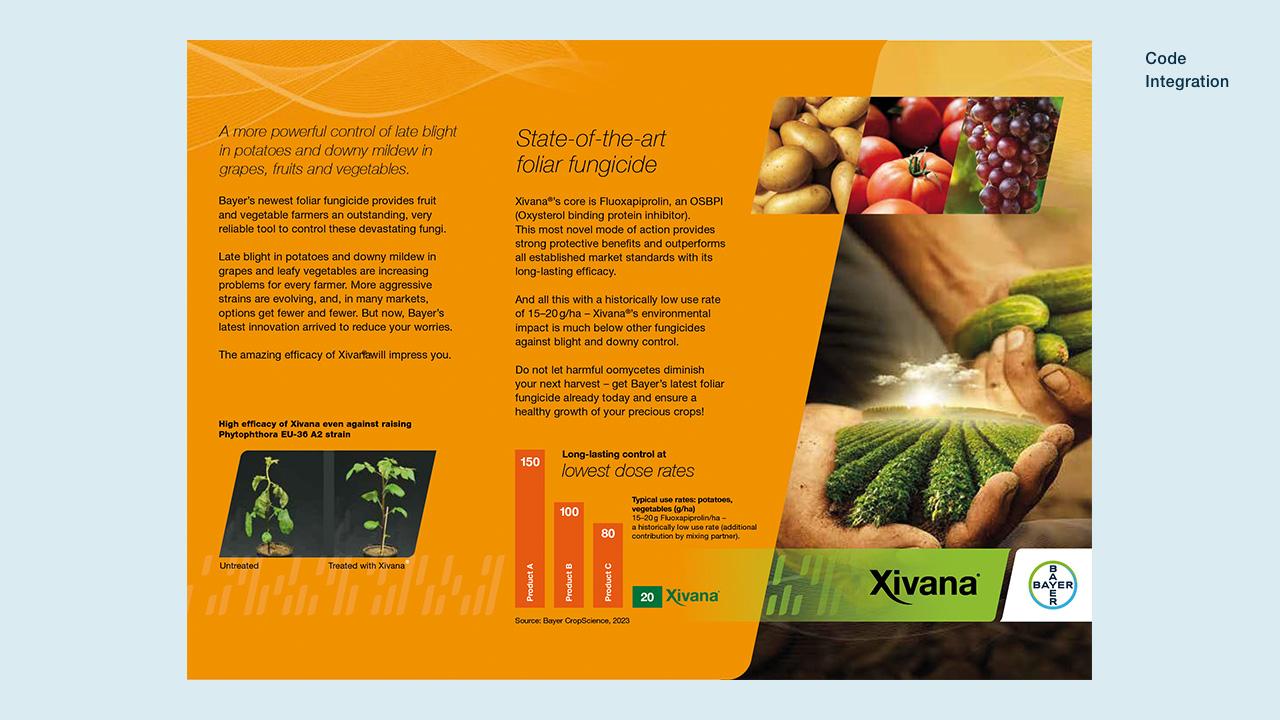
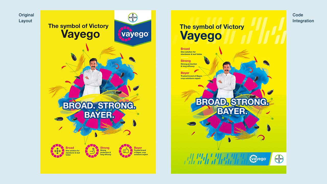
The Bayer Crop Science Code
The Bayer Crop Science Code is a visual design language that can represent — through colors and angled hashes — any possible tailored combination of brands, inputs, insights, technologies, traits or services.

The Bayer Crop Science Code
The Code is designed to maintain a universal Bayer Crop Science experience while affording flexibility needed from one execution to the next. The Code is composed of four parts: Code Elements, Grid, Gradient and Anchor.

The Anchor
The Anchor provides the connection to the Bayer Brand. The White Anchor with full-color Bayer Cross is the preferred version. The Bayer Dark Blue Anchor may be used on lighter backgrounds. Anchor

Code Elements and Grid
The Grid System defines sizing options and placement rules for code elements. Comprising three rows of equal height with a centerline, it offers three length options for Code Elements: 1/3, 1/2, or the full height of the Grid. This flexibility encourages the creation of unique Code configurations. Code Elements
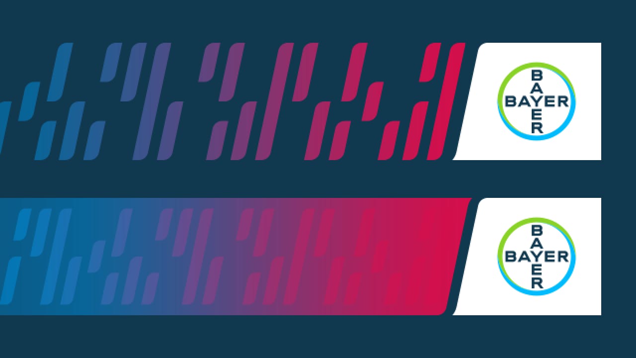
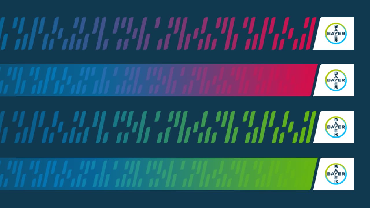


The Gradient
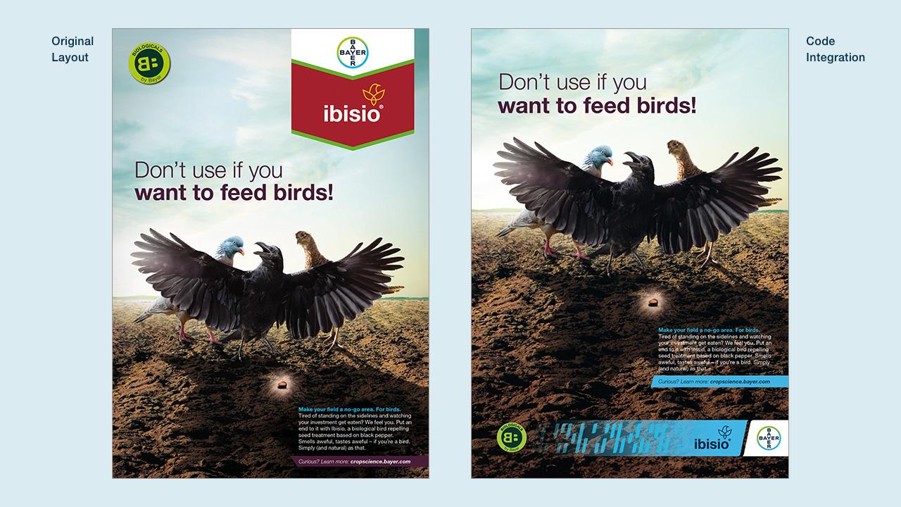
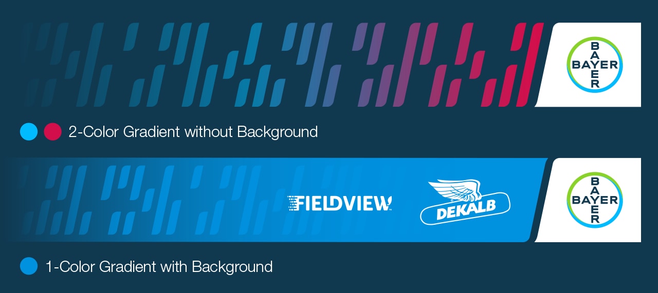
The Gradient can utilize one or two colors depending on brand category. The Code without Background allows for larger Code Elements. The Code with Background Gradient extends beyond up to four brand and product logos. Code and Background Gradients must be consistent in color. Gradient
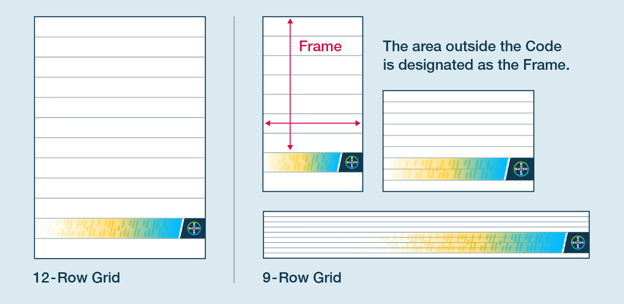
The 9-row and 12-row layout grid
Code sizing is determined by evenly dividing the vertical space into a 9- or 12-row grid. The Code may span multiple rows to ensure that the minimum Bayer logo size is always maintained. In print applications, the minimum diameter of the Bayer Cross is 15 mm. For digital applications with limited space, only one logo can fit in the Code, with the minimum diameter of the Bayer Cross set at 60 px. Layout Grid
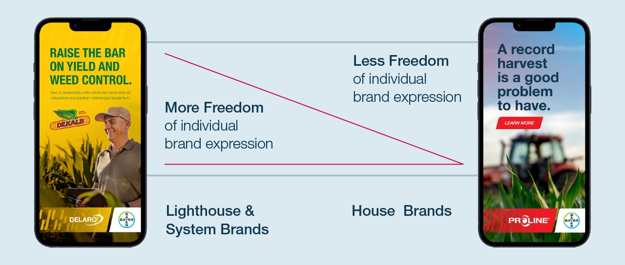
The Bayer Crop Science Code Design differentiates between brands
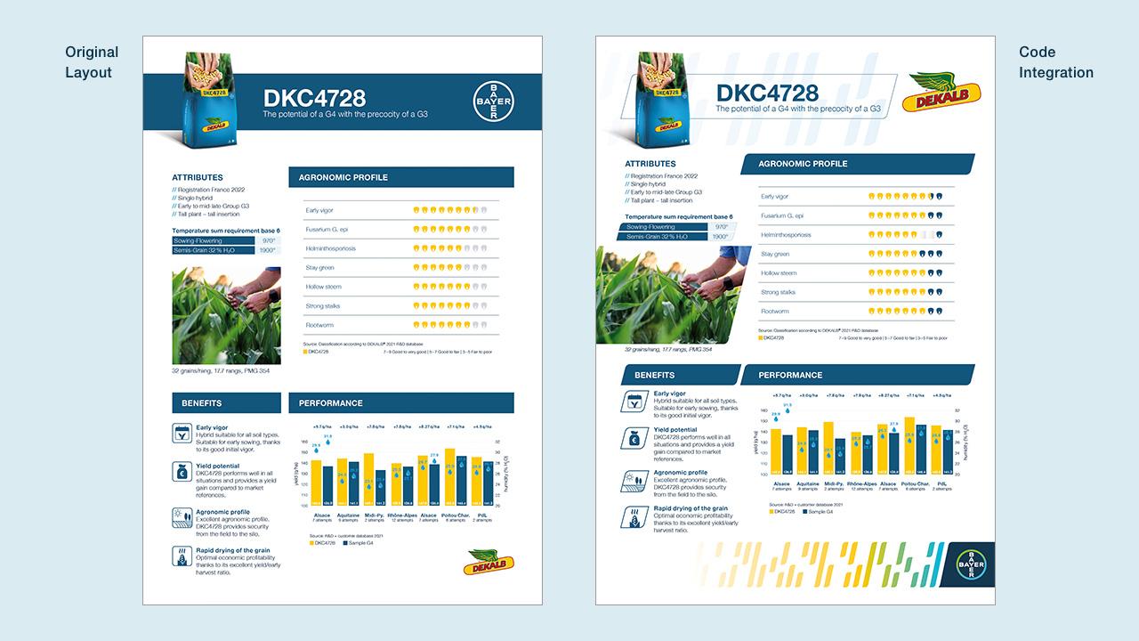
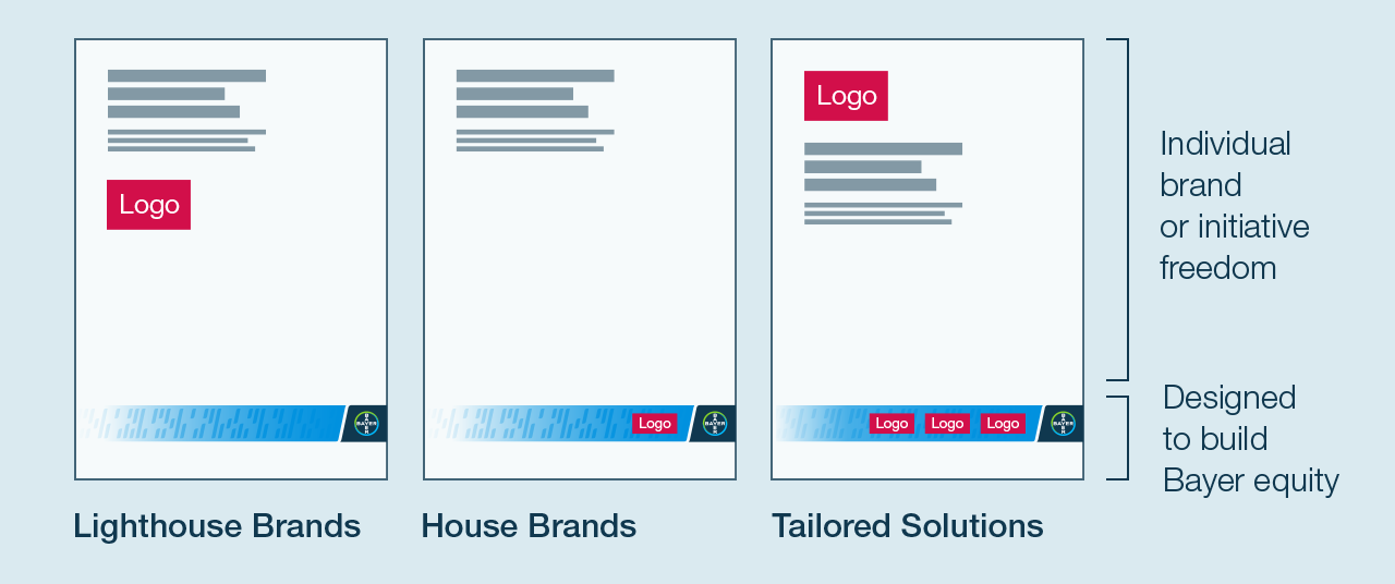
Lighthouse and System Brands can be expressive and unique while still easily recognizable as a Bayer property. The Lighthouse or System Branding as well as the logo takes priority and can be elevated above the Code design.
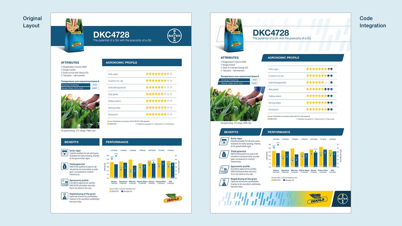
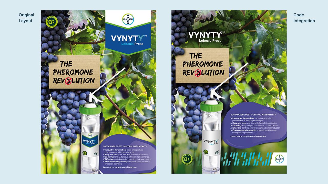
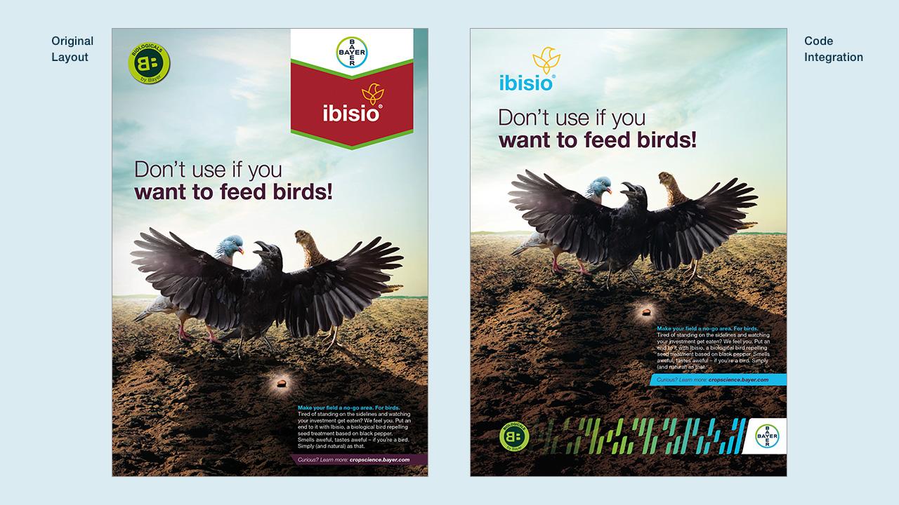
House Brands have still freedom of the layout, the brand logo appears within the Code to build greater Bayer equity.
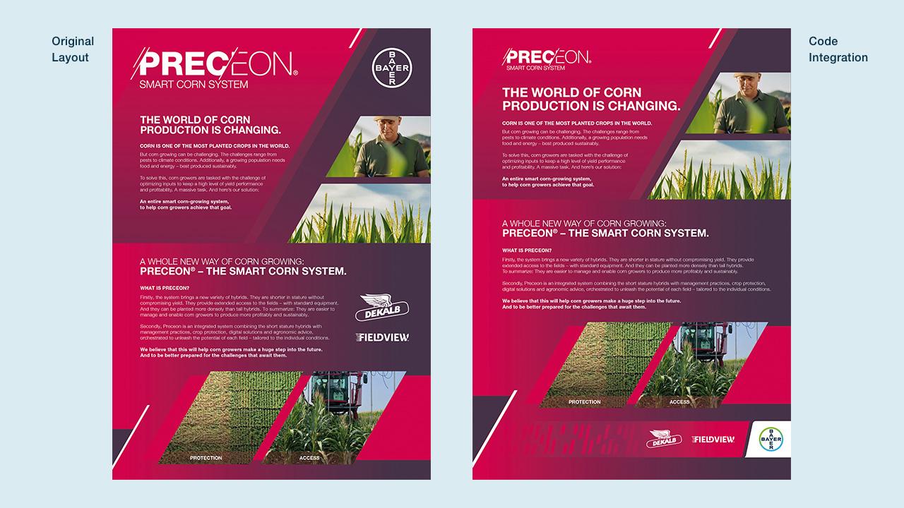
Tailored Solutions only feel like Bayer when the logos are paired next to the Bayer Cross. If this is a solution that falls under a singular name, like Preceon, the logo may be elevated and function like our Lighthouse Brands.
Gradient Color Options
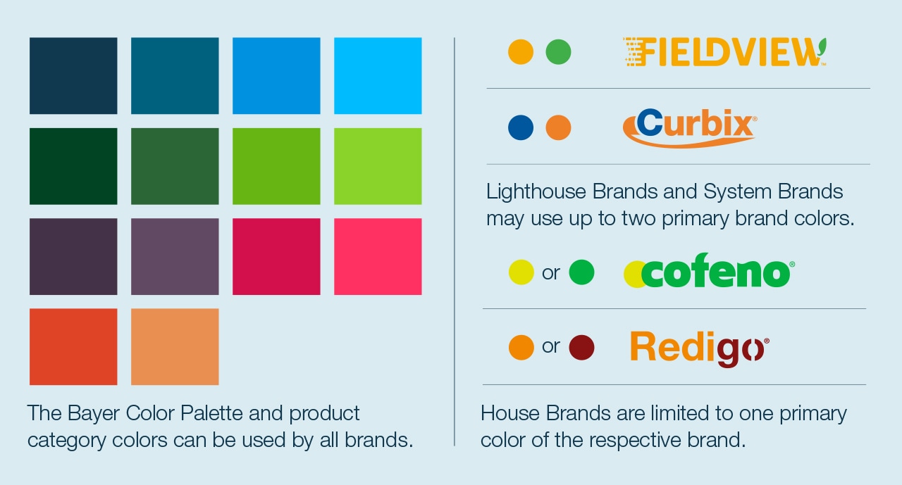
House Brands employ 1-color gradients based on a single color from the Bayer Color Palette, a product category color, or the brand’s primary color. Both Code and Background Gradients should be used for House Brands.
Lighthouse and System Brands may use either 1-color or 2-color gradients, designed with primary brand colors, product category colors, or hues from the Bayer Color Palette. Gradient Color Options
Product and Brand logo placement
House Brand logos are placed in the Code with a Background Gradient to enhance legibility. When used in the Gradient, brand and product logos adopt a single color. Logo Placement on Code Bar
Lighthouse and System Branding may take priority over the Code design. These logos are positioned outside of the Code, within the Frame, allowing individual brand or initiative expression. In some instances, the logo may fit the layout best when placed in the Code. This is an acceptable execution. Logo Placement in the Frame
Tailored Solutions feel Bayer first when the logos are paired next to the Bayer Cross. If this is a solution that falls under a singular name, like Preceon, the logo may be elevated and function like our Lighthouse Brands.
Before and after

