Graphic device
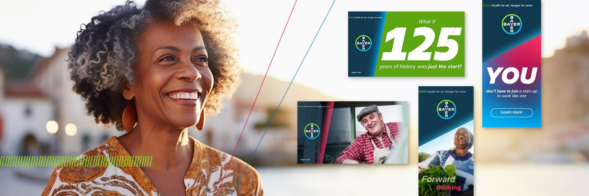
Standing for progress and forward thinking, our dynamic angle is the basis of our graphic device. The angle can appear in how we crop photography, the angle of our italic text, graphic textures and page graphics.
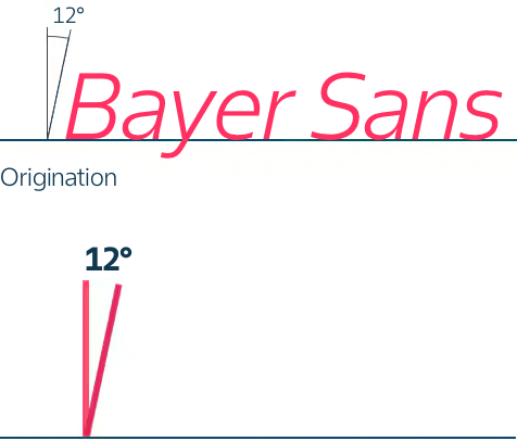
Dynamic angle: A 12° angle represents a possible starting point for keylines, block colors, etc.
- The dynamic angle concept corresponds to our brand typeface Bayer Sans. The italic versions of the font are constructed to tilt 12° towards the right. This angle creates a dynamic and progressive look and feel.
- The 12° angle represents a starting point. Other angles can be applied to suit the various applications, sizes and formats.
Expressions of the graphic device
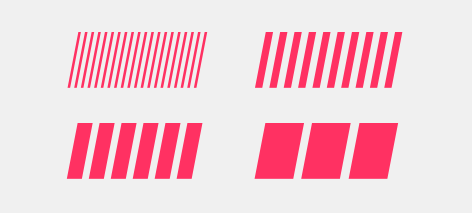
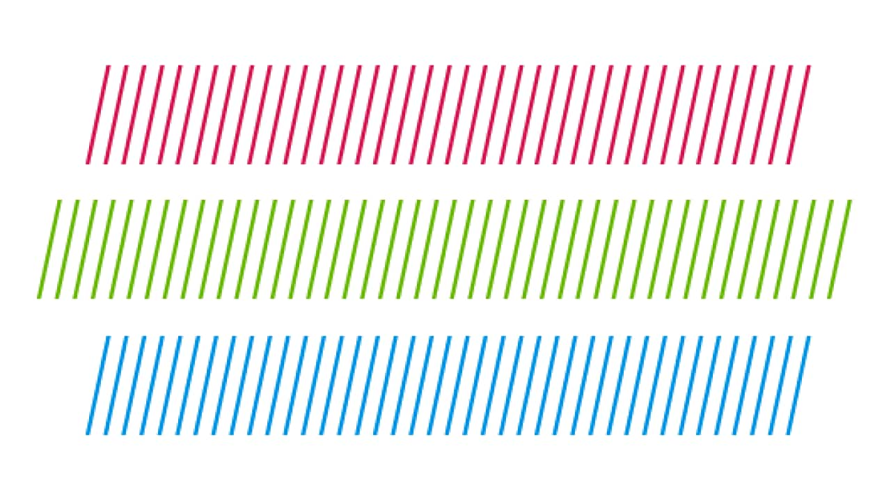
Dynamic textures
The dynamic angle concept is expressed in three main ways:
-
Dynamic textures
-
Dynamic image crops
-
Dynamic page graphics (panels and keylines)

Dynamic image crop
The dynamic angle device should be used throughout our communications. Care should be taken to avoid distracting effects. In most instances, one, two or three angles create pleasing designs. More than three angles should be avoided.
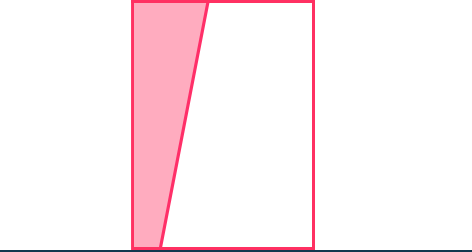
Dynamic page graphics
- All designs use a dynamic angle.
- In most instances the starting point for the dynamic angle is set at 12°.
- Other angles that can be used range between 12° and 80°.

Dynamic angle range

Multiple angles can be used, appropriate to the format of the application. Do not overcrowd the design with dynamic angles.

Dynamic angles may cross over eachother, provided they stay within the range of 12º to 80º.

Dynamic angles may define the border between a block of colour or an image and the rest of the space.

The same applies for a block of colour or an image with two exposed edges, the dynamic angles may define the border.
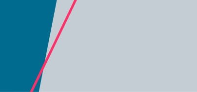
Dynamic angles may also cross over two areas of imagery or colour. The angles of both lines should be different enough to eachother to provide a clear distinction, and not look like an accident.
The above schematic shows examples of how these angles can be combined.
- The aim is to create dynamic and forward facing layouts and designs.
- The layout should show a clear direction, without too much distraction.
If you have any further questions about this or any other section of Bayer Identity Net, please contact:
Logo Devices
To make all our communication more accessible, there is a need to organize information hierarchically to guide the audience’s attention and help with comprehension, particularly for neurodivergent people. For this reason, the Bayer logo device is introduced as a consistent graphic asset across all our communications that ensures maximum visibility of the logo and mission statement. For maximum flexibility and stand out, there’s a selection of logo devices that can be applied in landscape, portrait and layouts with full bleed imagery.
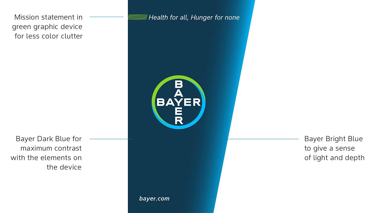
Logo device for landscape layouts
Use this device to ensure high contrast between the logo and mission statement, making it easier for individuals with visual impairments to perceive the information. Always use the approved master artwork.
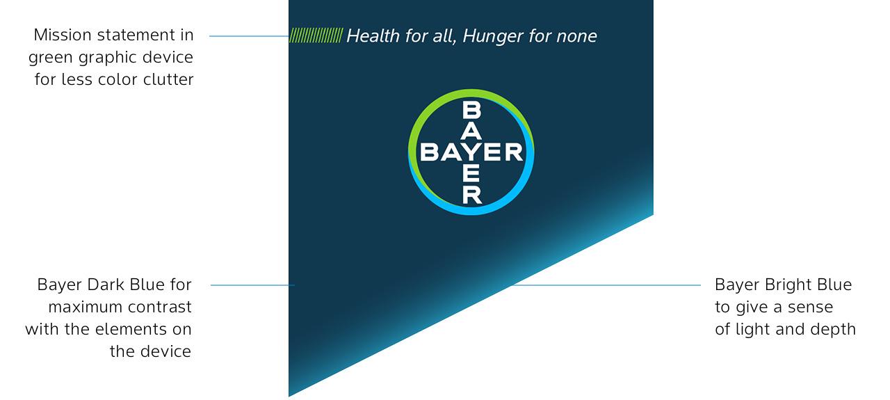
Logo device for portrait layouts
Similar to the landscape logo device, the portrait exists to ensure readability and visibility of the logo and mission statement in portrait layouts, making it easier for individuals with visual impairments to perceive the information. Always use the approved master artwork.
The graphic and logo device in use: examples
The following examples show how to best use the logo devices. Always ensure high contrast between the logo device and the background for those with visual impairments.
- 1/5
- 2/5
- 3/5
- 4/5
- 5/5
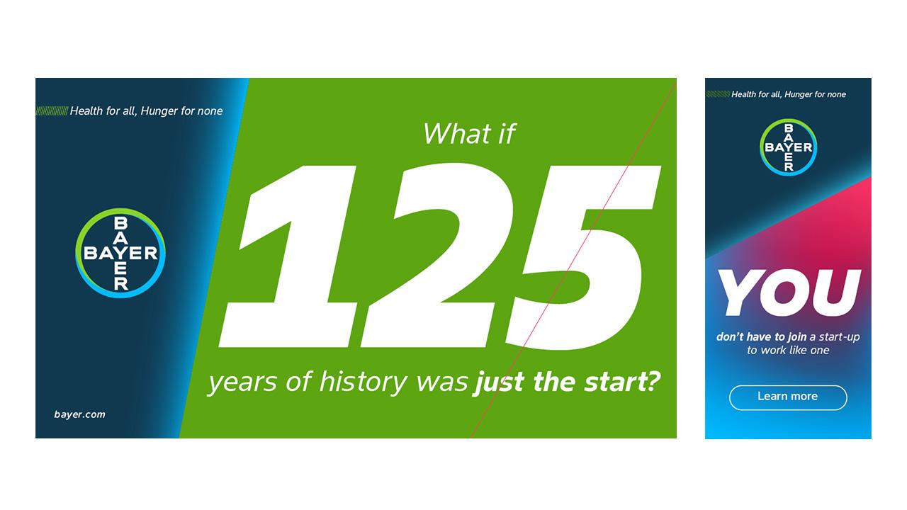
the following examples show how to best use the logo devices. Always ensure high contrast between the logo device and the background for those with visual impairments.

use the following logo devices on layouts with full bleed imagery. Always ensure high contrast between the logo device and the photography. Check the rules on photography for further guidance.

use the following logo devices on layouts with full bleed imagery. Always ensure high contrast between the logo device and the photography. Check the rules on photography for further guidance.
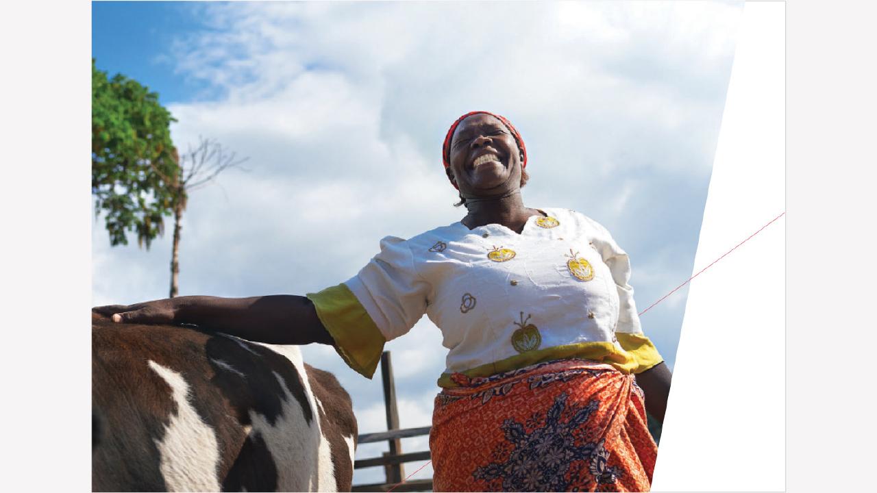
The example above shows the use of two dynamic angles. The first angle crops the photograph (creating white space), the second keyline ‘interacts’ with the photograph.
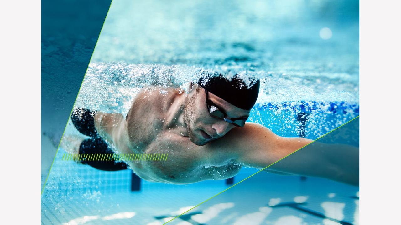
The example above shows the use of two dynamic angles. Both angles define the border between a blue panel and the photograph. The dynamic textures adds dynamism to the composition.

