


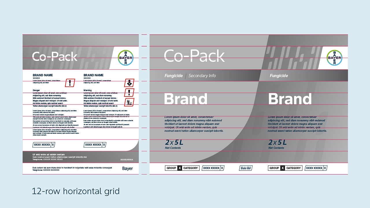
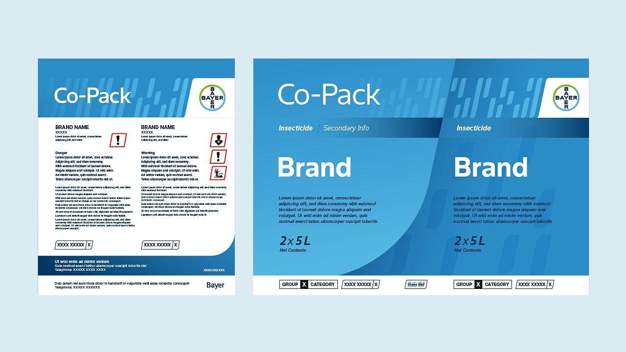
Crop Protection Packaging Design System
The flexible design system supports a range of copy and content lengths.
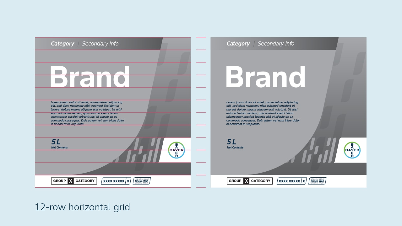
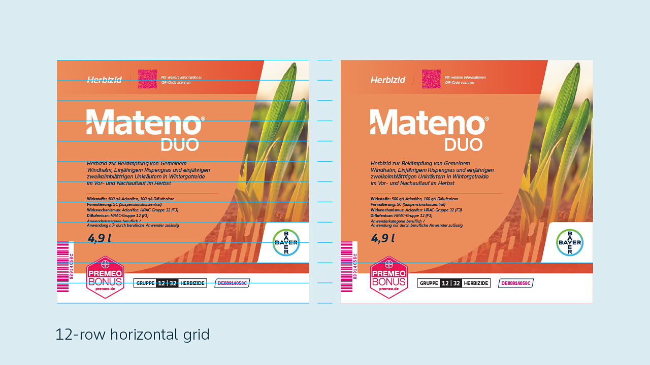
Design Elements
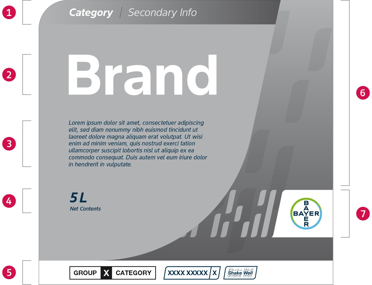
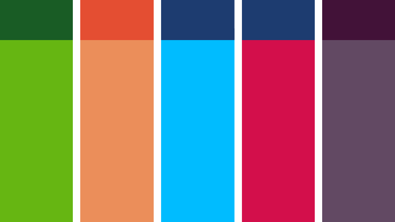
1. Category Gradient
This section identifies es the category and can be used to apply secondary info ranging from copy to signets. Information is separated by a 12 degree keyline.
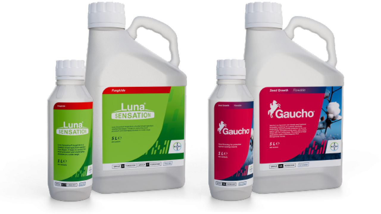
2. Brand Logo
The logo sits within the element and reverses out of the category color. The logos will vary in size but a common baseline is maintained. Both the Bayer logotype and the Bayer Cross must be used independently on the packaging. Where foreign character versions of the Bayer logotype are used, e.g. in China, these versions must also be included. For further details and information, please contact the responsible legal department.
3. Product Descriptor
The product info can vary in length.
4. Content Descriptor
The net contents can shift up and down depending on the length of the Product Descriptor.
5. Application Area
This area can be used to apply additional stickers, labels or icons. The height can adjust to accommodate the information.
6. Code Element
A cropped section of a Code element is used to house the main information of the product. The flexible shape can adjust in width and height to accommodate product descriptors. See examples below.
Background
A gradient of the category color is used to provide contrast to the label content and the full code lockup. When using an image, an optional dark gradient may be applied to the background to add contrast or weight to the composition.
Code Watermark
A subtle watermark is added to the background. This is not needed when an image is used.
7. Code without Background
The Code Lockup is positioned at the bottom of the layout. It’s position can move up or down depending on the content.