Packaging Design
Photographic and Clinical route
They both aim to be “fresh” and “clean” to match the Roundup® brand values and add some positioning statements to the product labels. You are free to choose either options. Once a route has been decided upon, it must be carried out through the whole range for a specific market. There must be “NO” mixing between the Photographic and the Clinical routes.
Photographic route
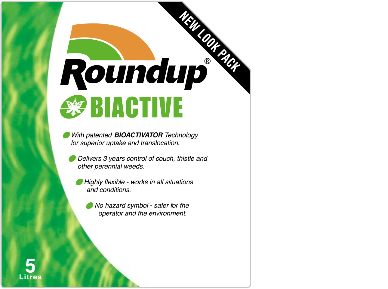
The photographic route is the preferred option as it reflects Roundup’s three core values – power, intelligence and efficacy, with more visual impact than the clinical route. It should be used as a first choice to achieve as much consistency as possible. It uses abstract imagery that changes across each sub brand which is located on the left-hand edge of the pack in a curved holding device. The image holds the pack size specification.
Clinical Route
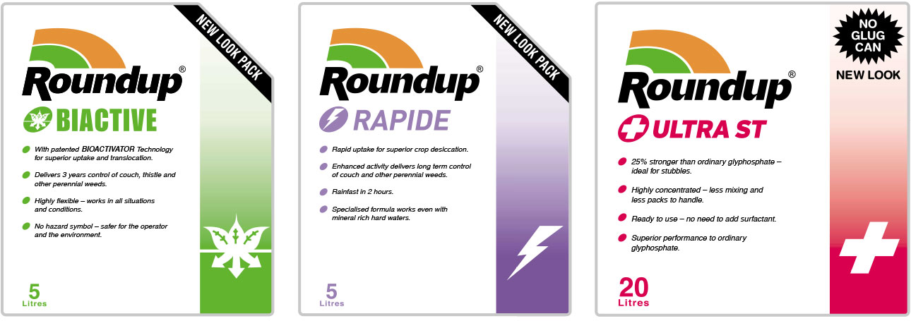
The clinical route is provided as an alternative execution that some markets may feel is cleaner, simpler and more appropriate. The clinical route uses a vertical bar device in the appropriate sub brand color which graduates from the bottom and fades out to white at the top. The bar is located on the right hand-side of the pack and holds the family icon
Don’ts and Dos
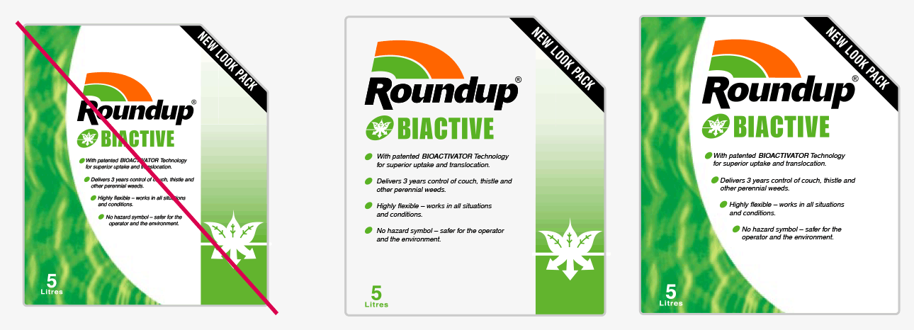
Never mix the clinical and photographic route. They must remain as separate executions to retain brand integrity.
Claims and legal claims
The label design provides a great opportunity to make competitive claims, add positioning statements, communicate grower benefits as well as unique features of Roundup® products and describe areas of usage. We strongly urge teams to work with their local regulatory contacts to ensure that these messages are pushed forward on to packs to ensure the brand is strengthened.
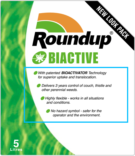
Ideally only claims should appear on the front label if legal information has the scope to go on the back. The bullet points use the ellipse device from the icon and appear in the appropriate sub brand color. The height of the bullet point is 125 % of the cap height used. The font is Helvetica Oblique, type sizes varies between each label type. Each bullet point has a line space between. A maximum of four claims should appear at any one time. On the photographic route the bullet point range off the curved edge.

Claims plus legal
Where legal information must go on the front of the pack, claims can still be placed as long as there is sufficient white space. Legal information is placed in keyline boxes with a weight of 1pt in the appropriate sub brand color. Legal text appears in either Helvetica Regular or Helvetica Bold and ranges left. The required size of legal text varies from market to market, so please check accordingly.
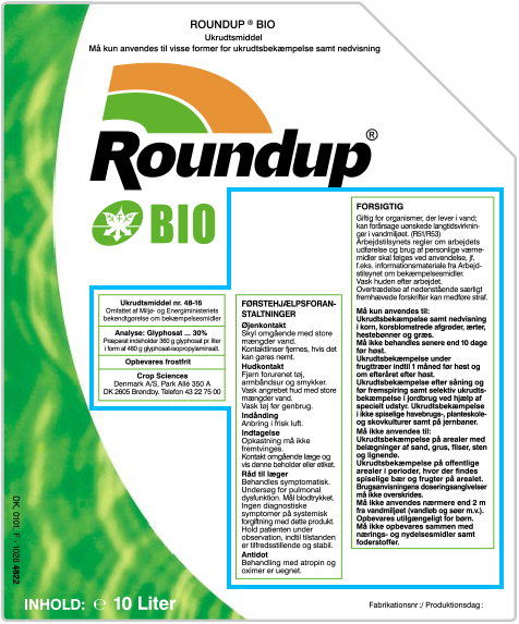
Legal information only
Where there this a large amount of legal information that must go on the front, claims should be dropped. The legal information should be managed in as clean a way as possible, placing it in keyline boxes with a weight of 1pt in the appropriate sub brand color. Legal text appears in either Helvetica Regular or Helvetica Bold and ranges left. The required size of legal text varies from market to market, so please check accordingly.
G3-family: Clean and green
Waves – to reflect the “efficacy” and the “strength” of the brand while showing the “safety” or “bio” position of G3.
GL-family: Power positionings
Lightening - to reflect the “power” and “control” of the GL-product.
Additional branding items
There are also additional branding items which needs to be incorporated on to some packs, such as those listed below.
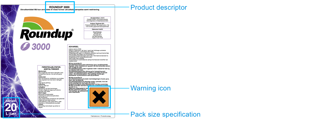
Product descriptor
Where there is a lot of legal information there is still scope to put a descriptor on to replace the claim information. It appears at the top of the pack centered.
Warning icon
To be used at he appropriate legal size where necessary.
Pack size specifications
Size varies from pack to pack but must be used in the specific sub brand color or reversed white out of an image on the photographic route. For the G3-family


