


Bayer Brand Communication: corporate campaign
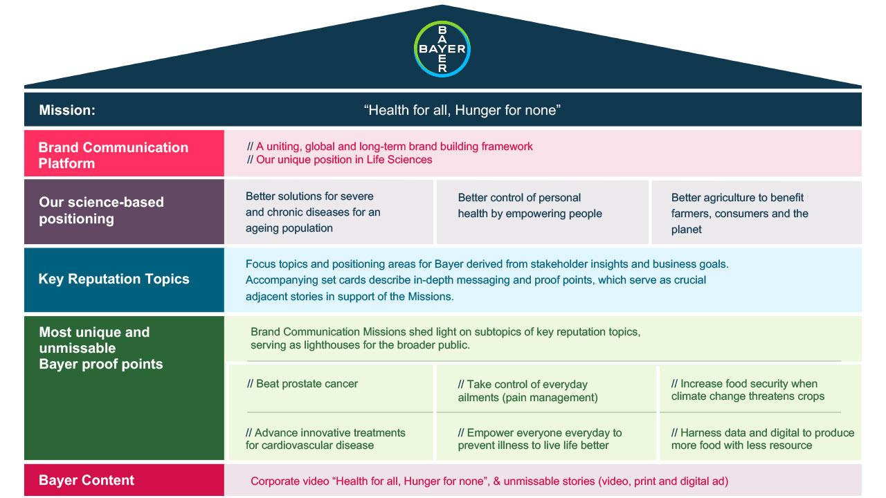
As #TeamBayer, we want to improve lives through science, working towards a world with ‘Health for all, Hunger for none’.
Bayer Brand Communication is a platform idea to articulate, unite, and elevate our unique Bayer brand with a single narrative that connects our three divisions. We want to tell the unmissable Bayer story at the intersection of world-defining topics – as a science-based company serving essential human needs in health and nutrition.
What is it?
Brand Communication is a unified, global communication platform idea that unites and unleashes the full potential of our iconic Bayer brand. It helps us articulate, unite, and elevate our brand with a single narrative that connects our divisions.
Why is it necessary?
We need to strengthen the Bayer story by broadly and consistently communicating who we are and what our vision is.

Now, more than ever, people need trust and reassurance in their health and nutrition. Global topics that have left people feeling vulnerable worldwide.
People are searching for allies, turning to brands that are seen to be tackling the sources of those vulnerabilities. Life’s most essential building blocks that we, as Bayer, are leaders in – based on science as our superpower.
How are we bringing it to life?
With a strategy built on Bayer’s unique DNA, the foundations of our brand, our business leadership and leveraging science as our superpower.
The brand communication concept combines Bayer’s Mission, messaging and proof points, and our existing visual identity with an additional design element – the Circle.
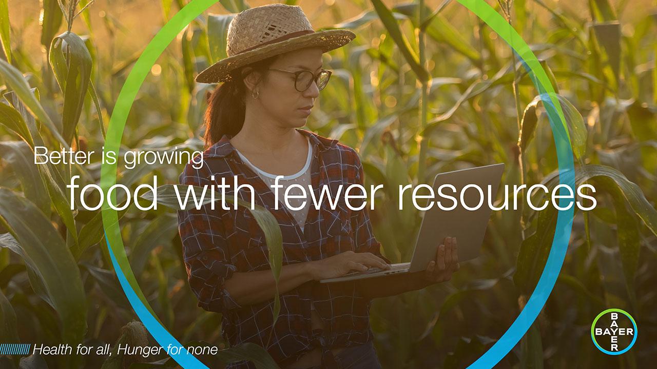
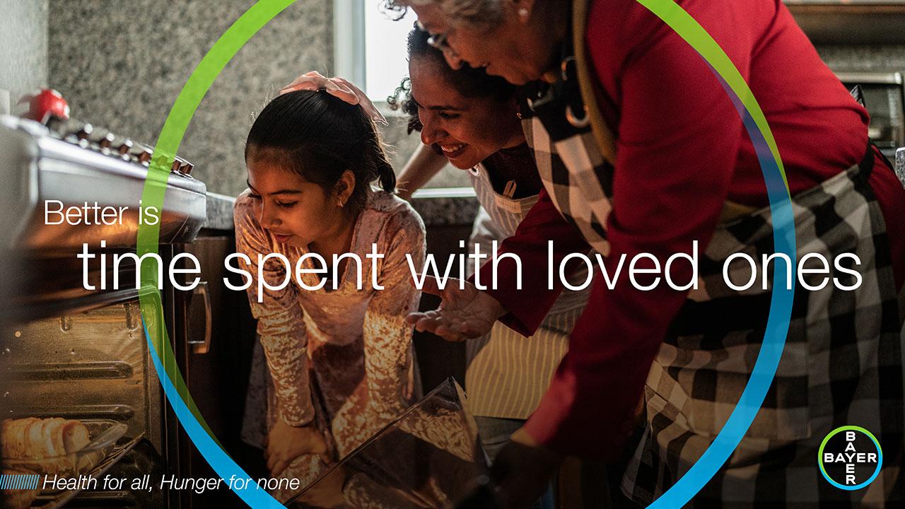
The Circle – connects one decisive part of our best-known and most distinctive brand asset, the Bayer Cross, with people and our solutions we provide – this helps humanize Bayer, rebalance the perception, and close the existing knowledge and likeability gaps. The green and blue circle acts as a burning glass, creating unity and connection, and putting humans at the center of our brand communication.
- 1/4
- 2/4
- 3/4
- 4/4


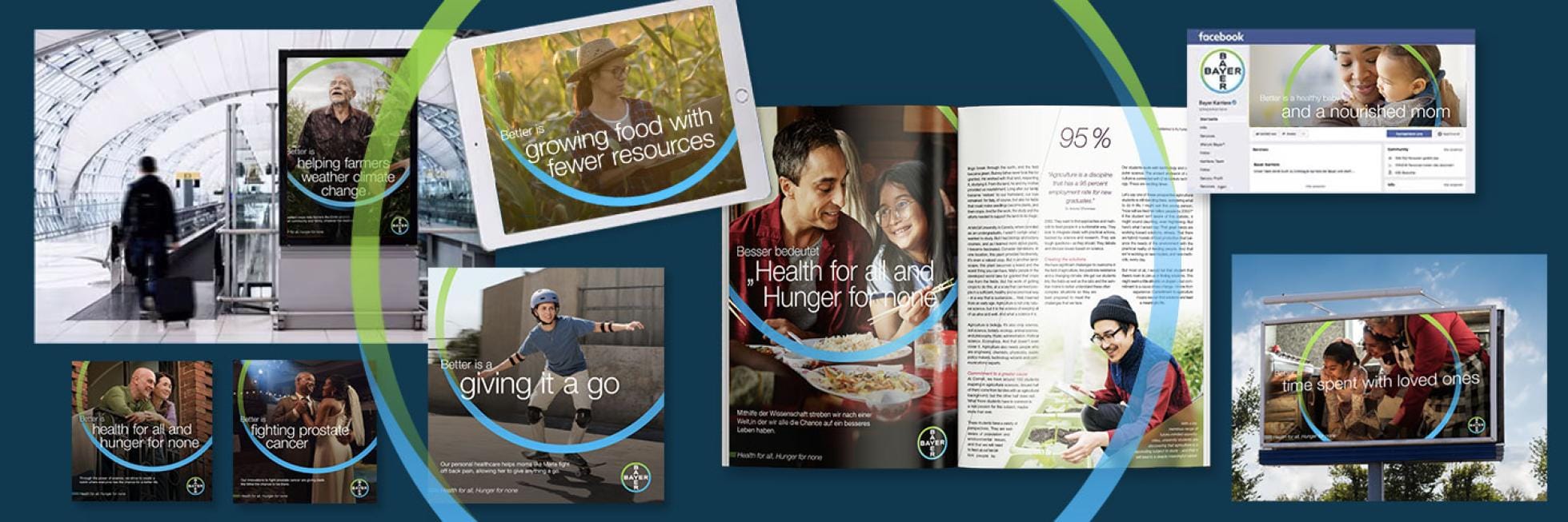
We provide you with a broad variety of creative assets in digital, print and video forms, showcasing our unmissable stories and representing different geographies in various formats. You can find them in Media Pool.
How you can join?
Join us in globally articulating and elevating our unique brand across our target audiences. Besides of the produced global assets, you are empowered to localize videos and key visuals to feature the most prominent Bayer stories in your region. Here we provide you with some principles and useful tips to follow.
Tone of Voice
We want to help create a more human, compassionate Bayer, therefore our tone of voice should always be warm and personal but still informative and confident. Depending on the subject matter our tone should be able to range in empathy, especially if we are talking about harder hitting matters such as cancer or heart conditions.
The language we use when describing our processes or products should more colloquial and less scientific, however, we shouldn’t treat our customers/viewers as uneducated. We still need to be informative, but we should do it in a warm and human language manner.
Circle
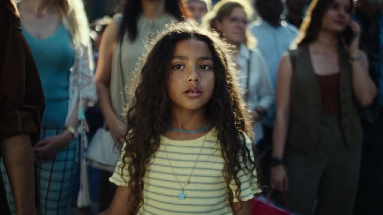
The Circle should always focus on a person (or group of people), this helps the viewer focus on the subject and allows us to create more of a connection to whatever we are talking about. Whatever image we select, the person/s should always be in the center, allowing for the Circle to be placed around them.
This graphic is usually cropped either left and right or top to bottom depending on the format. It is always placed at 100% opacity.
Photography
As part of our goal to create a more empathetic, likeable Bayer, our images should reflect society and be emotionally warm in color and subject matter. We want to show a positive but realistic reflection of life. We should avoid stock photography that is overly exposed or staged. We should see people interacting with the world around them.
Lighting should be warm and real; we should be capturing people in the moment. They should not pose or be looking directly into camera.
Key Visuals
Our first set of key visuals can serve you as a guide of what to capture.
If you are to pick new versions of the images above or aim to produce new ones, they should be warm in tone and reflect real life. The images should feel authentic. Lighting should feel like it has been captured in the moment and not staged.
In a nutshell – important to note:
- Bayer Brand Communication concept aims to help rebalance Bayer’s perception, building our reputation based on our unique position in Life Sciences, and unleashing the Bayer brand’s full value potential.
- We are using the Mission statement to emphasize the connection of everything we do with the our main long-term goal.
- Unmissable Bayer proof points (tangible stories) that are understandable to the general public are intended to make visible how we improve people’s and Planet life.
- The new brand communication doesn’t change who we are and what we stand for – the opposite is the case, it makes our Bayer positioning even clearer and adds to our unique story.
If you have any further questions about the ONE Bayer Brand Communication, please contact:
for Brand Strategy and Identity - Olena Paul
olena.paul@bayer.com
for Brand Communication and Partnerships - Liza Lobo
liza.lobo@bayer.com