


Code Design: Flexibility meets familiarity in Crop Science’s new visual language
Have you seen products or marketing materials bearing the new Code Design? It’s a step into the future for Crop Science: articulating the current strategy, meeting state-of-the-art communication needs, and injecting fresh energy and modernity into its look-and-feel. Learn how we are maximizing the upside, making the Code Design feel both recognizable and new, while enabling a safe and successful roll-out in every region.
What is the Code Design – and why did we create it?
It’s well established that stakeholders perceive our products more positively if they know they are from Bayer. That ‘uplift’ effect can occur in an instant, when someone sees our packaging or merchandising materials and immediately recognizes them as Bayer.
Think of how Aspirin’s teal and dark green colorways stand out in the Consumer Health category. In Crop Science, recognizability had long been promoted through the arrow-shaped Brand Tag, which appeared on products for 30 years or more. It’s a design that became part of our identity, inspiring trust in our products.
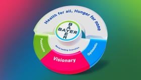
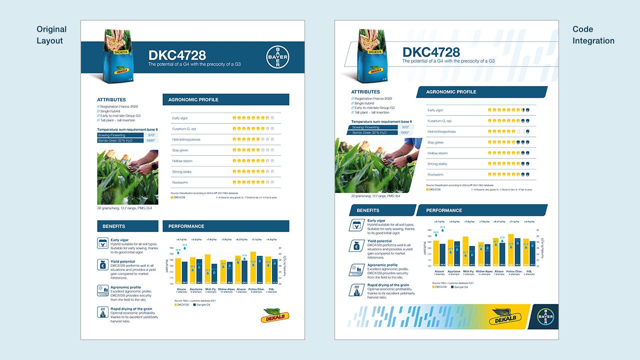
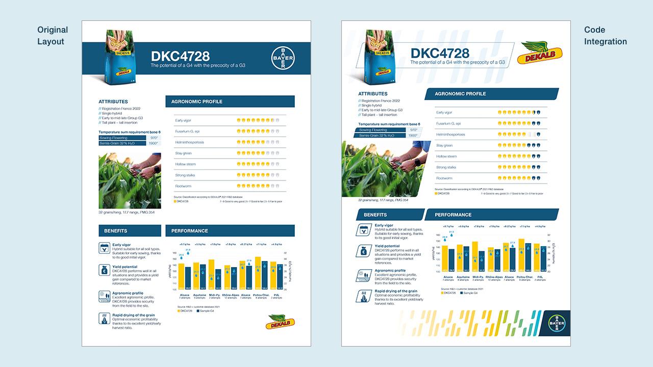
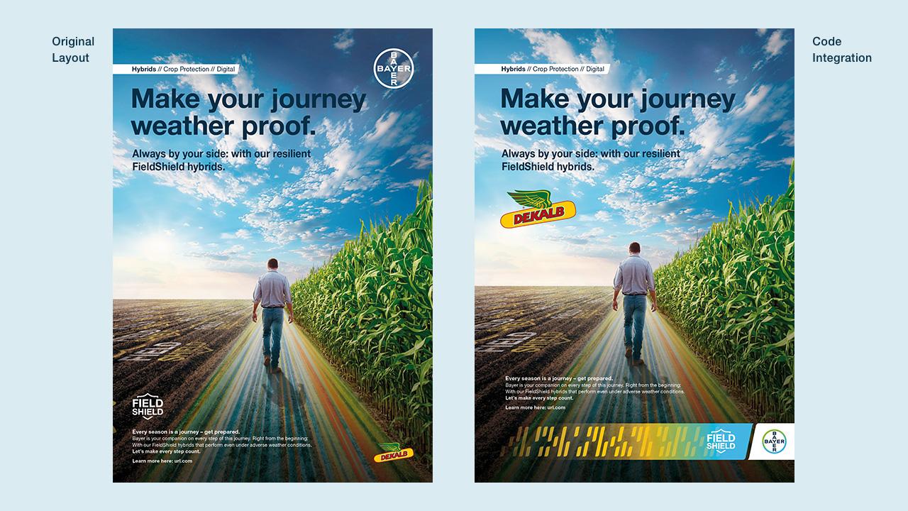
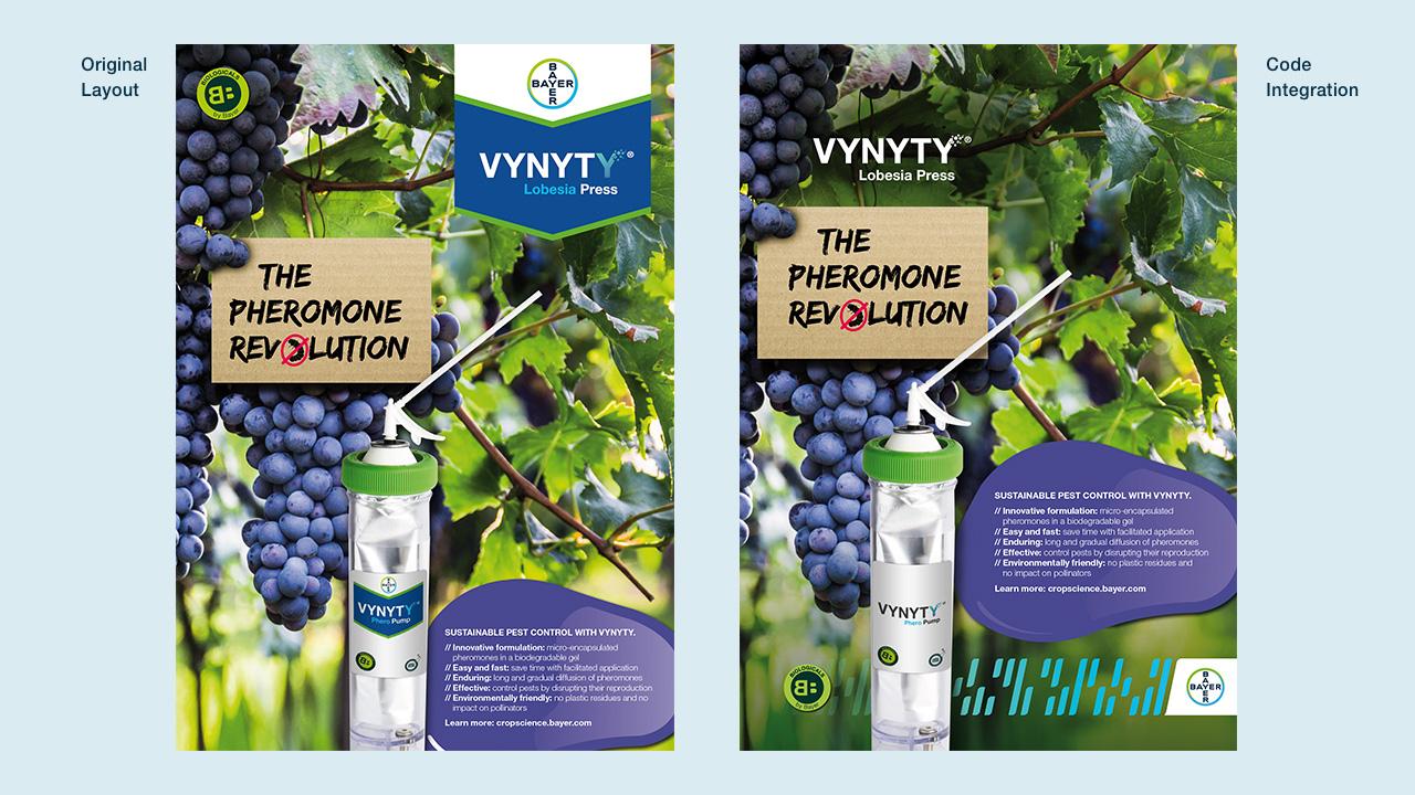
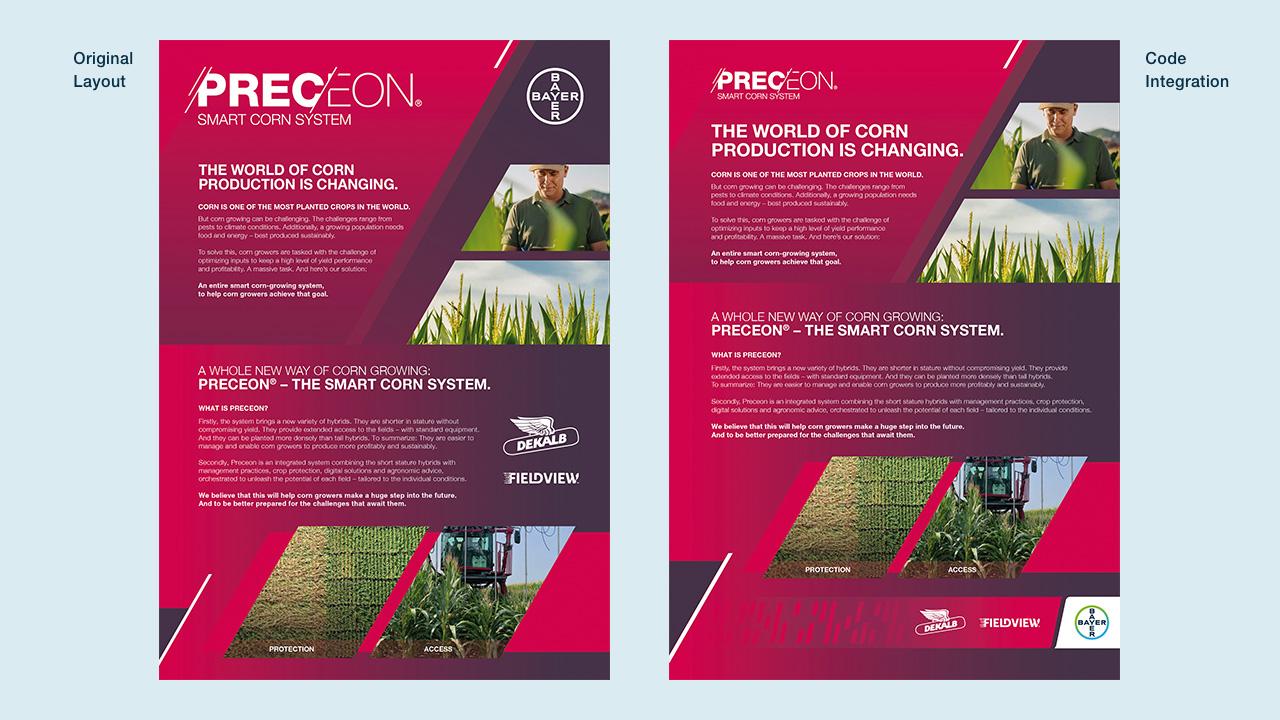
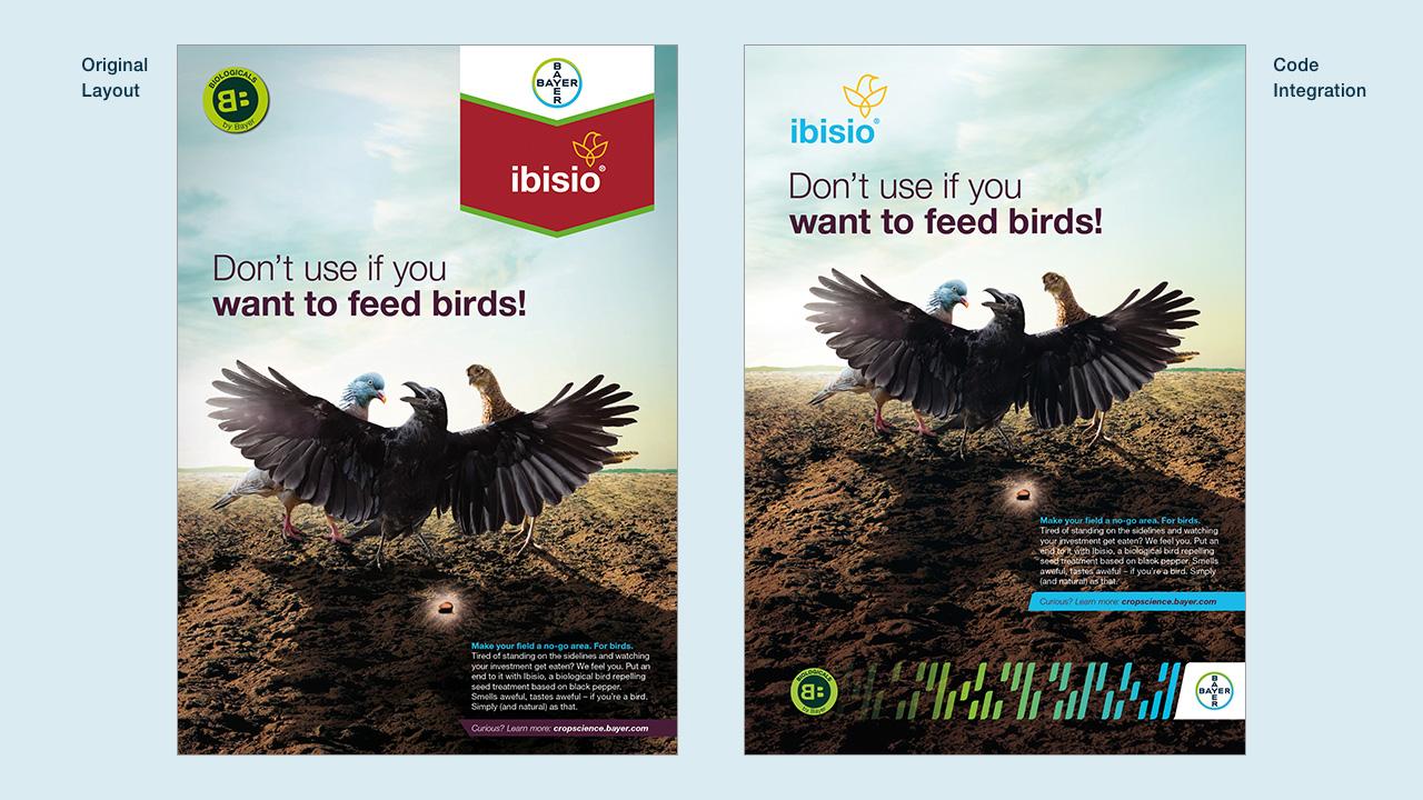
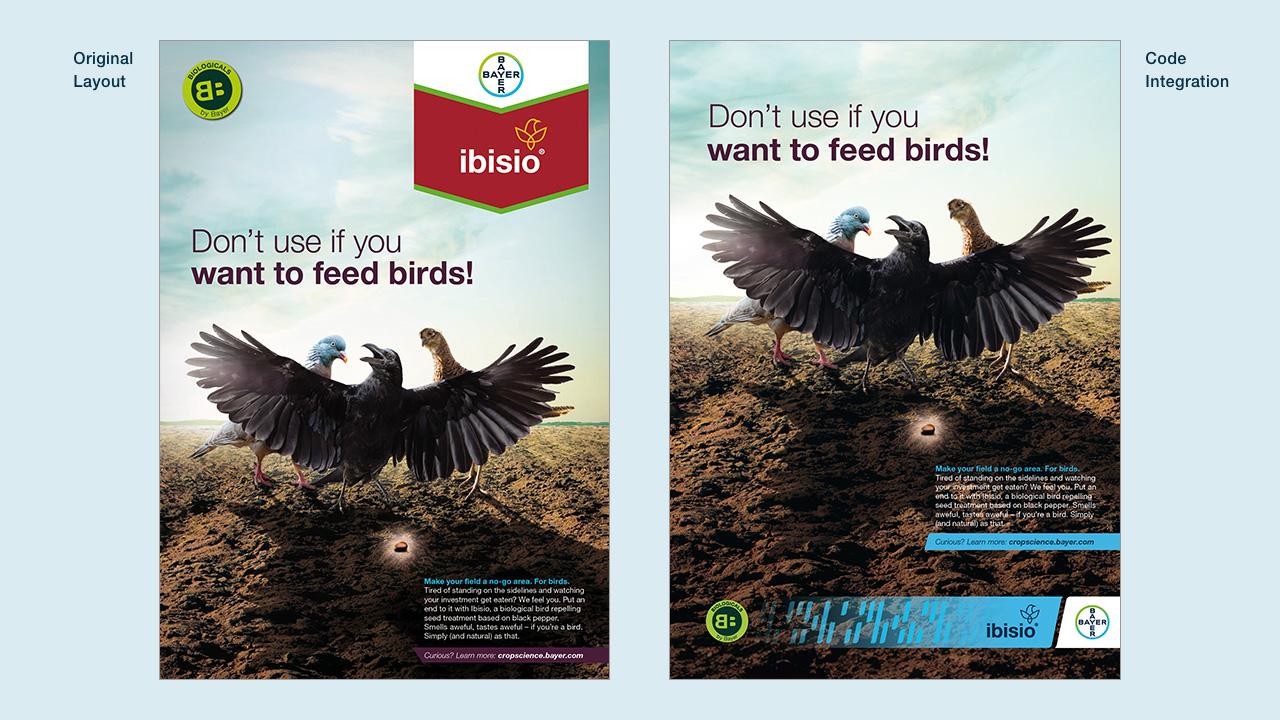
The Code Design supersedes the Brand Tag, becoming the universal look-and-feel for Crop Science. But why replace a familiar design? “Given our focus on integrated solutions, we needed to reconcile our brands across the board,” says Alejandra Ortega, Global Brand Performance and Development Lead. Since Bayer acquired Monsanto, our products weren’t always visually unified. Crop protection products generally looked ‘very Bayer’, but seed products often felt like separate entities.
“We wanted to bring everything together with a single visual identity – one that clearly shows Bayer as the parent brand. This was our chance to show ourselves as one Bayer, and to leverage our corporate brand, with all the benefits this brings.”
- 1/8
- 2/8
- 3/8
- 4/8
- 5/8
- 6/8
- 7/8
- 8/8

Iconically Bayer, infinitely flexible
Creativity is at the heart of any design transformation exercise. It wasn’t just about consistency, it was about creating something joyful, something everyone at Bayer can participate in and benefit from.
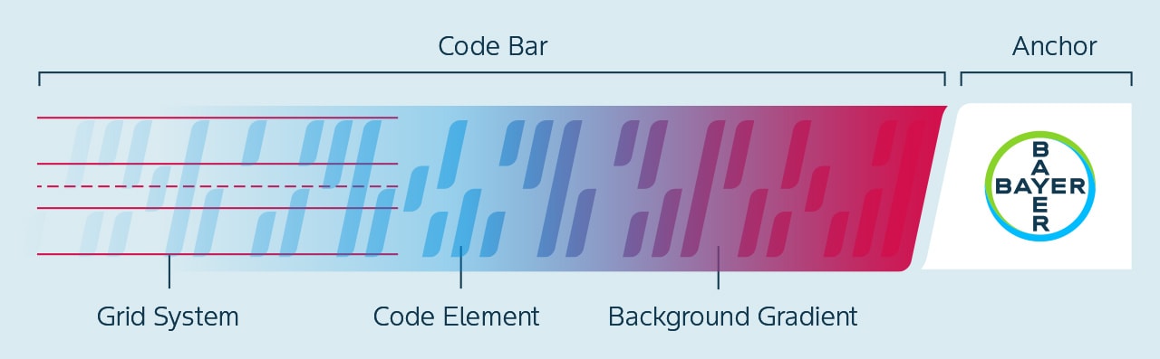
Marketing and design teams in Bayer, working with an external agency, co-created every element: the anchor, gradient, Code elements, and colors. More details are available on the Identity Net’s dedicated section.
Together, these elements say ‘this is Bayer’. The angle reflects our main corporate design, while the colors and Bayer Cross strengthen the connection between product and company. “Having the Code Design echo the Bayer corporate design is a strength,” says Alejandra. “It lets value flow both ways and gives customers and partners a unified experience.”
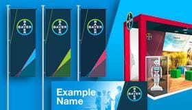
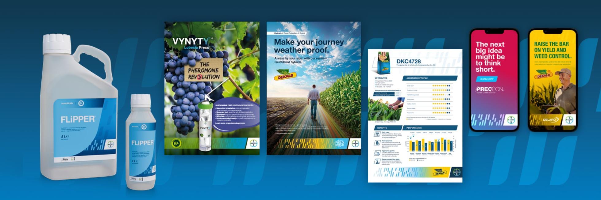
Yet despite its thorough development, the Code Design remains modular and flexible, with options such as different color gradients. Packaging adapts to local regulations, and Lighthouse Brands have tailored guidelines that allow the product brand to shine while reinforcing the corporate brand. The Brand Management Team is available to support local teams and share best practices.
5 things we love about the Code Design
- It’s a way to add value to every product brand at once, by strengthening the association with Bayer. That’s a big uplift!
- It’s a dynamic design language, not a set of rules. You can experiment and find different possibilities for showcasing brands and meeting your needs.
- It’s a modern, likable look-and-feel that is at home in the digital era.
- You aren’t left to implement it on your own, but are supported by a structured process, training and guidance.
- Its story isn’t over – guidelines and assets will continually evolve, and different teams and regions will be able to share their Code success stories with each other.
What’s happening with the Code Design today?
Regional marketing teams have been at the forefront of the rollout, identifying areas for pilots and product launches that could showcase the new look-and-feel. This phased approach helps us build a bank of tested guidelines and best-practice examples, so regions can learn from those who adopted the design before them.
“EMEA were early movers,” says Alejandra. “They proactively updated packaging across seeds and crop protection, and launched new campaigns. All the while, the global team has supported them with guidelines and training sessions.
“In turn, this gave us a strong foundation to get started in the Americas, where we’re now engaging leadership and running training sessions. Going region by region, engaging people and building trust, that’s how we’re gathering critical mass,” she explains.
Rolling out a consistent design is one challenge; so is communicating to stakeholders that change is coming and helping them feel confident that this is still quintessentially Bayer. These concerns are valid, and we’re addressing them with comprehensive support and outreach. Farmer trust is non-negotiable. We are working to provide clarity and reassurance, and to show that the new design reinforces the same high standards they’ve always trusted.
The Code Design’s true power lies in enhancing external brand perceptions. “When you see people’s excitement in the field – when they go to events, see the Code, and say it looks much better – that’s what makes it worth it,” says Alejandra. “Testing the Code with farmers has given us very positive feedback compared to the Brand Tag. Considering how long that visual identity was around for, matching its strength and even surpassing it is a huge achievement.
“I feel super-confident that this is the right way forward. It’s the best way to modernize our brand in agriculture and bring all our solutions together.”
Explore the world of the Code Design
Want to see how the Code Design works in detail? Check out the in-depth resources on the Identity Net:
Even if you aren’t in Crop Science, it is worth going through these pages to see how the Code Design works and how we build design systems from the ground up. And if you are in Crop Science, get involved and start experimenting with your own Code-compliant designs!
If you have any further questions about this or any other section of Bayer Identity Net, please contact: