Consistency is key for our most-recognized brand

The Aspirin brand family spans a huge number of product brands in different countries. New variants and campaigns are always being launched. How do you ensure all these meet brand guidelines, and reflect what’s unique about Aspirin? Making every brand resource easily available online – both to colleagues and external partners – removes uncertainty, makes branding decisions intuitive, and enables Aspirin to stay at the top of its game.
Explore the elements of the Aspirin brand
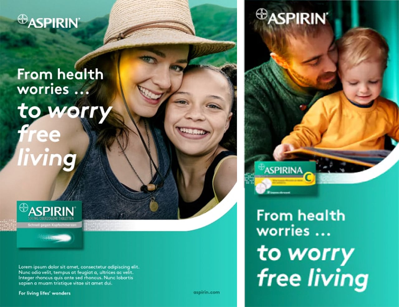
| Aspirin has been blazing a trail for Bayer ever since the brand began in 1899. It has been a hugely valuable brand, a consistent leader in its categories, a powerful driver of recognition for our company brand, and has even gone into space.
But with success comes responsibility. Protecting the Aspirin brand takes work – and that needs to be done across its three key markets (pain relief; heart health; and cough, cold and flu) in every relevant country. Not to mention that the brand is always evolving, whether that’s through new product launches or marketing campaigns in both physical and digital settings. |
The Aspirin brand team’s challenge was to find ways to link all these brand activations, so they could be unique and varied while retaining the distinct Aspirin look-and-feel. “What’s the common thread connecting all Aspirin products? From a human perspective, it’s the moment of transformation, when you feel relief,” says AJ Mekky, Global Design Innovation Lead, who is behind many of Aspirin’s brand developments today. “Whether it’s in the short term with cold and flu, or acting for the future with heart health, Aspirin gives the consumer that moment when they feel in control again.”
That feeling is the cornerstone of Aspirin’s visual brand language (VBL) – everything designed to make Aspirin products and communication instantly recognizable.
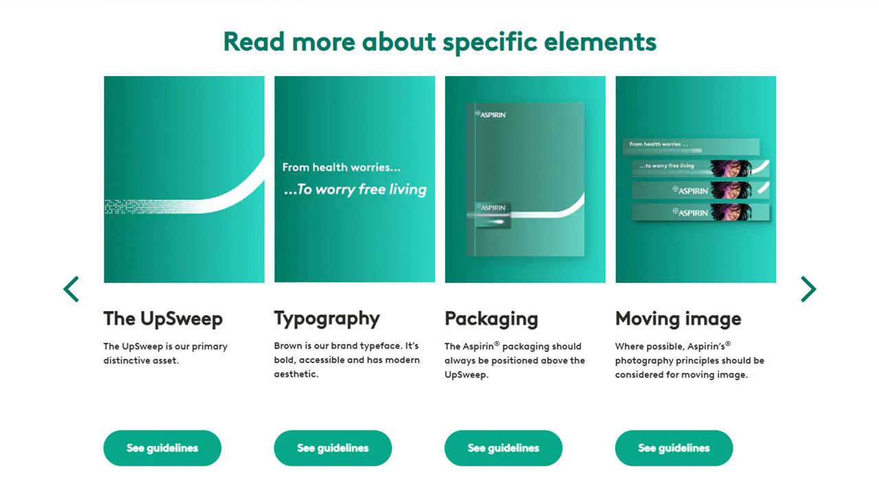
Everyone knows Aspirin’s iconic logo and green colorway. But there’s more to the VBL than that. Such as the Upsweep, the graphic element that visually represents the moment of transformation with its upward curvature and transition from a dotted line to a solid one. And the Aspirin effect, the color filter visible on the people depicted in brand materials, actively showing their moment of transformation as a ‘glow’ in their skin. It’s used throughout the Aspirin brand universe, but it is especially important in videos and other in-motion assets.
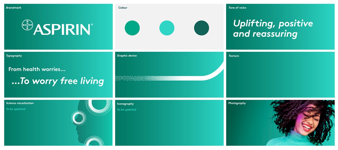
If there’s one thing these varied elements demonstrate, it’s that every asset and every touchpoint are critical to the Aspirin brand experience. From packaging to digital and social, everything needs to contribute and be consistent.
Everything about the Aspirin brand, in one place
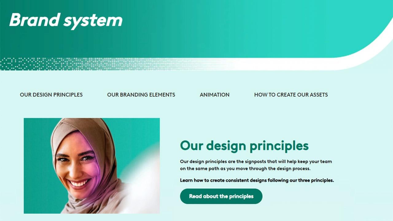
That brings us back to the principal question: How do you ensure a coherent brand presence, in line with brand guidelines, across all these creative formats and applications? This is where Aspirin’s online brand world – easily accessible at brand.aspirin.com – shines.
This resource details every aspect of the Aspirin brand system, starting with overall principles and delving deeper into colors, textures, typography, the brandmark, the Upsweep, photography and more. It’s not just a list of dos and don’ts; everything is accompanied by practical tools, examples and justifications.
And there are also password-protected links to download the assets you need to put the guidance into practice.
Why create a separate system just for Aspirin, rather than fold it into a central Bayer resource? Accessibility and universality hold the key. “Part of driving consistency is being present and easy to find,” says AJ. “When you have a massive brand with teams working across the world, sharing information can be a challenge. Having this digital asset management system deals with that challenge by making everything easy to find. If you need something, go to brand.aspirin.com – it couldn’t be simpler.”
5 reasons Aspirin’s digital system works so well
- It’s built on belief in Aspirin. This brand has done incredible things for consumers and for our business – and the brand world reflects our passion for it.
- It’s designed to empower, not restrict, brand communication by putting all the necessary assets at your fingertips.
- It saves time and promotes mutual understanding for global colleagues and partners
- It’s grounded in the real world, with people – and the emotional benefits of Aspirin for them – at the center of everything
- It’s got modularity and flexibility built in. Anyone can build their own campaigns from it, maximizing creativity at the same time as consistency
Consistency today, growth tomorrow
Having a consistent brand identity is enough of a reward. But feedback from the Aspirin brand community confirms that the brand world leads to even more benefits – making people’s jobs easier and laying the foundation for better results in future.

When US and global teams worked together across two different design languages, it enabled the US team to get up to speed in a week and launch new products faster. When cold and flu products expanded across different Central and Eastern European markets, it allowed them to keep consistency across different languages and regulatory environments. When the granules-based Aspirina Go launched in Mexico, having all the assets ready helped bring the product to life with new visuals.
As they look toward achieving even better results in the future, there is potential for utilizing GenAI image generation technology to adapt visuals to local cultures and preferences. This would help ensure that the protagonists of communication stories are effectively represented, further enhancing the overall impact of the brand’s messaging and resonating with audiences in various markets around the globe.

But perhaps the biggest success story has been the campaign to mark 125 years of Aspirin. The 125-year logo creation, led by AJ, has been widely seen and used – but that’s not all. There was also in-depth messaging work and campaign assets created, celebrating Aspirin’s role as the everyday wonder drug for better health, and all using familiar brand elements to tell the story.
And resources like the online brand world are setting it up for another 125 years of incredible results.
WANT TO CREATE SOMETHING SIMILAR FOR YOUR BRAND?
Follow AJ and Mohamed’s tips on how to emulate their success and build a brand-specific resource that serves your needs
AJ: “When setting the scope of your system, focus on the problem you are trying to solve. Don’t try to make too much available – stick to well-defined objectives. With Aspirin, our goal was to make it easier for colleagues or partners to find assets and achieve continuity. We knew that there are already resources at Bayer that cover other areas, and we knew not to duplicate them.”
Mohamed: “Be as simple and as clear as possible in your guidelines to the market. That way, users can be autonomous and get guidance easily on their own. Writing guidance is one thing; having it digested, applied and adhered to is another. A design system should not lead to you spending lots of time with marketers, giving manual guidance and correcting errors. It should facilitate independence!”
If you have any further questions about this or any other section of Bayer Identity Net, please contact:

