Typography
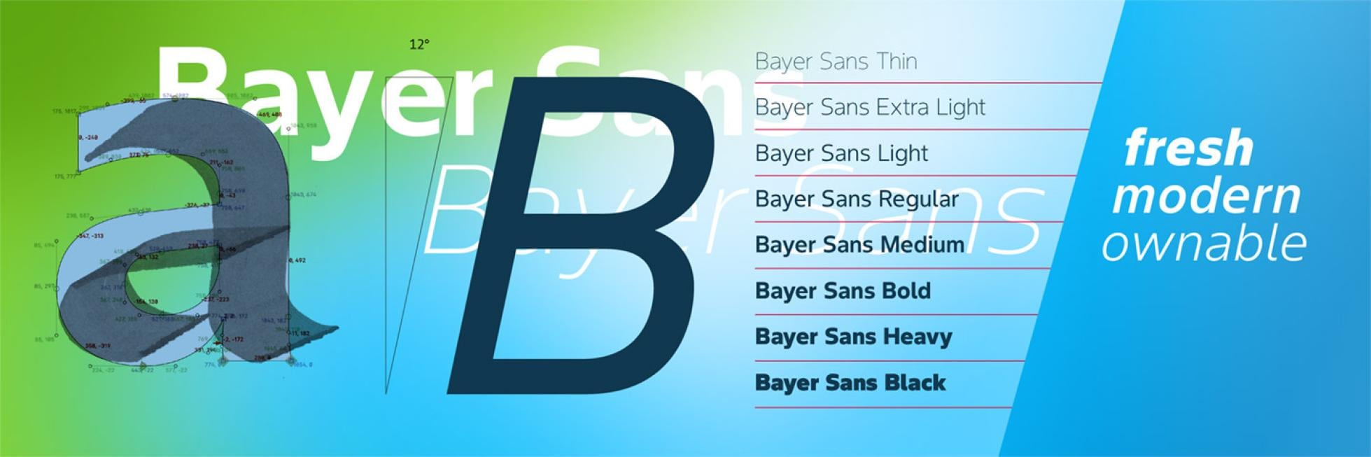
Our corporate typeface, specifically designed for us, is Bayer Sans. Unique, sustainable, scalable, and modern yet clear and highly legible, it gives our communications a fresh, consistent, and unique look. It is a real progress in accessibility and fits perfectly to our dynamic outward oriented brand personality.
To evolve our visual identity, we have designed our own corporate typeface that exclusively belongs to Bayer. It is a comforting, optimistic and dynamic typeface, which gives our Bayer brand a unique visual identity.
It outscores other typefaces when it comes to legibility, making our content more accessible.
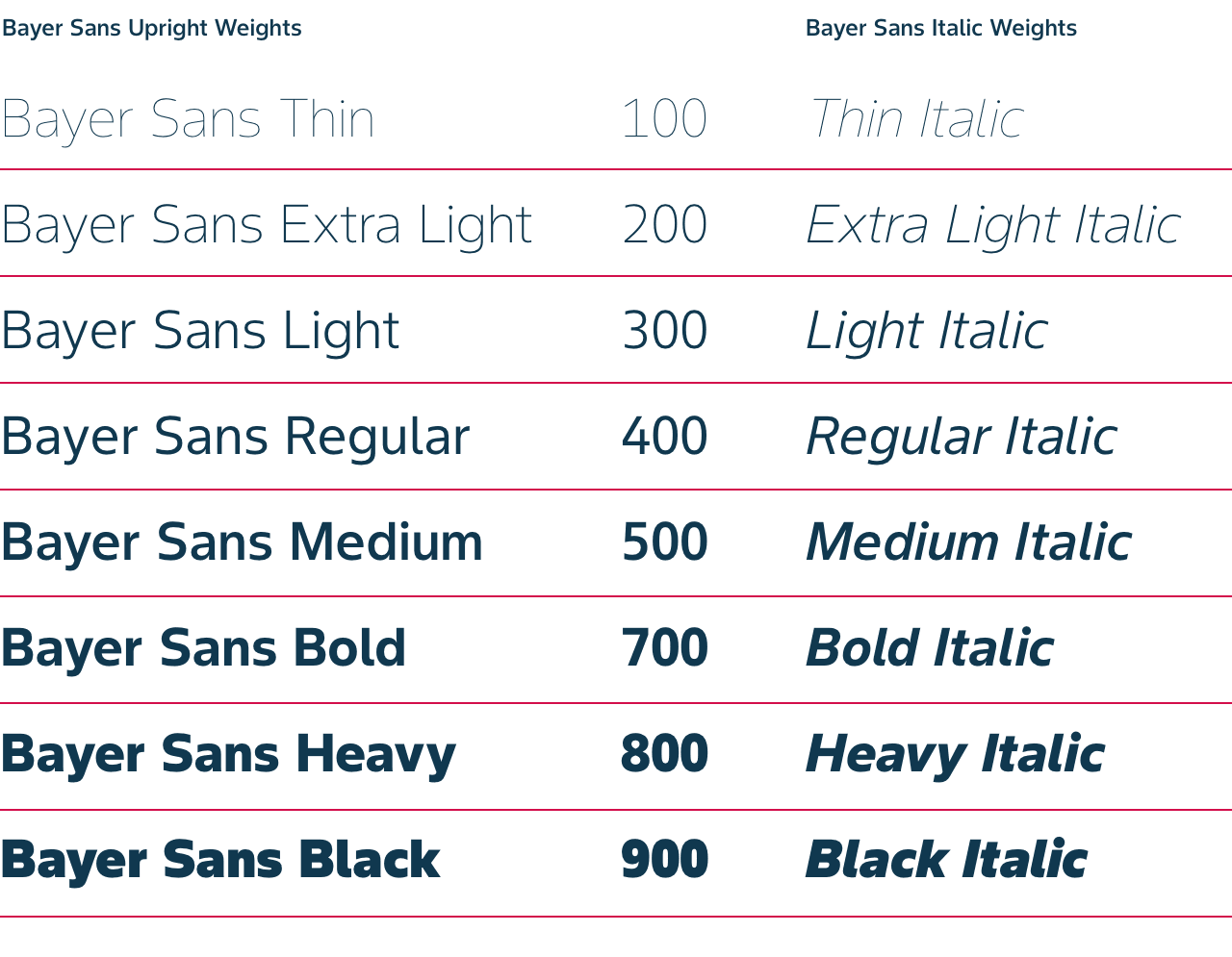
Bayer Sans is available in a large range of weights and styles for Latin and Cyrillic based languages.
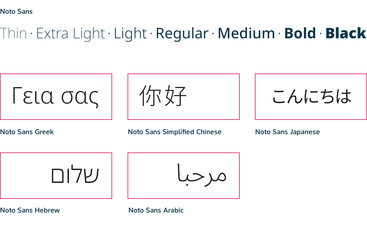
Other languages (neither Latin or Cyrillic based) can use the open font of Google Noto Sans. For more information, see chapter Exceptions: when to use Open Font License / Noto Sans.
- Fonts have usage rights, similar to images. You need to pay attention to the license costs before you implement a font software.
- The license costs for Neue Helvetica are no longer covered centrally since March 31, 2025 onwards and any unlicensed usage may have cost implications.
- Stick to Bayer Sans or Open Font Noto Sans
Start using Bayer Sans now
Our unique Bayer Sans typeface can be shared with external providers and third parties, is free of charge and can be used on any asset, worldwide, without time limitations. You can download it here.
How to use the Bayer Sans family
Our aim is to create designs that are dynamic and full of contrast. Therefore, we usually pair light with bold weights. Regular can also be used in situations where the light weight creates accessibility problems i.e. online.
No specific text sizing rules apply. Use text sizes appropriate for the application and format that suits your design requirements.
Bayer Sans light or thin italic can be applied at larger sizes to capture the idea of progress and forward movement.
The Bayer Logo is included in all Bayer Sans fonts and is available at your fingertips.
- On MacOS: to access it press Option + f.
- On Windows: To access it press and hold the ALT key and type the number 0131.Use any of our 12 palette colors for headlines, ensuring good contrast for legibility. There’s no need to use all the colors. Try to establish some consistency – e.g. use the same color for headlines that are the same size.
Headlines can also use the body text color, if desired.
Use any of the 12 colors for short introductory paragraphs, ensuring they are legible.
Always pick color combinations that create enough contrast and ensure that text is clearly legible. The following examples show combinations you can use and ones to avoid.
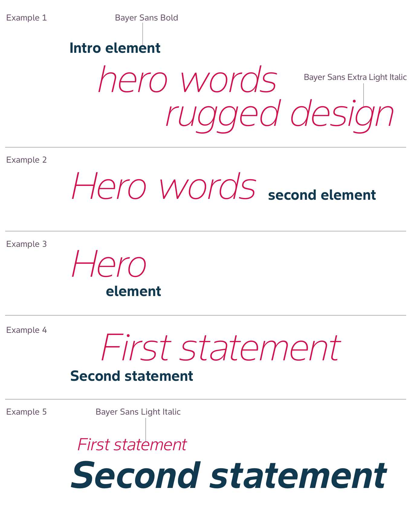
Hero headlines
Professionally designed items can use hero headlines at larger sizes.
Hero headlines usually combine italic and non-italic words or short sentences.
The sentence elements can be split over several lines or be on one line.
Exceptions: when to use Open Font License / Noto Sans
For the languages, which are not covered by Bayer Sans: (all language scripts other than Latin or Cyrillic) the Noto Sans (licensed under the Open Font License) typeface is recommended from the brand point of view to ensure consistency. It can be freely used for any purpose. You can download the font here. Please make sure your team is using the font in a static way by storing the font local and integrating the font into the website from there.
Exceptions: when to use Arial
For Microsoft® Office® applications, such as PowerPoint® or Word® and other on-screen applications nothing changes for the time being. We stick with Arial as the system font.
This also applies to e-learning programs and e-books that run on PCs.
System fonts are installed on most PCs and Macs, which ensures all users can view these fonts (this rule especially applies to emails.)
Arial can be used in Regular, Italic, Bold and Bold Italic. Arial Bold is used for headings and subheadings and Arial Regular for body text.
These typefaces should never be used on materials designed exclusively for print and are used only in Microsoft Office and email applications.
Examples
If you have any further questions about the use or implementation of typeface, please reach out to:
Olena Paul – Communications, Brand Identity Lead
olena.paul@bayer.com
Thekla Wege – Digital Lead, Corporate Communications
thekla.wege@bayer.com

