Preceon: Revolutionary system, revolutionary use of the Bayer brand

The Preceon® Smart Corn System was revealed to growers around the world and the Bayer community earlier this year. From the name to the logo design and colors, the whole Preceon look-and-feel is brand new – but at the same time, it’s steeped in Bayer tradition. We discover how global teams created the brand, and how regions are bringing it to life.
In the corn world, everyone is talking about the Preceon Smart Corn System. Being launched regionally – starting in North America with a dedicated presence at the major trade show Commodity Classic – Preceon is a game-changing new way of growing and managing corn.

At the center of the system are Short Stature Corn hybrids, which grow 30-40% shorter than traditional ‘tall’ corn, giving them excellent resistance to lodging, especially in high winds and other challenging conditions, as well as easier field management and the potential to plant at higher densities. But there is more: this is a digitally enabled system, harnessing the capabilities of FieldView to get the most out of the hybrids and deliver additional services and decision support. This full ecosystem of breeding and digital technologies, placement and management recommendations, crop protection innovations, new agronomic practices and close support makes the Preceon Smart Corn System a totally new offering. In fact, it could transform how corn is grown worldwide.
It’s also symbolic of Bayer’s own transformation, into a fully customer-centric, digitally-enabled business that delivers complete solutions to support the best outcomes in every acre. Such a powerful concept needed a brand to match.
Matthias Lindecke, Global Lead, Brand Marketing, explains how the brand got started: “Once we had identified the Smart Corn System descriptor, interesting questions arose from a brand architecture perspective. Do we go straight to the Bayer level and call it Bayer Smart Corn System? Or do we have a brand in between, and if so, should it be an existing corn brand or something totally new?”

Since this is a transformative system built around a groundbreaking innovation, digitally enabled and complete with tailored agronomic recommendations, the decision was made to take the most ambitious branding route: a new, distinct brand name to make it clear that this is a whole new concept that stands on top of the established product brands.
The Preceon name: Future meets familiarity
The first brand element to be decided was the name. The brief: to communicate the system’s innovative, forward-thinking nature, without losing the grower or coming off as superior. “Growers value independence and freedom of choice, and when we come to them with a whole new growing system, it can create fear of losing that independence,” Matthias says. “You need to stay on eye-level with them and act as their partner and friend, not their superior.
The name Preceon was a clear winner. Not only was it registerable, it also has several linguistic elements that resonate with what the system offers: Pre for precision and prediction; Eon from the Greek meaning forever, since this is a long-term transition for corn production; and on in the sense of switching on digital tools and switching on benefits.
Historical elements make something new

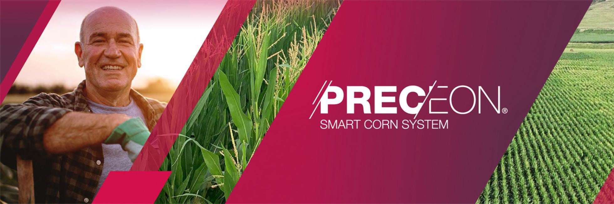
Next, the Preceon name came to life with its logo. When compared to other logos in its category, Preceon is markedly different, especially in its color choice. But you might be surprised to learn that it is entirely aligned with Bayer brand guidelines – in fact, it harks back to the very start of Bayer’s history. The logo uses Bayer Raspberry and Bayer Dark Purple in a gradient – and the raspberry color was sold by Bayer when it was founded as a dye company in 1863.
As for the angular lines, they depict tramlines and seeding rows in a field – and they also enable a break between different text weights, which can be customized depending on the execution and which aspect is most important to highlight. This is what’s referred to as the ‘algorithmic logo’.

“The logo embodies both adaptability and precision, which is what the system is all about,” says Matthias. “It works well alongside the Bayer logo, too. When they are shown together, it combines the modern, high-tech feel of the Preceon logo with the sense that Bayer is always there as a long-standing trusted partner, backing you up.”
Now, the brand has been developed further, and has a lot more than a logo: it has a complete visual identity, a way of speaking, and a set of design guidelines. A full brand world! And the purpose of this world is to communicate Preceon’s nature as a multi-faceted, integrated system, partially physical and partially digital. Accordingly, it both draws on Bayer’s history and strikes out in a new direction: looking distinctly like a Bayer brand, but in a fresh, modern and bold way, making playful use of colors and patterns that aren’t quite as common in other projects, and always speaking to the farmer like a companion.
Preceon is only just getting started
Matthias says that the level of enthusiasm from Bayer stakeholders for the Preceon Smart Corn System is unprecedented. Almost everyone reports that they love it. Now, the Preceon brand is heading for regional activations around the world.
Alejandra Ortega, Global Brand Performance & Development Lead, has been liaising with different regions to ensure successful launches in each one. She reveals how the phased launch has gone so far, starting with the North American launch at Commodity Classic: “The North America team did a really good job implementing the booth at Commodity Classic – it was very interactive and very tangible. They had plastic corn ‘plains’ with a wind generator, where the tall corn would fall and the short corn would stand still. There were also interactive exhibits looking into the other benefits.
These are being accentuated in different ways for each region, giving a “twist” based on locally determined needs, while the overall brand position remains consistent globally. Things are now ramping up with the EMEA team ahead of a launch in selected territories in the region. Alejandra explains that the learnings from each regional launch are being used to inform the next: “We paved the way in North America, in terms of not only the system but also the brand, visual identity, and how it’s related to some other innovations within Bayer.

“These learnings are being made available to everyone, in the form of flexible guidelines with proper adaptability. Our objective is to properly enable future releases of Preceon while making brand adherence as intuitive as possible.”
LATAM and APAC are scheduled to follow EMEA, so there is more to come from the system itself – and therefore the brand too. “Building the whole system is a journey,” says Matthias. “What we see today is still the building blocks. The full picture, with full creativity and all components executed, is still to be revealed! That’s what we are working on now. We got the pieces together and created excitement within the organization, and we did so in a truly international team. Now, the challenge is to keep working this way and build a global platform for a strong brand.”
Alejandra adds: “Across the world, the approaches may be a little bit different, but the importance of co-creation is the same. Farmers want to be active participants, not just a passive receiver of the technology. When they help create something new, they get a sense of pride that they don’t get if they are just given pre-ordained solutions and told to plant them. So they want to co-operate and be part of the future. I think this a global trend.”


